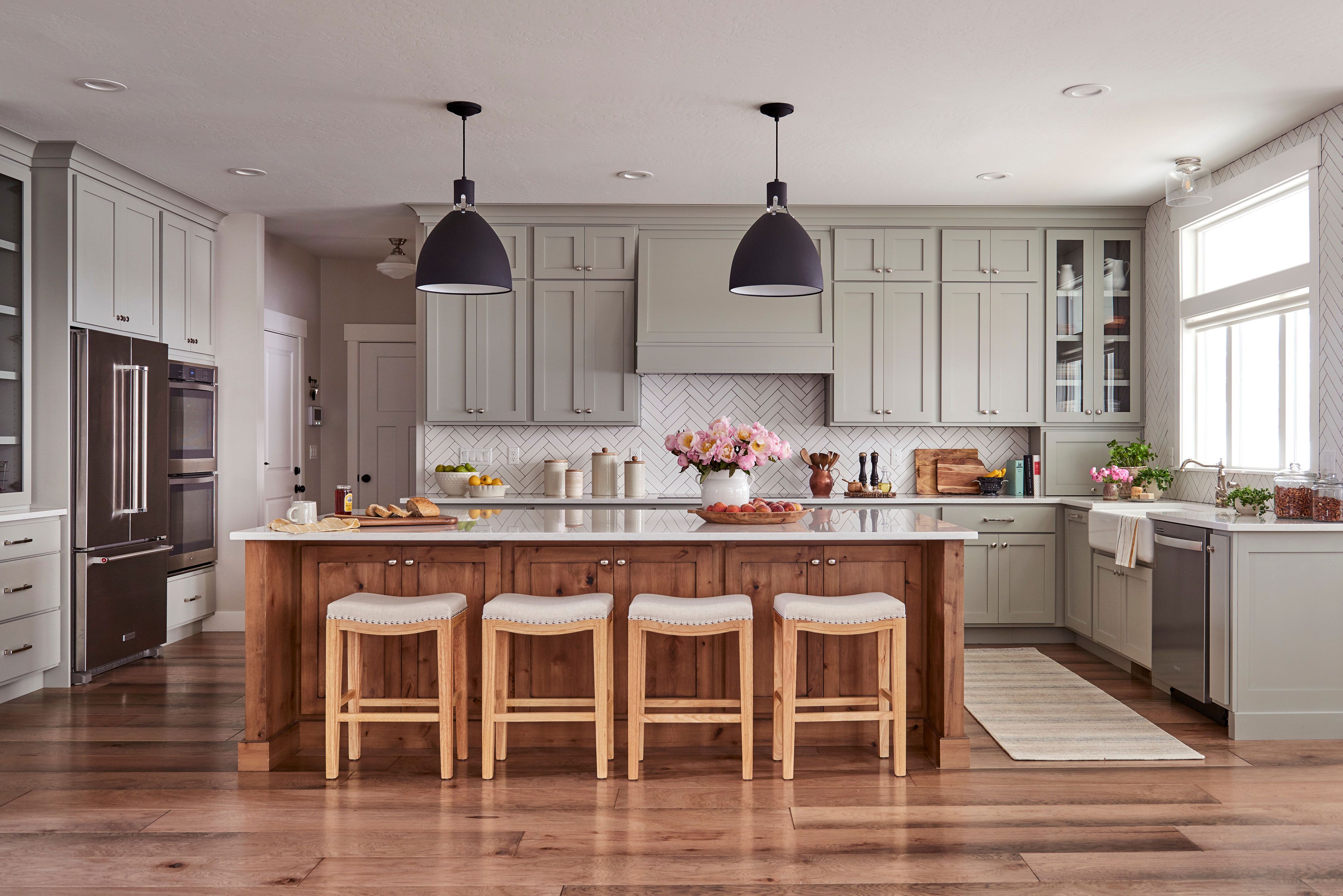
If the all-white kitchen was the crisp button-down of the 2010s, the cashmere kitchen is its beautifully tailored, impossibly soft sweater-wearing cousin. It is warm without being dark, elegant without being fussy, and polished without acting like nobody is allowed to spill pasta water. That balance is exactly why designers keep calling the cashmere kitchen trend timeless.
At its core, a cashmere kitchen is not one exact color. It is a feeling. Think creamy whites, taupes, sand, soft greige, light clay, and beige with enough warmth to make the room feel lived in rather than showroom-stiff. Add natural wood, stone with gentle movement, brass that patinas gracefully, and lighting that glows instead of glares, and suddenly the kitchen feels less like a display box and more like the heart of the home.
That is the secret sauce. Cashmere kitchens do not scream for attention. They do not rely on one trendy stunt color or an ultra-specific finish that could feel dated in five years. Instead, they lean on materials and tones that have lasted for generations, then reinterpret them in a cleaner, more relaxed way for modern living. In other words, this trend has excellent manners. It enters the room quietly, looks expensive, and somehow still makes everyone want to hang out near the island.
What Is a Cashmere Kitchen, Exactly?
The phrase “cashmere kitchen” sounds like something a luxury catalog invented after a strong latte, but the look is surprisingly practical. Designers generally use the term to describe kitchens built around warm neutrals, understated elegance, and tactile layering. The palette often includes creamy paint, beige cabinetry, warm whites, pale mushroom tones, soft oatmeal shades, and wood finishes that feel natural rather than overly orange or aggressively rustic.
The best cashmere kitchens usually pair that palette with a restrained mix of materials. You might see white oak or cerused oak cabinetry, marble or quartzite countertops, zellige or stone backsplashes, and brass hardware in antique, brushed, or unlacquered finishes. Cabinet profiles are typically clean and classic, whether that means slim Shaker fronts, flat panels, or softly detailed millwork. Nothing is too precious, but everything feels chosen.
That is an important difference. A cashmere kitchen is not just beige. Beige alone can fall flat. Cashmere kitchens work because they layer tone, finish, and texture so carefully that the room feels soft and dimensional. A matte wall, polished stone, woven pendant, brushed brass pull, and subtly grained wood all play together like a very well-rehearsed band. Nobody is trying to do a solo.
Why Designers Think It Feels So Timeless
1. It moves beyond stark white without abandoning neutrality
Designers love white kitchens for a reason: they are flexible, bright, and broadly appealing. But a lot of homeowners started noticing the downside of the ultra-cool version of white. In the wrong light, it can feel sterile, flat, or vaguely like a very upscale laboratory. Cashmere kitchens fix that problem by keeping the versatility of a neutral palette while introducing warmth and softness.
That warmth matters. A creamy off-white, sandy beige, or subtle greige still behaves like a neutral, but it reads as more welcoming. It also plays beautifully with changing decor. Swap out stools, pendants, runners, or artwork over time, and the room still works. That adaptability is a major reason the style feels lasting rather than fleeting.
2. The palette is quiet, but not boring
Timeless rooms rarely rely on drama alone. They are usually grounded in colors that age well and allow architecture, craftsmanship, and daily life to take center stage. Cashmere kitchens understand this assignment perfectly. The palette is calm, but because it includes nuanced undertones, it never feels one-note.
Some designers recommend paint colors like Sherwin-Williams Alabaster, Aesthetic White, and Accessible Beige when building that warm-neutral base. Others point to Benjamin Moore Swiss Coffee and Simply White, or earthy shades that sit between beige and gray. The point is not to memorize a shopping list like it is a chemistry exam. The point is to choose a tone that gives off its own gentle glow and makes the kitchen feel settled.
3. Natural materials age better than synthetic-looking finishes
Ask enough designers what makes a kitchen last, and the answer gets pretty consistent: natural materials. Stone, wood, marble, limestone, and living finishes tend to develop character instead of just looking worn out. That is a huge reason the cashmere kitchen has staying power.
Think about a countertop in Taj Mahal quartzite with warm movement, or a softly honed marble backsplash, or cabinetry with visible grain instead of a dead-flat, lifeless surface. These materials do not feel trendy because they never depended on trendiness in the first place. They have visual depth, historical precedent, and enough variation to keep the room interesting year after year.
Even the metals matter. Warm brass, especially unlacquered brass, has become a favorite because it gains patina over time. Rather than aging badly, it tends to age beautifully. That is pretty much the dream, both for kitchens and for people in general.
4. It relies on layering, not gimmicks
Cashmere kitchens are masters of subtlety. Instead of making one loud move, they create richness through layering. Designers often talk about combining matte and polished finishes, smooth stone and tactile wood, soft textiles and structured cabinetry. This is what gives the room depth.
It is also what keeps the trend from feeling disposable. A gimmick gets old fast. Layering does not. A woven pendant over an island, a linen Roman shade, an upholstered stool, a brushed marble backsplash, and warm-toned cabinets create a room that feels collected. That kind of design rarely goes out of style because it is based on balance rather than novelty.
The Hallmarks of a Beautiful Cashmere Kitchen
Warm cabinet colors
Cabinetry is usually where the cashmere kitchen look starts. Shades range from creamy white and mushroom to oatmeal, taupe, and soft beige. Even when wood is used, it tends to be pale oak, walnut, or another finish with depth and softness rather than a shiny, dated stain.
What works here is restraint. The color should feel warm and grounded, not yellowed, muddy, or overly pink. The best versions look natural in morning light, afternoon light, and lamplight. If a cabinet color only behaves well under perfect conditions, it is probably not timeless. It is just good at first impressions.
Stone that adds movement
Because the palette is intentionally soft, countertops and backsplashes often do more of the visual storytelling. Designers frequently recommend stones with warm veining or earthy movement, such as Taj Mahal quartzite, marble, or other natural surfaces that introduce dimension without heavy contrast.
Honed or brushed finishes are especially effective because they feel less formal than high-polish slabs. They support the “quiet luxury” vibe that cashmere kitchens do so well. The space looks refined, but you still believe someone actually cooks there.
Wood for warmth and balance
Wood is one of the easiest ways to keep a neutral kitchen from looking washed out. It can show up in cabinet accents, open shelving, range hoods, stools, floors, or furniture-style islands. White oak is a frequent favorite, but the broader principle matters more than the species: choose wood that looks honest, warm, and connected to the rest of the palette.
Even a mostly painted kitchen benefits from wood moments. A single oak island base or a few floating shelves can turn a nice kitchen into a memorable one.
Brass and other warm metallics
The cashmere kitchen does not usually reach for chrome first. It wants metal finishes with warmth. Brushed brass, antique brass, champagne bronze, and unlacquered brass all complement creamy cabinets and earthy stone especially well. They add sparkle, but a mellow kind of sparkle. More candlelight at dinner, less operating room at noon.
Soft, flattering lighting
A cashmere kitchen should glow. Harsh overhead lighting can flatten all the beautiful texture you just paid for, so designers often recommend a layered lighting plan: pendants, sconces, under-cabinet lighting, and warm bulbs that make the room feel human. Some of the most compelling recent kitchens even feature woven or fabric-shaded fixtures that introduce another soft material into the space.
That lighting choice may sound small, but it changes everything. Warm neutrals only look luxurious when the light lets them.
How to Make the Trend Work Without a Full Renovation
The good news is that you do not need to demolish your kitchen and emotionally process eighteen stone samples to bring in the cashmere look. Designers keep pointing out that warmth can be layered in gradually.
Start with paint
If your kitchen reads cold, painting the walls or cabinets in a warm neutral is the fastest way to shift the mood. Look for shades with creamy, sandy, or taupe undertones. Avoid anything too gray or too bright white if your goal is softness.
Swap hardware
Changing pulls and knobs from cool silver finishes to brass or champagne tones can make a surprising impact. It is a relatively small move, but it instantly nudges the room away from stark and toward inviting.
Bring in texture
Add a runner, upholstered counter stools, café curtains, woven pendants, or even just better kitchen textiles. Cashmere kitchens feel special because they include tactile layers. A room with only hard surfaces can look polished, but it rarely looks cozy.
Mix in wood
If your kitchen is all painted cabinetry and shiny surfaces, wood can rebalance it quickly. Try a butcher-block accessory zone, wooden stools, cutting boards left on display, a vintage table, or open shelves in a natural finish.
Be selective with accents
This trend is not about stuffing every corner with beige objects until the room resembles a very upscale sand dune. Use restraint. One beautiful stone, one lovely warm paint, one good metal finish, and a few natural textures can be enough.
What Makes a Cashmere Kitchen Feel Current Instead of Dated?
This is where some people get nervous. They hear “beige” and immediately flash back to builder-grade kitchens from decades past. Fair concern. But a timeless cashmere kitchen avoids that trap by focusing on sophistication, not sameness.
First, the undertones are better. Today’s warm neutrals are more nuanced and less flat. Second, the materials are richer. Instead of matching everything, designers are mixing creamy paint with wood grain, living brass, soft stone, handmade tile, and sculptural lighting. Third, the silhouettes feel cleaner. There is usually a contemporary crispness to the cabinetry, hardware, and overall composition that keeps the space grounded in the present.
In short, a dated beige kitchen looks like it stopped trying. A cashmere kitchen looks like it knows exactly what it is doing.
Why This Trend Has Real Staying Power
Design trends come and go, but the most enduring ones are usually rooted in something deeper than fashion. The cashmere kitchen reflects a bigger shift in how people want their homes to feel. They still want beauty, but they also want comfort. They still want polish, but not at the expense of personality. They want kitchens that support actual living: coffee at sunrise, homework at the island, friends hovering near the stove, and maybe one person dramatically announcing they are “just here for moral support.”
That is why the trend feels timeless. It solves a real design problem. It softens the coldness that made some modern kitchens feel impersonal, yet it keeps the clean lines and flexibility homeowners still value. It honors natural materials, embraces warmth, and lets the room evolve gracefully. That is not trend-chasing. That is good design.
Experiences and Real-Life Appeal: Why People Keep Falling for the Cashmere Kitchen
One of the most interesting things about the cashmere kitchen trend is how often designers describe it emotionally, not just visually. They talk about kitchens feeling “held,” “calm,” “welcoming,” and “lived-in.” That language matters because it reveals why this look connects so strongly with homeowners. People are not just choosing a cabinet color. They are choosing how they want the busiest room in the house to feel on an ordinary Tuesday.
In real homes, that often starts with light. A warm neutral kitchen looks different at 7 a.m. than it does at 7 p.m., and that is part of its charm. In the morning, the tones can feel creamy and bright, especially when paired with pale wood and stone. By evening, those same surfaces become softer and moodier under pendants and sconces. Instead of feeling blank, the room changes gently through the day. That kind of visual comfort is hard to fake, and once people experience it, they usually do not want to go back to colder finishes.
There is also a practical side to the appeal. Cashmere kitchens are forgiving. A little patina on brass does not ruin the look; it improves it. A wood stool that gets scuffed by sneakers still belongs. A marble or quartzite counter with subtle movement hides daily life better than a flat, stark slab. For families, frequent cooks, and people who like their homes to feel elegant without being stressful, that is a huge win. The room looks dressed up, but not delicate.
Designers also point out that this style tends to age well alongside people’s lives. A homeowner might begin with warm paint, simple cabinetry, and a stone counter, then add vintage art, a patterned runner, a prettier faucet, or softer lighting over time. Because the base is so adaptable, the kitchen can evolve without needing a complete identity crisis every few years. That makes it especially appealing to homeowners who want longevity rather than a series of expensive design plot twists.
And then there is the social part. Cashmere kitchens photograph beautifully, yes, but more importantly, they feel good in person. Friends lean longer at the island. Kids do homework there without the room feeling too precious. Guests naturally gather under the softer light. It is the rare trend that manages to be both photogenic and genuinely comfortable. That balance is what people remember after visiting someone’s home. They may not say, “I admire the layered tonal range of your finishes,” but they will say, “Your kitchen feels amazing.” Honestly, that is the better compliment anyway.
In that sense, the cashmere kitchen is timeless because it creates an experience people keep wanting: warmth, ease, elegance, and a sense that life is actually meant to happen here. Not in a chaotic way, and not in a museum way. Just in a beautifully considered, quietly luxurious, pass-the-olive-oil kind of way.
Conclusion
The cashmere kitchen trend earns its timeless reputation because it is built on enduring ideas: warm neutrals, natural materials, soft lighting, and layers that add depth without noise. It is flexible enough for modern, traditional, Scandinavian, and transitional homes, yet distinct enough to feel fresh right now. More importantly, it makes the kitchen feel better to live in. And when a design trend improves both how a room looks and how it feels, it usually sticks around for a very long time.