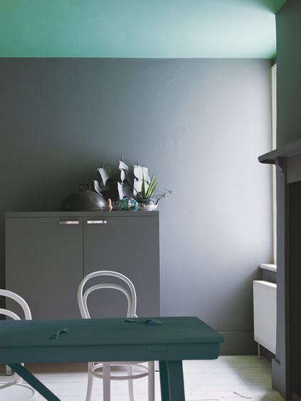
Minimal Living Paint No. 272 sounds like the name of a paint color that quietly alphabetizes your books, hides your extra phone chargers, and reminds you that “less is more” before you buy another throw pillow. In real design language, it points to a sophisticated architectural gray: Farrow & Ball’s Plummett No. 272, a strong, lead-inspired gray often associated with minimalist interiors, modern bedrooms, dramatic trim, and calm, edited spaces.
But this is not just another gray paint. Anyone who has ever painted a room “gray” and ended up with a wall that looks baby blue, storm purple, or mysterious office-cubicle beige knows the truth: gray is not simple. It is a mood. It is a lighting experiment. It is a tiny interior design personality test in a can. Minimal Living Paint No. 272 works because it embraces depth instead of pretending to be invisible. It has an industrial edge, a refined matte character, and enough visual weight to make a room feel intentional rather than unfinished.
This guide explores what Minimal Living Paint No. 272 is, where it works best, how to pair it, how to choose the right finish, and what real homeowners should consider before committing to a deeper gray. We will keep things practical, stylish, and only mildly dramaticbecause the paint may be serious, but your renovation does not need to require a support group.
What Is Minimal Living Paint No. 272?
Minimal Living Paint No. 272 is commonly connected with Farrow & Ball Plummett No. 272, a deep architectural gray inspired by the color of lead weights traditionally used by anglers. That origin story matters because it explains the tone: this is not a soft cloud gray or a polite silver. It is weightier, moodier, and more grounded. Think modern loft, boutique hotel bedroom, gallery wall, or a calm reading room with very good coffee and absolutely no visible clutter.
The phrase “minimal living” fits the color because Plummett No. 272 supports a pared-back design approach. It can make simple rooms feel finished without requiring loud patterns or endless accessories. In a minimalist home, the wall color often has to do more work. When furniture is clean-lined and decor is restrained, paint becomes texture, atmosphere, and architecture all at once.
A Strong Gray With an Industrial Personality
Plummett No. 272 is often described as one of Farrow & Ball’s more industrial-feeling grays. That does not mean it makes your bedroom look like a parking garageunless you pair it with fluorescent lighting and emotional neglect. Used well, it creates a tailored backdrop that feels modern, balanced, and quietly luxurious.
Its character changes depending on light, finish, and surrounding materials. In bright rooms, it can appear crisp and contemporary. In smaller or darker spaces, it becomes richer and more enveloping. That makes it especially appealing for homeowners who want a gray paint color that feels designed, not accidental.
Why Minimalist Interiors Love Deep Gray Paint
Minimalist design is often misunderstood as “white walls plus one wooden chair.” In reality, minimal living is about intention. Every surface, object, and color needs a reason to be there. A color like Minimal Living Paint No. 272 brings structure to that simplicity.
Deep gray works beautifully in minimal interiors because it adds contrast without chaos. It can define a room’s architecture, frame natural materials, and give simple furniture a more elevated presence. A white sofa against a deep gray wall looks deliberate. Pale oak shelving against Plummett feels warm and sculptural. Black metal lighting becomes crisp rather than harsh.
Minimal Does Not Mean Colorless
One of the best things about this paint color is that it proves minimalism does not have to be pale, sterile, or afraid of personality. A deeper gray can actually make a room feel calmer because it reduces visual noise. Instead of bouncing light everywhere, it absorbs some of it, creating a cocoon-like effect. That makes the space feel more restful, especially in bedrooms, home offices, and quiet sitting rooms.
In other words, Minimal Living Paint No. 272 is for people who want minimalism with a backbone. It is clean, but not cold. Dramatic, but not theatrical. Stylish, but not the kind of stylish that demands you own a chair nobody is allowed to sit in.
Best Rooms for Minimal Living Paint No. 272
Because this is a deeper gray, placement matters. It can look stunning in many rooms, but it performs best when you think about light, furniture, and the emotional effect you want.
Bedroom
A bedroom is one of the strongest places to use Minimal Living Paint No. 272. Deep gray can make a sleeping space feel calm, intimate, and grounded. Pair it with white bedding, linen textures, warm wood nightstands, and soft lighting. The result is a boutique-hotel feeling without the tiny shampoo bottles.
For a balanced look, use the color on all walls if the room has enough light, or create a feature wall behind the bed in a smaller bedroom. If you go all-in, keep bedding and window treatments soft and simple so the room feels restful rather than heavy.
Living Room
In a living room, Plummett No. 272 can create a refined backdrop for art, books, and natural materials. It pairs especially well with pale oak, walnut, black metal, ivory upholstery, leather, and stone. If your living room has large windows, the color can shift throughout the day, creating a dynamic but still understated effect.
If your living room is small, do not automatically avoid this shade. Dark paint can blur corners and create depth, which sometimes makes a compact room feel more intentional. The trick is to layer lighting: ceiling lights, table lamps, wall sconces, and maybe one dramatic floor lamp that makes guests say, “Oh, you have taste now.”
Bathroom
Minimal Living Paint No. 272 can be beautiful in a bathroom, especially with white tile, marble, brushed nickel, black fixtures, or warm brass. Because bathrooms deal with moisture, choose a durable, washable finish designed for humid spaces. A matte look is elegant, but practical performance matters unless you enjoy repainting as a weekend hobby.
Use this gray above tile wainscoting, on a vanity, or across all walls for a spa-like effect. It can make chrome feel sharper, brass feel warmer, and white ceramics look crisp.
Home Office
For a home office, deep gray can help reduce distraction and create a focused atmosphere. Plummett No. 272 is particularly effective behind a desk, built-in shelves, or a video-call background. It looks professional without screaming “corporate conference room.”
Pair it with black frames, a simple desk, warm task lighting, and one plant that you promise to water this time.
Trim, Doors, and Built-Ins
One of the smartest ways to use Minimal Living Paint No. 272 is on woodwork. Painted doors, trim, cabinets, or built-ins in a deep gray can add definition without covering every wall. This is a great option if you love the color but do not want the room to feel too dark.
Try it on interior doors with pale walls, on bookcases in a living room, or on lower kitchen cabinets paired with light countertops. The color’s architectural quality makes ordinary trim look custom.
How Light Changes Minimal Living Paint No. 272
Lighting is the boss of paint color. You may choose the paint, buy the sample, and stand proudly with your roller, but the sun will still have opinions.
In north-facing rooms, gray shades often look cooler and more shadowed. Minimal Living Paint No. 272 may feel more serious, blue-toned, or dramatic in that setting. This can be beautiful if you want a moody library or cozy bedroom, but it may feel too cool if your furniture is also gray or black.
In south-facing rooms, warmer natural light can soften the shade and reveal more depth. The paint may feel richer and more balanced. East-facing rooms may look brighter in the morning and calmer later in the day, while west-facing rooms can become warmer and more dramatic toward sunset.
Always Test Before Painting
Testing is not optional with a color like this. Paint a large sample on the wall or use a movable sample board. Look at it in morning light, afternoon light, evening lamplight, and on a cloudy day. Also check it next to your flooring, furniture, countertops, tile, and trim.
A tiny paint chip is helpful, but it cannot tell the full story. A deep gray on a two-inch card is a suggestion. A deep gray on an entire wall is a relationship.
Best Color Pairings for Minimal Living Paint No. 272
The right pairings make this paint color sing. The wrong pairings make it mutter. Because Plummett No. 272 has a strong architectural presence, it works best with colors and materials that respect its depth.
Cool White
A cool white trim creates a clean, minimal look. Farrow & Ball often recommends complementary whites based on undertones, and cool whites can support the sharper, industrial side of this gray. The result is crisp, modern, and gallery-like.
Soft Off-White
If you want a gentler room, pair Minimal Living Paint No. 272 with an off-white that has a subtle gray or warm undertone. This softens the contrast and makes the space feel more relaxed. It is especially useful in bedrooms and living rooms where comfort matters as much as style.
Natural Wood
Wood is the friendly handshake that keeps deep gray from feeling too cool. Pale oak adds Scandinavian calm. Walnut adds richness. Reclaimed wood adds texture and a lived-in quality. If your space feels too sleek, wood will bring it back to earth.
Black Accents
Black accents work well with Plummett No. 272 when used sparingly. Think slim black picture frames, cabinet pulls, metal lamps, or a black-framed mirror. Too much black can flatten the room, but small touches make the gray look intentional.
Warm Metals
Brass, bronze, and aged gold can look excellent against this shade. They add warmth and prevent the palette from becoming too cold. Use warm metals in lighting, hardware, mirror frames, or small decor pieces.
Choosing the Right Finish
Paint color is only half the story. Finish affects durability, shine, and how the color appears on the wall. A matte finish absorbs more light and gives deep gray a softer, more luxurious look. A higher-sheen finish reflects more light, adds durability, and can make the same color appear sharper or slightly brighter.
Matte or Flat Finish
A matte finish is ideal for adult bedrooms, dining rooms, and low-traffic living spaces. It gives Minimal Living Paint No. 272 a velvety, high-design quality. However, matte finishes may be less forgiving in busy areas unless you choose a modern washable formula.
Eggshell or Satin Finish
Eggshell and satin finishes are practical for hallways, family rooms, and spaces that need occasional cleaning. They reflect a bit more light, which can help a deeper gray feel less heavy. Satin can highlight wall imperfections, so surface prep matters.
Semi-Gloss or Gloss Finish
For trim, doors, cabinets, and furniture, a glossier finish can be excellent. It makes the color feel sharper and more architectural. Gloss also tends to be easier to clean, which is helpful on surfaces that hands, pets, bags, and everyday life constantly attack.
How to Use Minimal Living Paint No. 272 Without Making a Room Feel Too Dark
Deep gray is powerful, but it does not have to swallow the room whole. The key is balance.
Use Contrast Strategically
Pair the paint with lighter ceilings, pale rugs, white bedding, or cream upholstery. Contrast gives the eye places to rest and keeps the design from feeling heavy.
Layer the Lighting
One ceiling light is rarely enough. Use multiple light sources at different heights. Table lamps, wall sconces, floor lamps, and under-shelf lighting can make a deep gray room feel warm and dimensional.
Add Texture
Texture prevents minimal spaces from looking flat. Linen curtains, wool rugs, woven baskets, ceramic lamps, leather chairs, and natural wood all work beautifully with Plummett No. 272.
Keep Clutter Low
This color rewards restraint. Too many small accessories can make the wall color feel busy. Fewer, better pieces will look more polished. Yes, this may be your sign to donate the decorative bowl full of mystery keys.
Painting Tips for a Professional Result
A rich gray paint color exposes sloppy prep faster than a bright white wall. If you want the finish to look expensive, prepare the surface like you mean it.
Clean and Repair the Walls
Remove dust, grease, and marks before painting. Fill nail holes and cracks, sand rough patches, and wipe the wall clean. A smooth surface gives deep paint a more even appearance.
Use the Right Primer
For deeper colors, a suitable dark-toned primer can help create richer coverage and a more even final result. Primer is especially important if you are painting over a light color, patchy surface, new drywall, or glossy finish.
Paint in the Right Order
For a full room refresh, start with the ceiling, then paint the walls, and finish with trim, doors, and baseboards. This order helps reduce visible drips and touch-up headaches.
Apply Two Coats
Deep colors usually look best with two coats. The first coat builds coverage; the second creates depth, consistency, and that satisfying “yes, this was worth moving the sofa” moment.
Minimal Living Paint No. 272 Design Ideas
The Minimal Bedroom
Paint all four walls in Minimal Living Paint No. 272, keep the ceiling a soft white, and use white linen bedding with a pale oak bed frame. Add black reading lamps and one oversized abstract print. The room will feel calm, modern, and intentionally edited.
The Urban Living Room
Use Plummett No. 272 behind a low-profile sofa. Add a textured cream rug, walnut coffee table, black metal floor lamp, and warm brass accents. Keep artwork simple but large-scale. This creates a modern city-apartment mood without feeling cold.
The Dramatic Powder Room
Paint the walls in a moisture-friendly finish, add a white sink, stone countertop, round brass mirror, and warm sconces. A small powder room can handle drama because nobody is living in therehopefully.
The Built-In Bookcase
Paint built-in shelves or a media wall in Minimal Living Paint No. 272 while keeping surrounding walls light. This creates a custom look and gives books, ceramics, and framed photos a rich backdrop.
Who Should Choose Minimal Living Paint No. 272?
This paint color is ideal for homeowners, renters with permission, designers, and DIY decorators who want a refined gray with depth. It works especially well for people drawn to modern, Scandinavian, industrial, Japandi, contemporary, or transitional interiors.
It may not be the best choice if you want a bright, airy, barely-there neutral. It is also not ideal if your room has very limited natural light and you dislike cozy, shadowed spaces. But if you want atmosphere, contrast, and quiet drama, Minimal Living Paint No. 272 is a strong candidate.
Common Mistakes to Avoid
Skipping the Sample
Never choose this color from a screen alone. Digital color varies wildly depending on your monitor, phone brightness, and the mysterious emotional state of online product photography.
Ignoring Undertones
Gray paint can shift blue, green, violet, or brown depending on the formula and room conditions. Test it against your permanent finishes, especially flooring, tile, and countertops.
Using Too Many Other Grays
A gray wall, gray sofa, gray rug, gray curtains, and gray artwork can quickly become the interior design equivalent of a rainy Tuesday. Add contrast through white, wood, metal, greenery, and texture.
Choosing the Wrong Finish
A beautiful color in the wrong finish can disappoint. Use washable finishes in high-traffic and moisture-prone areas. Save softer matte finishes for spaces where elegance matters more than scrubbing peanut butter fingerprints.
Experiences With Minimal Living Paint No. 272
Living with a color like Minimal Living Paint No. 272 is different from simply admiring it online. On a screen, it looks like a perfect design decision. In real life, it becomes part of your daily rhythm: the way morning light touches the wall, the way a lamp warms it at night, the way your furniture either rises beautifully against it or suddenly confesses that it needs replacing.
One of the most common experiences homeowners have with this type of deep gray is surprise. The color often looks more complex once it covers a real wall. During the day, it may feel architectural and clean. At night, it can become softer, almost cocoon-like. This is why many people end up loving it in bedrooms and reading corners. It gives the room a sense of pause. After a day full of screens, errands, and tabs open in your brain, a deep gray wall can feel like a visual exhale.
Another practical experience is that Minimal Living Paint No. 272 tends to make cheap clutter look even cheaper. This is not a flaw; it is a design truth serum. Against a strong, sophisticated wall color, random plastic storage bins, tangled cables, and tiny mismatched decor pieces stand out more. Many homeowners find that after painting, they naturally simplify the room. They remove extra objects, upgrade lighting, add a better rug, or finally frame the artwork that has been leaning against the wall since the previous presidential administration.
In small rooms, the experience can be surprisingly positive. People often fear that dark gray will make a compact room feel smaller. Sometimes it does, especially with poor lighting. But in many cases, it makes the room feel more intentional. A small bedroom painted in Plummett No. 272 with warm lamps, pale bedding, and simple curtains can feel cozy rather than cramped. The walls become a soft boundary instead of a reminder of square footage.
Maintenance is another real-world consideration. Deep gray can show dust, roller marks, and uneven patches if the surface is poorly prepared. The better the prep, the better the result. Homeowners who clean, sand, prime, and apply two even coats usually get a much more polished finish. Those who rush may end up staring at streaks and whispering, “Maybe it is just the lighting,” which is what people say before repainting.
The most satisfying experience comes when the color is paired with the right materials. White linen, warm oak, aged brass, black metal, stone, wool, and greenery all come alive against this gray. Plants look greener. Art looks more deliberate. Lamps feel warmer. Even a simple bed or sofa can appear more designed because the wall color gives it context.
Minimal Living Paint No. 272 is not a background extra. It is a supporting actor with excellent cheekbones. It asks you to be thoughtful, but it rewards you with atmosphere, contrast, and a sense of calm sophistication. For anyone building a minimal home that still feels human, tactile, and memorable, this color offers a strong foundation.
Conclusion
Minimal Living Paint No. 272 is more than a stylish gray. Connected with Farrow & Ball’s Plummett No. 272, it offers a strong architectural look that fits beautifully in minimalist, modern, industrial, and refined transitional interiors. Its depth makes rooms feel intentional, while its versatility allows it to work on walls, trim, doors, cabinetry, and built-ins.
The key to success is planning. Test the color in your actual space, study it in changing light, choose the correct finish, and pair it with materials that add warmth and texture. When used thoughtfully, Minimal Living Paint No. 272 can transform a plain room into a calm, tailored, deeply stylish space. It is minimal, yesbut never boring.
SEO Tags
Note: This article was written from synthesized, real-world product and interior painting information, including paint color guidance, finish selection, lighting behavior, room-preparation practices, and minimalist design principles.