Note: This article is based on real art-history, museum, foundation, and design information, rewritten in original language for web publication.
Introduction: How a Square Became a Whole Personality
At first glance, Josef Albers’ Homage to the Square looks almost suspiciously simple: squares inside squares, colors sitting politely next to other colors, no dramatic horses, no stormy skies, no fruit bowl trying to be meaningful. But give it a few seconds. The colors begin to shift. A gray turns warm. A yellow seems to glow. A blue retreats like it suddenly remembered an appointment. That is the quiet magic of Albers: he made the square do more emotional labor than most movie villains.
Today, Homage to the Square is not only a museum icon. It is also a powerful design language that feels surprisingly natural as wall art, quilt inspiration, and rug design. Its clean geometry, disciplined proportions, and fearless color relationships make it ideal for modern interiors, textile projects, and decorative art. The series began as a rigorous investigation into color perception, but it now lives comfortably in living rooms, studios, bedrooms, galleries, and anywhere else a wall has the courage to host four nested rectangles with attitude.
Who Was Josef Albers?
Josef Albers was a German-born American artist, educator, and color theorist whose career moved through several defining institutions of modern art. He studied and taught at the Bauhaus, emigrated to the United States after the Bauhaus closed in 1933, taught at Black Mountain College in North Carolina, and later led design education at Yale University. His influence stretched far beyond his own paintings because he trained generations of artists to observe, experiment, and question what the eye thinks it knows.
Albers believed color was never fixed in isolation. A color changes depending on its neighbor, its size, its placement, and the light around it. This principle became central to his legendary 1963 book Interaction of Color, a cornerstone of art and design education. In plain English: color is a drama queen. Put beige next to orange and it behaves one way; put the same beige next to blue and suddenly it has a different career.
What Is Homage to the Square?
Homage to the Square is Albers’ best-known body of work, a long-running series of nested square compositions he developed from around 1949 or 1950 until his death in 1976. The works usually feature three or four squares arranged in a consistent format. By keeping the structure nearly the same, Albers turned attention toward the real subject: the behavior of color.
Many works were painted in oil on Masonite, often using paint straight from the tube. Albers kept careful notes about colors and materials, sometimes recording them on the backs of his panels. This methodical approach makes the series feel part artwork, part laboratory experiment, and part very elegant argument with the human eye.
Why the Square?
The square is stable, neutral, and wonderfully stubborn. It does not suggest a landscape, a face, or a narrative. That neutrality gave Albers a perfect container for color research. The repeated form allows viewers to compare color relationships without being distracted by complicated shapes. In other words, the square is the quiet friend who lets everyone else talk.
The format also creates optical movement. Depending on the palette, the inner square may seem to float forward, sink backward, glow, cool down, expand, or compress. Nothing physically moves, of course, but the eye has already bought a ticket to the illusion.
Why Homage to the Square Works as Wall Art
As wall art, Homage to the Square has the rare ability to be both minimal and expressive. It offers order without boredom, color without chaos, and modernism without the need to explain your bookshelf in lowercase Helvetica.
A print or painting inspired by Albers can anchor a room because the composition is direct and easy to read from a distance. In a living room, a square-based artwork above a sofa creates calm structure. In a hallway, it acts like a visual pause. In a home office, it offers focus without shouting motivational quotes at you before coffee.
Choosing the Right Color Palette
The secret is not simply choosing colors you like. Albers teaches us to choose colors that change one another in interesting ways. A warm yellow surrounded by earthy brown may feel sunny and grounded. A pale blue inside charcoal and gray may feel quiet, architectural, and cool. A red center wrapped in orange and pink can create heat, while green against blue may feel more contemplative.
For modern interiors, look at the room’s existing tones first. If your space already has warm wood floors, an Albers-inspired piece with ochre, cream, rust, or olive can feel connected. If your room has concrete, black metal, or cool gray upholstery, a palette of blue, white, slate, and muted green may work beautifully.
Scale Matters
Small Albers-style wall art feels jewel-like and precise. Large wall art feels architectural. A large square composition can make a plain wall look intentional, especially in minimalist spaces where every object has to earn its rent. The best placement often leaves breathing room around the piece, allowing the geometry to command attention without competing with shelves, lamps, or that one plant everyone pretends is thriving.
As a Quilt: When Color Theory Gets Cozy
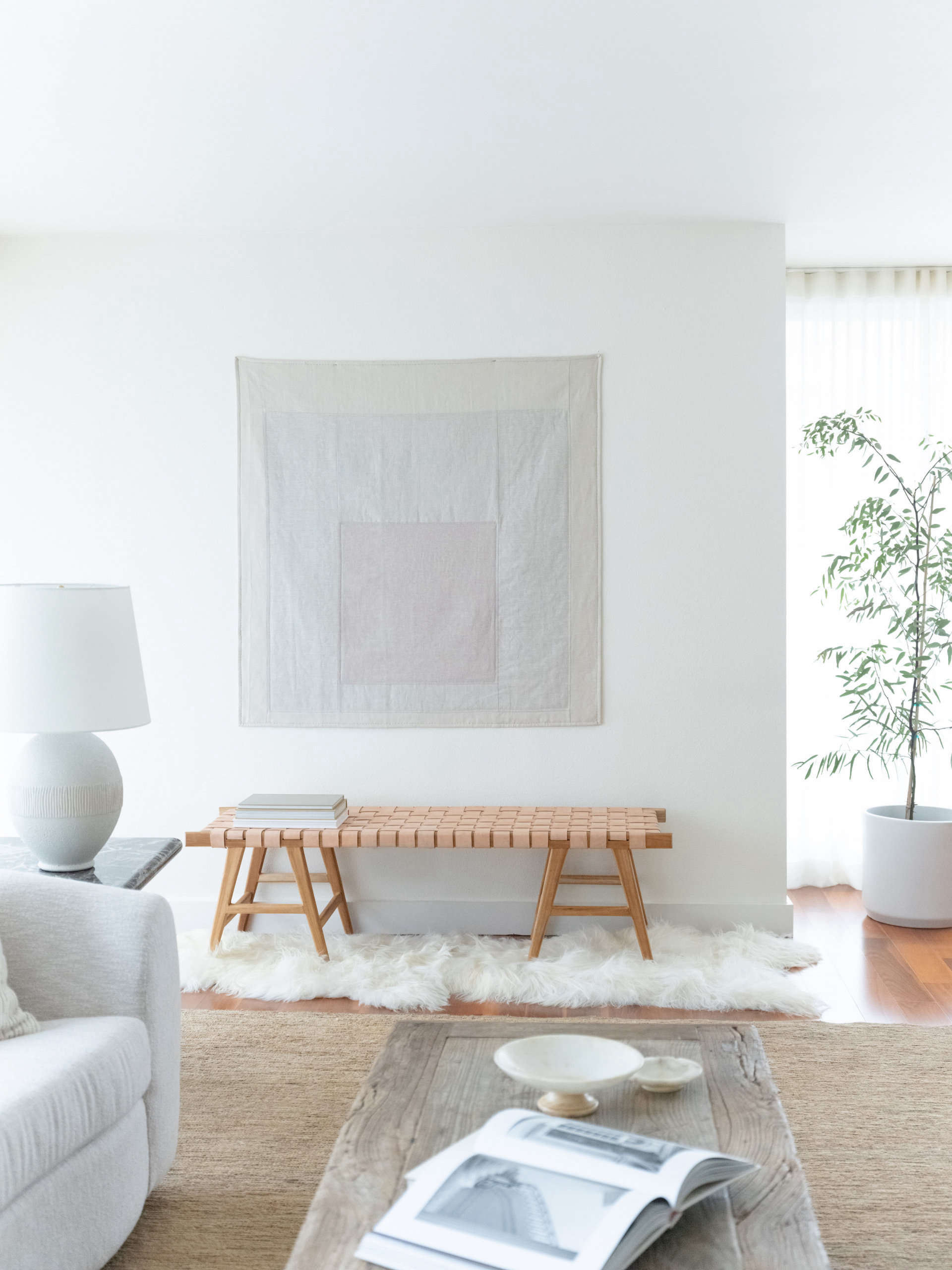
A quilt inspired by Homage to the Square makes perfect sense. Quilts are already built from geometry, repetition, blocks, borders, and color relationships. Albers may not have designed the series as a quilt pattern, but the structure translates naturally into fabric. The result can be both modern and deeply tactile.
Fabric changes the experience of the square. Paint gives flatness and control; cloth gives softness, seams, texture, and shadow. A quilted square composition introduces a human touch. Slight variations in stitching, fabric grain, and quilting lines add warmth to Albers’ disciplined format. The square becomes less like a laboratory and more like a very smart blanket.
Design Ideas for an Albers-Inspired Quilt
A quilt can use three or four nested fabric squares, echoing the visual rhythm of the original paintings. Solid cottons work especially well because they preserve the clean color fields. Linen blends can add subtle texture. Wool or heavier fabrics create a more sculptural wall-hanging effect.
For a classic modern look, choose one dominant outer color, one transitional middle color, and one vivid center. For a softer bedroom quilt, use low-contrast neutrals: ivory, sand, warm gray, and pale clay. For a bolder statement, try navy, teal, citron, and cream. The magic is in testing. Lay fabric swatches beside each other before cutting. Albers would approve. He might also quietly rearrange them while you were not looking.
Quilt or Wall Hanging?
An Albers-inspired quilt does not have to live on a bed. In fact, many of the strongest versions work as textile wall art. A quilted wall hanging brings softness into modern interiors and makes the square feel handmade. It also creates a bridge between Josef Albers’ color theory and the textile legacy associated with Anni Albers, his wife and a major modernist artist in her own right.
One important note: direct commercial copies of specific Albers works may involve copyright and licensing considerations. For personal projects, inspiration is common. For products to sell, it is smarter to create original palettes and compositions influenced by Albers’ principles rather than copying a protected artwork exactly.
As a Rug: Color Theory Underfoot
A rug inspired by Homage to the Square may be the most surprising translation of the series. When the square moves from wall to floor, it changes how the viewer experiences the composition. Instead of standing in front of the image, you stand on it, walk across it, and arrange furniture around it. The artwork becomes a room’s color engine.
Authorized rug editions have translated Albers’ square compositions into wool, showing how well his visual language adapts to interiors. A hand-tufted rug softens the precision of the original painting. Wool pile absorbs and diffuses color, making tones appear warmer, deeper, and more tactile than paint on board.
Where an Albers-Style Rug Works Best
In a living room, a square rug can organize the seating area and create a strong center. In a bedroom, it can sit partly under the bed, allowing the borders to frame the furniture. In a studio, it can act like a color study you can accidentally step on while looking for scissors.
The key is balance. Because the design is graphic, surrounding furniture should not fight it. Clean-lined sofas, wood tables, neutral upholstery, and simple lighting let the rug do its work. If the rug has a bold center color, repeat that color once elsewhere in the room: a pillow, vase, book spine, or small artwork. This creates harmony without turning the room into a matching set from a catalog that whispers, “I fear spontaneity.”
The Bauhaus Spirit: Art, Craft, and Design in One Square
The reason Homage to the Square translates so well into quilts, rugs, and wall art is deeply connected to Bauhaus thinking. The Bauhaus challenged rigid divisions between fine art, craft, architecture, and design. Albers’ own career reflected that spirit. He was not only a painter but also a teacher who cared about materials, process, structure, and perception.
This is why the square can move across media without losing its identity. On a wall, it becomes a visual experiment. In a quilt, it becomes warmth and structure. In a rug, it becomes spatial design. The same idea wears different outfits, and frankly, it looks good in all of them.
How to Bring Albers-Inspired Design Into Your Home
Start Small
If you are new to bold color, begin with a print, pillow, or small textile wall hanging. This gives you a manageable way to test color interaction in your space. Notice how the piece changes from morning to evening. Albers’ work is especially sensitive to light, so a palette that feels calm at noon may become surprisingly dramatic at sunset.
Use the Room as a Color Partner
An Albers-inspired object does not exist alone. The wall color, flooring, furniture, and daylight all become part of the composition. A cream wall will make colors feel different than a dark green wall. A walnut floor will warm everything. A white sofa will sharpen contrast. Color is social; it refuses to live alone.
Let Geometry Create Calm
One reason square-based art remains popular is that it brings order to a room. Even when the colors are bright, the geometry feels stable. This makes Albers-inspired wall art, quilts, and rugs useful in spaces that need both energy and control. Think reading corners, creative studios, guest rooms, and modern apartments where every inch needs to behave.
Why Designers Still Love Homage to the Square
Designers return to Albers because his work solves a practical problem: how to use color boldly without making a room feel messy. The nested square format gives strong color a disciplined frame. It proves that intensity can be organized. A room can include yellow, orange, blue, or green without looking like a box of crayons held a staff meeting.
Albers also offers a timeless lesson for interior design: relationships matter more than individual choices. A single color may look dull on a swatch but brilliant beside the right companion. A neutral may become luminous next to a saturated hue. A small accent may control the mood of an entire composition. This is as true for a rug as it is for a painting.
Experience Section: Living With Josef Albers’ Square in Real Spaces
Bringing Homage to the Square into a home is less like decorating with a picture and more like introducing a very quiet, very intelligent guest. It does not demand attention with ornament or narrative. Instead, it changes the atmosphere slowly. The first experience is usually visual clarity. A square composition immediately gives a wall, bed, or floor a center. Rooms that previously felt scattered can suddenly feel composed, as if someone politely told the furniture to stand up straight.
With wall art, the experience depends heavily on distance. From across the room, the image reads as a bold geometric statement. Up close, the color relationships become more subtle. You notice that the inner square is not simply “yellow” or “gray.” It may feel warmer on one edge, cooler against another, deeper when surrounded by a pale band, or brighter when boxed in by a darker tone. This slow discovery makes the piece rewarding over time. It is not a poster you understand in one glance; it is a visual conversation that keeps changing its tone.
As a quilt, the experience becomes more personal. The square format still feels modern, but fabric adds intimacy. A quilted version hanging above a bed or sofa can soften a minimalist room that risks feeling too crisp. On a bed, the design becomes part of daily life. It is folded, touched, lived with, and seen in changing conditions. Morning light may make one color feel airy; lamplight may make the same color feel dense and warm. The stitched seams also create small shadows, turning flat geometry into something quietly dimensional.
As a rug, the square changes the way the room is navigated. A central square can visually anchor a coffee table, while the outer bands define the seating zone. The experience is spatial rather than purely visual. You do not just look at color relationships; you move through them. This can be especially effective in open-plan rooms where a rug needs to create an “area” without adding walls. Albers’ geometry becomes invisible architecture.
The biggest practical lesson is restraint. An Albers-inspired piece is strongest when the surrounding room gives it room to breathe. Too many competing patterns can flatten its impact. Simple furniture, thoughtful lighting, and a few repeated accent colors allow the square to work properly. The reward is a space that feels both artistic and livable. It has discipline, warmth, and a little optical mischief. In other words, it is modern design with a wink.
Conclusion: The Square That Refuses to Sit Still
Josef Albers’ Homage to the Square remains powerful because it turns the simplest shape into an endless study of perception. As wall art, it brings clarity and color intelligence to a room. As a quilt, it becomes tactile, warm, and human. As a rug, it transforms color theory into spatial experience. The square may be basic in geometry class, but in Albers’ hands, it becomes a complete design philosophy.
Whether you admire the original paintings, choose an authorized rug, create a quilted wall hanging, or simply borrow the idea of nested color fields, the lesson is the same: color is never alone. It is always reacting, shifting, and surprising us. Albers taught the world to look harder. The square was just his wonderfully stubborn way of making sure we did.