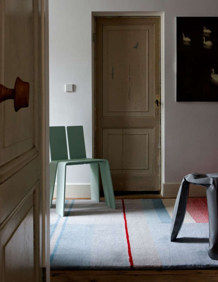
Some rugs behave like polite background music. Hay Denmark’s Colour Carpets are not those rugs. They do not scream, throw confetti, or demand that every chair in the room bow down in chromatic submission. Instead, they do something much smarter: they use color like a designer uses punctuation. A band here, a gradient there, a quiet wool surface underfoot, and suddenly the room feels edited, warmer, and just a little more intentional.
HAY, often styled in all caps, is the Danish design brand known for bringing modern Scandinavian furniture, lighting, textiles, and accessories into everyday homes without making the phrase “good design” sound like a museum guard is about to shush you. Founded in Copenhagen, HAY has built its reputation on accessible contemporary design, collaboration with international designers, and a cheerful willingness to treat color as a serious design tool rather than a risky personality flaw.
That is where HAY Colour Carpets earn their place. Designed by Scholten & Baijings, the rugs reflect the Dutch design duo’s well-known interest in refined palettes, grids, transparency, and carefully layered tones. The result is a carpet collection that fits naturally into Scandinavian interiors, modern apartments, creative studios, reading corners, and any room that needs softness without slipping into beige-on-beige boredom.
What Are HAY Denmark’s Colour Carpets?
HAY Denmark’s Colour Carpets are design-forward rugs associated with HAY’s broader flooring and textile universe. They are best known for their graphic use of colored bands, subtle gradients, and soft wool construction. Rather than relying on a loud all-over pattern, the design plays with measured blocks of color and optical transitions, giving the rug a calm but visually memorable identity.
In many listings and design references, the Colour Carpet is connected with Scholten & Baijings, a studio recognized for precise color research and clean graphic structure. Their work often feels mathematical, but not cold; playful, but not childish. That balance makes the Colour Carpet especially useful in rooms where you want interest, rhythm, and warmth without turning the floor into a carnival ride.
The HAY Design Philosophy: Practical, Playful, and Very Danish
HAY’s appeal comes from a simple but powerful idea: modern design should be beautiful, useful, and reachable. The brand borrows from Denmark’s mid-century design heritage but updates it for contemporary life. That means clean silhouettes, thoughtful materials, clever color choices, and products that can live in real homes where people spill coffee, move chairs, host friends, and occasionally wonder why they own six nearly identical mugs.
Colour Carpets fit this philosophy beautifully. They are decorative, but they are not precious little floor paintings that make guests afraid to walk. They are functional textiles meant to define space, soften acoustics, add comfort, and bring color into a room in a way that feels intentional. A HAY rug does not need a velvet rope. It needs a sofa, a coffee table, and maybe someone who remembers to use coasters.
Why the Colour Carpet Works in Modern Interiors
1. It Adds Color Without Chaos
Many homeowners want color but panic at the first sight of a bright sofa. A rug is a smarter entry point. HAY Colour Carpets introduce color at floor level, where it can anchor the room rather than overwhelm it. Because the palette is controlled and the pattern is structured, the rug gives personality without making the space feel busy.
2. It Creates a Clear Zone
In open-plan homes, rugs are visual traffic directors. A Colour Carpet can define the living area, separate a reading nook from a dining corner, or give a workspace a more finished look. The rectangular format and banded design naturally help organize furniture, especially in apartments where one room may be doing the job of three.
3. It Brings Scandinavian Warmth
Scandinavian design is often described as minimal, but the best Scandinavian interiors are not empty. They are tactile. Wood, wool, ceramics, linen, glass, and soft lighting all work together to create comfort. A wool rug is one of the fastest ways to make a clean modern room feel lived-in rather than showroom-stiff.
4. It Plays Well With Neutrals
If your room already has white walls, oak flooring, gray upholstery, or black metal accents, a HAY Colour Carpet can become the one element that prevents the space from looking like a rental listing titled “minimalist but emotionally unavailable.” The rug adds warmth, contrast, and a human touch while still respecting a restrained palette.
Material Matters: Why Wool Is a Design Favorite
Many HAY Colour Carpet references describe the rugs as wool-based, with some versions noted as hand-tufted and made from high-quality wool. Wool has long been prized in rug making because it feels soft, has natural resilience, and can hold color beautifully. It also brings texture, which is essential in modern rooms that rely on clean lines and simple furniture.
A wool rug can make a living room feel quieter and more grounded. It absorbs sound, warms the floor visually and physically, and adds a layer of craft to the space. In a room with hard flooring, glass tables, metal lamps, and sleek chairs, wool is the friendly character who walks in and says, “Relax, everyone. I brought texture.”
How to Style HAY Colour Carpets at Home
In the Living Room
For a living room, place the front legs of the sofa and chairs on the rug if the size allows. This makes the seating area feel connected. If the rug is too small and floats in the middle of the room like a tiny design island, the furniture may feel disconnected. A Colour Carpet works best when it visually anchors the main conversation area.
Pair it with a low-profile sofa, a simple wood coffee table, and one or two accent pieces that echo a color from the rug. The key word is echo, not copy. You do not need a cushion in the exact same shade as the carpet stripe. A nearby tone is enough. Design should look coordinated, not like the room was assembled by a spreadsheet.
In the Bedroom
In a bedroom, a Colour Carpet can sit partly under the bed, extending beyond the sides to give bare feet a soft landing in the morning. This is especially helpful if your first daily thought is less “good morning, world” and more “why is the floor personally attacking me?” Soft wool underfoot makes the room feel calmer and more finished.
Keep bedding simple if the rug has stronger color variation. White, cream, charcoal, pale blue, soft gray, or muted earth tones can all work well. Let the carpet provide the graphic note while the bed stays restful.
In a Dining Area
A rug under a dining table can look elegant, but sizing matters. The rug should extend far enough beyond the table so chairs remain on the rug when pulled out. If chairs keep catching on the edge, dinner will come with an unwanted soundtrack of scraping, bumping, and mild regret.
For dining spaces, consider household habits honestly. If the table hosts adults, quiet meals, and the occasional wine glass, a wool rug can be lovely. If it hosts toddlers, tomato sauce, and experimental pancake architecture, you may want to place the rug somewhere less dramatic.
In a Home Office
A Colour Carpet can make a home office feel less temporary and more creative. It helps define the work zone, improves acoustic comfort, and adds visual energy during long hours at the desk. Choose a low or medium pile placement if you use a rolling chair, or place the desk and chair fully on the rug to reduce awkward transitions.
Color Strategy: How to Choose the Right Palette
The smartest way to choose a HAY Colour Carpet is to look at what your room already has. Start with fixed elements: flooring, wall color, built-in cabinets, large furniture, and natural light. Then decide whether the rug should blend, contrast, or bridge several tones together.
If your room is mostly neutral, a more colorful Colour Carpet can become the main visual feature. If your room already has bold art, patterned upholstery, or colorful shelving, choose a quieter version so the floor does not compete with everything else. A room can have multiple personalities, but they should at least be on speaking terms.
Muted tones tend to work best for long-term flexibility. Soft gray, dusty pink, ochre, pale blue, warm beige, terracotta, and deep green can feel modern without becoming trendy in a disposable way. The beauty of HAY’s approach is that color often feels edited and architectural rather than random.
HAY Colour Carpets and the Scandinavian Interior Trend
Scandinavian interiors continue to attract attention because they solve a very modern problem: people want homes that feel clean but not sterile, stylish but not exhausting, functional but not boring. HAY Colour Carpets contribute to that formula by adding softness and visual structure at the same time.
Unlike some decorative rugs that rely on heavy ornament, the Colour Carpet uses geometry and color relationships. This makes it compatible with simple furniture, natural woods, modular shelving, sculptural lighting, and contemporary ceramics. It can also work surprisingly well with vintage pieces, especially mid-century chairs or simple wood sideboards.
Care and Maintenance Tips
A beautiful rug deserves normal, non-heroic care. Vacuum regularly using a gentle setting, rotate the rug occasionally so wear is distributed evenly, and use a suitable rug pad to prevent slipping and protect the floor. For spills, blot immediately with a clean, absorbent cloth. Do not rub aggressively, because rubbing can push liquid deeper into the fibers and make the stain more stubborn.
For wool rugs, avoid harsh cleaners, bleach, and overly wet cleaning methods. If a stain is serious, professional cleaning is usually safer than internet chemistry performed at midnight with vinegar, panic, and a suspicious sponge. Always check the specific care instructions for the exact HAY rug version you own.
Who Should Buy a HAY Colour Carpet?
HAY Colour Carpets are ideal for people who like modern design but do not want a cold interior. They suit homeowners, renters, design collectors, apartment dwellers, and anyone trying to make a room feel more finished without repainting walls or replacing major furniture.
They are especially good for people who appreciate color but prefer it in controlled doses. If you like Scandinavian furniture, contemporary accessories, wool textiles, graphic design, and interiors that look relaxed but considered, this rug category makes sense. If your dream room involves fifteen neon colors, mirrored ceilings, and a sofa shaped like a dragon, HAY may be a little too calm for your kingdom.
Common Mistakes to Avoid
Choosing a Rug That Is Too Small
The most common rug mistake is buying too small. A tiny rug can make even expensive furniture look disconnected. Measure carefully before ordering, and use painter’s tape on the floor to outline the rug size. This simple trick prevents the classic “it looked bigger online” tragedy.
Ignoring the Existing Color Palette
A Colour Carpet should connect with the room. It does not need to match everything, but it should have a conversation with at least one existing element: the sofa, artwork, curtains, lamp, or wood tone. When nothing relates, the rug can look accidental.
Skipping a Rug Pad
A rug pad improves comfort, reduces slipping, and helps protect both the rug and floor. It is the unsung hero of rug ownership. Nobody writes poems about rug pads, but everyone appreciates not sliding across the living room while carrying tea.
Design Examples and Room Ideas
Imagine a compact city apartment with white walls, pale oak floors, a charcoal sofa, and a round coffee table. A HAY Colour Carpet with muted bands can bring the whole seating area together. Add a paper-shade lamp, a few books, and a ceramic vase, and the room suddenly looks intentional rather than “I moved in six months ago and still own one fork.”
In a family room, a larger Colour Carpet can soften noise and create a comfortable play area without sacrificing grown-up style. In a studio, it can separate the sleeping zone from the living zone. In a creative office, it can add energy without shouting over the work happening in the room.
Buying Considerations Before You Order
Before buying, check dimensions, material composition, pile height, backing, care instructions, delivery terms, and return policy. Rug colors may look different depending on screen settings and room lighting, so look at multiple photos whenever possible. Natural daylight, warm evening bulbs, and cool LED lighting can each change how a color reads.
Also consider lifestyle. A wool rug in a low-traffic bedroom will age differently from one placed in a busy entryway. Pets, children, shoes, dining spills, and rolling chairs all affect performance. A rug is not just a design object; it is a daily-use surface. Choose with both your eyes and your habits.
Experience Notes: Living With HAY Denmark’s Colour Carpets
The best thing about a HAY Colour Carpet is that it changes the room without acting like it has single-handedly discovered design. The experience is subtle at first. You place it down, adjust the sofa, step back, and realize the room now has a center. The furniture looks less scattered. The floor feels warmer. The colors in nearby objects seem more deliberate. Even the coffee table starts behaving as if it has a purpose beyond collecting remote controls.
In daily use, the rug’s value comes from small moments. Walking across wool in the morning feels better than stepping onto a cold hard floor. Sitting on the rug to read, stretch, wrap a gift, or sort laundry feels natural. In a living room, guests tend to gather around a good rug because it gives the seating area a visual boundary. Nobody says, “I am standing within the carefully defined spatial zone created by your Danish carpet,” but that is basically what they are doing.
Color also has a quiet psychological effect. A muted, well-designed carpet can make a room feel friendlier without making it feel childish. Many people decorate cautiously because they fear choosing the wrong color. HAY’s approach helps because the tones are usually balanced, not random. A stripe of warm color can lift a gray room. A cooler tone can calm a sunny space. A gradient can connect several shades that would otherwise feel unrelated.
Another real-life advantage is flexibility. A Colour Carpet can move from a living room to a bedroom, from a studio to an office, or from a main seating area to a reading corner as your home changes. Good design has this portable quality. It does not rely on one perfect showroom arrangement. It adapts, which is helpful because real homes evolve. Sofas get replaced, shelves get rearranged, plants multiply mysteriously, and someone eventually buys a lamp that “looked smaller in the store.”
Maintenance is manageable if you treat the rug with normal respect. Vacuuming, rotating, and quick spill response go a long way. The main experience lesson is this: do not wait to clean spills, and do not rub them like you are trying to erase a bad memory. Blot gently, follow the care guidance, and get professional help for serious stains. A quality wool rug can age gracefully, but it is still a textile, not a superhero cape.
For design lovers, the Colour Carpet also offers emotional satisfaction. It feels like an object with authorship. The graphic pattern, material choice, and restrained palette all suggest that someone thought carefully about how color meets daily life. That is the charm of HAY Denmark’s design language: it makes ordinary home objects feel considered without making them untouchable.
In the end, living with a HAY Colour Carpet is less about showing off and more about improving the atmosphere of a room. It brings warmth, order, color, and comfort. It gives the floor a voice, but thankfully not a loud one. And in modern interiors, where every square foot has to work hard, that kind of quiet confidence is worth noticing.
Conclusion
Hay Denmark’s Colour Carpets show how a rug can be more than a decorative afterthought. With their Scandinavian design sensibility, wool texture, structured color, and connection to Scholten & Baijings’ thoughtful visual language, these carpets offer a refined way to bring personality into modern homes. They work because they balance opposites: color and calm, pattern and restraint, function and beauty.
Whether used in a living room, bedroom, office, or open-plan apartment, a HAY Colour Carpet can anchor furniture, soften sound, warm the floor, and make the entire room feel more intentional. It is not the cheapest design move, but it is one of the most effective. After all, walls get most of the attention, but the floor is where daily life actually happens.
Note: This publication-ready article is synthesized from current product information, reputable design references, U.S. retailer context, Scandinavian interior guidance, and wool rug care best practices.