Note: This publish-ready article is written in standard American English, synthesized from real design history, Danish design culture, typography references, and city-poster trends, with no inline source links for clean web publishing.
Some people bring home magnets from a trip. Others collect airline boarding passes, tiny espresso cups, or enough vacation photos to crash a family group chat. Then there are design lovers, who prefer souvenirs with clean lines, emotional depth, and absolutely no glitter. For them, typographic city posters are the sweet spot: part map, part memory, part wall art, and part “yes, I have good taste, thank you for noticing.”
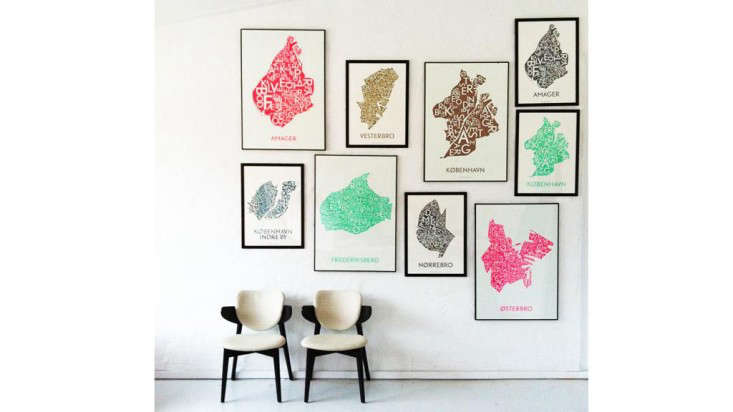
Danish Love: Typographic City Posters is more than a catchy design phrase. It captures a very Scandinavian idea: a place can be remembered through restraint. Instead of shouting with skyline clichés or postcard sunsets, Danish-style city posters often whisper through typography, negative space, careful alignment, and local names arranged with quiet confidence. They are simple, but not empty. Minimal, but not cold. Romantic, but thankfully not covered in roses.
The appeal is easy to understand. A typographic map of Copenhagen, Frederiksberg, Nørrebro, Indre By, Aarhus, or another beloved city does not just show where streets are. It shows how a place feels when it has become personal. The neighborhood names become architecture. The letters become blocks, canals, squares, and memories. Suddenly, typography is not just text. It is a city you can hang above the sofa.
What Are Typographic City Posters?
A typographic city poster is a poster that uses words, letters, place names, and visual hierarchy as the main design element. Instead of relying on a traditional map with roads and icons, it may arrange neighborhood names, districts, landmarks, or city boundaries into a graphic composition. The result can look like a map, a print, a piece of modern art, or all three at once.
In the Danish design context, these posters often lean toward clean composition, balanced spacing, understated color, and high-quality printing. The focus is not on decoration for decoration’s sake. The goal is to make meaning visible. A Copenhagen poster might divide the city into boroughs, turn district names into shapes, or use a restrained palette such as black, gray, petrol blue, copper, or soft neutrals. The result feels modern without trying too hard, which is basically the Danish design superpower.
These posters are popular as travel keepsakes, moving-away gifts, housewarming presents, wedding gifts, office decor, and personal reminders of home. They work especially well because they are specific. A generic “I love Copenhagen” print can be charming, but a carefully designed poster featuring Nørrebro, Frederiksberg, or Indre By feels more intimate. It says, “This place meant something to me,” without requiring a dramatic monologue and background violin music.
The Danish Design DNA Behind the Look
Danish design has long been associated with functionality, simplicity, craftsmanship, and warmth. From furniture and lighting to architecture and public spaces, Denmark’s design reputation grew from the idea that beautiful objects should also serve everyday life. A chair should be comfortable. A lamp should improve the room. A poster should communicate clearly and still make you pause.
This design philosophy became internationally influential during the rise of Danish Modern in the 20th century. Designers such as Arne Jacobsen, Hans Wegner, Poul Henningsen, Kaare Klint, and Verner Panton helped shape a visual culture where form, material, and purpose worked together. While city posters are a different medium than chairs or lamps, they share the same basic instinct: remove the unnecessary, honor the useful, and leave enough beauty to make the object emotionally durable.
That is why Danish typographic city posters feel so natural. Typography is functional because it must be read. Mapping is functional because it helps us understand place. Wall art is emotional because it changes how a room feels. Combine the three, and you get a design object that behaves like a good Danish chair: practical, elegant, and suspiciously good at making visitors ask where you bought it.
Christina Muff, Kortkartellet, and the Power of Homesickness
One of the most charming stories connected to Danish typographic city posters comes from designer Christina Muff, who began creating highly typographic, minimally designed maps after feeling homesick for Denmark while living abroad. That emotional spark led to Kortkartellet, a Danish poster shop known for graphic prints that pay tribute to Denmark, Copenhagen, and other European cities.
The story matters because it explains why these posters resonate. They are not just exercises in layout. They are design responses to longing. Homesickness is a surprisingly powerful creative director. It tells you what details matter: the neighborhood where you bought coffee, the district where you got lost, the bridge you crossed too many times, the city name that still makes your chest do a small, embarrassing somersault.
Kortkartellet-style posters show how minimal design can carry maximum feeling. A map of Denmark, a Copenhagen borough poster, or a print focused on Frederiksberg or Nørrebro can become a decorative reminder of where someone has been, where they come from, or where they dream of going. It is travel memory stripped down to its most graphic form.
Why Typography Works So Well for Cities
Typography and cities have more in common than they first appear to. Both rely on structure. Both need rhythm. Both can be graceful, chaotic, loud, quiet, historic, modern, or all of the above before lunch. A city is a system of streets, signs, buildings, and movement. A typographic poster is a system of letters, spacing, scale, and hierarchy. When designed well, both help people find meaning inside complexity.
Copenhagen is an especially strong example because typography is visible throughout the city’s identity. The city has embraced custom type design, including KBH Sans, a typeface developed for the City of Copenhagen. Inspired by historical Art Nouveau curves and modern accessible lines, it reflects the city’s blend of heritage and contemporary life. That mix is exactly what makes Copenhagen so visually interesting: old street signs, clean municipal design, hand-painted shop lettering, bicycle-friendly urban planning, and modern architecture all sharing the same stage.
There is also a local affection for distinctive letterforms, including details like the so-called Danish “g,” a character shape often noticed in Copenhagen signage. These small typographic traits give a city personality. They are the visual equivalent of an accent. You may not notice them consciously at first, but they help a place feel like itself.
From Map to Memory: Why These Posters Feel Personal
A traditional city map is useful when you are trying to find a train station. A typographic city poster is useful when you are trying to remember who you were when you lived near that train station. That is the emotional difference.
Typographic city posters transform geography into identity. The names of neighborhoods become anchors for memory. A poster of Copenhagen might remind one person of a study-abroad semester, another of a honeymoon, another of a childhood home, and another of that heroic afternoon when they successfully ordered lunch in Danish and only panicked internally.
Because the design is usually minimal, the viewer has room to bring personal meaning to it. There is no over-explaining. No cartoon Viking. No aggressive tourist energy. The poster simply presents the place with dignity. That restraint is part of the magic. A good typographic city poster does not scream, “Remember this city!” It calmly says, “You already do.”
The Design Elements That Make Danish City Posters Stand Out
1. Minimal Color Palettes
Danish-style city posters often use limited color: black and white, muted gray, deep blue, copper, beige, soft green, or other calm tones. This gives the poster longevity. It can live in a modern apartment, a cozy home office, a gallery wall, or a minimalist bedroom without starting a fistfight with the furniture.
2. Strong Typographic Hierarchy
Good typography is not just choosing a pretty font. It is deciding what the viewer should read first, second, and third. City posters may use larger type for major districts, smaller type for neighborhoods, and careful spacing to create movement. The hierarchy guides the eye through the city like a quiet tour guide wearing excellent glasses.
3. Negative Space
Negative space is one of the great strengths of Scandinavian-inspired design. Empty space is not wasted space. It gives the composition breathing room. In a typographic city poster, this space can make the city shape clearer, the names easier to read, and the entire print feel more refined.
4. Local Specificity
The best posters are not generic. They respect the city’s actual districts, names, atmosphere, and cultural personality. A poster of Nørrebro should not feel exactly like a poster of Frederiksberg. A Copenhagen city poster should not be interchangeable with Stockholm or Berlin. Place matters. Otherwise, we are just decorating with geography-flavored soup.
5. Print Quality
Paper, ink, scale, and finish matter. High-quality paper gives typographic posters a tactile richness, while precise printing keeps small text sharp and readable. Matte finishes often work beautifully because they reduce glare and support the calm, architectural feel of the design.
How Typographic Posters Fit Modern Interior Design
One reason Danish typographic posters remain popular is that they are easy to live with. They provide personality without visual clutter. In a small apartment, a city poster can add character without overwhelming the room. In a larger space, it can act as a quiet focal point. On a gallery wall, it pairs well with photography, abstract prints, line drawings, and vintage travel posters.
For Scandinavian interiors, these posters are a natural match. They complement pale wood, linen textures, white walls, black accents, simple furniture, and warm lighting. But they also work beyond Scandinavian decor. A typographic Copenhagen poster can soften an industrial loft, bring structure to a bohemian room, or add a smart graphic note to a traditional study.
The secret is balance. If your room already has bold colors, choose a restrained poster. If your space is very minimal, a copper or petrol blue city print can add depth. If you are creating a travel-themed wall, mix typography with photography rather than using only one style. Too many maps in one corner can accidentally make your living room look like a very stylish airport control center.
Typographic City Posters as Gifts
A city poster is one of those rare gifts that feels thoughtful without requiring impossible sizing information. You do not need to know someone’s shoe size, ring size, or whether they secretly hate scented candles. You just need to know a place that matters to them.
For someone who studied in Copenhagen, a poster of the city can feel deeply personal. For a Danish expat, it can be a small window back home. For newlyweds, a poster of the city where they met can become a romantic keepsake. For a friend moving into a new apartment, a clean typographic print adds instant character without screaming “I bought this at the last minute,” even if, technically, you did.
These posters also work for people who love architecture, urban planning, typography, travel, or minimalist wall art. They are intelligent objects. They suggest curiosity. They say the giver noticed something more specific than “you have walls.”
How to Choose the Right Danish-Inspired City Poster
Start with emotional geography. Which city, district, or neighborhood means the most? A full Denmark map may suit someone who feels connected to the country as a whole. A Copenhagen city poster may be perfect for travelers or design lovers. A Frederiksberg, Indre By, or Nørrebro print may be better for someone with a specific local memory.
Next, consider the room. For a bright Scandinavian-style space, black and white or soft gray may look timeless. For a room with brass, walnut, or warm neutrals, copper or deep blue can feel richer. For an office, choose a clean design with strong readability. For a bedroom, pick something softer and less visually busy.
Size also matters. A small poster can look elegant on a shelf or narrow wall, while a large typographic map can become a main feature above a sofa, bed, or desk. Always think about framing. A simple black, white, oak, or walnut frame usually works best. The frame should support the poster, not audition for its own reality show.
The Broader Trend: Cities in Words
Typographic city posters are part of a broader design movement that treats cities as collections of names, neighborhoods, stories, and emotional coordinates. In the United States, designers like Jenny Beorkrem of Ork Posters helped popularize typographic neighborhood maps by arranging neighborhood names into city shapes. Around the world, designers continue to explore how text can become place-based art.
This trend works because people are increasingly attached to hyper-specific locations. We do not just love “New York.” We love Brooklyn, Queens, the Lower East Side, Astoria, or the street where the bagel shop knew our order. We do not just love “Copenhagen.” We love Vesterbro, Nørrebro, Frederiksberg, Christianshavn, Østerbro, or the corner where the bicycles appear to be reproducing unsupervised.
City posters turn that local attachment into design. They make memory legible. They prove that a place does not need to be illustrated literally to be recognized emotionally.
Why Danish Love Still Feels Fresh
The phrase Danish Love works because it carries warmth inside restraint. Danish design is often described as minimal, but the best Danish design is not cold. It is human. It is made for daily life, for touch, for light, for comfort, for small rituals. Typographic city posters follow that same pattern. They are clean enough for modern interiors, but personal enough to avoid feeling sterile.
They also speak to a modern desire for meaningful decor. People want homes that tell stories, but not every story needs to be printed in giant cursive letters above the dining table. Sometimes the most meaningful object is quieter: a map of a city, a neighborhood name, a carefully spaced letterform, a reminder of a place that shaped you.
That is why Danish typographic city posters continue to appeal to travelers, expats, designers, collectors, and anyone who has ever missed a place so much they wanted to frame it.
Personal Experiences with Danish Love: Typographic City Posters
The first time you really notice a typographic city poster, it may not feel like a dramatic design revelation. There is no thunder. No spotlight. No mysterious Scandinavian choir humming in the background. More likely, you are standing in someone’s apartment, holding a coffee, pretending not to inspect their wall too intensely. Then you see it: a city rendered almost entirely in words. Clean. Balanced. Familiar. Suddenly, you are leaning closer.
That is the curious power of these posters. They reward attention. From across the room, they look like elegant graphic art. Up close, they become a memory machine. You start reading neighborhood names, tracing invisible routes, remembering train stops, cafés, museums, cold walks, warm bakeries, and the strange confidence of cyclists who appear to have been born with built-in traffic sensors.
A Danish-style Copenhagen poster has a particularly strong emotional pull because Copenhagen itself feels designed at human scale. The city has grandeur, yes, but it also has intimacy. You can move from historic streets to modern waterfront architecture, from design shops to bakeries, from formal palaces to relaxed harbor swimming spots, all without feeling swallowed by the city. A typographic poster can capture that human scale beautifully. It does not need to show every window, canal, or bicycle basket. The names alone can do the work.
For someone living away from Denmark, a poster like this can become more than decor. It can become a daily check-in with identity. You pass it in the hallway and see a familiar district. You sit at your desk and notice the name of a place where you once lived, studied, fell in love, or learned how expensive coffee could be while still somehow being worth it. The poster quietly reconnects you to a personal map.
For travelers, the experience is slightly different but just as meaningful. A typographic city poster can preserve the emotional shape of a trip better than a photo. Photos capture what something looked like for one second. A poster captures the idea of the place. It leaves space for memory to fill in the weather, the taste of pastries, the sound of footsteps on old streets, the glow of shop windows in winter, and the satisfaction of finding your way without checking your phone every twelve seconds.
In home decor, the experience is also practical. A Danish typographic poster is easy to style because it does not demand too much attention. It can sit above a writing desk and make the space feel more thoughtful. It can hang in an entryway and start conversations. It can join a gallery wall without competing with every other print like an insecure theater kid. It brings structure, place, and feeling in one neat rectangle.
There is also something refreshingly adult about choosing this kind of artwork. It is personal, but not sentimental in an obvious way. It is stylish, but not trendy in a disposable way. It says you care about design, place, and memory. It does not say you bought the first mass-produced canvas with a motivational quote because the wall looked lonely.
The best experience comes when the poster matches a real connection. Maybe it is the city where you were born. Maybe it is where you studied architecture. Maybe it is where you ate the best cardamom bun of your life and still think about it during boring meetings. Maybe it is simply a place you dream of visiting. Either way, the poster becomes a quiet promise: this place matters.
That is the lasting charm of Danish Love: Typographic City Posters. They are not just maps. They are emotional coordinates. They turn names into shapes, shapes into memories, and memories into something beautiful enough to live with every day.
Conclusion
Danish Love: Typographic City Posters celebrates the meeting point of typography, geography, memory, and Scandinavian design. These posters prove that wall art does not need to be loud to be meaningful. With clean layouts, thoughtful type, restrained colors, and deep local specificity, they transform cities into elegant visual stories. Whether focused on Copenhagen, Denmark, Frederiksberg, Nørrebro, or another beloved place, a typographic city poster can hold travel memories, hometown pride, design appreciation, and personal nostalgia in one beautifully composed print.
For modern interiors, they offer a rare combination: sophistication and emotion. For gift-giving, they feel personal without being overly sentimental. For design lovers, they show how letters can become architecture and how a city can be remembered through form. In the end, Danish typographic city posters are not just about where a place is. They are about why it stays with us.