Subway tile is the little black dress of kitchens and bathrooms: reliable, flattering, and somehow always ready for a second act. The funny part is that most people think subway tile is “basic” right up until they see what happens when you rotate it, stack it, stagger it, or send it marching across a wall in a new direction. Suddenly, the same humble rectangle goes from safe choice to scene-stealer.
That is the magic of subway tile patterns. You do not need an exotic material, a celebrity designer, or a budget that makes your wallet file a complaint. Sometimes the biggest design upgrade comes from a simple shift in layout. Change the direction, adjust the spacing, rethink the grout, and a classic backsplash or shower wall can feel taller, wider, calmer, moodier, or far more custom.
In other words, subway tile is not boring. It is just waiting for better choreography.
Below are eight subway tile patterns that can completely change the mood of a room. Some lean traditional, some feel crisp and modern, and a few split the difference beautifully. Whether you are refreshing a kitchen backsplash, reworking a shower surround, or trying to give a powder room some personality without turning it into a theme park, these layouts prove that design drama does not always require dramatic materials.
Why Subway Tile Still Works So Well
Before we get into the patterns, it helps to understand why subway tile has such staying power. Its rectangular shape is clean and versatile, which means it can slide into farmhouse, transitional, coastal, vintage, industrial, and modern interiors without causing a style identity crisis. It also plays nicely with other materials. Pair it with marble countertops, butcher block, concrete, brass, black hardware, or painted cabinetry, and it still knows how to behave.
Another reason designers keep returning to it is that layout does a lot of heavy lifting. A glossy white subway tile in a running bond pattern feels classic and familiar. The same tile in a vertical stack feels graphic and current. In herringbone, it gets energetic. In basket weave, it feels more detailed and decorative. Same tile, totally different personality.
That flexibility is what makes subway tile such a smart choice for homeowners who want something timeless but not sleepy. You get the dependability of a proven material with enough design range to make the room feel personal.
1. Classic Running Bond
The dependable favorite that never embarrasses itself
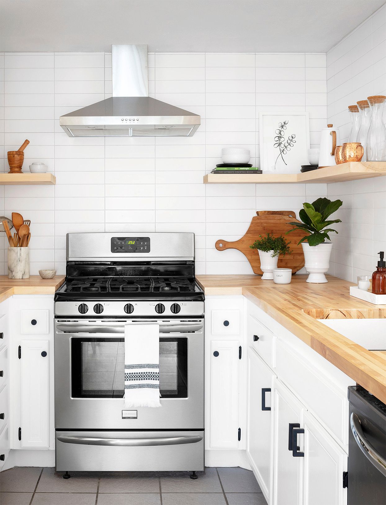
If subway tile had a greatest-hits album, classic running bond would be track one. This is the familiar brick-style layout where each tile is offset, usually by half its length. It is balanced, easy on the eyes, and incredibly adaptable. If you want a backsplash that still looks good five years from now, ten years from now, and probably while future robots are judging our cabinet choices, this is the one.
Classic running bond works especially well in kitchens because it creates rhythm without demanding attention. It adds texture, but not chaos. In a busy room with open shelving, decorative hardware, countertop appliances, and whatever is happening near the coffee station, that calm matters.
For a softer look, pair it with grout close to the tile color. For sharper definition, use contrasting grout. White tile with charcoal grout gives this old-school pattern a crisper, more graphic attitude.
2. Vertical Running Bond
The height booster
Turn the classic running bond on its end and the room changes immediately. Vertical running bond keeps the staggered, offset rhythm of the traditional layout, but because the tiles stand upright, the eye travels upward. That makes walls feel taller and spaces feel a little more architectural.
This pattern is especially effective in small bathrooms, narrow shower stalls, and kitchens with lower ceilings. It offers a fresh spin without feeling too trendy, which is useful if you want a space to feel updated but not like it is trying too hard. Nobody wants a backsplash that looks like it is fishing for compliments.
Vertical running bond also pairs beautifully with slimmer, elongated subway tile. The longer the rectangle, the more dramatic the vertical pull. Add a clean trim piece at the top, and the whole installation feels intentional and tailored.
3. 45-Degree Herringbone
The movement maker
When a room needs energy, 45-degree herringbone answers the call. This pattern arranges subway tiles in a zigzag formation on the diagonal, creating a sense of movement that can wake up an otherwise simple room. It is one of the most popular ways to make subway tile look custom without abandoning the material altogether.
Herringbone is fantastic behind a range, over a vanity, or across a full shower wall where you want one surface to feel more special than the rest. It naturally becomes a focal point, so it is a smart choice when the surrounding finishes are relatively restrained.
There is also an elegance to diagonal herringbone that works across styles. In a traditional kitchen, it feels polished. In a modern bathroom, it reads sculptural. In a transitional space, it adds just enough flair to keep the room from drifting into “nice but forgettable.”
One caution: because this pattern is busier, grout matters. A strongly contrasting grout will make every angle shout. A quieter grout lets the overall pattern speak in a more refined tone.
4. Double Basket Weave
The pattern with a little extra personality
Double basket weave gives subway tile a more decorative, woven appearance by grouping vertical pairs and framing them with horizontal tiles. The effect feels detailed and dimensional without veering into anything overly fussy. It is a great option if you like classic design but want more interest than a straightforward brick layout can offer.
This pattern often looks especially good in powder rooms, niche walls, and backsplashes where you want some visual texture in a compact area. It also works beautifully with monochrome palettes because the layout itself supplies the drama. You do not need wild color to make it interesting.
Dark grout can emphasize the woven effect, while tone-on-tone grout keeps it more subtle. Either way, basket weave has a tailored, almost bespoke quality that makes a room feel thoughtfully designed. It says, “Yes, someone paid attention here,” without yelling it from the roof.
5. 90-Degree Herringbone
The cleaner, sharper cousin of diagonal herringbone
If 45-degree herringbone feels a little too sweeping for your taste, 90-degree herringbone is the cooler, more structured alternative. Instead of moving diagonally across the surface, the tiles lock together at right angles, giving the wall a stair-step effect that feels neat and directional.
This layout works well in kitchens and baths that already have a lot of straight lines. Think shaker cabinets, framed mirrors, slab vanities, or strong architectural trim. The pattern softens the severity of those hard edges without disrupting the room’s order.
It is a particularly strong choice for vintage-inspired or classic spaces that want a touch of motion without losing their sense of discipline. In short, it is playful, but in a buttoned-up sort of way.
6. Horizontal Stacked Bond
The minimalist crowd-pleaser
Stacked bond lines up subway tiles in perfectly straight rows and columns. No staggering, no weaving, no zigzagging. Just clean, orderly geometry. The result is modern, crisp, and quietly confident.
Horizontal stacked bond is ideal for contemporary kitchens, streamlined bathrooms, and spaces where you want the tile to support the room rather than dominate it. Because the grout lines form a visible grid, this layout feels more graphic than running bond, even when the tile color is soft and understated.
One of the clever visual perks of horizontal stacking is that it can make a wall feel wider. In a narrow bathroom or compact kitchen, that subtle widening effect can be useful. It is not magic, but it is close enough for tile work.
This pattern rewards precision, so it works best when installation is sharp and spacing is consistent. If you want a clean modern look, this is one of the easiest ways to get there.
7. Vertical Stacked Bond
The sleek modern statement
Vertical stacked bond takes the clean grid of stacked tile and rotates it upward. The result is one of the freshest-looking subway tile patterns around. It feels a little fashion-forward, a little architectural, and very effective in spaces that need height, drama, or both.
Because the lines run straight up and down, this layout can make even modest walls feel taller. That makes it a favorite for shower surrounds, vanity walls, and backsplashes that extend to the ceiling. It is especially striking in colored tile, where the orientation turns a simple rectangle into a real design feature.
Vertical stacked bond also works well when you want subway tile to feel less traditional. The material stays familiar, but the layout shifts it into a more current conversation. It is proof that you can modernize a classic without picking a fight with it.
8. Stacked Running Bond
The hybrid pattern that adds rhythm
Stacked running bond is where things get interesting. This pattern combines horizontal and vertical placement, often using color shifts or alternating directions to create stripes, blocks, or a more layered composition. It feels dynamic and custom, which makes it perfect for homeowners who want a subway tile installation that does not look copied from every other kitchen on the internet.
This layout is excellent for feature walls, bar areas, bold backsplashes, and bathrooms that need a little lift. It can create movement, emphasize height, or introduce a graphic effect without relying on loud materials. Think of it as subway tile with a side hustle in visual storytelling.
Because stacked running bond has more going on, it benefits from restraint elsewhere. Let the tile be the star and keep surrounding finishes a little calmer. Busy countertop plus busy cabinets plus busy tile is how rooms end up looking like they need a nap.
How to Choose the Right Pattern for Your Space
Match the layout to the room’s visual problem
The smartest way to choose a subway tile pattern is not to ask, “Which one looks coolest?” It is to ask, “What does this room need?” If the room feels short, use a vertical layout. If it feels narrow, try horizontal stack. If it feels flat or forgettable, herringbone or basket weave can add energy and depth.
Let grout do some of the design work
Grout is not just the filler between tiles. It changes the whole mood. Matching grout creates a softer, more unified look. Contrasting grout highlights each rectangle and makes the pattern more visible. If you are paying for a layout with personality, grout can help make sure people actually notice it.
Respect the countertop, cabinets, and fixtures
If your counters are dramatic, your subway tile can be simpler. If your cabinetry is neutral and quiet, your tile can carry more pattern. The best rooms have balance. Every surface does not need to perform like it is auditioning for a renovation show.
Think beyond white
White subway tile is classic for a reason, but color can completely change the mood. Soft sage feels gentle and grounded. Deep blue adds polish. Warm greige feels relaxed. Black or charcoal looks moody and sophisticated. Even a familiar pattern can feel brand new when the color shifts.
Final Thoughts
Subway tile has survived more trends than most of us survive group texts, and there is a reason for that. It is durable, versatile, easy to style, and endlessly adjustable. The secret is not just the tile itself. It is the pattern.
With a simple shift in design, the same rectangular tile can become traditional, modern, playful, tailored, graphic, or quietly luxurious. Running bond keeps things timeless. Vertical layouts stretch the room. Herringbone adds movement. Basket weave adds detail. Stacked patterns deliver structure and edge.
So if you are staring at a backsplash or bathroom wall and thinking it needs something more, the answer may not be a more expensive tile. It may just be a smarter layout. Sometimes the glow-up is already in the box. You just have to turn it a different way.
Extra Design Experience: What People Often Notice After Changing the Pattern
One of the most interesting things about subway tile is how emotional the result can feel, even though the change seems technical on paper. Homeowners often go into a renovation thinking they are choosing tile, when they are really choosing the mood of the room. A classic running bond usually feels safe and familiar, which is why so many people relax as soon as they see it installed. It reminds them of kitchens they have loved before, old apartments with charm, or bathrooms that felt clean and simple in the best way. It is familiar without being stale.
Vertical layouts tend to create a different kind of reaction. People regularly say the room feels taller, cleaner, and somehow more intentional. Even when the square footage has not changed at all, the space can feel more edited. That is a powerful experience in smaller homes, especially in bathrooms where every visual trick counts. A narrow shower with vertically stacked subway tile can suddenly feel more boutique hotel than builder-grade box.
Herringbone often delivers the biggest “wow, that changed everything” moment. It catches light differently, creates motion, and makes a wall feel designed rather than merely finished. Many people describe it as the feature that pulls the whole room together. It is especially satisfying when the rest of the materials are understated, because the pattern adds richness without requiring extra colors or expensive stone.
There is also a practical experience that shows up again and again: grout changes expectations. Homeowners who choose contrasting grout are often thrilled by how much definition they get, but they also learn quickly that the pattern becomes a major visual player every single day. That can be exciting or overwhelming depending on the room. Matching grout, on the other hand, tends to age more quietly and lets the layout whisper instead of shout. Neither choice is wrong; the experience is simply different.
Another common takeaway is that subway tile becomes much more personal when color enters the picture. White is classic, yes, but soft greens, moody blues, warm taupes, and inky charcoals can make the exact same pattern feel entirely new. People often discover that the layout gave them structure while the color gave them personality. Together, they create a finish that feels both timeless and individual.
In the end, the experience of choosing a subway tile pattern is rarely just about style. It is about how you want the room to feel when you walk into it half awake in the morning, when guests wander into the kitchen, or when the afternoon light hits the backsplash just right. That is why this simple rectangular tile keeps winning. It does not demand attention through extravagance. It earns it through smart design choices, and sometimes that is the most satisfying transformation of all.