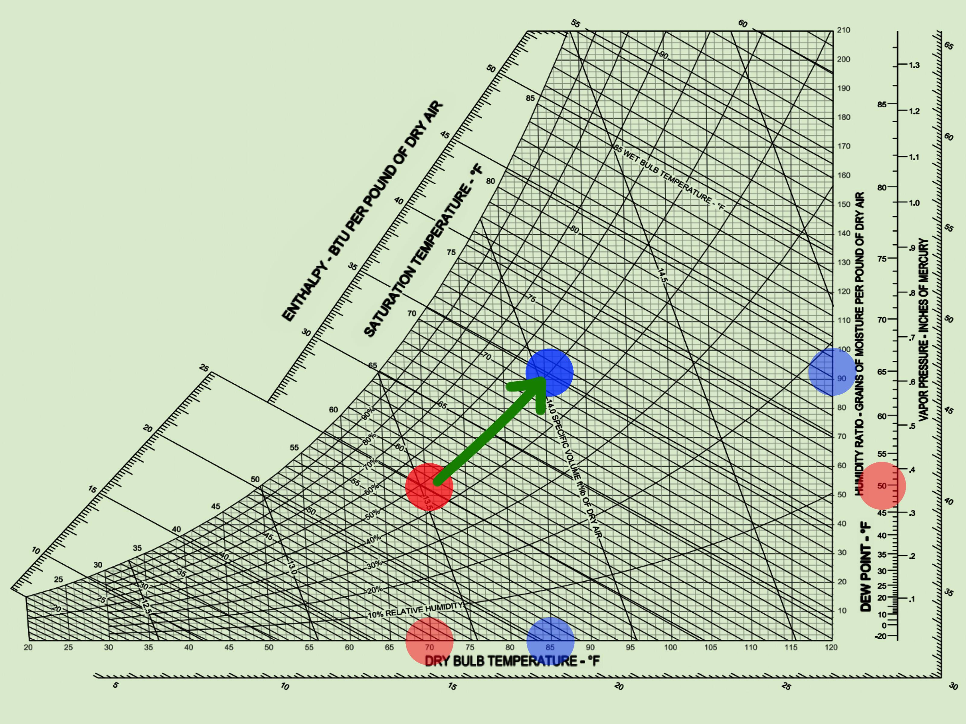
A psychrometric chart looks like someone asked a geometry teacher, an HVAC engineer, and a weather report to share one sheet of paper. At first glance, it can feel like a tiny tornado of curves, diagonal lines, numbers, and mysterious labels. But once you know what each line means, the chart becomes one of the most useful tools in heating, ventilation, air conditioning, building science, agriculture, drying, indoor air quality, and comfort design.
In simple terms, a psychrometric chart shows the relationship between air temperature, moisture, relative humidity, dew point, wet-bulb temperature, enthalpy, humidity ratio, and specific volume. That sounds like a full buffet of science words, but the core idea is friendly: the chart helps you understand what is happening to moist air. Is air too dry? Too humid? Close to condensation? Easy to cool? Hard to dehumidify? The psychrometric chart answers these questions without making you solve a page of equations by hand.
This guide breaks down how to read a psychrometric chart in 11 practical steps. You will learn what the major lines mean, how to plot a point, how to find missing air properties, and how to use the chart for real-world HVAC and building comfort decisions. Bring your pencil, your patience, and maybe a snack. Moist air has layers.
What Is a Psychrometric Chart?
A psychrometric chart is a graphical map of moist air properties. Instead of looking at temperature and humidity as separate numbers, the chart shows how they interact. This matters because air comfort is not only about temperature. A room at 74°F can feel pleasant at 45% relative humidity and sticky at 70% relative humidity. Same thermometer reading, very different human experience. Your skin knows the difference, even if your thermostat pretends not to.
Psychrometric charts are commonly used by HVAC professionals, engineers, building managers, architects, industrial drying specialists, greenhouse operators, and energy analysts. The chart can help estimate cooling loads, heating needs, humidification requirements, dehumidification performance, condensation risk, and indoor comfort conditions.
Key Terms You Should Know Before Reading the Chart
Dry-Bulb Temperature
Dry-bulb temperature is the normal air temperature measured by a regular thermometer. On most psychrometric charts, dry-bulb temperature is shown along the bottom horizontal axis. If someone says a room is 75°F, they are usually talking about dry-bulb temperature.
Wet-Bulb Temperature
Wet-bulb temperature is measured using a thermometer with a wetted wick exposed to moving air. Evaporation cools the bulb, so the wet-bulb temperature is usually lower than the dry-bulb temperature unless the air is fully saturated. Wet-bulb temperature tells you a lot about evaporative cooling potential.
Relative Humidity
Relative humidity, or RH, tells you how full the air is with water vapor compared with the maximum amount it could hold at that same temperature. Warm air can hold more water vapor than cool air, which is why relative humidity can change even when the actual moisture content stays the same.
Humidity Ratio
Humidity ratio is the mass of water vapor per mass of dry air. In U.S. charts, it is often shown in grains of moisture per pound of dry air. In SI charts, it may be shown as grams of moisture per kilogram of dry air. This value tells you the actual moisture content of the air more directly than relative humidity.
Dew Point
Dew point is the temperature at which air becomes saturated and water vapor begins to condense. If a surface is at or below the dew point temperature of the surrounding air, condensation can form. That is why cold windows sweat in winter and why your iced tea glass looks dramatic on a humid day.
Enthalpy
Enthalpy is the total heat content of the air, including sensible heat from temperature and latent heat from moisture. HVAC professionals use enthalpy to compare energy content between air streams and estimate heating, cooling, humidification, or dehumidification loads.
How to Read a Psychrometric Chart: 11 Steps
Step 1: Choose the Correct Psychrometric Chart
Before plotting anything, make sure you are using the correct chart for your units and pressure conditions. Some charts use I-P units, such as degrees Fahrenheit, Btu per pound of dry air, and grains of moisture. Others use SI units, such as degrees Celsius, kilojoules per kilogram, and grams per kilogram.
Also pay attention to altitude or barometric pressure. A chart designed for sea level will not be perfectly accurate for a high-altitude city such as Denver. Air pressure affects the relationship between temperature and moisture, so serious design work should use a chart or software tool matched to the project location.
Step 2: Find the Dry-Bulb Temperature on the Bottom Axis
Start with the dry-bulb temperature because it is usually the easiest value to measure. Look along the bottom of the chart for the temperature scale. On many I-P charts, this may run from around 30°F to 120°F. On SI charts, the scale may run from below freezing to 50°C or higher.
Once you find the dry-bulb temperature, draw or imagine a vertical line rising from that point. For example, if the air temperature is 75°F, locate 75°F on the bottom axis and move straight upward. That vertical line represents all possible moisture conditions at 75°F.
Step 3: Find the Relative Humidity Curve
Relative humidity lines are curved lines sweeping across the chart. The outer left boundary is the saturation curve, which represents 100% relative humidity. Inside the chart, you will usually see curved lines for 10%, 20%, 30%, 40%, 50%, and so on.
Suppose your room is 75°F and 50% RH. After locating 75°F on the dry-bulb axis, move upward until you reach the 50% relative humidity curve. The point where the vertical dry-bulb line crosses the 50% RH curve is your air state point. Congratulations. You have plotted moist air. It did not even complain.
Step 4: Read the Humidity Ratio on the Right Side
From your state point, move horizontally to the right side of the chart. The value you reach is the humidity ratio. This tells you how much water vapor is actually in the air per pound or kilogram of dry air.
This is especially useful because relative humidity can be misleading. For example, air at 50°F and 80% RH may contain less actual moisture than air at 80°F and 50% RH. Humidity ratio helps you compare moisture content more accurately, which is critical for dehumidification, drying, and ventilation analysis.
Step 5: Find the Dew Point Temperature
To find dew point, start at your plotted state point and move horizontally left until you hit the saturation curve. Then read the temperature value at that curve. That temperature is the dew point.
For example, if your room air is 75°F at 50% RH, the dew point may be around the mid-50s°F depending on pressure and chart type. If a basement wall or air-conditioning supply duct surface drops below that dew point, condensation may appear. The chart helps you see the problem before the wall starts auditioning for a swamp documentary.
Step 6: Follow the Wet-Bulb Temperature Lines
Wet-bulb temperature lines usually slope diagonally downward from left to right. These lines are important for evaporative cooling, cooling tower performance, outdoor air analysis, and agricultural drying. If you know dry-bulb and wet-bulb temperatures, you can plot the state point by finding where those two lines intersect.
For example, if a sling psychrometer reads 80°F dry bulb and 67°F wet bulb, you would locate 80°F on the bottom axis, move upward, and find the diagonal wet-bulb line for 67°F. Their intersection gives you the air state point. From there, you can read relative humidity, dew point, humidity ratio, enthalpy, and other values.
Step 7: Read Enthalpy Lines for Total Heat Content
Enthalpy lines are often diagonal and close to the wet-bulb lines, though they are not always exactly the same. Enthalpy is commonly measured in Btu per pound of dry air on I-P charts or kilojoules per kilogram of dry air on SI charts.
HVAC professionals use enthalpy when comparing air streams. For instance, if outdoor air has a lower enthalpy than indoor return air, bringing in outdoor air may help reduce cooling energy under certain conditions. This is the basic idea behind economizer operation. Of course, controls, ventilation requirements, and local climate still matter. The chart gives insight; it does not replace professional design judgment.
Step 8: Understand Specific Volume Lines
Specific volume lines show how much space a given mass of dry air occupies. These lines usually slope steeply across the chart. Specific volume is helpful for airflow calculations because HVAC systems move volume, while many energy equations use mass.
In plain English, warm humid air is less dense than cool dry air. That affects fans, ducts, ventilation rates, and equipment performance. If you are doing detailed system design, specific volume can help convert between cubic feet per minute and pounds of dry air per minute.
Step 9: Plot Common HVAC Processes
Once you can plot a point, the chart becomes more powerful. HVAC processes appear as movement from one state point to another. Sensible heating moves horizontally to the right because temperature increases while moisture content stays about the same. Sensible cooling moves horizontally to the left until the air reaches saturation. Cooling with dehumidification moves left and downward because both temperature and moisture content decrease.
Humidification usually moves upward because moisture is added to the air. Evaporative cooling moves along or near a constant wet-bulb or enthalpy line: dry-bulb temperature drops while humidity ratio rises. These process lines help explain why swamp coolers work beautifully in dry climates but sulk in humid ones.
Step 10: Use the Chart to Check Comfort Conditions
A psychrometric chart is not only for engineers with clipboards. It can also help explain why a room feels uncomfortable. Most people are comfortable when indoor air is roughly in the 68°F to 76°F range with moderate relative humidity, often around 30% to 60%, depending on activity, clothing, season, and air movement.
If a room is 72°F but the relative humidity is 70%, people may feel clammy because sweat evaporates slowly. If the room is 72°F but the RH is 20%, the air may feel dry, causing static electricity, dry skin, or irritated nasal passages. The psychrometric chart helps connect those comfort complaints to measurable air properties.
Step 11: Practice With a Real Example
Let’s walk through a practical example. Imagine a classroom is measured at 78°F dry-bulb temperature and 60% relative humidity. First, find 78°F on the bottom axis. Move upward until you hit the 60% RH curve. Mark that point.
Now read horizontally to the right to estimate humidity ratio. Move horizontally left to the saturation curve to estimate dew point. Follow the nearby diagonal wet-bulb line to estimate wet-bulb temperature. Check the enthalpy scale to estimate total heat content. In just a few moves, one temperature and one humidity reading have turned into a full air-condition report card.
If the goal is comfort, you might compare that state point with a target such as 74°F and 50% RH. On the chart, that target point is lower in temperature and lower in moisture. So the HVAC system must remove sensible heat and latent heat. In everyday terms: cool the air and pull out moisture. The chart shows both jobs at once.
Common Mistakes When Reading a Psychrometric Chart
Using Relative Humidity as the Only Moisture Clue
Relative humidity is useful, but it changes with temperature. If you heat air without adding moisture, relative humidity drops even though the actual water vapor content stays almost the same. That is why winter indoor air can feel dry after being heated. The humidity ratio tells the deeper story.
Ignoring Altitude and Pressure
Psychrometric charts are pressure-specific. A chart for standard atmospheric pressure is close enough for many learning examples, but not for all engineering decisions. High-altitude conditions require the correct chart or a reliable calculator.
Confusing Wet-Bulb and Dew Point
Dew point is found by moving horizontally to the saturation curve. Wet-bulb temperature follows diagonal lines. These two values can be close, but they are not the same except at saturation. Mixing them up is a classic beginner mistake, right up there with calling a wrench “that metal turny thing.”
Reading Lines Too Quickly
Psychrometric charts are packed with information. A small reading error can change humidity ratio, enthalpy, or dew point estimates. Use a ruler, zoomed digital chart, or software tool when accuracy matters.
Why Psychrometric Charts Matter in Real Life
Psychrometric charts are not just classroom decorations for people who love graph paper. They solve practical problems. In homes, they help explain condensation on windows, musty basements, dry winter air, and poor comfort despite “correct” thermostat settings. In commercial buildings, they support ventilation design, economizer operation, cooling coil selection, humidity control, and energy savings.
In agriculture and food processing, psychrometric principles help manage drying, storage, greenhouse humidity, and animal housing conditions. In museums and archives, humidity control protects paper, wood, textiles, and artwork. In hospitals and laboratories, moisture control can affect comfort, safety, and process reliability. The same chart that looks confusing at first can quietly protect buildings, products, and people.
of Practical Experience: Learning the Chart Without Losing Your Mind
The first time many people see a psychrometric chart, they react as if someone spilled spaghetti on an engineering textbook. That reaction is completely normal. The trick is not to learn every line at once. Start with only two values: dry-bulb temperature and relative humidity. Plot that single point again and again until your eyes stop panicking. Once you can find that point confidently, the rest of the chart becomes less like a maze and more like a neighborhood map.
One helpful experience is to compare chart readings with everyday comfort. Take a small digital thermo-hygrometer and record the indoor temperature and relative humidity in different rooms. A bathroom after a hot shower may be warm and humid. A basement may be cool with a high relative humidity. A sunny living room may be warmer but feel drier. Plot each condition on the chart. Suddenly the lines are not abstract anymore; they describe places you actually stand in.
Another useful practice is watching what happens when air is heated. In winter, outdoor air may enter a house at a low temperature. When the furnace heats that air, the dry-bulb temperature rises, but the humidity ratio may stay nearly unchanged. On the chart, that movement is mostly horizontal to the right. Relative humidity drops, which explains why heated winter air can feel dry even when no moisture was removed. The chart turns a common complaint into a visible process.
Cooling and dehumidification are also easier to understand with practice. Air passing over a cold cooling coil may first move left as it cools. If it reaches the saturation curve, water begins to condense out of the air, and the process moves downward as moisture is removed. This is why an air conditioner can reduce humidity, but only if it runs long enough and the coil is cold enough. Oversized systems may cool quickly without removing enough moisture, leaving a room chilly but clammy. Nobody enjoys living inside a refrigerated sponge.
A field-friendly habit is to use a psychrometric chart as a conversation tool. When someone says, “It is 72°F in here, so why does it feel awful?” plot the actual temperature and humidity. If the RH is high, the chart shows that the problem is latent load, not just temperature. If the dew point is close to surface temperatures, condensation risk becomes obvious. If outdoor air has lower enthalpy than indoor air, ventilation strategies may be worth considering.
For beginners, digital psychrometric calculators can be a great training partner. Enter dry-bulb temperature and relative humidity, then compare the output with a printed chart. This builds confidence and helps you learn which direction to move for dew point, wet bulb, humidity ratio, and enthalpy. Over time, you will stop seeing the chart as a confusing web and start seeing it as a weather map for indoor air. And once that happens, HVAC conversations become much less mysterious.
Conclusion
Learning how to read a psychrometric chart is mostly about understanding relationships. Dry-bulb temperature tells you how warm the air is. Relative humidity tells you how close the air is to saturation. Humidity ratio shows the actual moisture content. Dew point warns you about condensation. Wet-bulb temperature reveals evaporative cooling potential. Enthalpy shows total heat content. Together, these values create a full picture of moist air behavior.
The 11 steps are simple when taken in order: choose the correct chart, locate dry-bulb temperature, follow relative humidity, read humidity ratio, find dew point, trace wet-bulb lines, check enthalpy, understand specific volume, plot HVAC processes, evaluate comfort, and practice with real examples. With a little repetition, the psychrometric chart changes from intimidating wall art into a practical decision-making tool.
Whether you are troubleshooting a humid room, studying HVAC, designing a building, managing a greenhouse, or simply trying to understand why your basement feels like a cave with Wi-Fi, the psychrometric chart gives you a clear way to see what air is doing. Moist air may be invisible, but with the right chart, it is no longer mysterious.
SEO Tags
Note: This article is for educational and general informational purposes. For HVAC design, equipment sizing, code compliance, or critical humidity-control work, use calibrated instruments, the correct pressure-based chart or software, and guidance from a qualified HVAC professional.