Note: This original article is written for web publication, based on publicly available information about Westeros cartography, fan-made maps, official map collections, and the cultural impact of Game of Thrones geography.
A Map So Detailed You Almost Expect Google Street View
Every great fantasy world eventually faces the same challenge: sooner or later, readers and viewers stop asking, “Who is sitting on the throne?” and start asking, “Wait, how far is Winterfell from King’s Landing again?” That is exactly why a high-resolution map of Westeros can cause such a stir. The world of Game of Thrones and A Song of Ice and Fire is not just a backdrop with dramatic weather and extremely stressful dinner parties. It is a living, breathing political machine where mountains, rivers, roads, castles, coastlines, and frozen wastelands shape nearly every major decision.
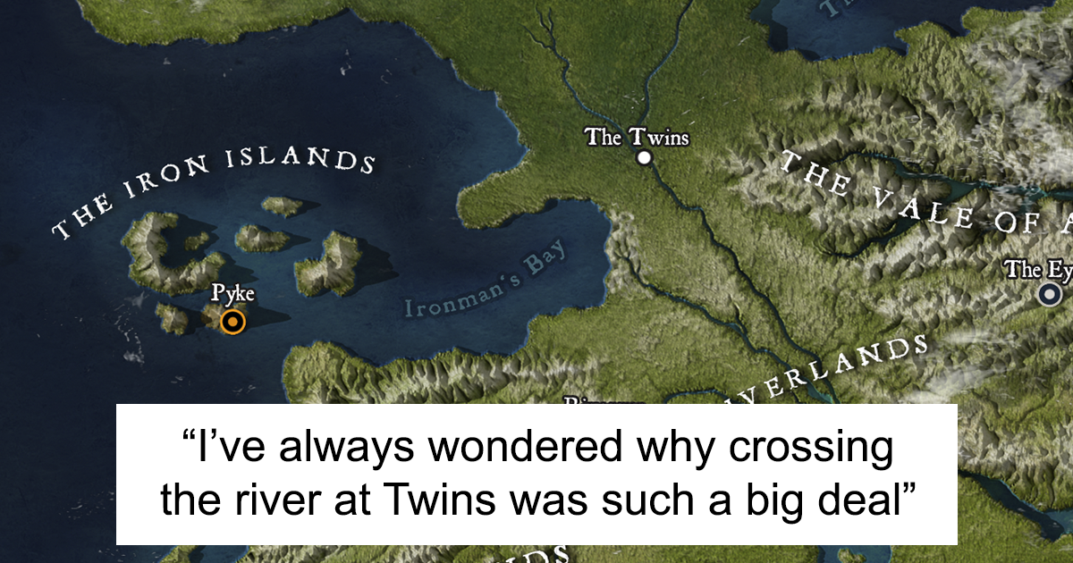
When artist and cartography enthusiast Julio Lacerda created a high-resolution map of Westeros, fans immediately noticed that it did not look like a typical parchment-style fantasy illustration. Instead, it resembled something closer to a satellite view: textured terrain, realistic shadows, natural coastlines, and a sense of depth that makes the Seven Kingdoms feel like a place you could actually zoom into. One moment you are admiring the North; the next, you are mentally planning a very bad road trip from Dorne to the Wall. Bring snacks. And maybe chainmail.
The appeal is obvious. Westeros has always been one of fantasy’s most memorable fictional continents, but a realistic high-resolution map turns familiar names into geography you can feel. The Neck becomes more than a label; it looks like a defensible marshland. The Mountains of the Moon suddenly explain why the Vale is so isolated. The Wall no longer feels like a metaphorical boundary but like a hard northern edge against the unknown. That is the magic of good fantasy cartography: it makes story logic visible.
Who Created the High-Resolution Map of Westeros?
The widely shared high-resolution Westeros map was created by Brazilian artist Julio Lacerda, an illustrator known for detailed work, including prehistoric animals, fantasy subjects, and pop culture-inspired art. His version of Westeros gained attention because it treated George R. R. Martin’s fictional continent almost like a real place photographed from above. Rather than using the old-map style of aged paper, ornate borders, and decorative compass roses, Lacerda aimed for realism: altitude, terrain, land texture, and environmental variation.
That creative choice matters. Many fantasy maps are designed to look like artifacts from within the story world. They are maps a maester might unroll on a wooden table while someone nearby makes a doomed military decision. Lacerda’s map feels different. It looks like the sort of image a modern analyst would use to understand topography. The result is a fascinating contrast: ancient castles and feudal politics shown through a modern, almost geographic-information-system lens.
According to the public discussion around the project, Lacerda cross-referenced multiple map sources, paying close attention to official materials such as The Lands of Ice and Fire, the map collection associated with Martin’s fictional world. He also created a height map, used erosion-style effects to give the terrain a natural appearance, textured the land with the help of aerial-photo-style references, and rendered the final image in 3D software. In plain English: he did not just draw a squiggly coastline and call it a kingdom. He gave Westeros cheekbones.
Why Westeros Maps Matter So Much to Fans
Fantasy maps are not just decorative. They are reading tools, worldbuilding engines, and, in the case of Game of Thrones, emotional support devices for viewers trying to remember who is marching where and why everyone is angry. Westeros is massive, politically fragmented, and shaped by regional identity. The North is not simply “the cold part.” Dorne is not merely “the hot part.” The Iron Islands are not just “the wet, shouty part.” Each region has history, resources, climate, culture, military advantages, and narrative weight.
Maps help readers understand why Moat Cailin matters as a choke point, why naval power is crucial for the Ironborn, why the Riverlands become a repeated battleground, and why King’s Landing is both symbolically central and dangerously exposed. In a story where armies crawl across continents and ravens apparently do the work of an overburdened postal service, geography is plot.
This is why fan-made maps can become popular even when official maps already exist. Fans do not only want to know where places are; they want to see the world from new angles. A parchment map tells us how people inside the world might imagine Westeros. A satellite-style high-resolution map asks a different question: what would Westeros look like if it were real enough to photograph from space?
The Official Map Tradition Behind Westeros
George R. R. Martin’s world has a long map history. The novels in A Song of Ice and Fire include maps that expand as the story moves through new regions. Over time, readers were introduced to more of Westeros, parts of Essos, city maps, and lands beyond the familiar political centers. This gradual approach fits the books beautifully because the world feels only partially known, much like medieval geography in real history.
The major official map collection, The Lands of Ice and Fire, helped satisfy fans who wanted a broader geographic view. Illustrated by cartographer Jonathan Roberts, the boxed collection includes multiple fold-out maps covering Westeros, Essos, the known world, the Free Cities, Slaver’s Bay, Braavos, King’s Landing, and major character journeys. It remains one of the most important reference points for anyone trying to understand the geography of Martin’s world.
What makes these official maps especially interesting is that they are not just “complete answers.” Martin has often treated maps as knowledge limited by culture, distance, rumor, and uncertainty. In other words, a map in this universe may show what scholars, sailors, and maesters believe, not necessarily what an all-seeing satellite would confirm. That makes the map tradition richer. It leaves space for mystery, which is exactly where fantasy likes to keep its dragons, legends, and suspiciously dramatic ruins.
How Lacerda’s Map Feels Different
The most striking feature of Lacerda’s high-resolution Westeros map is its realism. Many viewers compared it to a location on Google Maps because it gives the continent recognizable landforms instead of pure fantasy symbols. Mountain ranges look elevated. Coastal edges feel worn and irregular. Forested zones, plains, deserts, islands, and northern ice regions appear as parts of a coherent physical world.
That sense of realism changes how fans interpret the continent. When the terrain looks believable, political decisions become easier to understand. The North feels huge and sparsely manageable. The Vale appears protected by geography, not merely by reputation. Dorne’s isolation and distinct culture make more sense when seen at the far southern end of the continent, divided by mountains and distance. The Iron Islands look like a people’s entire worldview could be shaped by hard rock, rough seas, and a chronic shortage of cuddly farmland.
This kind of map also highlights how much geography contributes to atmosphere. Winterfell feels different because it belongs to a colder, wider, harsher landscape. King’s Landing feels different because it sits near the Blackwater and functions as a political magnet. The Wall feels more intimidating because the land beyond it stretches into a hostile northern unknown. In a good high-resolution map, these are not simply labels; they are visual arguments.
Westeros as a Realistic Fantasy Continent
One reason Westeros works so well is that it borrows the logic of real geography without becoming a direct copy of any one place. Fans have often noticed similarities between Westeros and the British Isles, especially when discussing general shape and inspiration. But the continent is more than a flipped or stretched reference. It is a fantasy construction built to support history, war, trade, migration, religion, and dynastic conflict.
The continent’s long north-south form allows for dramatic climate variation. The far north is associated with snow, old forests, the Wall, and the threat beyond civilization. The central regions contain river systems, fertile plains, and contested crossroads. The south introduces heat, deserts, mountains, and cultural separation. That geographic range helps Martin tell many kinds of stories in one fictional landmass.
High-resolution mapping makes these contrasts sharper. It invites viewers to think like strategists. Where would armies move? Which routes would be slow? Which ports matter most? Why is the Neck such a defensive nightmare? Why would the Reach become wealthy? Why does the Westerlands’ terrain support a powerful house with mining wealth? Suddenly, staring at a map becomes less like reading a legend and more like playing a very dangerous board game where every player has betrayal installed as a default setting.
The Role of Maps in Game of Thrones Storytelling
The television adaptation made maps central from the beginning. The famous opening credits use an animated map of Westeros and Essos to guide viewers through the episode’s major locations. Cities rise like clockwork models, roads stretch across the land, and the camera moves from place to place as if the audience is being briefed before a campaign. It is one of the smartest title sequences in modern television because it solves a real storytelling problem: this world is huge, and viewers need orientation.
The opening credits also reinforce the idea that location matters. When the story moves to Winterfell, King’s Landing, Dragonstone, the Wall, or Braavos, the map prepares the viewer before the episode begins. It teaches geography without feeling like homework. That is not easy. Most homework does not come with Ramin Djawadi’s theme music and rotating castles.
Fan maps like Lacerda’s continue this tradition from another angle. They are not part of the official credits, but they serve a similar purpose: they help audiences re-enter the world. They also show how deeply fans engage with the material. A casual viewer may remember dragons and duels. A map fan remembers river forks, mountain passes, and the approximate inconvenience of traveling anywhere without a dragon.
Why High-Resolution Fantasy Maps Go Viral
A high-resolution map of Westeros is the kind of fan creation that spreads quickly because it satisfies several audiences at once. Game of Thrones fans appreciate the locations. Fantasy readers appreciate the worldbuilding. Map lovers appreciate the technique. Digital artists appreciate the workflow. People who simply enjoy zooming into things appreciate the ability to inspect details until their coffee gets cold.
There is also a strong emotional factor. Westeros is familiar to millions of people, but it is familiar in fragments: a castle here, a road there, a battlefield, a coastline, a ruined tower, a haunted forest. A detailed map gathers those fragments into one view. It makes the world feel whole. That can be strangely satisfying, especially for a series famous for complexity, uncertainty, and the occasional reminder that weddings should always be approached with caution.
Maps also invite participation. Fans compare locations, debate distances, analyze borders, and point out similarities to real-world geography. Some use maps for rereads. Others use them for role-playing campaigns, fan fiction, video essays, or lore research. A great map is not the end of a conversation. It is the table everyone gathers around.
What the Map Reveals About Worldbuilding
Lacerda’s high-resolution map demonstrates a key principle of strong worldbuilding: believable places do not need to explain everything, but they should suggest causes and consequences. A mountain range should affect travel. A river should matter to settlement and war. A coast should imply ports, fishing, trade, and invasion routes. A desert should shape culture and defense. When those elements appear visually connected, the fictional world becomes more persuasive.
Westeros has always benefited from that kind of structure. The great houses are tied to place. Stark identity is inseparable from the North. Lannister power is connected to the Westerlands and Casterly Rock. Tyrell wealth belongs to the fertile Reach. Martell independence grows out of Dorne’s distance, heat, and defensible terrain. Greyjoy culture is shaped by islands and sea power. Baratheon strength is linked to the storm-battered east. Arryn isolation depends on the Vale’s mountains. Tully vulnerability reflects the Riverlands’ central location.
In other words, the map is not just pretty. It is political. It shows why the Seven Kingdoms are so difficult to rule. Anyone who looks at the continent for more than a minute can understand the basic administrative problem: uniting Westeros is like trying to manage a group project where every region has its own army, grievance, weather system, and family motto.
High-Resolution Maps and the Future of Fantasy Fandom
The popularity of detailed fan maps reflects a larger trend in modern fandom. Audiences do not simply consume fictional worlds; they explore, archive, remix, annotate, and reconstruct them. A map is one of the most natural tools for that kind of engagement. It gives fans a shared visual language.
As digital art tools become more powerful, fantasy maps are becoming more sophisticated. Artists can combine hand-drawn design, 3D rendering, elevation modeling, satellite-style textures, and interactive layers. A fan cartographer today can produce work that feels cinematic, scientific, and artistic at the same time. That does not replace official artwork; it expands the conversation around it.
For Westeros, this is especially fitting. Martin’s world is already built on partial knowledge, old records, unreliable reports, competing histories, and distant rumors. Fan cartography becomes part of that same culture of interpretation. Every map is a reading of the world. Some emphasize beauty. Some emphasize accuracy. Some emphasize movement, politics, or military control. Lacerda’s version emphasizes physical realism, and that is why it stands out.
Experiences Related to “Someone Created A High-Resolution Map Of Westeros”
Looking at a high-resolution map of Westeros is a surprisingly personal experience for many fans. The first reaction is usually visual: the map is beautiful, detailed, and easy to stare at for far longer than planned. But after that first wave of admiration, a second reaction tends to arrive: the story suddenly feels different. Places that once existed as names become connected spaces. The map quietly changes how you remember the series.
For example, seeing the long distance between the Wall and King’s Landing makes the political disconnect between the North and the capital feel more believable. The people in King’s Landing are not simply ignoring northern warnings because they are careless, although, to be fair, there is plenty of carelessness to go around. They are also geographically removed from the danger. The map helps explain why southern politics can remain obsessed with court intrigue while the far north is dealing with an existential crisis wrapped in snow.
The same thing happens with Dorne. On the page or screen, Dorne can feel like a separate cultural chapter. On a realistic map, that separateness becomes physical. It is far south, shaped by heat, mountains, and coastlines. Its difference is not decorative; it is geographic. A reader can understand why Dorne would develop its own customs, military strategies, and political confidence. Distance protects identity.
Another enjoyable experience is using the map to retrace character journeys. Suddenly, the road from Winterfell to King’s Landing is not just “south.” It is a massive movement across regions, climates, and political boundaries. Daenerys’s relationship to Westeros also feels different when you consider the Narrow Sea as a real barrier rather than a convenient strip of blue on a fantasy page. Even the Iron Islands become easier to understand when viewed as a harsh maritime world sitting off the western coast, separated from mainland assumptions.
High-resolution maps also make rereading or rewatching more rewarding. A scene in the Riverlands becomes clearer when you understand how central and exposed that region is. Mentions of the Kingsroad gain practical meaning. References to the Neck, the Trident, the Red Mountains, or Shipbreaker Bay become easier to place. Instead of floating lore, these details become coordinates in a mental landscape.
For writers, artists, and worldbuilding enthusiasts, the map offers another kind of experience: a lesson. It shows that fantasy settings become stronger when geography has consequences. If a kingdom has mountains, those mountains should affect culture and warfare. If a city sits on a river, that river should influence trade. If a region is isolated, its politics should reflect that isolation. Westeros feels memorable because its places are not interchangeable.
There is also simple joy in the act of zooming in. Fans love details. They love finding familiar names, comparing coastlines, and noticing how terrain shifts from region to region. A good map rewards curiosity. It turns passive viewing into exploration. You are no longer just remembering where Winterfell is; you are noticing what surrounds it, what separates it from other places, and why it feels like the heart of the North.
That is why Lacerda’s high-resolution map remains compelling. It is not merely fan art. It is an invitation to revisit a world that many people thought they already knew. Like the best fantasy maps, it does not reduce the magic of the story. It makes the magic easier to navigate.
Conclusion: A Fan Map Worthy of the Realm
Someone created a high-resolution map of Westeros, and the internet reacted exactly as expected: with delight, analysis, zooming, sharing, and a healthy amount of geographic nerdiness. Julio Lacerda’s map stands out because it reimagines a famous fantasy continent through realistic terrain and modern visual style. It makes Westeros look less like a distant legend and more like a place that could exist just beyond the edge of our own atlas.
The map also reminds us why George R. R. Martin’s world continues to fascinate people. Westeros is not memorable only because of dragons, thrones, battles, and betrayals. It is memorable because its geography supports its drama. The land shapes the houses, the houses shape the wars, and the wars shape the story. A great map lets us see that structure at a glance.
For fans, the high-resolution Westeros map is more than a beautiful image. It is a tool for understanding, a tribute to worldbuilding, and a reminder that fictional places can feel astonishingly real when artists take them seriously. Also, it confirms one important truth: if Westeros ever did appear on Google Maps, the reviews for most castles would be terrible, but the landscape photos would be magnificent.