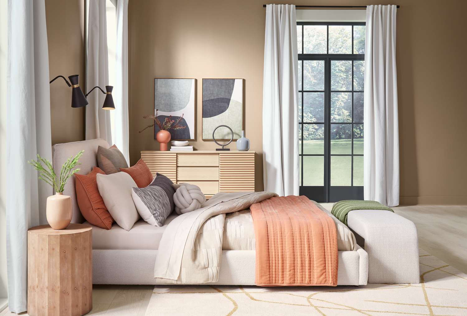
Paint is the closest thing the home world has to a time machine: one weekend, one roller, and suddenly your “meh” room is giving “magazine spread.” The tricky part is picking a color that won’t feel dated faster than a viral dance trend. For 2026, HGTV Home by Sherwin-Williams’ color pros are basically waving a little flag that reads: Welcome to the Warm Era. Cooler grays are stepping aside, and richer, earthier hues are moving in like they already know where your snacks are.
The forecast isn’t about wild, hard-to-live-with shades. It’s about livable colorthe kind that makes your space feel more grounded, more intentional, and (bonus) more expensive than it actually was. According to HGTV Home by Sherwin-Williams’ trend insights, three paint colors (and the families they represent) are poised to show up everywhere in 2026:
- Utaupeia a sandy beige that’s warm, modern, and suspiciously calming.
- Dark Auburn an earthy red that can act like a neutral (yes, really).
- Quietude a tranquil teal-leaning sage that feels like a deep breath in paint form.
Why 2026 Is Leaning Warm (And Why That’s Good News for Your Walls)
The big story behind 2026 color trends is comfort with structure. Think clean lines, fewer distractions, and colors that don’t fight your furniture. HGTV Home by Sherwin-Williams has leaned into “honest” essentialsearthy neutrals, grounded reds, and watery blue-greensbecause homeowners want spaces that feel stable, restorative, and easy to live with. Translation: you shouldn’t need a design degree (or a group chat vote) to make the room look good.
This warmth-forward shift also plays nicely with popular design directions: quiet luxury, vintage touches, natural materials, and the ongoing “bring the outdoors in” vibe. These three picks work because they’re versatile: they can be minimal, cozy, dramatic, or coastal-adjacent depending on how you style them. (A paint color that can multitask? In this economy? We love to see it.)
1) Utaupeia: The Sandy Beige That Doesn’t Feel Like Giving Up
Beige is backexcept it’s not the flat, lifeless beige of rental past. Utaupeia lands in that sweet spot: warm, sandy, and quietly sophisticated. It’s the kind of color that makes a room feel serene without looking washed out, and it plays well with both modern and traditional décor.
Where Utaupeia Works Best
- Bedrooms: If you want your room to feel restful but not cold, Utaupeia is a strong choiceespecially with layered textiles.
- Open-plan living spaces: It creates a cohesive backdrop that can flex across living, dining, and kitchen sightlines.
- Hallways and transitional areas: Warm neutrals are forgiving and make connective spaces feel intentional (not like “the place where coats go to disappear”).
How to Style It (So It Looks Intentional, Not Accidental)
Utaupeia’s superpower is how well it supports other materials and colors. To keep it elevated:
- Pair with warm off-whites on trim and ceilings for a soft, layered look (instead of stark contrast).
- Lean into natural texturesoak, walnut, rattan, linen, bouclé, stoneware.
- Add depth with darker accents like charcoal hardware, aged bronze, or deep wood tones.
- Bring in greens (sage, olive, moss) for an organic palette that feels current.
Pro Moves for Utaupeia
- Sample it in multiple lights: Warm beiges can read creamier in south-facing rooms and deeper in north-facing rooms.
- Choose sheen wisely: Matte is cozy and modern; eggshell is practical for high-traffic walls. Save satin for trim if you want subtle contrast.
- Use it as a “reset” color: If you change décor often, Utaupeia is the steady friend who doesn’t judge your new throw pillow era.
2) Dark Auburn: The Earthy Red That Acts Like a Grown-Up Neutral
If Utaupeia is your calm baseline, Dark Auburn is your dramadone tastefully. This is not cherry-red diner energy. It’s a brown-meets-burgundy tone that feels grounded and organic. And yes, HGTV Home by Sherwin-Williams has pointed to earthy reds as a major 2026 directionespecially the kind that can function like a neutral foundation.
Why is this happening? Two reasons: (1) the “unexpected red” idea popularized the notion that a hit of red can make a room feel more alive, and (2) homeowners are craving warmth with depthcolors that feel rich without feeling loud. Dark Auburn fits because it reads sophisticated, not shouty.
Where Dark Auburn Shines
- Powder rooms: Small space + moody color = instant boutique-hotel energy.
- Dining rooms: Reds can make spaces feel intimate and layered, especially with warm lighting.
- Libraries, dens, and media rooms: If you want cozy, enveloping, and slightly dramaticthis is your guy.
- Color-drenched spaces: Painting walls, trim, and even the ceiling in one hue can look lux and intentional.
How to Use Dark Auburn Without Overwhelming the Room
Dark Auburn is bold, but you can control the vibe with strategy:
- Balance with warm neutrals: Pair it with sandy beiges (hello, Utaupeia) or a creamy off-white to keep it grounded.
- Bring in teal or sage: Blue-green accents make earthy reds feel modern instead of heavy.
- Use it selectively: Try it on built-ins, lower cabinets, a feature wall, or an interior door if you want less commitment.
- Let materials do some work: Brass, leather, dark wood, and stone textures make the color feel elevated.
Specific, Real-World Examples
- Basement refresh: Dark Auburn can make a basement feel intentional and cozyespecially with layered lighting and lighter rugs.
- Trim glow-up: Painting trim and doors in Dark Auburn against a warm neutral wall creates architectural punch.
- Moody entry moment: A deep red-brown on the front door signals “welcome” with personality (and looks great against brick or neutral siding).
3) Quietude: The Tranquil Teal That Makes Your Home Feel Like a Deep Breath
Green has been dominating interiors for years, but 2026 is seeing that love shift toward teal-leaning greens blue-green shades that still feel natural but add a little watery, spa-like calm. Quietude sits right in that zone: a soft sage with a whisper of blue influence. It’s serene, flexible, and easy to use as either a gentle statement or an everyday neutral.
Where Quietude Works Best
- Bedrooms: It’s soothing without being blandperfect for winding down.
- Bathrooms and powder rooms: Blue-green shades look amazing with tile, warm metals, and soft whites.
- Kitchens: Try it on cabinets or an island for color that feels timeless, not trendy.
- Wellness spaces: Meditation corners, reading nooks, yoga roomsQuietude understands the assignment.
How to Style Quietude (So It Feels Fresh, Not “Beach Rental 2009”)
- Pair with warm whites and beiges: This keeps the look modern and avoids icy contrast.
- Add natural wood: Oak, maple, walnutwood tones make teal-sage shades feel grounded.
- Use warm metals: Brass and aged bronze add depth and keep the palette cozy.
- Try a “layered earth” palette: Quietude + sandy beige + earthy red accents can look unexpectedly sophisticated.
Quietude’s Secret Weapon
Quietude bridges two cravings at once: the desire for nature-inspired color and the desire for serenity. If you’ve ever wanted your home to feel calmer without turning everything white (and then stressing about scuffs), this kind of blue-green is a smart middle ground.
Quick Pick Guide: Which 2026 Color Should You Choose?
- Want the easiest, most flexible option? Start with Utaupeiait’s a warm neutral that supports almost any style.
- Want drama and depth (without going full black)? Choose Dark Auburn for cozy, elevated richness.
- Want calm, fresh color that still feels timeless? Go with Quietudeespecially for bedrooms, baths, and cabinetry.
Don’t Skip This Step: Test Before You Commit
Paint changes depending on lighting, flooring, and what’s already in your home. Before you commit: sample each color on multiple walls, look at it morning/day/night, and check it next to your trim, countertops, and big furniture pieces. The goal isn’t “perfect on Pinterest.” It’s “still love it when your friend texts ‘on my way’ and you see the room in panic-cleaning mode.”
of Experience-Based Tips: What It’s Like to Live With These 2026 Colors
Trend reports are great, but real homes have real lighting, real fingerprints, and real life happening at full volume. Here are practical, experience-based lessons homeowners and DIYers commonly run into when using warm neutrals, earthy reds, and teal-sage shadesso you can get the “wow” without the “why does this look different every hour?” spiral.
1) Lighting Will Humble You (In a Helpful Way)
Warm colors are incredibly sensitive to exposure. In bright, south-facing rooms, Utaupeia can look lighter and creamier; in dimmer, north-facing rooms, it can read deeper and moodier. Dark Auburn can feel plush and cocooning at nightbut in harsh daylight it may show more of its brown undertones. Quietude tends to shift between green and blue depending on bulbs and daylight. If you’ve ever watched a paint swatch “change outfits” throughout the day, that’s not your imaginationit’s the room doing room things. The fix is simple: sample wide and live with it for a few days.
2) The Three-Day Rule Saves Regret
The first day you paint is emotional. The second day is when you notice the undertones. The third day is when you decide whether you genuinely like it or you were just excited about owning a ladder. Give yourself at least three days with your sample patches before committing. You’ll catch surprises like: “Utaupeia looks perfect… unless it’s next to my cool-toned tile,” or “Dark Auburn is gorgeous… unless I use daylight bulbs that make it feel harsh.”
3) Sheen Choice Is Half the Design
If you want Utaupeia to feel soft and modern, matte or eggshell is your friend. If you want it to wipe clean in busy spaces, eggshell often wins the peace treaty between beauty and practicality. Dark Auburn in higher sheen can reflect light and emphasize texturesometimes that’s glam, sometimes it’s “why do I see every drywall flaw I’ve ever made?” For Quietude, eggshell on walls looks relaxed, while satin on cabinets gives a gentle polish. Matching sheen across walls/trim can look contemporary; contrasting sheens can highlight architecture.
4) Touch-Ups and Wear Patterns Are Real
Dark, saturated colors (like Dark Auburn) can show scuffs more easily in high-traffic zones, especially near switches, hallways, and door frames. That doesn’t mean “don’t use it.” It means plan for it: keep a labeled jar of leftover paint, and consider using it in spaces where drama is the point, not where backpacks are constantly grazing the wall. Utaupeia is generally forgivingone of the reasons warm neutrals are so popular. Quietude sits in the middle: calm and practical, but still worth choosing a washable finish in busy households.
5) Your Furniture Will Vote on the Final Color
Colors don’t live aloneyour sofa, rugs, and floors will influence how paint reads. Utaupeia looks especially rich with warm wood and creams, and a bit flatter next to very cool grays. Dark Auburn feels sophisticated with leather, brass, and warm neutrals, but can feel heavy if everything else is also dark. Quietude loves natural textures and warm whites; it can look sharper next to icy whites or cool metallics. Before painting the whole room, hold your sample next to the largest items you already own. If the room’s biggest object disagrees with the paint, you’ll feel it every day.
6) These Colors Make Decorating Easier (Not Harder)
The quiet magic of this 2026 trio is how “decor-friendly” it is. Utaupeia is a flexible canvasswap pillows, art, or curtains and the room instantly evolves. Dark Auburn makes cheap décor look intentional (a secret superpower of moody hues). Quietude keeps spaces feeling fresh and restorative, especially when you layer in warm neutrals and natural materials. If you want a home that feels curated but not precious, these colors help you get therewithout requiring you to replace everything you own. Which, frankly, is the best design trend of all.
Conclusion: 2026’s Top Colors Are Warm, Grounded, and Surprisingly Easy to Live With
If 2026 had a design motto, it might be: “Make it cozy, make it intentional, make it last.” Utaupeia brings sandy calm. Dark Auburn delivers earthy, grown-up drama. Quietude gives you that serene, nature-meets-sophistication vibe. Use one, use all three, or build around them with warm whites, natural woods, and a few well-placed accents. The point isn’t to chase trendsit’s to choose colors that make your home feel like you.