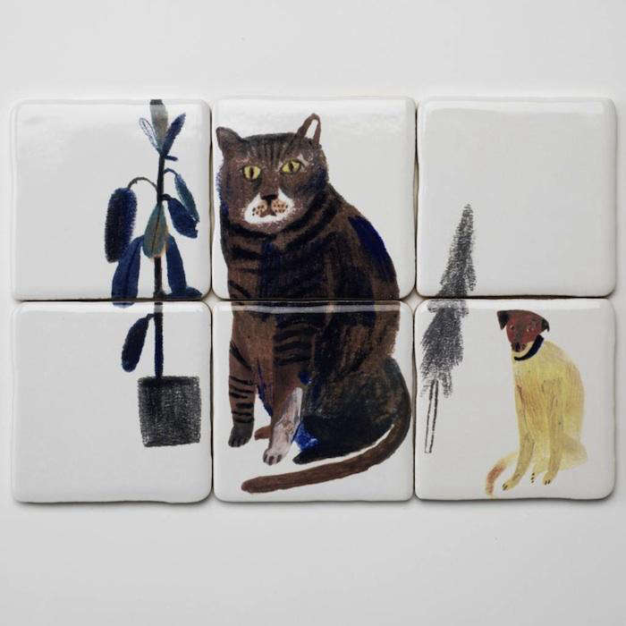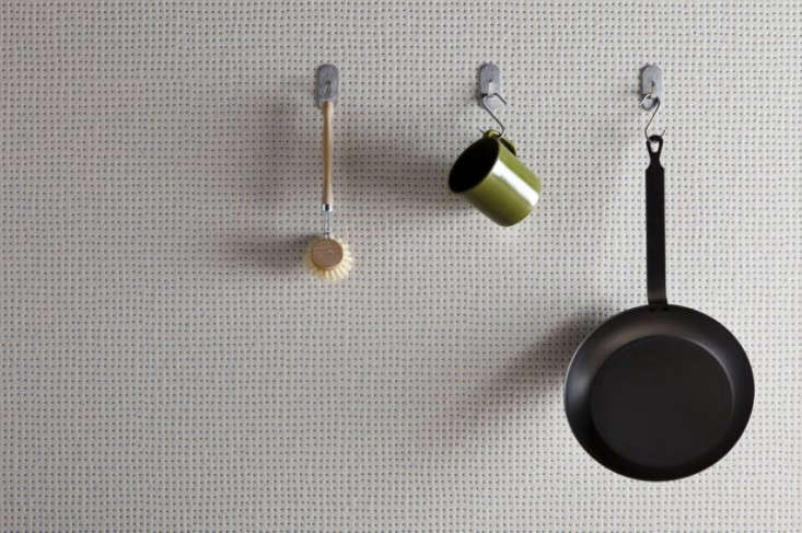
Minimalism used to mean “make everything white and pretend you do not own phone chargers.” Thankfully, modern minimalist interiors have grown up. Today’s version is warmer, smarter, and far more fun. One of the best examples is the rise of minimalist graphic ceramic tiles: tiles that use simple lines, restrained color, geometric rhythm, texture, and clever layout to create personality without visual chaos.
These tiles are not loud in the “look at me, I bought a disco ball” sense. They are confident in a quieter way. Think crisp checkerboards in cream and taupe, slim vertical ceramic tiles stacked like architectural pinstripes, soft geometric wall tiles that catch the light, and small mosaics that make a bathroom floor feel custom without requiring a trust fund or an emergency design intervention.
Across kitchens, bathrooms, mudrooms, laundry rooms, fireplace surrounds, and boutique-style powder rooms, graphic ceramic tile is becoming the sweet spot between plain subway tile and high-drama pattern. It gives a room movement, structure, and style while staying calm enough to live with every day. Below are five minimalist graphic ceramic tile ideas worth watching, plus practical advice on where to use them, how to style them, and what to consider before installation.
Why Minimalist Graphic Ceramic Tile Is Having a Moment
The current tile conversation is leaning toward pattern, texture, warmth, and quiet individuality. Homeowners are still drawn to clean spaces, but they do not want rooms that feel like a showroom after everyone forgot to add a pulse. Minimalist graphic tiles solve that problem beautifully. They create a design moment using basic visual tools: line, shape, repetition, scale, and contrast.
Ceramic tile also fits the practical side of modern living. It is easy to clean, moisture-resistant, stain-resistant, and suitable for busy spaces like kitchens, bathrooms, and entryways. In other words, it can look elegant while surviving toothpaste splatter, coffee drips, muddy shoes, and whatever mysterious sauce appears near the stove at 8:47 p.m.
The best minimalist graphic ceramic tiles usually share a few traits: limited color palettes, simple geometry, matte or satin finishes, subtle texture, and patterns that feel intentional rather than frantic. They work especially well in neutral interiors, Japandi-inspired rooms, modern farmhouse updates, Scandinavian spaces, contemporary bathrooms, and small apartments where every design choice has to earn its square footage.
1. Thin-Line Grid Ceramic Tile
The look: clean, architectural, quietly bold
Thin-line grid ceramic tile is the design equivalent of a perfectly tailored white shirt. It is simple, structured, and somehow always appropriate. The look usually comes from square or rectangular tiles installed with visible grout lines, often in a high-contrast pairing such as white tile with charcoal grout or warm ivory tile with soft gray grout.
This style works because the graphic effect comes from the grid itself rather than from a printed pattern. The tile stays minimal, while the grout becomes the drawing. It is a great option for homeowners who want visual interest without committing to decorative motifs, florals, or anything that might make future buyers whisper, “Well, that was a choice.”
Thin-line grids are especially effective on kitchen backsplashes, shower walls, laundry room walls, and compact powder rooms. A vertical stack can make ceilings feel taller. A horizontal stack can stretch a narrow wall. A square grid adds a modern café feeling, particularly when paired with open shelving, matte black fixtures, natural wood, or brushed nickel hardware.
For a softer version, use off-white tiles with beige or light gray grout. For a sharper version, use white ceramic tile with dark grout. Just remember: contrast grout makes every line visible, so installation precision matters. If your wall is uneven, the grout will not politely keep that secret.
2. Low-Contrast Checkerboard Ceramic Tile
The look: classic pattern, modern restraint
Checkerboard tile has been around forever, but the minimalist version is not the harsh black-and-white diner floor of old-school imagination. The updated approach uses softer color pairings: ivory and sand, cream and clay, pale gray and white, mushroom and bone, or sage and warm white. The result is graphic but not shouty.
A low-contrast checkerboard ceramic tile floor can turn a bathroom, mudroom, pantry, or laundry room into a charming design moment. It adds instant rhythm while still feeling timeless. The trick is to avoid overly busy surroundings. Let the floor carry the pattern, then keep walls, cabinetry, and textiles calm.
This tile idea is particularly useful in small rooms. A powder room with a soft checkerboard floor, simple plaster-look walls, a floating vanity, and one sculptural mirror can look designed without feeling overdecorated. It is also a smart choice for transitional homes because checkerboard sits comfortably between traditional and modern styles.
For a more custom effect, consider using handmade-look ceramic tiles with slight color variation. The small imperfections soften the geometry, making the pattern feel crafted rather than computer-generated. Minimalism does not have to be sterile; sometimes it just needs better lighting and a little texture.
3. Micro-Hex Mosaic Ceramic Tile
The look: small-scale pattern with big design discipline
Hexagon tile is a design favorite because it is geometric without feeling rigid. A micro-hex ceramic mosaic brings a subtle honeycomb pattern to floors, niches, backsplashes, and shower pans. From far away, it reads as texture. Up close, it reveals a crisp graphic structure.
For a minimalist graphic look, stick with one color or a very limited palette. White micro-hex with matching grout creates a quiet texture. White tile with dark grout becomes more vintage and graphic. Warm gray, matte black, or soft green hex mosaics can feel modern while still being easy to pair with wood, stone, and metal finishes.
Micro-hex mosaics are also practical for wet areas because smaller tiles mean more grout lines, which can improve traction on shower floors when installed correctly. They are popular for bathrooms, but they also look great as a kitchen backsplash behind open shelves or as a fireplace surround when the rest of the room is simple.
The key to keeping hex tile minimalist is restraint. Avoid mixing too many colors, borders, and decorative inserts in the same area. A single field of hex tile often looks more elevated than a complicated pattern trying to audition for a marching band uniform.
4. Fluted or Ribbed Ceramic Wall Tile
The look: texture as the graphic element
Fluted ceramic tile is one of the most elegant ways to create a minimalist graphic wall. Instead of relying on printed designs, it uses raised ridges, grooves, or convex surfaces to make light and shadow do the decorating. The pattern changes throughout the day as natural light moves, which gives the surface a quiet sense of motion.
This tile style is especially strong on shower walls, vanity backsplashes, fireplace surrounds, and feature walls. It can make a small bathroom feel more architectural or give a kitchen backsplash a polished, boutique-hotel quality. White, ivory, pale gray, sand, and muted green are popular choices because they highlight the texture without overwhelming the room.
Fluted tile pairs well with simple fixtures and organic materials. Try it with a floating oak vanity, a stone countertop, a wall-mounted faucet, or minimal brass lighting. The effect is clean but not cold. It says, “I have taste,” without also saying, “I alphabetize my spice jars by emotional tone.”
Because dimensional tile has raised surfaces, cleaning and installation should be considered early. Use it where texture can shine but will not become a daily battle with heavy grease or hard-water buildup. In a kitchen, it may be better behind a coffee bar than directly behind a high-splatter range unless you are emotionally prepared to clean grooves with the focus of a museum conservator.
5. Minimalist Arch, Half-Moon, and Line-Art Ceramic Tile
The look: playful geometry for grown-up rooms
Minimalist graphic ceramic tiles do not have to be all grids and straight lines. Arches, half-moons, scallops, and simple line-art motifs are becoming popular because they add softness to modern interiors. They are graphic, but their curves prevent them from feeling severe.
These tiles work well in spaces that need a small dose of personality: powder rooms, bar backsplashes, shower niches, stair risers, laundry rooms, and fireplace surrounds. A white ceramic tile with a thin black arch motif can feel fresh and artistic. A tone-on-tone half-moon pattern in beige or sage can feel calm and handmade. A simple linear motif can make a wall look custom without requiring a mural-sized commitment.
The minimalist rule is simple: let the motif breathe. If the tile has a graphic print, avoid crowding it with patterned wallpaper, busy countertops, ornate hardware, and five competing metal finishes. One main character per scene, please. This is interior design, not a reality show reunion.
Line-art ceramic tiles are also a clever way to bridge modern and vintage influences. They can look Art Deco, midcentury, Mediterranean, or Scandinavian depending on color and layout. That flexibility makes them useful for homeowners who want a trend-forward surface that still feels adaptable over time.
How to Choose the Right Minimalist Graphic Tile
Start with the room’s job
Before choosing a tile, ask what the room needs to do. A shower floor needs slip-conscious materials and proper drainage. A kitchen backsplash needs easy cleaning. A mudroom floor needs durability. A fireplace surround needs heat-safe installation materials. The prettiest tile in the world is not a win if it becomes a maintenance hobby with grout.
Control the contrast
Minimalist graphic tile depends heavily on contrast. High contrast creates drama; low contrast creates calm. Black grout against white tile is crisp and bold. Beige grout against ivory tile is softer and more forgiving. If you are nervous about pattern, choose a lower-contrast palette. You will still get movement, but your wall will not yell before coffee.
Think about scale
Large-format geometric ceramic wall tile can make a room feel sleek and seamless. Small mosaics create texture and detail. Medium square tiles feel classic and flexible. In a small bathroom, tiny patterns can add charm, but too many small shapes on every surface may feel busy. In a large kitchen, a small backsplash tile can look beautiful if the color palette is controlled.
Use grout intentionally
Grout is not just filler. It is part of the design. Matching grout makes tile feel quiet and continuous. Contrasting grout turns each shape into a visible graphic element. For minimalist interiors, the grout color should be chosen as carefully as the tile itself. A sample board is worth it because grout can look different under warm bulbs, daylight, and the strange lighting in a home improvement aisle where all decisions feel urgent.
Respect installation standards
Graphic tile shows layout mistakes more quickly than plain tile. Straight lines, centered patterns, clean cuts, and consistent grout joints matter. For rectangular tiles, especially longer formats, discuss offset patterns with the installer. A one-third offset is often recommended for certain long rectangular tiles to reduce lippage. When in doubt, mock up the pattern before committing.
Best Places to Use Minimalist Graphic Ceramic Tiles
Kitchen backsplashes: Thin-line grids, fluted tile, and soft geometric patterns work beautifully behind counters. Keep the countertop simpler if the tile has a noticeable pattern.
Bathroom floors: Low-contrast checkerboard, micro-hex mosaics, and small-scale graphic tile can make bathrooms feel polished without relying on lots of décor.
Shower walls: Vertical stacked ceramic tiles, ribbed wall tiles, and large-format geometric tiles can create height and texture. Choose finishes and grout that suit wet conditions.
Powder rooms: This is the perfect place to try a stronger graphic tile. The room is small, guests see it, and you are less likely to get tired of a little drama in a space that does not dominate the whole house.
Fireplace surrounds: Graphic ceramic tile can update a fireplace without making it look trendy in the disposable sense. A quiet arch motif, matte grid, or ribbed ceramic tile can frame the firebox beautifully.
Color Palettes That Make Graphic Tile Feel Minimalist
The safest minimalist tile palettes are warm white, bone, cream, sand, pale gray, charcoal, taupe, clay, sage, and soft black. These colors work because they have enough contrast to show pattern but enough restraint to stay livable.
For a calm bathroom, try ivory tile with warm gray grout. For a modern kitchen, use white stacked tile with charcoal grout and light oak shelves. For a mudroom, choose a taupe-and-cream checkerboard that hides dust better than pure white. For a powder room, experiment with matte black ceramic tile and a simple white line motif.
Avoid choosing a tile only because it looks exciting in a close-up photo. Tiles repeat across a surface, and repetition changes everything. A pattern that looks subtle on one sample may become very energetic across an entire wall. Always view multiple pieces together before making the final call.
Styling Tips for a Minimalist Graphic Tile Room
Minimalist graphic tile looks best when the surrounding design gives it room to work. Pair patterned tile with flat-front cabinetry, simple lighting, natural wood, linen textiles, plaster-look walls, or stone counters. Use fewer accessories, but make them better. A single ceramic vase, one framed print, or a sculptural mirror can do more than a shelf full of tiny objects slowly forming a dust-based society.
Metal finishes should also be edited. Matte black, brushed brass, polished nickel, and stainless steel can all work, but mixing too many finishes makes a minimalist room feel confused. Choose one dominant finish and one accent finish if needed.
Lighting matters more than people think. Ribbed and dimensional ceramic tiles need light to reveal their texture. A wall-washing sconce, under-cabinet lighting, or daylight from a nearby window can turn a quiet tile into a beautiful feature. Without light, texture can disappear, and then you have paid for drama that is hiding in the corner.
Common Mistakes to Avoid
Choosing pattern without considering layout
Graphic tile depends on alignment. Before installation, decide where the pattern starts, where cuts will land, and what will be centered. A beautiful tile can look awkward if the most visible wall ends with tiny slivers at the edge.
Using too many statement surfaces
If the floor is graphic, keep the walls calmer. If the backsplash is bold, simplify the countertop. Minimalism is not about having no personality; it is about giving each design choice enough space to matter.
Ignoring maintenance
Textured tile, light grout, and intricate mosaics all have different cleaning needs. Be honest about your tolerance for maintenance. If you hate scrubbing grout, do not choose the most grout-heavy option for the messiest part of your home.
Skipping samples
Tile color changes in different lighting. Gloss level, surface texture, and grout color can shift the final look. Order samples and view them in the actual room before buying. Your future self will be grateful, and possibly less dramatic.
Experience Notes: Living With Minimalist Graphic Ceramic Tiles
After working with design ideas like minimalist graphic ceramic tiles, one lesson becomes very clear: the best tile choice is rarely the loudest one. It is the one that makes the room feel finished without making every other object in the space nervous. A simple grid backsplash can make a kitchen feel sharper. A soft checkerboard floor can make a laundry room feel intentional instead of purely functional. A ribbed ceramic wall tile can make a tiny bathroom feel like it borrowed confidence from a boutique hotel.
In real-life spaces, minimalist graphic tile tends to perform best when it solves both a visual problem and a practical one. For example, a plain white bathroom may feel clean but flat. Add a warm gray micro-hex floor, and suddenly the room has texture, traction, and character. A kitchen with simple cabinets may feel unfinished. Add a vertical stacked ceramic backsplash with subtle grout contrast, and the wall gets structure without needing open shelves packed with decorative bowls no one is allowed to touch.
The most successful projects usually begin with restraint. Homeowners often fall in love with five tile ideas at once, which is understandable because tile showrooms are basically candy stores for responsible adults. But the magic happens when you choose one strong idea and support it. If you select a graphic floor, choose quieter walls. If you choose a fluted backsplash, let the cabinets and counters stay calm. If you choose a line-art tile, resist the urge to add another pattern nearby just because the internet said “mixing patterns is fun.” It is fun, yes, but so is karaoke, and both require judgment.
Another real-world observation: grout color can make or break the design. Many people treat grout like an afterthought, but with minimalist graphic tile, grout is often the pattern’s outline. A white tile with matching grout whispers. The same tile with charcoal grout speaks clearly. The same tile with uneven grout lines may start a small argument with your eyeballs. For high-visibility areas, professional installation is worth considering because clean alignment is part of the final design.
Maintenance is also part of the experience. Smooth ceramic wall tile is typically easy to wipe down, which makes it friendly for backsplashes and bathrooms. Dimensional tile is beautiful, but the grooves can collect dust, soap residue, or cooking splatter depending on location. That does not mean you should avoid it. It means you should place it wisely. A fluted vanity wall? Gorgeous. A deeply ribbed tile behind a frying station? Bold, but perhaps a little too committed to future cleaning cardio.
Finally, minimalist graphic ceramic tile has emotional staying power when the palette is thoughtful. Trendy colors come and go, but simple shapes in warm neutrals, soft greens, gray, clay, black, and white tend to age gracefully. They feel designed without feeling trapped in a specific year. That is the real beauty of this trend: it lets you enjoy pattern and personality while keeping the room flexible for future updates. Change the towels, swap the hardware, repaint the walls, add a new mirror, and the tile still works.
In short, minimalist graphic ceramic tile is a practical trend with style discipline. It gives surfaces rhythm, makes small rooms memorable, and creates a polished look without relying on clutter. It is proof that minimalism does not have to be boring. Sometimes all it needs is a line, a curve, a grid, or a tiny hexagon doing its quiet little job extremely well.
Conclusion
Minimalist graphic ceramic tiles are one of the most useful design trends for homeowners who want clean interiors with a little more personality. From thin-line grids and soft checkerboards to micro-hex mosaics, fluted wall tiles, and curved line-art patterns, these tiles bring movement and structure without overwhelming the room.
The secret is balance. Choose a simple palette, think carefully about grout, respect scale, and let one tile feature lead the design. When done well, minimalist graphic tile can make a kitchen feel tailored, a bathroom feel spa-like, a powder room feel memorable, and a mudroom feel far more stylish than a place where shoes go to recover from bad weather.
This trend works because it blends beauty and common sense. Ceramic tile is durable, easy to maintain, and versatile, while graphic patterns add the kind of visual interest that paint alone cannot always deliver. Minimalist? Yes. Boring? Not even close.