Some paint colors whisper. Some politely clear their throat. Little Greene’s Air Force Blue (260) walks into the room wearing a tailored jacket, polished shoes, and the confidence of someone who knows exactly where the good lighting is. It is rich, deep, historic, and surprisingly flexiblea blue that can look traditional in a library, crisp on kitchen cabinets, dramatic in a hallway, and almost cinematic on an exterior wall.
Air Force Blue is not a shy pastel or a predictable navy. It sits in that interesting territory between refined heritage blue and lively modern statement color. With a Light Reflectance Value, or LRV, of 21, it absorbs more light than it reflects, giving rooms depth and atmosphere without tipping into near-black territory. In plain English: this is a color with presence. Use it thoughtfully, and it can make a room feel designed rather than merely decorated.
What Is Little Greene’s Air Force Blue (260)?
Little Greene’s Air Force Blue (260) is a deep, full-bodied blue from the brand’s historic color range. The name “Air Force Blue” has roots in aviation history, but it was never just one fixed color. Historically, different squadrons mixed their own versions, which means the term refers to a family of blues rather than a single universal shade. Little Greene’s interpretation is deeper and richer than many versions, making it especially effective when used across larger surfaces.
The color has enough gray and softness to feel grown-up, but it still reads clearly as blue. It is more spirited than a flat navy, less severe than black, and more memorable than a standard blue-gray. That balance is why Air Force Blue 260 works in both classic and contemporary interiors. It can support antique furniture, brass hardware, marble counters, natural wood, white trim, and even playful accent colors without looking confused.
Why Air Force Blue 260 Feels So Timeless
The best paint colors have range. They do not depend on one design trend, one furniture style, or one Instagram angle. Air Force Blue has that kind of range because it borrows from several visual languages at once: military history, British heritage interiors, coastal blues, library-like depth, and modern color-drenching. That sounds like a lot for one paint can, but somehow it behaves itself.
In a traditional room, Air Force Blue can feel stately and grounded. Picture it behind walnut bookshelves, paired with leather, framed art, and warm lamplight. In a modern home, it becomes crisp and architectural, especially when used on cabinets, built-ins, stair rails, or a front door. In a small powder room, it can feel jewel-box dramatic. In an entryway, it creates the feeling that the rest of the house has its life togethereven if there is a backpack, three shoes, and a mystery charging cable just out of frame.
Understanding the LRV of Air Force Blue
LRV stands for Light Reflectance Value. It measures how much light a color reflects on a scale from 0 to 100. A value of 0 is absolute black, while 100 is pure white. Air Force Blue’s LRV of 21 places it firmly in the medium-dark category. That means it will create a cozy, enveloping effect, especially in rooms with limited natural light.
However, low LRV does not automatically mean a room will feel gloomy. The final effect depends on lighting, ceiling height, furniture, trim color, and finish. In a bright kitchen with white countertops and polished nickel hardware, Air Force Blue can look energetic and clean. In a north-facing bedroom with warm bedding and soft lamps, it can feel calm and cocooning. In an exterior setting, it can look bold and tailored, particularly when paired with crisp trim or lively garden colors.
Best Rooms for Little Greene Air Force Blue Paint
Kitchen Cabinets
Air Force Blue is a strong candidate for kitchen cabinets because it gives cabinetry a custom, furniture-like quality. It looks especially good with white or creamy walls, marble or quartz counters, unlacquered brass, aged bronze, or brushed nickel. For a fresh American kitchen look, pair Air Force Blue lower cabinets with light upper walls and warm wood accents. The result feels upscale without entering “please do not touch anything” territory.
Hallways and Entryways
Hallways often get ignored, which is unfair considering they work harder than almost any other space. Air Force Blue can turn a pass-through area into a design moment. In a narrow hallway, consider using it on wainscoting, doors, trim, or a console wall rather than every surface. If the hallway has good light, color drenchingwalls, trim, and doors in the same bluecan look incredibly polished.
Bedrooms
Blue has long been associated with calm, and Air Force Blue brings that calm with a tailored edge. In a bedroom, it works beautifully behind a headboard, across all four walls, or on built-in wardrobes. Add linen bedding, warm white lampshades, and natural textures to keep the room from feeling too formal. A few brass or antique gold details can warm the color and prevent it from reading too cool.
Dining Rooms
Dining rooms love drama. Air Force Blue can make a dining space feel intimate, evening-ready, and a little glamorous. Use it with dark wood furniture for a classic look, or contrast it with pale oak and modern art for something cleaner. If you want the color to feel extra rich, use a slightly higher sheen on trim or built-ins while keeping walls more matte.
Bathrooms and Powder Rooms
A small bathroom is one of the safest places to go bold. Air Force Blue can create a boutique-hotel effect when paired with white tile, stone counters, polished hardware, or patterned flooring. For powder rooms, the color can be used on walls, vanity, ceiling, or even the door. Small room, big personality. The math checks out.
Exterior Walls, Doors, and Garden Features
Little Greene specifically positions Air Force Blue as a color that can work in exterior settings. On a front door, it feels smart and welcoming. On garden walls or outdoor structures, it can create a rich backdrop for greenery, terracotta pots, white flowers, and bright accent furniture. Unlike very dark navy, it keeps enough blue character to feel lively outdoors.
Best Color Pairings for Air Force Blue 260
Air Force Blue is strong, but it is not difficult. The trick is to decide whether you want contrast, calm, or drama.
Air Force Blue and Warm White
This is the classic choice. Warm white trim or walls keep the blue crisp without making it feel icy. Use this pairing in kitchens, bedrooms, hallways, and exteriors. A soft white ceiling can also keep a dark blue room feeling open.
Air Force Blue and Brass
Brass and deep blue are basically old friends. Brass warms the coolness of blue and adds a layer of sophistication. Try brass cabinet pulls, picture lights, curtain rods, sconces, or mirror frames. Just avoid going overboard unless your design goal is “nautical jewelry box,” which, to be fair, could be fabulous in the right powder room.
Air Force Blue and Natural Wood
Wood brings Air Force Blue down to earth. Oak, walnut, pine, and teak can all work, depending on the mood you want. Pale oak creates a Scandinavian-leaning freshness, while darker walnut adds library-level depth. This combination works especially well in offices, kitchens, and living rooms.
Air Force Blue and Soft Neutrals
Little Greene suggests related neutrals such as Inox and Bone China Blue. These quieter tones help Air Force Blue feel layered rather than isolated. Soft gray, chalky white, stone, oatmeal, taupe, and pale blue-gray can all support the color without competing with it.
Air Force Blue and Lively Accent Colors
For outdoor spaces or playful interiors, Air Force Blue can handle energetic accents. Try coral, ocher, tomato red, leafy green, or sunny yellow in small doses. Think cushions, planters, art, flowers, or a painted chair. The key is restraint: let Air Force Blue be the anchor, not one loud voice in a crowded room.
Choosing the Right Little Greene Finish
The same color can look different depending on finish. A flat finish softens the color and hides surface imperfections, while satin, eggshell, or gloss can make the blue look richer and more reflective.
Absolute Matt Emulsion
Absolute Matt is best for interior walls and ceilings where you want a soft, chalky, low-sheen look. It is a good option for bedrooms, living rooms, dining rooms, and lower-traffic spaces where depth of color matters most. In Air Force Blue, a flat finish gives the shade an elegant, velvety quality.
Intelligent Matt Emulsion
Intelligent Matt is the practical choice for busy interiors. It is designed to be washable while keeping a low-sheen appearance, making it suitable for kitchens, hallways, utility rooms, children’s rooms, and other high-traffic areas. If your walls encounter backpacks, fingerprints, pets, or the occasional flying snack, this finish deserves serious consideration.
Intelligent Eggshell, Satin, and Gloss
For trim, doors, cabinets, furniture, and woodwork, eggshell or satin finishes can give Air Force Blue a polished look. Gloss is more dramatic and reflective, ideal for statement doors, furniture pieces, or architectural details. The more sheen you choose, the more surface preparation matters, because glossy finishes tend to reveal bumps and flaws.
Exterior and Masonry Finishes
For outdoor use, choose the proper exterior formulation. Air Force Blue can be used on masonry, exterior woodwork, doors, and garden features when applied in the appropriate Little Greene finish. Exterior paint must handle weather, sunlight, and surface movement, so do not substitute an interior finish outdoors and hope for the best. Paint is talented, but it is not magic.
How Air Force Blue Changes in Different Lighting
Lighting is the boss of paint color. Air Force Blue can shift depending on exposure, bulb temperature, and surrounding materials.
In south-facing rooms, the color may appear brighter and more saturated during the day. In north-facing rooms, it may look moodier and slightly grayer. Under warm bulbs, the blue can feel softer and more traditional. Under cool bulbs, it may look sharper and more contemporary. This is why sampling is non-negotiable. Paint a large sample area or use a sample board, then check it morning, afternoon, and evening.
Also test the color next to your fixed elements: flooring, tile, countertops, stone, brick, and large furniture. Air Force Blue is flexible, but it will react to undertones around it. Creamy whites will warm it. cool grays may make it feel more formal. Orange-toned woods can create a bold complementary contrast.
Design Ideas Using Little Greene Air Force Blue
Color-Drenched Study
Paint the walls, trim, and built-ins in Air Force Blue, then add a leather chair, warm wood desk, and brass task lamp. The result feels focused, cozy, and expensiveeven if the desk is secretly assembled with an Allen wrench.
Two-Tone Kitchen
Use Air Force Blue on the island or lower cabinets, with warm white walls and upper cabinets. Add butcher block, marble, or light quartz counters. This creates contrast without making the kitchen feel heavy.
Front Door Statement
Paint the front door in Air Force Blue and pair it with white trim, black hardware, or brass details. It is bold enough to stand out but classic enough not to scare the neighbors.
Moody Powder Room
Use Air Force Blue on all walls, then add a framed mirror, wall sconces, patterned floor tile, and crisp white fixtures. Small rooms can handle saturated color beautifully because they are already compact. Lean into the drama.
Bedroom Accent Wall
Paint the wall behind the bed in Air Force Blue and keep the remaining walls soft white, pale gray, or muted blue-gray. Add layered bedding in linen, oatmeal, ivory, or muted stripe patterns for a calm but not boring retreat.
Common Mistakes to Avoid
The first mistake is skipping samples. Deep blue paint can look dramatically different from a tiny card once it covers a wall. The second mistake is using too many competing dark colors without enough texture or contrast. If everything is dark, flat, and heavy, the room can lose dimension. Balance Air Force Blue with wood, textiles, metal, stone, art, or lighter surfaces.
The third mistake is choosing the wrong finish for the job. A matte wall finish may be beautiful in a bedroom but less practical in a busy mudroom. A glossy cabinet finish can look spectacular, but only if the surface is properly prepared. The fourth mistake is forgetting lighting. A deep blue room needs good lamps, sconces, or natural light planning. Even the most beautiful paint cannot rescue a room lit by one lonely ceiling bulb from 1998.
Is Air Force Blue 260 Worth It?
For homeowners who want a premium heritage blue with depth, flexibility, and personality, Little Greene’s Air Force Blue 260 is absolutely worth considering. It is not the cheapest route to a blue wall, but it offers a distinctive color story and a refined finish range. The shade works especially well for people who want something richer than blue-gray, more interesting than basic navy, and more livable than a very dark near-black blue.
It is best for design projects where color is meant to be part of the architecture, not just a background choice. Use it on cabinetry, doors, built-ins, walls, exteriors, or furniture when you want the color to carry some emotional weight. Air Force Blue has enough character to make a room memorable, but enough discipline to stay elegant.
Personal Experience and Practical Lessons With Air Force Blue 260
Living with a color like Little Greene’s Air Force Blue is different from admiring it on a screen. On a website, it looks handsome. On a wall, it starts having opinions. That is not a bad thing. In fact, that is the pleasure of using a rich blue: it changes throughout the day and gives a space a sense of movement. Morning light can make it feel clearer and more energetic. Evening light can pull out its depth and make the room feel calmer, almost like the walls have put on a cashmere sweater.
The first experience worth mentioning is that Air Force Blue rewards preparation. Darker colors tend to show uneven edges, roller marks, and poor patching more than pale neutrals. Before painting, it is worth sanding rough spots, filling dents, cleaning the surface, and using the right primer where needed. This is not the paint color for a “just slap it on and hope” project. It can forgive some imperfections in a flatter finish, but the cleaner the surface, the more luxurious the final result will look.
The second lesson is that Air Force Blue works best when the rest of the room has a plan. You do not need a professional designer or a museum budget, but you do need a few supporting actors. A white lampshade, a warm wood table, a brass handle, a striped pillow, or a textured rug can make the blue feel intentional. Without those details, a deep blue wall may look lonely. With them, it looks curated.
Another practical experience is that this color can make ordinary trim look important. A simple door painted in Air Force Blue suddenly feels architectural. Basic built-ins look more custom. A plain hallway becomes a feature. This is one of the strongest reasons to use the color on woodwork, cabinetry, or doors if painting an entire room feels too bold. You still get the richness of the shade, but in a more controlled dose.
For small homes or apartments, Air Force Blue can be surprisingly useful. Many people assume dark colors shrink spaces, but that is not always true. A dark blue accent wall can create depth, and a color-drenched small room can feel cozy rather than cramped. The trick is to keep clutter under control and use reflective or lighter elements nearby. A mirror, pale curtains, light bedding, or a warm white ceiling can keep the space breathing.
When using Air Force Blue in a kitchen, the biggest lesson is to check it against countertops and backsplash materials. Some whites are cool and crisp; others are creamy or beige. Some marbles have blue-gray veining, while others lean warm. Air Force Blue can work with many of them, but the undertone relationship matters. A sample board placed vertically next to counters and tile will tell you more in one afternoon than twenty online photos.
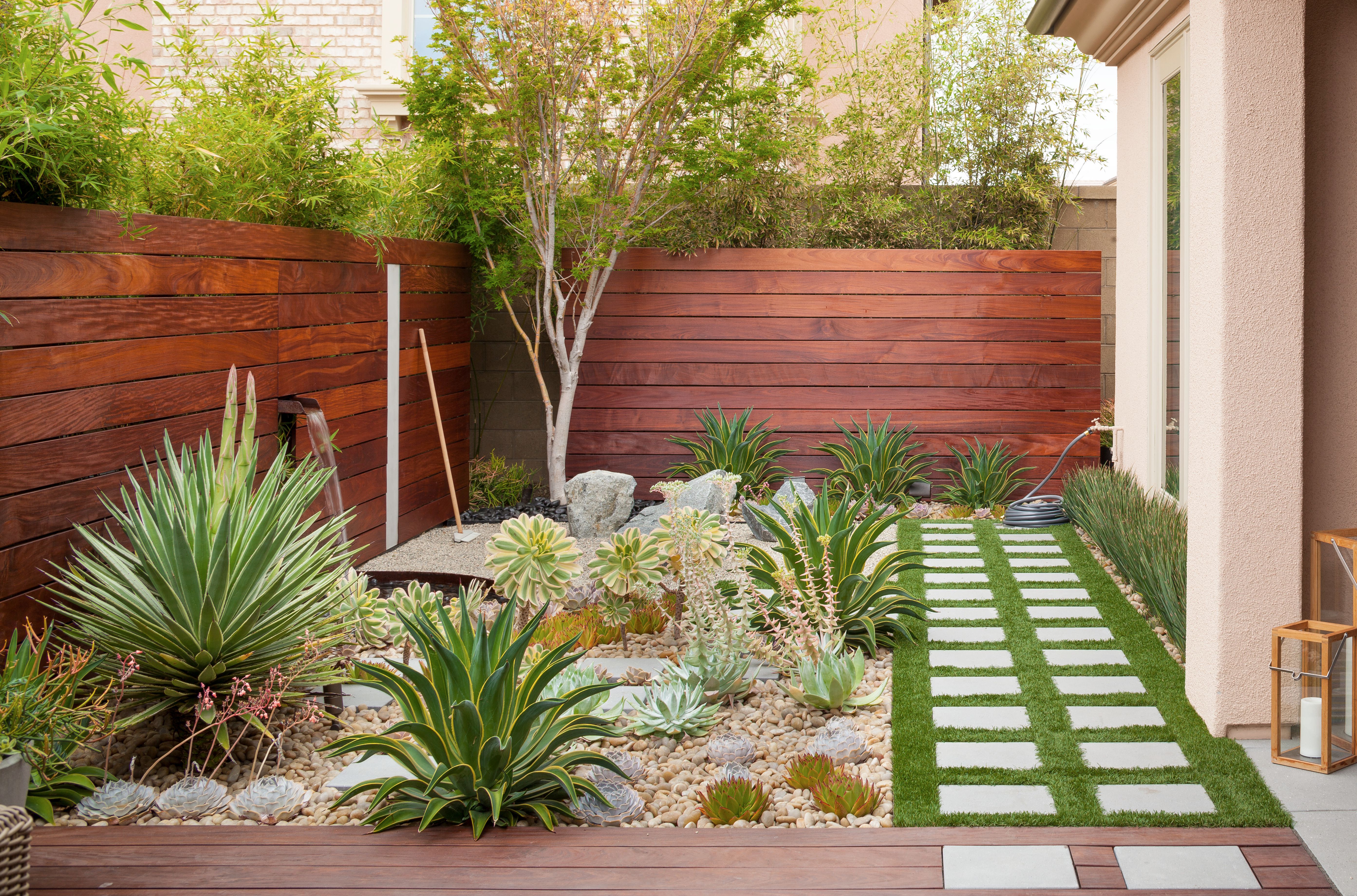
For exterior use, Air Force Blue feels especially attractive when surrounded by greenery. Plants soften the formality of the color, while the blue makes leaves, flowers, and terracotta look more vibrant. On a garden wall or shed door, it can turn a practical surface into a backdrop. Add a bright accent chair or planter, and suddenly the yard looks less like “outdoor storage area” and more like “yes, we meant to do this.”
The final experience is emotional: Air Force Blue makes a home feel more personal. Neutrals are useful, but a color like this says something. It suggests confidence, taste, and a willingness to let a room have a point of view. It is not loud, but it is memorable. That is the sweet spot for many interiors: a color that adds character without exhausting the eye.
Conclusion
Little Greene’s Air Force Blue (260) is a rich heritage blue with enough depth for drama and enough refinement for everyday living. Its LRV of 21 gives it a cozy, grounded quality, while its historical character keeps it from feeling trendy or disposable. Whether used on kitchen cabinets, bedroom walls, hallways, front doors, exterior masonry, or built-in furniture, Air Force Blue brings instant structure and style.
The best way to use it is with intention. Sample it in your real lighting, choose the right finish, and pair it with materials that bring out its strengths: warm whites, brass, natural wood, soft neutrals, stone, greenery, and carefully chosen accents. Done well, Air Force Blue is not just a paint color. It is a design decision with backbone.