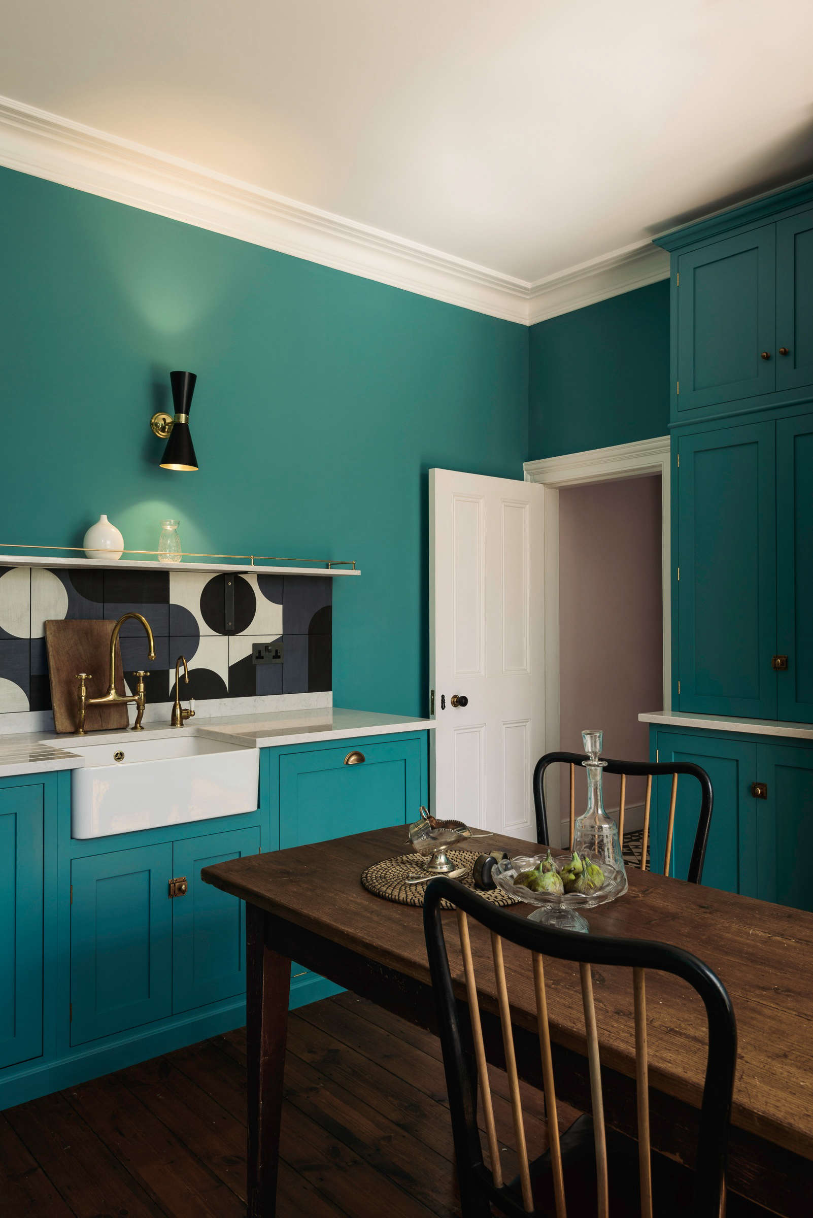
Some paint colors whisper. Some politely clear their throat. And then there is Fired Earth South Bank, a blue-green shade with enough personality to walk into a room, rearrange the furniture, and somehow make the coffee table look more expensive. Part of Fired Earth’s Paint Collection, South Bank is not a shy neutral or a background beige. It is a bold, bright, mid-century-inspired color that sits beautifully between blue and green, giving interiors that confident “yes, I meant to do that” feeling.
For homeowners, decorators, and design lovers searching for a statement paint that still feels livable, Fired Earth – The Paint Collection South Bank deserves a serious look. It has the freshness of teal, the optimism of vintage design, and the versatility to work in living rooms, kitchens, bathrooms, offices, and small accent spaces. Used well, it can make a home feel curated rather than copied from page 47 of a catalog.
This guide explores what South Bank is, why it works, how to pair it, which finishes make sense, and how to use it without accidentally turning your dining room into a tropical aquarium. Spoiler: sampling is your friend.
What Is Fired Earth South Bank?
South Bank by Fired Earth is best described as a vivid blue-green paint color. It leans into the world of teal, but it does not feel flat or cartoonish. The color has a clean, energetic quality that makes it suitable for contemporary interiors, while its historical inspiration gives it a sense of design heritage.
The name South Bank refers to the South Bank of the River Thames in London, an area closely associated with the Festival of Britain. That connection matters because the color has a distinct mid-century optimism. Think architectural exhibitions, modern furniture, clever materials, public art, and people believing the future might come with better chairs. South Bank captures that same upbeat spirit in paint form.
In Fired Earth’s wider Paint Collection, South Bank sits among colors designed to feel elegant, characterful, and carefully edited. The collection includes neutrals, pastels, heritage shades, and stronger accent colors. South Bank belongs firmly to the confident side of the family. It is not here to blend into the drywall and apologize.
Why Blue-Green Paint Colors Are So Popular
Blue-green paint colors have become favorites because they do something rare: they feel both calming and expressive. Blue brings associations with sky, water, and quiet. Green adds freshness, nature, and balance. Put them together and you get a shade that can relax a room without making it sleepy.
South Bank works especially well because it is not too dark to feel heavy, yet it has enough saturation to make a clear design statement. Pale blue-green shades can sometimes drift into nursery territory. Dark teal can look moody and dramatic, which is wonderful unless your room is already smaller than your laundry basket. South Bank lands in the middle: bold enough to be memorable, bright enough to stay cheerful.
That balance is why blue-green paint is often used in bedrooms, bathrooms, home offices, creative studios, and living spaces. It can support concentration, soften hard edges, and create a visual link with natural materials such as wood, stone, linen, rattan, brass, and ceramic tile.
The Style Personality of South Bank
Mid-century but not trapped in the past
South Bank has a mid-century flavor, but it does not require you to fill your home with atomic clocks and kidney-shaped coffee tables. The color pairs beautifully with walnut furniture, tapered legs, simple silhouettes, and vintage lighting, but it also works with clean-lined contemporary pieces.
If your room includes warm woods, South Bank can look especially sharp. The warmth of oak, teak, walnut, or even bamboo helps balance the cooler blue-green base. This is one of the easiest ways to make the color feel intentional rather than random.
Bold but still grown-up
Some bright paint colors look fun for ten minutes and exhausting by lunchtime. South Bank avoids that problem because it has enough depth to feel sophisticated. It is lively, yes, but not neon. It can handle a grown-up room with good lighting, interesting art, and proper curtains. It also plays nicely with white trim, charcoal accents, and muted gray furnishings.
Fresh without being trendy-only
Teal and blue-green shades often cycle in and out of trend reports, but South Bank’s strength is that it does not rely only on trendiness. Its connection to classic mid-century palettes gives it staying power. It feels current, but it also has roots. That is useful when you want a room to look stylish next year, not just during this week’s design algorithm fever dream.
Where to Use Fired Earth South Bank
Living rooms
In a living room, South Bank can turn a plain wall into a focal point. Use it behind a sofa, around built-in shelving, or across all four walls if the room has good natural light and enough visual balance. Pair it with cream upholstery, dark wood tables, brass lamps, and textured rugs for a polished look.
If you prefer a softer approach, use South Bank on one feature wall and keep the remaining walls warm white. This allows the color to shine without overwhelming the space. Add artwork with black frames or natural wood frames for structure.
Kitchens
South Bank can be stunning in a kitchen, especially on cabinetry, an island, a pantry door, or a breakfast nook wall. Blue-green cabinetry has become popular because it feels more interesting than white but less severe than black or navy. It also pairs well with marble-look counters, butcher block, white tile, aged brass, matte black hardware, and stainless steel appliances.
For a full kitchen, consider how much color you want to live with every morning before coffee. Cabinets in South Bank can look chic and custom. Walls in South Bank can feel fresh and cheerful. Cabinets and walls together can work, too, but that is a bolder design decision and should be tested carefully.
Bathrooms
Blue-green paint is almost too obvious for bathrooms, but obvious is not always bad. South Bank can give a bathroom a spa-like yet energetic mood. It works particularly well with white fixtures, terrazzo-style surfaces, patterned floor tile, natural wood vanities, and brushed brass hardware.
For bathrooms, finish matters. A moisture-resistant eggshell or similar washable finish is often more practical than a very flat finish, especially around sinks, showers, and high-humidity areas. Ventilation is also important. Even the prettiest paint is not a superhero against trapped moisture.
Bedrooms
In a bedroom, South Bank creates a fresh but cozy atmosphere when paired with soft textiles. Use white bedding for contrast, add muted ochre or rust accents for warmth, and bring in wood furniture to keep the color grounded. If painting every wall feels too strong, try the wall behind the headboard.
South Bank can also work in a guest room because it feels distinctive without being overly personal. Guests may not remember where you keep the extra towels, but they will remember the room.
Home offices
For a home office, South Bank offers color without chaos. It can make video-call backgrounds look more designed and less “I found this corner five minutes before the meeting.” Pair it with white shelving, dark desk accessories, and warm lighting. The blue-green tone can feel focused, creative, and uplifting.
Hallways and small spaces
Small spaces are often the best places for brave color. A hallway, powder room, mudroom, or reading nook can handle South Bank beautifully. In fact, small rooms sometimes benefit from a strong color because it gives them a reason to exist. Otherwise, they risk becoming places where shoes gather to discuss rebellion.
Best Color Pairings for South Bank
Sharp white
One of the cleanest combinations is South Bank with a crisp white. White trim, ceilings, doors, or shelving can frame the color and make it feel architectural. This pairing is ideal for modern homes, coastal-inspired rooms, and spaces where you want contrast without heaviness.
Mid-tone gray
A balanced gray can calm South Bank and make it feel more refined. This is especially useful in living rooms or bedrooms where the goal is stylish but not loud. Avoid grays that are too cold unless the room has warm lighting or plenty of wood. Otherwise, the space may start feeling like a very fashionable refrigerator.
Warm wood tones
Warm woods are among the best partners for South Bank. Walnut, teak, oak, and antique wood finishes bring out the mid-century inspiration and prevent the blue-green from feeling too cool. A simple walnut sideboard against a South Bank wall can look expensive even if your budget is currently whispering, “Please be gentle.”
Brass and bronze
Metallic accents in brass, bronze, or aged gold add warmth and polish. Try them through cabinet pulls, mirror frames, picture lights, lamps, or small decorative objects. The goal is not to make the room look like a treasure chest. A little glow goes a long way.
Soft pink, coral, and peach
Because green-based colors often respond well to warm complementary tones, South Bank can look beautiful with soft pink, coral, clay, or peach accents. These colors add friendliness and prevent the palette from feeling too cool. Use them in pillows, artwork, ceramics, flowers, or upholstery.
Charcoal and black
Black accents can make South Bank feel sharper and more contemporary. Try black picture frames, black sconces, black hardware, or a charcoal rug. Keep the balance thoughtful; too much black can make the room feel heavy, while small doses give it definition.
Choosing the Right Finish
Paint color gets most of the attention, but finish decides how that color behaves in real life. South Bank in a soft matt finish will look velvety and modern. South Bank in eggshell will reflect a little more light and offer more practicality for trim, doors, cabinetry, and moisture-prone areas.
Matt emulsion
A matt emulsion finish is a natural choice for walls and ceilings. It gives a flatter, softer look that helps hide minor surface imperfections. This finish is particularly attractive in bedrooms, living rooms, dining rooms, and lower-traffic areas where you want color depth without shine.
The benefit of a flat matt look is elegance. The trade-off is that flat finishes usually need more care than shinier finishes. If you have children, pets, or a hallway where backpacks attack the wall daily, consider how much wipeability you need.
Eggshell
Eggshell has a low sheen and tends to be more durable and washable than very flat finishes. It is often a smart choice for woodwork, trim, doors, kitchen details, bathroom walls, and furniture projects. In South Bank, eggshell can look rich and polished without becoming glossy.
If you want to paint a vanity, built-in shelves, interior doors, or cabinetry, eggshell is likely the more practical option. It gives the color a subtle lift and can better handle daily contact.
Practical Painting Tips Before You Commit
Always sample first
South Bank is a strong color, so sampling is not optional. Paint a sample board or apply a test patch in the actual room. Look at it in morning light, afternoon light, evening light, and artificial light. A blue-green shade can shift dramatically depending on exposure, bulb temperature, and nearby furnishings.
In north-facing rooms, South Bank may feel cooler and slightly deeper. In south-facing rooms, it may appear brighter and more energetic. In rooms with warm bulbs, the green side may become more noticeable. In cool LED lighting, the blue side may step forward.
Check your undertones
Undertones are the tiny gremlins of interior design. They hide quietly until your new wall color makes your sofa look strange. Before painting a full room, compare South Bank with flooring, countertops, tile, upholstery, and curtains. If your fixed elements are very yellow, orange, or red-toned, South Bank may need warm accessories to bridge the palette.
Prepare the surface properly
Beautiful paint cannot hide poor prep forever. Clean the walls, fill holes, sand rough spots, and use the right primer when needed. If you are covering a very dark or glossy surface, primer can help create a more even result. If the existing paint is peeling, painting over it is not optimism; it is denial with a roller.
Use the right tools
Quality brushes and rollers matter. A good roller can help achieve even coverage, while a proper angled brush makes cutting in around trim much easier. Keep a wet edge as you work and avoid overworking the paint once it starts to dry.
Plan for two coats
High-quality paints often cover well, but strong colors usually look best with two coats. The first coat builds the base; the second coat gives richness and evenness. Skipping the second coat is like leaving the house with one shoe. Technically possible, but why?
How South Bank Compares With Similar Colors
South Bank belongs to the broader family of teal, turquoise, and blue-green paints. Compared with pale aqua, it feels more mature and grounded. Compared with dark teal, it feels brighter and more playful. Compared with sage green, it feels cleaner and more energetic. Compared with navy, it feels less formal and more optimistic.
This makes it a useful choice when you want color that is distinctive but not gloomy. It can bring life to a room without the intensity of emerald green or the seriousness of deep blue. It is also more flexible than many people expect. With white, it feels crisp. With wood, it feels retro-modern. With brass, it feels elegant. With pink accents, it becomes charming and slightly unexpected.
Is Fired Earth South Bank Worth Considering?
South Bank is worth considering if you want a paint color with character, historical inspiration, and design flexibility. It is especially appealing for people who are tired of plain neutrals but not ready to live inside a fire-engine-red experiment. The color feels confident, fresh, and curated.
It may not be the best choice if you want a barely-there wall color or if your home already has many competing strong colors. It also needs thoughtful lighting and pairing. South Bank is not difficult, but it does ask to be treated like a design decision rather than an afterthought.
For best results, use it with intention. Choose a room or surface where the color can become a feature. Support it with neutrals, natural textures, and warm accents. Test it thoroughly. Then enjoy the part where visitors ask, “What color is this?” and you get to answer with the calm confidence of someone who owns sample pots.
500-Word Experience Section: Living With the South Bank Look
The real experience of using a color like Fired Earth South Bank begins before the lid comes off the can. It starts with the sample. At first glance, the color may look like a cheerful teal. Then you tape the sample to the wall and suddenly it changes personalities throughout the day like a dramatic but stylish houseguest. In morning light, it can feel fresh and blue. By late afternoon, the green may become richer. Under warm lamps, it can look cozy and almost vintage. This is not a flaw. This is the charm of a complex blue-green.
In a living room, the South Bank experience is about energy. The room wakes up. Plain furniture looks more deliberate. A simple white sofa feels cleaner. A wooden sideboard suddenly becomes the star of the show, even if it previously served mostly as a place where mail went to disappear. The color creates a backdrop that makes art, books, ceramics, and plants look more collected.
In a kitchen, South Bank can feel surprisingly practical. On lower cabinets or a kitchen island, it offers color without becoming too precious. It hides minor visual clutter better than white and feels less severe than black. Paired with white tile and warm hardware, it gives the kitchen a smart, slightly retro mood. It says, “I make excellent coffee,” even if the actual coffee situation is instant and emotional.
In a bathroom, South Bank feels crisp and refreshing. White porcelain, chrome, brass, and natural wood all respond well to it. The color can make a small bathroom feel designed rather than forgotten. Add a round mirror, a good wall light, and a striped towel, and suddenly the room has boutique-hotel energy. Not the hotel where the elevator smells weird. A nice one.
The biggest lesson from living with a color like this is balance. South Bank is happy to be the main character, but it should not have to compete with twelve other main characters. If the walls are South Bank, keep large furniture pieces quieter. If the cabinets are South Bank, let the backsplash breathe. If the ceiling is also South Bank, congratulations: you are brave, and possibly wearing excellent glasses.
Maintenance also becomes part of the experience. In busy spaces, choose the finish carefully. A matt wall may look beautiful and soft, but an eggshell finish can be easier to wipe on trim, doors, and furniture. Families with pets, children, or enthusiastic furniture movers should think practically. Beauty is wonderful, but so is being able to clean a scuff without holding a family meeting.
Ultimately, South Bank is the kind of paint color that rewards confidence. It makes a room feel alive, personal, and finished. It is not the safest choice, but safe is not always the goal. Sometimes the goal is to walk into a room and feel a tiny spark of delight. South Bank does that very well.
Conclusion
Fired Earth – The Paint Collection South Bank is a bold blue-green paint color with mid-century roots, modern versatility, and plenty of personality. It works beautifully in living rooms, kitchens, bathrooms, bedrooms, offices, and small accent spaces when paired with the right finishes and materials. Its best companions include crisp white, mid-tone gray, warm wood, brass, charcoal, and soft coral or pink accents.
The key to success is testing the color in your own lighting, choosing the right finish, and giving the shade enough visual breathing room. South Bank is not background paint. It is a design feature. Used thoughtfully, it can turn an ordinary room into a space that feels fresh, stylish, and unmistakably intentional.