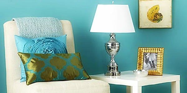
Metallic colors are the design equivalent of a well-timed wink. They are not always loud, they do not need to shout from every wall, and when used well, they can make a room feel polished, layered, and expensive without requiring a bank loan or a chandelier the size of a compact car. From warm brass and aged bronze to brushed nickel, soft silver, copper, pewter, champagne gold, and deep gunmetal, metallics bring something ordinary flat paint cannot: movement. They catch light, shift with the time of day, and add depth to a home in a way that feels both classic and current.
The best colors for your home are not always the boldest or trendiest. They are the shades that work with your architecture, lighting, furniture, flooring, and lifestyle. Metallics are especially powerful because they function as both color and finish. A bronze faucet can warm up a white kitchen. A silver mirror can brighten a narrow hallway. A brass lamp can make a navy bedroom feel tailored rather than gloomy. A copper pendant can turn a basic dining nook into a place where even leftovers feel fancy.
But metallics need a little discipline. Too much shine can make a room look like it is auditioning for a casino lobby. Too little, and the effect disappears. The secret is balance: choose a dominant metal, pair it with the right wall colors, repeat it thoughtfully, and let the sparkle support the room instead of taking over the room.
What Are Metallic Colors in Home Design?
Metallic colors are shades inspired by metals and metal finishes, including gold, silver, brass, bronze, copper, nickel, chrome, pewter, iron, steel, and gunmetal. In interior design, the word “metallic” can describe an actual metal surface, a metallic paint, a reflective wallpaper, a glazed finish, or a color that suggests metal even without shine.
That last point matters. Metallic home decor is not only about glossy gold paint. A room can feel metallic through subtle materials: brushed brass cabinet pulls, oil-rubbed bronze lighting, satin nickel faucets, silver-framed art, bronze-green paint, warm taupe walls with champagne accents, or charcoal cabinetry with blackened steel hardware. The finish can be polished, brushed, hammered, antiqued, matte, satin, or patinated. Each one creates a different mood.
Polished chrome feels crisp and modern. Unlacquered brass feels warm, traditional, and alive because it develops a patina over time. Bronze feels grounded and slightly moody. Copper feels rustic, glowing, and artisanal. Silver and nickel feel clean, elegant, and flexible. Matte black behaves almost like a neutral, giving metallic schemes a graphic edge without adding extra glitter.
Why Metallics Work So Well in Modern Homes
Metallics succeed because they interact with light. A flat beige wall may sit quietly in the background, but a brass sconce or silver-framed mirror bounces light around the room. This makes metallic accents useful in small rooms, dark corners, narrow entryways, and spaces that need a little visual lift.
Metallics also add contrast. A soft linen sofa looks more finished next to a dark bronze floor lamp. A creamy kitchen becomes more interesting with aged brass hardware. A blue-gray bathroom feels sharper with polished nickel. The metal gives the eye a place to land, which helps the entire room feel intentional.
Another reason metallics remain popular is that they bridge styles. Brass can work in traditional, transitional, modern farmhouse, Art Deco, and contemporary interiors. Chrome can feel futuristic, midcentury, or retro depending on its shape. Bronze can move from rustic to elegant with ease. Metallics are not one style; they are supporting actors. Good ones can play almost any role.
The Best Metallic Colors for Your Home
1. Brass: Warm, Classic, and Friendly
Brass is one of the most versatile metallic colors for home interiors. It has a golden warmth without always feeling flashy, especially when used in satin, brushed, or aged finishes. Brass pairs beautifully with creamy whites, deep greens, navy blue, chocolate brown, charcoal, terracotta, blush, and warm wood tones.
Use brass when you want a room to feel welcoming and elevated. In kitchens, brass cabinet hardware can warm up white, green, black, or navy cabinets. In bathrooms, brass faucets and mirrors can soften marble, porcelain, and tile. In living rooms, brass lamps, picture frames, and side tables add quiet glow.
The trick is to avoid making every object brass. A room with brass hardware, brass lamps, brass mirrors, brass furniture legs, brass curtain rods, and brass bowls may start to look less like a home and more like a trophy case. Let brass lead, but give it breathing room.
2. Bronze: Sophisticated, Earthy, and Timeless
Bronze is having a strong moment because it feels rich without being loud. It is darker and more grounded than brass, with a depth that works especially well in homes using earthy color palettes. Bronze pairs beautifully with mushroom, olive, clay, cream, warm gray, walnut, stone, and deep blue.
Choose bronze when you want metallic warmth with a more mature personality. It is excellent for lighting, cabinet pulls, door hardware, bathroom fixtures, mirror frames, and fireplace accessories. In a kitchen, bronze hardware can make wood cabinets feel custom. In a bathroom, bronze fixtures can make white tile feel warmer and less clinical.
Bronze is also friendly to patina. That means small changes in color or finish can make the piece look more collected over time. If brass is the charming guest at the dinner party, bronze is the guest who brings an excellent bottle of wine and somehow knows how to fix the squeaky door.
3. Copper: Glowing, Rustic, and Full of Character
Copper brings warmth with a reddish-orange undertone. It feels handcrafted, cozy, and slightly nostalgic. Copper is especially effective in kitchens, dining rooms, rustic interiors, Mediterranean-inspired spaces, and homes with natural textures such as brick, leather, wood, linen, and stone.
Pair copper with deep green, cream, warm white, charcoal, navy, terracotta, cocoa brown, or sage. A copper pendant over a kitchen island can become a beautiful focal point. Copper cookware displayed on a rail can act as both storage and decoration. Copper vases, planters, and bowls add warmth without requiring a full renovation.
Copper does change over time, especially if it is unlacquered. Some homeowners love that evolving patina. Others want a consistent shine. Before choosing copper for high-touch items, decide whether you enjoy a lived-in look or prefer finishes that stay more uniform.
4. Silver and Nickel: Elegant, Calm, and Flexible
Silver, nickel, and pewter finishes are excellent choices for homeowners who want shine without golden warmth. These cooler metallic colors pair well with blue, gray, white, black, lavender, soft green, and crisp modern palettes. They are also ideal for bathrooms and kitchens because they feel clean and timeless.
Brushed nickel is softer than chrome and often easier to mix with warm metals. Polished nickel has a beautiful reflective quality, while satin nickel feels understated and practical. Pewter sits between silver and gray, making it a wonderful choice for traditional and transitional homes.
Silver metallics are especially useful in rooms that already have stainless steel appliances. Instead of fighting those appliances, you can repeat silver tones through lighting, hardware, mirrors, or small accessories. Then, if the room needs warmth, add wood, woven textures, cream walls, or a secondary metal like aged brass.
5. Chrome: Bright, Modern, and Crisp
Chrome has a mirrorlike shine that feels sleek and energetic. It works well in modern bathrooms, contemporary kitchens, retro-inspired spaces, and rooms with high contrast. Chrome pairs nicely with black, white, cobalt blue, red, cool gray, and glass.
Because chrome is highly reflective, it should be used with intention. A chrome faucet, chrome chair frame, or chrome lamp can feel stylish. Too many chrome surfaces can feel cold or overly commercial. Balance it with soft textiles, warm lighting, art, and natural materials.
6. Gold and Champagne: Soft Glamour Without the Drama
Gold metallics can be glamorous, but the most livable versions are often muted: champagne gold, antique gold, brushed gold, and soft gilded finishes. These tones pair well with ivory, taupe, blush, emerald, plum, charcoal, chocolate brown, and deep olive.
Gold works best when it feels intentional rather than random. A gold-framed mirror over a console table, a pair of gold sconces, or a champagne-finish coffee table can elevate a room instantly. If you are nervous, start small with picture frames, lampshades, trays, or drawer pulls.
7. Gunmetal and Matte Black: The Modern Metallic Neutrals
Gunmetal and matte black are the easiest metallic finishes to use when you want contrast but not shine. They work with almost every color palette, from warm neutrals to dramatic jewel tones. Matte black hardware can make white cabinets look sharper, while gunmetal lighting can add depth to a gray, navy, or green room.
These finishes are especially helpful when mixing metals. Matte black can act as a bridge between warm and cool finishes, making brass and nickel feel more deliberate in the same room.
Best Wall Colors to Pair With Metallics
Warm Whites and Creams
Warm white and cream walls are ideal backdrops for brass, bronze, copper, and gold. They create a soft glow and prevent metallic accents from feeling harsh. Use this palette in living rooms, bedrooms, kitchens, and hallways where you want brightness without sterility.
Charcoal and Soft Black
Charcoal walls make metallics look dramatic. Brass pops against charcoal. Silver feels crisp. Bronze feels moody and luxurious. This combination works beautifully in powder rooms, dining rooms, libraries, and bedrooms where a cocooning effect is welcome.
Deep Green
Deep green and metallics are a natural match. Brass and copper bring warmth to emerald, olive, and forest green. Bronze deepens the earthy mood. Nickel can make green feel more refined. Try this combination on cabinetry, accent walls, or built-ins.
Navy and Blue-Gray
Navy loves metal. Brass makes navy feel classic. Chrome makes it feel modern. Nickel gives blue-gray a tailored, quiet elegance. This is a strong choice for bathrooms, bedrooms, offices, and kitchen islands.
Taupe, Mushroom, and Greige
Earthy neutrals such as taupe, mushroom, greige, and warm gray are excellent partners for metallic finishes. They soften shine and create a calm, expensive-looking palette. Add bronze or brass for warmth, or use pewter and nickel for a cooler look.
Terracotta and Clay
Terracotta and clay shades bring out the richness in copper, bronze, and antique gold. This palette feels warm, Mediterranean, organic, and relaxed. It works especially well with natural wood, woven shades, stone, and linen.
How to Mix Metallic Colors Without Making a Mess
Mixing metals is no longer a design mistake. In fact, a perfectly matching room can feel flat. The goal is not to match every metal finish; the goal is to create a hierarchy.
Choose One Dominant Metal
Pick one metal as the main finish in the room. It might appear on cabinet hardware, lighting, or plumbing fixtures. Then choose one or two accent metals. For example, a kitchen might use aged brass as the main metal, matte black as a secondary finish, and stainless steel appliances as the practical silver element.
Repeat Each Metal at Least Twice
A single random metal can look like an accident. Repetition makes it look intentional. If you use bronze on a chandelier, repeat it in a picture frame, curtain rod, or table base. If you use polished nickel on a faucet, echo it with a mirror frame or light fixture.
Pay Attention to Undertones
Warm metals include brass, gold, bronze, and copper. Cool metals include chrome, stainless steel, and many silvers. Nickel and pewter can sit somewhere in the middle depending on the finish. Warm metals generally pair easily with warm paint colors, while cool metals work well with cool palettes. You can mix warm and cool metals, but do it with contrast and repetition so it looks planned.
Vary the Finish
A room with polished brass, polished chrome, polished gold, and mirrored furniture may feel too shiny. Try mixing sheen levels instead. Satin brass with polished nickel feels elegant. Matte black with brushed bronze feels modern. Antiqued gold with pewter feels layered and traditional.
Room-by-Room Ideas for Metallic Colors
Kitchen
In the kitchen, metallics appear naturally through appliances, faucets, cabinet hardware, lighting, pot racks, stools, and range hoods. For a timeless look, pair white or cream cabinets with aged brass or polished nickel. For a moodier kitchen, use bronze hardware with deep green, navy, charcoal, or walnut cabinetry. If you already have stainless steel appliances, do not panic. Stainless steel is neutral enough to work with brass, bronze, black, or nickel.
Bathroom
Bathrooms are perfect for metallic finishes because the fixtures are already functional. Brass warms up marble and white tile. Chrome keeps things clean and modern. Nickel feels traditional and refined. Matte black adds contrast. A small powder room can handle more drama, such as a metallic wallpaper, gold mirror, or bronze wall sconces.
Living Room
Use metallics in living rooms through lamps, frames, coffee tables, fireplace tools, curtain rods, mirrors, and decorative bowls. The best approach is subtle repetition. If your room has a brass floor lamp, add a brass picture frame or tray across the room. If you use silver, repeat it with a mirror or table detail.
Bedroom
In bedrooms, metallics should feel soft rather than flashy. Champagne gold, brushed nickel, pewter, bronze, and antique brass work beautifully. Try metallic bedside lamps, a framed mirror, drawer pulls, or a subtle metallic-thread pillow. Avoid too many reflective surfaces near the bed unless your personal sleep style includes being startled by moonlight at 2 a.m.
Dining Room
Dining rooms can handle more shine because they are often used in the evening. A metallic chandelier, gilded mirror, bronze buffet lamps, or silver candlesticks can create atmosphere. Pair metallics with deep wall colors like plum, navy, olive, charcoal, or chocolate for a dramatic dinner-party mood.
Metallic Paint: When to Use It and When to Step Away Slowly
Metallic paint can be stunning, but it is less forgiving than standard wall paint. Because reflective particles catch light, brush marks and roller lines may show more easily. Metallic finishes often work best on accent walls, ceilings, furniture, niches, powder rooms, trim details, or decorative panels rather than every wall in a large room.
If you want a subtle effect, consider a metallic glaze, pearlescent finish, or specialty paint used over a base color. If you want drama, a brushed metallic accent wall behind a bed or dining buffet can be gorgeous. Just test a large sample first. Metallic paint changes dramatically depending on daylight, artificial light, and viewing angle.
Common Metallic Decorating Mistakes
Using Too Much Shine
Metallics are seasoning, not soup. Use them to enhance the room, not drown it. If every surface sparkles, nothing feels special.
Ignoring the Existing Finishes
Look at what is already in the room: door handles, hinges, appliances, lighting, furniture legs, curtain rods, and frames. These pieces count. A successful metallic palette includes them instead of pretending they are invisible.
Choosing Trend Over Architecture
A historic home may love aged brass, bronze, pewter, or polished nickel. A sleek modern condo may prefer chrome, stainless steel, matte black, or gunmetal. Trends are helpful, but your home’s bones should get a vote.
Forgetting Texture
Metallics look better when balanced with wood, stone, linen, wool, plaster, ceramic, leather, or woven materials. Texture keeps shine from feeling cold.
Best Metallic Color Combinations
Brass + Cream + Olive: warm, classic, and relaxed.
Bronze + Mushroom + Walnut: earthy, mature, and cozy.
Chrome + Black + White: crisp, graphic, and modern.
Copper + Terracotta + Ivory: rustic, glowing, and inviting.
Nickel + Blue-Gray + White: clean, calm, and timeless.
Gold + Charcoal + Plum: dramatic, elegant, and evening-ready.
Matte Black + Brass + Warm White: modern, balanced, and easy to live with.
Experience-Based Tips for Decorating With Metallics
One of the biggest lessons homeowners learn with metallic colors is that the smallest details often have the biggest impact. You do not need to repaint the entire house in shimmering bronze to make metallics work. In fact, please do not do that unless your long-term goal is to confuse delivery drivers and possibly low-flying aircraft.
A practical way to start is with hardware. Cabinet pulls, knobs, door handles, and curtain rods are relatively small changes, but they can shift the feeling of a room quickly. A plain white kitchen with basic silver knobs may feel simple and safe. Replace those knobs with aged brass, and suddenly the cabinets look warmer. Use matte black pulls, and the same kitchen feels sharper and more modern. Choose polished nickel, and it becomes classic and clean.
Lighting is another high-impact area. Metallic finishes on lamps and fixtures matter because lighting already draws attention. A bronze pendant over a breakfast table can make the corner feel cozy. A brass sconce in a hallway can make a forgotten pass-through space feel designed. A silver floor lamp next to a reading chair can brighten a dark corner without adding another color to the palette.
Mirrors are especially useful when experimenting with metallics. A gold mirror warms up a room. A black metal mirror adds structure. A silver mirror bounces light and works well in narrow spaces. If a room feels flat, a metallic-framed mirror is often easier than buying new furniture, and it does not require arguing with a sofa delivery schedule.
Another experience-based tip: test metallics at different times of day. A brass finish that looks soft in morning light may look much brighter under warm evening bulbs. Chrome may feel crisp in daylight but too cold at night. Copper can look rich in dim lighting and orange in harsh lighting. Bring samples home whenever possible, or buy one small item first before committing to matching fixtures throughout the room.
When mixing metals, start with what you cannot easily change. Stainless steel appliances, existing faucets, exposed hinges, or a large chandelier may need to stay. Treat those as part of the palette. Then add one warm metal and one grounding finish. For example, stainless steel appliances can work with brass hardware and black lighting. Chrome bathroom faucets can work with a brass mirror if you repeat brass in the sconces or accessories.
Metallics also work better when they are spread around the room instead of trapped in one corner. A brass lamp on one side of a living room looks lonely. Add a small brass frame, bowl, or table detail across the space, and the lamp suddenly feels connected. This is the design version of giving it a friend at lunch.
Finally, remember that metallic colors should support your daily life. Highly polished finishes show fingerprints more easily. Matte and brushed finishes are usually more forgiving. Living finishes like unlacquered brass and copper change over time, which can be beautiful if you enjoy patina and frustrating if you want everything to remain showroom-perfect. Before choosing a finish, ask yourself how much maintenance you realistically want. Be honest. The most beautiful finish is the one you will not resent cleaning.
Conclusion
Metallic colors are among the best colors for your home because they add light, contrast, texture, and personality without requiring a complete design overhaul. Brass brings warmth, bronze adds depth, copper glows with character, nickel and silver offer timeless elegance, chrome feels crisp and modern, gold adds glamour, and matte black or gunmetal gives the room structure.
The smartest way to decorate with metallics is to choose one dominant finish, repeat it thoughtfully, mix in one or two complementary metals, and pair them with wall colors that enhance their undertones. Warm whites, deep greens, navy, charcoal, taupe, terracotta, and blue-gray all make excellent partners. Whether you are updating a kitchen, refreshing a bathroom, styling a living room, or giving a bedroom a little glow-up, metallics can make your home feel more layered, personal, and finished.
Note: This article is written in original standard American English and synthesizes current U.S. interior design guidance, paint color trends, finish recommendations, and practical decorating principles for web publishing.