Pink has a public relations problem. For years, it was treated like the design equivalent of a cupcake with too much frosting: sweet, obvious, and not invited to serious adult rooms. But here is the plot twist: pink is not one color. It is a whole personality spectrum. There is barely-there blush, dusty rose, clay pink, raspberry, coral, mauve, salmon, peony, ballet slipper, and deep berry. Some pinks whisper. Some pinks wink. Some pinks walk into the room wearing velvet loafers and a tailored blazer.
So if your first reaction to pink decor is “absolutely not,” you may not hate pink. You may hate the wrong pink, used in the wrong way, in a room that looked like a candy store lost a bar fight. The good news? Pink can be warm, grounded, elegant, vintage, modern, moody, coastal, minimalist, maximalist, or quietly expensive-looking. It all depends on shade, placement, texture, lighting, and what you pair it with.
This guide is for skeptics. We are not going to ask you to paint your entire home bubblegum and call it a day. Instead, these makeover ideas show how pink can soften a cold room, energize a neutral space, flatter natural materials, and make familiar furniture feel fresh again. Whether you want a weekend update or a full room transformation, pink may be the design move you never expected to love.
Why Pink Works Better Than You Think
Pink succeeds in interiors because it carries warmth without always feeling heavy. Beige can feel safe, gray can feel cool, white can feel clean but sometimes clinical, and brown can feel rich but visually dense. Pink slips into the middle. A muted blush wall can behave almost like a neutral, while a raspberry chair can act like art. That range gives pink serious makeover power.
The secret is undertone. Peachy pinks add glow and look beautiful with rattan, oak, brass, cream, and terracotta. Dusty rose has a gray undertone, which makes it calmer and more sophisticated. Mauve leans purple and can feel moody, especially with charcoal, walnut, or deep green. Coral pink has energy and looks lively in kitchens, entryways, and sunny rooms. Hot pink is best used with intention, like espresso: powerful, exciting, and not something you pour into a bathtub.
Start Small: The “I’m Not Ready for a Pink Room” Method
If you are pink-resistant, start with accessories. This is the design version of dipping one toe into the pool instead of cannonballing into a flamingo float. Try a dusty pink throw pillow on a cream sofa, a blush ceramic vase on a wood console, or pale pink linen napkins on a dining table. These small pieces let you test how pink behaves in your actual lighting and alongside your existing colors.
Easy Pink Accents That Do Not Feel Overdone
Choose items with texture rather than glossy novelty finishes. A velvet cushion, ribbed glass lamp, linen curtain, wool throw, stoneware bowl, or framed abstract print will look more grown-up than plastic accessories in bright candy pink. The color becomes part of a layered room instead of shouting, “I am the theme!”
For a living room, repeat the pink in two or three places. One pillow may look random. A pillow, a piece of art, and a small vase create rhythm. In a bedroom, try blush pillowcases, a dusty rose quilt, or artwork with soft pink tones. In a bathroom, hand towels and a patterned shower curtain can warm up cold tile without requiring a renovation permit or emotional support contractor.
Use Pink as a New Neutral
The most persuasive pink makeover is often the quietest one. Pale blush, plaster pink, and beige-pink shades can replace white, cream, or greige while giving the room more personality. These shades work especially well in spaces that need warmth: north-facing rooms, hallways, offices, guest bedrooms, and bathrooms with lots of white fixtures.
Think of pink as “warm light” in color form. A pale pink wall can make wood floors feel richer, brass hardware feel intentional, and black accents feel softer. It can also flatter skin tones, which is one reason pink bathrooms and powder rooms can feel surprisingly luxurious when done with restraint.
Best Pairings for Neutral Pink
For a calm look, pair pale pink with warm white, oatmeal, camel, light oak, and natural woven textures. For a more modern look, combine blush with matte black, stone gray, and clean-lined furniture. For a classic feel, add burgundy, olive, cream, and antique brass. The result is not “cute.” It is composed, warm, and quietly confident.
Try a Pink Ceiling Instead of Pink Walls
If painting four walls pink feels like too much commitment, look up. A pink ceiling can create a subtle glow without dominating the room. Soft blush overhead works beautifully in bedrooms, dressing rooms, nurseries, dining rooms, and powder rooms. It is also a clever way to add color when you want to keep walls white or wallpapered.
A pink ceiling is especially effective with crown molding or architectural trim. The color draws attention to the room’s shape and adds a custom feel. Pair it with warm white walls for a light effect, or use it above deep green or navy walls for drama. It is like adding a sunset to your ceiling, minus the bugs and awkward lawn chairs.
Make Pink Moody With Dark Colors
People who hate pink often change their minds when they see it paired with darker shades. Pink beside charcoal, navy, forest green, chocolate brown, oxblood, or black instantly loses its sugary reputation. The contrast gives pink structure. It becomes elegant, even a little mysterious.
Try a dusty rose sofa against a dark green wall, blush curtains in a navy bedroom, or mauve bedding with black metal lighting. In a dining room, raspberry velvet chairs around a dark wood table can feel dramatic and expensive. In a home office, a pink accent wall behind walnut shelves gives warmth without sacrificing professionalism.
The Rule of Contrast
If the pink is soft, give it a strong partner. If the pink is bold, balance it with calm surfaces. A pale pink room benefits from black picture frames, dark wood furniture, or sculptural lighting. A hot pink chair needs breathing room: white walls, natural flooring, or a simple rug. Contrast keeps pink from floating away into cotton-candy territory.
Choose Dusty Rose for an Adult Bedroom
Bedrooms are where pink can really win over skeptics. Dusty rose, clay pink, and mauve create warmth and softness without feeling childish. These shades look beautiful with linen bedding, upholstered headboards, vintage rugs, ceramic lamps, and muted artwork. They also work across multiple design styles, from modern farmhouse to Parisian apartment to organic contemporary.
For a low-risk bedroom makeover, keep the walls neutral and bring pink into bedding. Try a dusty rose duvet, ivory sheets, a patterned lumbar pillow, and wood nightstands. Add a black reading lamp or antique brass sconce to keep the look grounded. If you want more impact, paint the wall behind the bed in a muted pink and leave the other walls warm white.
Use Pink Tile in Bathrooms and Kitchens
Pink tile can sound frightening if your mental image is a neglected 1950s bathroom with suspicious grout. But modern pink tile can be stunning. Zellige-style blush tile, matte clay tile, terrazzo with rosy chips, or pale pink subway tile can make a bathroom or kitchen feel warm and distinctive.
In bathrooms, pink pairs well with white fixtures, marble, brass, walnut, and soft gray. In kitchens, pink tile works best when the cabinetry is simple: white oak, cream, sage green, navy, or matte black. A blush backsplash behind open shelving can add warmth without turning the kitchen into a dessert display case.
How to Keep Pink Tile Sophisticated
Choose handmade texture, matte finishes, or earthy undertones. Avoid overly glossy, overly bright pink tile unless you are intentionally going for a retro or maximalist look. Grout also matters. White grout makes pink tile feel crisp; warm gray grout feels calmer; matching grout creates a seamless, modern surface.
Bring Pink Into Furniture, Not Just Paint
Paint is not the only way to use pink. A single pink furniture piece can transform a room more quickly than a wall color. A blush sofa, coral side chair, dusty rose ottoman, or raspberry dining bench can become the focal point of a makeover.
If you are nervous, choose a classic shape in a pink fabric. A clean-lined sofa in muted rose feels more timeless than a trendy shape in neon pink. Velvet gives pink depth, linen makes it casual, boucle softens it, and leather or faux leather gives it an unexpected edge. Pink furniture looks especially good when surrounded by neutrals, wood, black accents, and layered lighting.
Pair Pink With Green for Instant Freshness
Pink and green are a power couple. They work because they balance each other: pink brings warmth, green brings freshness. This pairing can look botanical, preppy, vintage, tropical, or sophisticated depending on the shades.
For a soft look, pair blush with sage. For drama, try rose with emerald. For a playful room, combine coral pink with leafy green and crisp white. For a moody library or den, dusty pink upholstery against olive walls can feel unexpectedly rich. Houseplants are the easiest green accent of all, and they make pink feel more natural. Congratulations, your pothos is now a design consultant.
Use Pink in Patterns
If solid pink feels too direct, use it inside a pattern. Floral wallpaper, striped curtains, vintage rugs, geometric pillows, or abstract art can include pink without making it the only thing people notice. Pattern is also useful when you want to connect pink with other colors already in the room.
A rug with blush, rust, cream, and navy can help a pink chair belong in a living room. Wallpaper with pink flowers and green leaves can make a powder room feel charming instead of plain. Striped pink-and-white curtains can add freshness to a bedroom while still feeling tailored.
Pattern Tip for Pink Skeptics
Choose patterns where pink is not the brightest color. If the pink is softened by rust, burgundy, brown, blue, olive, or cream, the room will feel layered rather than themed. This is especially helpful in traditional homes, rentals, or shared spaces where not everyone has joined the pink appreciation society yet.
Create a Pink Entryway That Feels Welcoming
An entryway is a perfect place to experiment because it is small, transitional, and meant to make an impression. A pale pink front door interior, dusty rose console table, rosy runner, or blush wallpaper can make the space feel warm the moment someone walks in.
For a polished look, pair pink with a mirror, warm metal hooks, a natural basket, and a patterned rug. If your entryway is narrow or dark, a light pink wall may feel warmer than gray and less stark than white. It says, “Welcome home,” not “Please remove your shoes and personality.”
Give Old Furniture a Pink Makeover
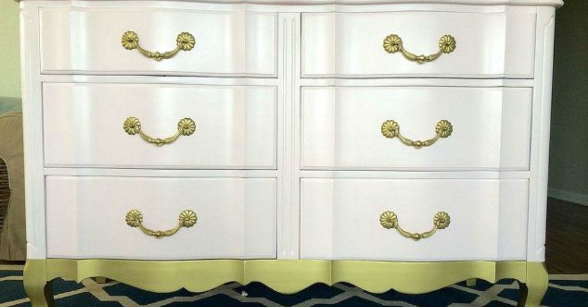
One of the most budget-friendly pink makeover ideas is painting or reupholstering a piece you already own. A tired dresser can become a chic bedroom accent with clay pink paint and brass knobs. A basic side table can look custom in muted coral. Dining chairs can be updated with dusty rose seat cushions.
This approach is ideal because the commitment is contained. You are not changing the entire room; you are giving one piece a second act. For best results, sand and prime furniture properly, choose a durable finish, and upgrade the hardware. Pink plus cheap hardware can look crafty. Pink plus handsome hardware looks intentional.
Try Color Drenching With a Muted Pink
Color drenching means using one color across multiple surfaces: walls, trim, doors, built-ins, and sometimes the ceiling. With a muted pink, this can create a cozy, enveloping room that feels designed from top to bottom. It works especially well in small rooms, powder rooms, home offices, and bedrooms.
The key is choosing a pink with complexity. Look for shades with beige, brown, gray, or terracotta undertones. A sophisticated pink drench should feel like plaster, clay, rose tea, or sun-warmed stonenot a plastic toy aisle. Use eggshell or matte on walls and a slightly higher sheen on trim for subtle contrast.
Make Pink Work in Minimalist Rooms
Minimalist spaces do not have to be colorless. In fact, pink can make minimalism feel warmer and less severe. The trick is to keep lines clean and the palette restrained. Think pale pink walls, cream upholstery, light oak furniture, one black lamp, and one oversized piece of art. That is enough.
In minimalist rooms, avoid too many small pink objects. They can look cluttered. Instead, use pink as one large gesture: a wall color, a rug, a bedspread, or a single sculptural chair. Let negative space do its job. Pink does not need backup dancers in every corner.
Use Hot Pink Sparingly but Boldly
Hot pink is not for the faint of heart, but it can be fantastic when used with discipline. Treat it like an accent spice. A hot pink lamp, lacquered tray, modern art print, chair piping, or inside of a bookshelf can electrify a room. The brighter the pink, the cleaner the surrounding palette should usually be.
Try hot pink with black and white for a graphic look, with red for a fashion-forward palette, with cobalt blue for high energy, or with camel and cream for a more balanced effect. The goal is not to make the room scream. The goal is to give it a pulse.
Room-by-Room Pink Makeover Ideas
Living Room
Start with blush pillows, a rose-toned rug, or a statement chair. If your living room is mostly beige or gray, pink will add warmth immediately. For a bigger makeover, try pale pink walls with white trim, wood furniture, and black accents.
Bedroom
Use dusty rose bedding, mauve curtains, or a pink upholstered headboard. Keep the palette soft with cream and taupe, or add drama with navy and deep green.
Kitchen
Consider blush backsplash tile, pink bar stools, coral artwork, or rosy dishware on open shelves. Pink works especially well with white oak, cream cabinets, brass fixtures, and green accents.
Bathroom
Try pink towels, a patterned shower curtain, blush tile, or a pale pink vanity. Add brass hardware and warm lighting to keep the look polished.
Home Office
A muted pink office can feel focused and calm without being boring. Pair it with walnut, black frames, cream storage, and a comfortable chair.
Common Pink Decorating Mistakes to Avoid
The first mistake is choosing a pink without testing it. Pink changes dramatically with light. A shade that looks soft in the store can look neon at noon or muddy at night. Always sample paint on more than one wall and observe it in morning, afternoon, and evening light.
The second mistake is using only smooth, shiny pink surfaces. Texture is what makes pink feel sophisticated. Add linen, velvet, wood, stone, woven baskets, aged brass, ceramic, or matte finishes.
The third mistake is forgetting balance. Pink needs contrast, even when it is pale. Add grounding colors like black, brown, navy, olive, burgundy, charcoal, or natural wood. Without contrast, pink can become too sweet. With contrast, it becomes interesting.
Personal Experience: How Pink Wins Over the Reluctant Decorator
The funny thing about pink is that most people do not reject it in real life. They reject the idea of it. I have seen plenty of rooms where someone says, “I hate pink,” while standing beside a vintage rug full of faded rose, rust, and blush tones that they absolutely love. They do not notice the pink because it is not performing as “pink.” It is acting as warmth, softness, age, and atmosphere.
One of the easiest ways to change your mind is to stop shopping by color name and start shopping by mood. Do you want a room to feel calmer? Try a gray-pink or dusty mauve. Do you want it to feel sunnier? Try peachy blush. Do you want a plain room to feel more designed? Add a raspberry accent in a small but confident dose. The name on the paint chip matters less than the feeling it creates when the room is finished.
In many makeovers, pink works best when it is not the star. For example, imagine a living room with a beige sofa, oak coffee table, cream walls, and black picture frames. It is fine, but maybe a little sleepy. Add two dusty rose pillows, a piece of art with blush and terracotta, and a small ceramic lamp in a clay-pink glaze. Suddenly the room has warmth and rhythm. Nothing looks aggressively pink. Everything simply looks better.
Another experience-backed lesson: pink becomes more acceptable when it is paired with materials people already trust. Put blush beside marble, and it feels elegant. Put it beside oak, and it feels warm. Put it beside black metal, and it feels modern. Put it beside rattan, and it feels relaxed. Put it beside burgundy velvet, and it looks like it owns a library card and a very good coat. Context changes everything.
For renters, pink is especially useful because small updates can have a big effect. You may not be able to renovate the bathroom, but you can add a muted rose shower curtain, warm bulbs, a wooden stool, and art with pink undertones. You may not be able to replace kitchen cabinets, but you can add blush dish towels, a runner with faded rose tones, or framed prints. These changes are affordable, reversible, and surprisingly powerful.
The best advice is to begin with the pink you almost do not recognize as pink. Look for shades that could be described as clay, plaster, rose beige, faded coral, or muted berry. Once you live with those tones, the fear usually fades. Pink stops looking like a theme and starts looking like a tool. And that is when the makeover magic happens: the color you thought you hated becomes the thing that makes the room feel finished.
Conclusion
You do not have to love bubblegum pink to appreciate what pink can do for a home. The right shade can warm up a cold room, soften sharp furniture, refresh tired neutrals, and add personality without chaos. Start with accents if you are cautious, try dusty rose or blush if you want sophistication, and use deeper or brighter pinks when a room needs confidence.
Pink is not just cute. It can be earthy, moody, tailored, glamorous, vintage, coastal, romantic, or modern. The trick is choosing the version that fits your space and pairing it with colors and textures that give it balance. So if you think you hate pink, do not worry. You may simply be one good makeover away from a very stylish apology.
Note: Before committing to pink paint, tile, or upholstery, test samples in your actual room and view them throughout the day. Lighting, flooring, and nearby colors can completely change how pink appears.