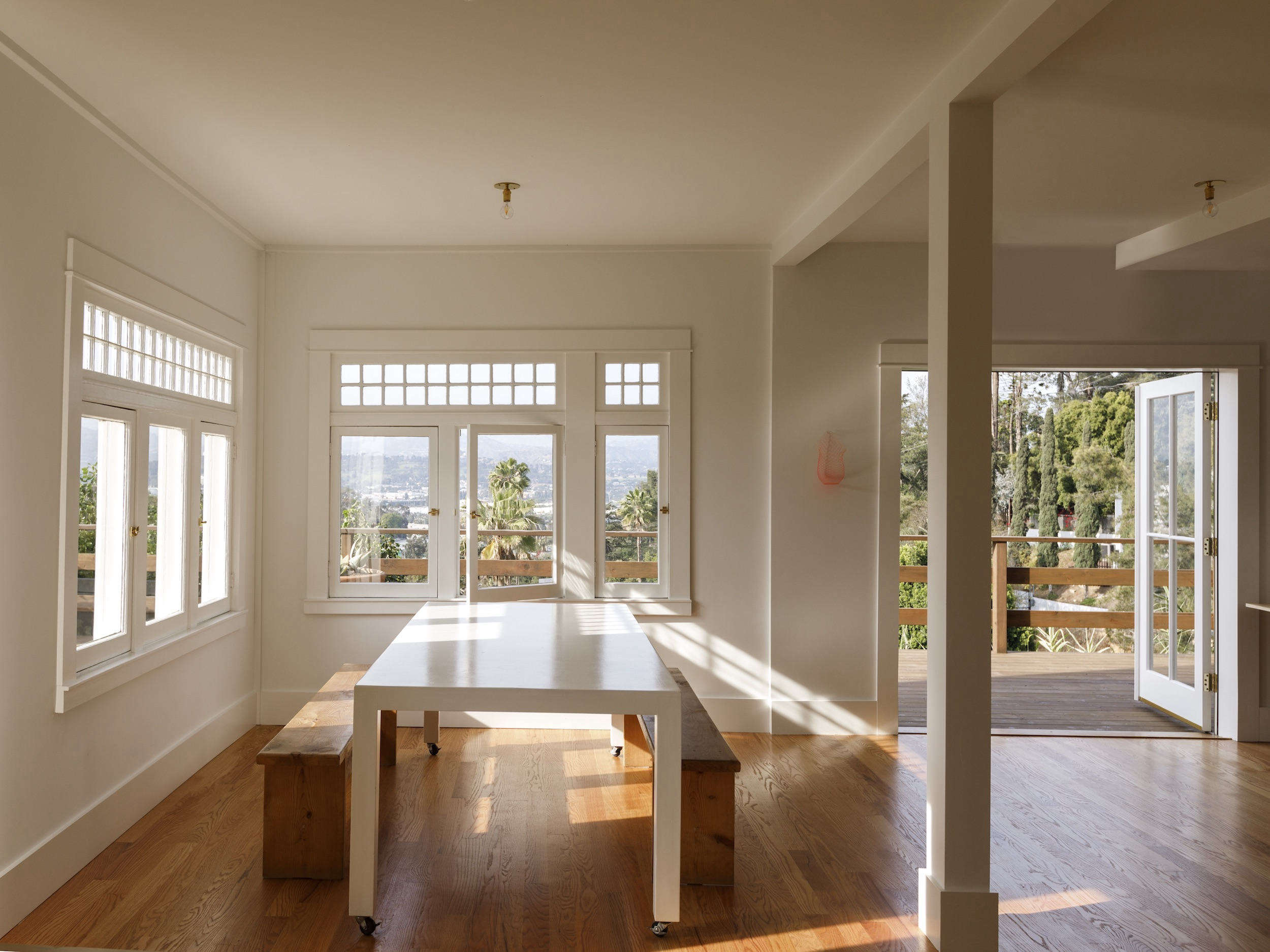
Some homes whisper. Some homes sing. And then there are homes that go through a full personality arc, like a character in a great Los Angeles indie film with excellent lighting and one extremely photogenic chair. Jewelry designer Kathleen Whitaker’s LA home is one of those rare interiors that has lived more than one design life. First, it embraced expressive color, historic charm, and a hands-on renovation spirit. Later, it shifted dramatically toward a quieter, more neutral language: white walls, warm wood, sculptural furniture, thoughtful restraint, and the kind of calm that makes your shoulders drop two inches the moment you walk in.
The story behind Shift to Neutral: Jewelry Designer Kathleen Whitaker’s LA Home 2.0 is not simply about painting everything white and calling it a day. That would be design’s version of ordering plain toast and pretending it is a tasting menu. Instead, Whitaker’s home shows how a neutral interior can feel layered, personal, creative, and deeply alive when it is guided by architecture, light, texture, and restraint.
Whitaker is known for minimal, architectural fine jewelry designed with precision and quiet impact. Her brand, launched in Los Angeles in 2003, built a following around geometric forms, mix-and-match studs, and later stone pieces that pair organic gemstones with sculptural simplicity. Her home, fittingly, reflects the same creative tension: reduction without coldness, simplicity without boredom, and detail without fuss. In other words, it is minimalism with a pulse.
The Evolution of Kathleen Whitaker’s LA Home
Kathleen Whitaker and her husband, cinematographer Bradford Whitaker, took on a turn-of-the-century house in Echo Park, a Los Angeles neighborhood known for hills, views, old homes, and that specific Eastside feeling of casual cool mixed with serious real estate envy. The house had history in its bones. Built in the early 1900s, it had been altered over time, including a period when it was divided into apartments. The couple’s first major project was not cosmetic fluff; it was a deep, hands-on restoration that brought the house back toward its original single-family form.
That first phase leaned colorful and expressive. The home had saturated walls, strong visual moments, plants, art, vintage finds, and a kind of cheerful unruliness. It made sense at the time. Old houses often tolerate color beautifully because color can soften quirks, celebrate unevenness, and turn architectural oddities into personality. A wall that is not perfectly straight suddenly looks charming in moss green. In white, it might look like it has been keeping secrets.
But homes, like people, are allowed to change. Whitaker’s later redesign moved in the opposite direction. The second version, or LA Home 2.0, reduced visual noise and embraced a neutral palette. The renovation was not as labor-heavy as the first restoration. Much of the transformation came from white paint, edited furnishings, quieter materials, and a clearer relationship between room, view, and light. The shift was mostly surface-level in method, but the emotional impact was huge.
Why the Neutral Shift Works
Neutral interiors can fail spectacularly when they are treated as a shortcut. Paint a room white, buy a beige sofa, add one sad bowl, and suddenly the space looks less like a refined retreat and more like a waiting room for very stylish ghosts. Whitaker’s home avoids that trap because the neutral palette is not the design. It is the stage.
The real stars are the original details: leaded glass windows, Douglas fir floors, intimate room proportions, hillside views, and the way Southern California light moves through the house. White walls create continuity between rooms, especially in an older home with smaller spaces and many transitions. Instead of each room announcing itself with a different color, the eye moves calmly from one area to the next. The home breathes.
This is one of the most useful lessons from the project. A neutral home does not have to erase character. It can reveal it. When the walls quiet down, wood grain becomes more visible. Window shapes matter more. Shadows become part of the decoration. A simple chair starts looking sculptural. Even a stack of books gets promoted from clutter to composition, which is excellent news for anyone whose nightstand currently resembles a small literary landslide.
Architecture First, Decoration Second
One reason Kathleen Whitaker’s Echo Park home feels so successful is that it respects the building. The couple restored flow, preserved original materials, and made adjustments that improved function without flattening the house into something generic. The repositioning of the front door, for example, helped clarify the entry sequence. That kind of decision is not flashy, but it changes how a home feels every single day.
In LA Home 2.0, decoration seems to follow architecture rather than fight it. The palette lets the house’s age remain visible. The warm wood floors keep the white walls from feeling sterile. The leaded windows add pattern without wallpaper. The views supply color without the need for a dramatic accent wall. It is an interior version of good jewelry styling: choose the right piece, place it well, and stop before you accidentally become a chandelier.
The Power of White Walls
White walls are often described as simple, but they are rarely easy. White changes constantly depending on natural light, artificial light, floor color, window direction, and surrounding materials. In a bright Los Angeles home, white can amplify daylight and create a sense of expansion. In a historic house, it can make small rooms feel connected. But the magic depends on warmth, contrast, and texture.
Whitaker’s home demonstrates why white works best when paired with wood, woven materials, ceramics, art, books, and natural imperfection. The effect is not blankness. It is visual clarity. A neutral palette becomes interesting when every object has a job: a chair adds curve, a rug softens sound, a bookcase builds rhythm, a ceramic piece brings handmade irregularity, and the floor contributes warmth from below like a very hardworking design intern.
Minimalism with Human Evidence
The best thing about this home is that it does not confuse minimalism with emptiness. There is still evidence of life. Books appear. Objects matter. Furniture is chosen, not merely placed. The rooms have air, but they are not allergic to personality. That distinction is crucial for anyone trying to create a neutral interior that feels livable rather than overly staged.
Modern design coverage has increasingly moved away from cold, impractical minimalism and toward interiors that feel warmer, more tactile, and more personal. That evolution fits Whitaker’s home perfectly. Her version of neutral is not about hiding everything. It is about editing until the right things can speak. If maximalism is a dinner party where everyone talks at once, this kind of minimalism is the friend who waits, says one perfect sentence, and somehow wins the evening.
Jewelry Thinking Applied to Interior Design
Kathleen Whitaker’s jewelry background gives the home an especially interesting lens. Jewelry design is about scale, proportion, material, negative space, and the relationship between body and object. Those same principles appear in her interiors. A small stud earring can change a face because of placement and proportion. A small chair, lamp, or ceramic vessel can change a room for the same reason.
The connection between her jewelry and her home is not literal. The house does not look like a necklace, thankfully. But it does share the same discipline. There is an emphasis on form, quiet confidence, and the beauty of things that are not trying too hard. Her Stone Collection introduced more texture and organic material into her work, while her home moved toward reduction. That push-pull is fascinating: as one creative outlet became more textural and colorful, the living environment became calmer and more restrained.
Texture Becomes the New Color
When a room loses bold color, texture has to step up and pay rent. In a neutral home, texture is what keeps the eye engaged. Wood floors, woven seating, matte ceramics, velvet upholstery, linen, stone, plaster, and aged finishes all create subtle variation. These materials do not scream for attention. They murmur, which is often much more elegant and far less likely to give your sofa a superiority complex.
This is where Whitaker’s house offers a practical design formula: reduce the palette, then increase the tactile range. Use white and warm neutrals as the base. Add honeyed wood, natural fiber, ceramics, and a few darker accents for grounding. Let plants and outdoor views bring in green. Allow books and art to introduce personal color in small doses. The result is calm but not flat.
The Echo Park Garden as Part of the Interior
Whitaker’s property is not only about the house. The garden plays a major role in the home’s atmosphere. Her Echo Park lot includes a substantial outdoor space with mature trees, shaded seating areas, pea gravel, succulents, jade, toyon, and layered planting. In Southern California, indoor-outdoor living is not just a design phrase; it is practically a civic religion, right up there with strong coffee and discussing traffic as a personality trait.
The neutral interior makes the garden more important. Greenery becomes a living color story seen through windows. Dappled light becomes decoration. The outdoor areas extend the calm of the house while adding texture, shade, and movement. This is one reason the neutral shift feels so natural in LA. When the outside world is generous with light, plants, sky, and hillside views, the interior does not need to compete. It can frame.
How to Get the Look Without Owning a Historic LA House
Most of us do not have a turn-of-the-century Echo Park house with original leaded windows and a cinematic garden. Rude, but true. Still, the design lessons are surprisingly adaptable. You do not need historic bones to borrow the logic of Whitaker’s LA Home 2.0. You need editing, warmth, proportion, and a willingness to let your rooms calm down.
1. Start with the Light
Before choosing paint, study how light moves through your home. A white that looks creamy in one room can look chilly in another. Test paint on multiple walls and watch it morning, afternoon, and evening. Neutral design succeeds when it responds to actual conditions, not just a saved image on your phone labeled “dream house, maybe when I become mysterious and rich.”
2. Keep the Best Existing Features
If your home has original wood floors, old windows, built-ins, vintage tile, exposed beams, or even one charmingly weird corner, consider making that the anchor. Neutral walls can help older details feel intentional. Do not erase the thing that gives the space its soul just because a showroom told you everything should be new.
3. Use Wood as Warmth
White walls need a counterweight. Wood is often the easiest and most timeless option. It can come through floors, tables, chairs, shelves, bowls, frames, or cabinetry. Warm wood tones keep neutral spaces from becoming clinical and add a natural richness that does not require bright color.
4. Edit, Then Edit Again
Whitaker’s neutral shift worked partly because pieces were removed, not just added. Editing is underrated because it is not as fun as shopping. But subtraction can be powerful. Remove what feels visually noisy, keep what has shape or meaning, and give important pieces room to breathe. Design sometimes begins with the brave act of admitting that the extra side table was never pulling its weight.
5. Add Texture Like You Mean It
A neutral room needs touchable surfaces. Think linen curtains, woven baskets, matte ceramic lamps, nubby rugs, aged wood, stone trays, velvet cushions, and handmade objects. These details prevent a light palette from feeling flat. Texture is the seasoning. Without it, the room is boiled chicken.
Why This Home Still Feels Relevant
Even years after its neutral transformation, Kathleen Whitaker’s LA home continues to feel current because it avoids trend-chasing. Warm minimalism, natural materials, wood tones, soft whites, and collected personal objects remain central to American interiors because they solve real problems. People want homes that feel calm but not empty, polished but not precious, designed but not untouchable.
The home also reflects a larger shift in design culture. The cold, image-first minimalism of the 2010s has softened. Today’s best neutral spaces are layered and functional. They welcome books, pets, coffee cups, art, plants, and the occasional human being who forgot to use a coaster. Whitaker’s home predicted that direction by showing that neutral does not mean lifeless. It means intentional.
Experience Notes: Living With a Neutral Home Inspired by Kathleen Whitaker
Anyone who has tried to live with a neutral interior knows the truth: calm takes work. A white room does not automatically become serene. Sometimes it becomes a place where every charging cable looks like a tiny act of rebellion. The experience of building a neutral home is really the experience of learning what you can remove, what you must keep, and what deserves to be seen.
The first lesson is that neutral design changes how you notice objects. In a colorful room, a strange little vase can hide in the crowd. In a neutral room, that same vase suddenly has stage presence. This can be wonderful if the object is beautiful, handmade, sentimental, or sculptural. It can be less wonderful if the object is a random promotional mug from 2014. A neutral home gently asks every item, “Are you here on purpose?” Some items answer confidently. Others quietly pack their bags.
The second lesson is that maintenance becomes part of the aesthetic. Light walls and pale upholstery can be forgiving in spirit but not always in practice. That does not mean you should avoid them. It means you choose better materials. Washable slipcovers, textured rugs, natural wood with visible grain, and finishes that age gracefully are your friends. A home should not require its residents to hover nervously over guests with a napkin and a threat.
The third experience is emotional. Neutral rooms can make daily life feel slower. Morning light looks softer against white walls. Plants become more vivid. Books feel more inviting. A wood table gathers small marks that begin to look like memory rather than damage. The room becomes a quiet backdrop for life instead of a design performance demanding constant applause.
There is also a creative benefit. A neutral home is easier to change without starting from zero. Swap a rug, move a chair, bring in a new ceramic piece, add seasonal branches, or rotate artwork, and the room shifts. This flexibility is especially useful for restless design lovers, the kind of people who mentally renovate their kitchen while waiting for toast. Whitaker’s own approach suggests that a home can be a laboratory, but a calm one. The experiment does not need to explode every weekend.
The most valuable experience, however, is learning restraint without losing warmth. A neutral home should still smell like coffee, hold stacks of books, welcome friends, and make room for the slightly imperfect rhythms of daily life. Kathleen Whitaker’s LA Home 2.0 is inspiring because it does not present neutrality as a lack of personality. It presents neutrality as confidence. The house no longer needs to shout because it knows exactly what it is saying.
Conclusion: The Beauty of the Quiet Reset
Shift to Neutral: Jewelry Designer Kathleen Whitaker’s LA Home 2.0 is more than a makeover story. It is a study in creative evolution. The house began with color, restoration, and expressive energy. It later moved toward white walls, warm materials, edited furnishings, and a closer relationship with light and landscape. Both versions had merit, but the neutral transformation revealed something deeper: restraint can be just as personal as exuberance.
For homeowners, renters, design lovers, and anyone currently staring at a paint deck in mild emotional distress, Whitaker’s home offers a practical reminder. Neutral design is not about giving up color. It is about choosing where attention goes. Let the architecture speak. Let texture carry interest. Let wood add warmth. Let the view become art. Let the room breathe. And when in doubt, remove one thing before adding three more. Your house may thank you. Your closet, however, remains a separate negotiation.