Most people open Microsoft Paint to crop a screenshot, circle something in red, or create a masterpiece titled “dog, maybe horse.” Pat Hines looked at the same humble Windows tool and apparently thought, “Yes, this is where I shall build an illustrated world of haunted woods, summer-camp chaos, revenge plots, monsters, and 1980s nostalgia.”
The result was Camp Redblood And The Essential Revenge, a self-published illustrated ebook that became internet-famous because its artwork was made in Microsoft Paint. Not Photoshop. Not Illustrator. Not a tablet loaded with expensive brushes. Microsoft Paint: the digital equivalent of a cafeteria napkin and a ballpoint pen, except Hines somehow used it like a one-person animation studio with a suspicious amount of patience.
His story is funny on the surface: a guy admits he is bad at Photoshop, spends a decade getting weirdly good at MS Paint, and then uses it to illustrate his book. But underneath the joke is a surprisingly useful lesson about creativity, self-publishing, digital art, and the difference between having the “best” tools and actually mastering the tools you have.
Who Is Pat Hines, And Why Did The Internet Care?
Pat Hines, also known online as Captain Redblood, is a Boston-based writer and artist. He is connected with the world of storytelling in more ways than one: he has written fiction, worked as a camp counselor, and built his Camp Redblood universe around the kind of spooky, funny, slightly unhinged summer-camp energy that feels like someone tossed 1980s adventure movies, ghost stories, and teen mischief into a blender.
The detail that made his work go viral was not simply that he illustrated a book. Plenty of authors draw their own covers or add illustrations to indie ebooks. The hook was that Hines created detailed, atmospheric, full-color images in Microsoft Paint after admitting he never really got along with Photoshop or other advanced design programs.
That confession was instantly relatable. Anyone who has opened Photoshop for the first time knows the feeling: panels everywhere, mysterious masks, layers behaving like cursed parchment, and a toolbar that looks like it was designed by a committee of wizards. Paint, by contrast, is blunt. It gives you basic brushes, lines, shapes, fill tools, color pickers, text, and a canvas. No dramatic learning curve. No “professional workflow.” No emotional support group required.
Instead of fighting with software that made him miserable, Hines kept returning to the tool he knew. Over roughly ten years, he developed enough control to create illustrations that looked far more complex than most people expect from MS Paint. The internet loves a good underdog story, and this one came with pixels.
The Book: Camp Redblood And The Essential Revenge
Camp Redblood And The Essential Revenge is a summer-camp adventure with a horror-comedy flavor. The story centers on a camp world filled with awkward heroes, bullying villains, monsters, haunted woods, and revenge schemes that do not always go according to plan. In other words, it understands a core truth of camp fiction: give teenagers a forest, a rivalry, and limited adult supervision, and suddenly everyone is one bad decision away from local folklore.
The book’s setting leans into 1980s nostalgia, but not in a sterile museum-display way. It has the energy of old adventure posters, ghost tales told with a flashlight under the chin, and the kind of camp drama where a rival camp is treated like an enemy nation. Hines’ illustrations help sell that mood. They are not just decorative extras; they make the fictional world feel louder, stranger, and more lived-in.
That matters because self-published books often struggle to stand out. The market is crowded, covers can look generic, and readers make quick judgments. Hines’ MS Paint artwork gave his book a memorable identity. It also created an irresistible story around the story: the author did not merely write a weird camp adventure; he illustrated it with a tool many people associate with childhood doodles and office boredom.
Why Microsoft Paint Was The Perfect “Bad” Tool
On paper, Microsoft Paint is a terrible choice for detailed illustration. For most of its life, it lacked the advanced conveniences artists expect: robust layer systems, professional brushes, complex blending options, non-destructive editing, and sophisticated filters. That is exactly why Hines’ work is so interesting.
When a tool is limited, the artist has to solve problems manually. Want shading? Build it slowly. Want texture? Create it by hand. Want depth, lighting, atmosphere, and tiny visual jokes? You cannot simply download a brush pack and hope for the best. You have to understand the image well enough to construct it piece by piece.
That is where limitation becomes a creative gym. Paint forces decisions. It makes you commit. It strips away the temptation to spend two hours organizing brushes instead of drawing the haunted bus, creepy lodge, or monster lurking in the woods. In Paint, the workflow is honest: click, drag, undo, panic, zoom in, repeat.
Hines’ Microsoft Paint art became impressive not because the software was secretly powerful, but because he learned how to push its simple features far beyond ordinary use. That is the difference between using a tool and developing a craft. A beginner sees Paint as a toy. A patient artist sees it as a stubborn little machine that will eventually cooperate if you keep showing up.
Photoshop Is Powerful, But Mastery Is Personal
Photoshop remains an industry-standard program for photo editing, digital painting, compositing, and design. There is no serious argument that old-school MS Paint can match it feature for feature. But Hines’ story is not really about whether Paint is “better” than Photoshop. It is about whether the most advanced tool is always the best tool for a particular creator.
For some artists, Photoshop feels like freedom. For others, it feels like sitting in the cockpit of a plane when all they wanted was a bicycle. Hines chose the bicycle and then learned to do tricks with it for ten years.
This is a valuable lesson for writers, illustrators, bloggers, designers, and anyone trying to make something. The tool that keeps you creating is often better than the tool that makes you feel professional but frozen. If a simple program removes friction, it can become more productive than a sophisticated program that makes every project feel like a tax audit with gradients.
How His MS Paint Style Works
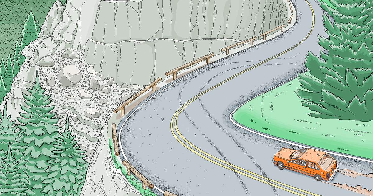
The most striking thing about Hines’ illustrations is how much atmosphere they carry. Viewers often expect Paint artwork to be flat, stiff, or intentionally crude. His images, by contrast, use composition, contrast, lighting, and tiny details to create scenes that feel cinematic.
1. He Builds Scenes Like Movie Posters
Many of the illustrations connected to Camp Redblood feel influenced by adventure and horror posters. There is a strong sense of staging: characters, vehicles, camp buildings, trails, monsters, and dramatic skies are arranged to guide the viewer’s eye. This gives the images a narrative quality. You are not just looking at an object; you are looking at a moment before or after something chaotic happens.
2. He Uses Detail As A Punchline
Part of the humor is visual. A camp bus, a lodge, or a group of troublemaking characters can be packed with little choices that reward close looking. That is especially funny when you remember the tool involved. The more detailed the image becomes, the more absurd the process seems. It is like watching someone build a cathedral with a spoon and then politely ask if you noticed the gargoyles.
3. He Turns Nostalgia Into Setting
The 1980s camp atmosphere is not just a label. The art helps create the mood: old vehicles, wooded paths, camp structures, spooky night scenes, and the slightly exaggerated tone of retro adventure fiction. The images understand that nostalgia works best when it feels specific, not when it simply throws neon colors at the wall and calls it a decade.
Why The Story Went Viral
Hines’ Microsoft Paint project had all the ingredients the internet loves: an ordinary tool, an unexpected result, a self-deprecating origin story, and proof that obsession can produce something beautiful and ridiculous at the same time.
The headline practically writes itself: someone bad at Photoshop becomes shockingly good at Paint. It is funny because it reverses what most people expect. Usually, artists “graduate” from simple programs to professional ones. Hines did the opposite. He stayed with the basic tool long enough to make it impressive.
It also tapped into widespread affection for Microsoft Paint. For many Windows users, Paint was one of the first digital creative spaces they ever touched. It was where people made terrible birthday cards, pixel monsters, fake logos, desktop backgrounds, school-project graphics, and little drawings that looked like they had been created during a power outage. Seeing someone turn that familiar app into a serious illustration tool felt both nostalgic and inspiring.
What Creators Can Learn From Pat Hines
The biggest lesson is not “quit Photoshop and use Paint.” Please do not abandon your entire workflow because one Boston artist achieved pixel wizardry through stubbornness. The real lesson is more practical: consistency beats tool envy.
Many creators waste months waiting for the perfect software, perfect camera, perfect desk, perfect notebook, perfect font, or perfect moment when life suddenly becomes quiet and organized. That moment rarely arrives. Hines’ story shows the opposite path. Start with what is available. Keep using it. Learn its weaknesses. Turn those weaknesses into style.
Another lesson is that constraints can create a recognizable voice. If Hines had used a polished professional workflow from the beginning, his illustrations might still have been strong, but the story around them would have been less distinctive. The “made in Microsoft Paint” detail became part of the art’s identity. It gave the book a built-in conversation starter.
That is useful for indie authors and bloggers, too. In a crowded digital world, a memorable creative process can help people care. Readers do not only respond to finished products; they respond to the human effort behind them. A book illustrated in MS Paint for ten years is not just a book. It is a saga with a toolbar.
Microsoft Paint Then And Now
Microsoft Paint has changed over the years, but its cultural identity remains rooted in simplicity. It has been part of the Windows experience for decades, and many users still think of it as the friendly little drawing app that was always there. When Microsoft once signaled that Paint might be moved away from its traditional role, the reaction showed how emotionally attached people were to the program.
Modern versions of Paint have gained new features, including tools that make the app more useful for everyday editing and digital creation. But the legend of old Paint remains powerful because it represents accessibility. You did not need a subscription, a studio, or formal training to begin. You just needed a mouse, a blank canvas, and enough confidence to draw something hideous until it became slightly less hideous.
That accessibility is part of why Hines’ story still resonates. It reminds people that creativity does not always begin in professional spaces. Sometimes it begins at a reception desk during overnight hours, in a basic Windows app, with someone slowly figuring out how to make a haunted summer camp look alive.
The Funny Truth About “Bad” Tools
Calling Microsoft Paint a “bad” tool is both fair and unfair. It is fair because compared with advanced digital art software, old Paint is limited. It is unfair because a tool is only bad if it prevents the right person from making the right thing. Hines proved that a basic program could become surprisingly expressive in the hands of someone willing to practice far longer than common sense recommends.
The same thing happens across creative fields. Great photos can be taken with cheap cameras. Great songs can be written on battered guitars. Great essays can begin in the Notes app. Great meals can come from tiny kitchens with one good pan and a heroic amount of garlic. The premium tool may help, but it does not create taste, discipline, humor, or imagination.
In Hines’ case, Paint became part of the charm. The work carries the energy of someone who refused to wait for permission from “real” software. He made the thing anyway. That is why people responded: not just because the images were detailed, but because the whole project felt like a victory for stubborn creativity.
Why This Matters For Self-Published Authors
Self-published authors often face a brutal challenge: they have to be writer, marketer, designer, editor, project manager, and emotional support animal for themselves. A book needs a hook, and that hook cannot always be “I wrote a book,” because thousands of other people did too.
Hines’ process gave Camp Redblood And The Essential Revenge a hook that was visual, memorable, and easy to share. People could understand it instantly: this guy made all this in Microsoft Paint. That simple sentence invited curiosity. Curiosity led to clicks. Clicks led people to the book.
For indie creators, the takeaway is clear: your process can be part of your positioning. Maybe you write every chapter on a train. Maybe you illustrate with vintage software. Maybe you create horror stories based on regional folklore. Maybe you cook every recipe in a studio apartment kitchen smaller than a suitcase. The behind-the-scenes story can give readers a reason to pay attention before they even know the plot.
Experiences Related To This Story: What MS Paint Teaches About Creativity
Anyone who has ever tried to make something ambitious with a simple tool understands the emotional roller coaster behind Hines’ achievement. At first, the tool feels charming. Then it feels limiting. Then it feels insulting. Eventually, if you keep going, it starts to feel like a language. You stop asking, “Why can’t this program do what I want?” and start asking, “How can I make what I want using what this program can do?”
That shift is huge. It is the moment a beginner becomes a problem-solver. In Paint, you learn to fake softness with careful color choices. You learn to suggest depth with shadows and perspective. You learn to create texture through repetition, not magic. You learn that zooming in is both a blessing and a trap, because suddenly one tree trunk becomes a two-hour commitment and dinner becomes cereal at midnight.
The experience is not limited to digital art. Writers face the same thing with language. A sentence is a simple tool. It has no special effects. No cinematic soundtrack. No automatic applause button. Yet a patient writer can use ordinary words to build suspense, humor, sadness, or a full fictional world. The limitation is not the enemy; often, it is the shape of the challenge.
There is also something psychologically freeing about using a tool that is not considered elite. When people work in professional software, they sometimes feel pressure to produce professional results immediately. That pressure can kill experimentation. A humble tool lowers the stakes. Nobody opens Microsoft Paint expecting a museum piece. That makes it easier to play, fail, revise, and accidentally discover a style.
Hines’ decade-long Paint journey also proves that boredom can be creatively useful. Many people try to eliminate every dull moment with scrolling, streaming, and constant noise. But long, quiet stretches can become incubators. If you have a notebook, a laptop, a drawing app, or even a basic tool that everyone else ignores, boredom can push you into practice. The trick is staying with the work long enough for awkward experiments to become skill.
For bloggers, illustrators, indie authors, and students, this story is a permission slip. You do not need to wait until you own the best software or understand every feature. You can begin with the tool in front of you. You can be bad at the “right” program and still become excellent with the “wrong” one. You can turn a limitation into a signature. And, with enough patience, you might even make Microsoft Paint look like it has been hiding a tiny art school under the hood all along.
Conclusion: Talent Is Great, But Stubbornness Has A Mouse
Pat Hines’ Microsoft Paint illustrations are more than a quirky internet story. They are a reminder that creative mastery often comes from repetition, constraints, and the willingness to look a little ridiculous while learning. He did not wait to become a Photoshop expert before building his illustrated world. He used the tool he knew, practiced for years, and turned that unlikely choice into the very thing that made his book stand out.
That is why the story of the guy who “sucks at Photoshop” still works. It is funny, yes, but it is also encouraging. It tells every creator with imperfect tools, limited time, and a messy process that the work can still matter. Sometimes the best creative decision is not upgrading your software. Sometimes it is opening the simple app, making one more image, and refusing to quit until the haunted camp finally looks haunted enough.
Note: This article is based on publicly available information about Pat Hines, Camp Redblood And The Essential Revenge, Microsoft Paint culture, and digital illustration trends, rewritten in original language for web publication.