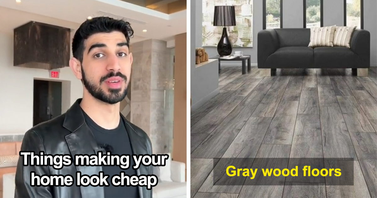
A house does not look cheap because the owner has a modest budget. Let’s clear that up before the throw pillows start sweating. Some of the most beautiful homes are humble, collected, and full of smart choices. A space starts looking cheap when it feels careless, overly trendy, badly scaled, or stuffed with items that are pretending to be something they are not.
That is why the phrase “it sucks the life out of any space that you have” hits so hard. Luxury interior designers often use similar language when talking about design mistakes that flatten a room: tiny furniture floating in a large space, cold gray walls everywhere, fake luxury materials, harsh lighting, cluttered shelves, and decor that looks like it came home in one giant shopping-cart avalanche.
The good news? Making your house look expensive is not about buying the most expensive sofa in the showroom or installing a chandelier so dramatic it needs its own zip code. It is about proportion, texture, intention, editing, lighting, and choosing fewer things with more personality. Below, we break down the biggest interior design mistakes that make a house look cheapand how to fix them without emptying your bank account or developing a personal relationship with your credit card’s fraud department.
What Really Makes a House Look Cheap?
A cheap-looking home usually suffers from one major problem: lack of intention. The room may be full of things, but the things are not talking to each other. The rug is too small, the sofa is too low, the curtains are too short, the lighting is too harsh, and the accessories are multiplying like decorative rabbits.
Luxury interiors, by contrast, feel considered. They do not always look perfect, but they look deliberate. A high-end room usually has a few key ingredients: proper scale, layered lighting, natural materials, restrained styling, comfortable seating, and at least one element that feels personal instead of purchased because an algorithm whispered, “People who bought this also bought twelve identical vases.”
1. Furniture That Is Too Small for the Room
One of the fastest ways to make a house look cheap is to fill it with furniture that is too small. Tiny sofas, skinny coffee tables, undersized nightstands, and little accent chairs can make a room feel nervous, unfinished, and oddly temporary. In a large living room, small furniture does not create elegance. It creates the feeling that everyone is waiting for the real furniture to arrive.
Scale is one of the quiet secrets of luxury interior design. A generous sofa, a substantial coffee table, full-height curtains, and a rug large enough to anchor the seating area can instantly make a room feel more expensive. Even in a small apartment, the solution is not dollhouse furniture. Choose fewer pieces with better proportions. A compact room can still handle a real sofa, a full-size mirror, or one bold piece of art.
How to fix it
Measure before you buy. The front legs of sofas and chairs should usually sit on the rug, or the entire seating group should fit comfortably on it. Nightstands should relate to the height of the bed. Art should be large enough to hold the wall. When in doubt, go bigger with fewer pieces rather than scattering small objects everywhere.
2. Rugs That Look Like Bath Mats With Ambition
A too-small rug is a classic design mistake. It makes furniture look disconnected and causes the entire room to feel like it is slowly drifting apart. In a living room, a rug should not sit alone in the center like a tiny island of fabric. It should visually connect the seating area and make the room feel grounded.
This mistake is common because large rugs can be expensive. But a small rug in the wrong place often makes everything else look cheaper, including the good furniture you already own. A better strategy is to choose a larger natural-fiber rug, shop vintage, layer rugs, or wait until you can buy the correct size.
How to fix it
For living rooms, choose a rug large enough for at least the front legs of the main furniture pieces. In dining rooms, the rug should extend beyond the table so chairs stay on the rug when pulled out. In bedrooms, the rug should extend well beyond the sides and foot of the bed. Your toes deserve a soft landing, not a postage stamp.
3. Harsh Overhead Lighting
Nothing drains the life from a beautiful space faster than one cold ceiling light blasting down like an interrogation room. Harsh overhead lighting makes colors look flat, skin look tired, and furniture look less inviting. It also removes the shadows and warmth that give a room depth.
Expensive-looking homes usually rely on layered lighting. That means a mix of overhead lighting, table lamps, floor lamps, wall sconces, picture lights, and sometimes candles. The goal is not to flood the room with brightness. The goal is to create mood, function, and atmosphere.
How to fix it
Use warm bulbs, add dimmers where possible, and place light sources at different heights. A living room may need a floor lamp beside a reading chair, a table lamp near the sofa, and a softer overhead fixture. A bedroom looks instantly more polished with matching or coordinated bedside lamps. A kitchen can feel more high-end with under-cabinet lighting and pendants that suit the scale of the island.
4. Cluttered Surfaces and Over-Styled Shelves
Clutter is not the same as personality. A room can be layered, collected, and interesting without every surface carrying seventeen candles, four trays, six books, and a ceramic object shaped like a confused pear. Too many accessories make a space feel visually noisy, and visual noise often reads as cheap.
Luxury interiors usually give objects room to breathe. A single sculptural bowl on a coffee table can look more elegant than five random objects fighting for attention. Open shelving looks better when it includes negative space, varied heights, books, art, and a few meaningful piecesnot every souvenir, vase, and mystery cable in the house.
How to fix it
Edit in rounds. Remove everything from a surface, then put back only the best pieces. Group small items on trays. Hide daily clutter in baskets, drawers, or cabinets. Keep cords, remotes, mail, and chargers from becoming part of the decor scheme unless your theme is “airport lost and found.”
5. Matching Furniture Sets
A matching bedroom or living room set can feel convenient, but it often makes a home look like a showroom instead of a lived-in space. When the sofa, chairs, tables, lamps, and TV console all share the same finish and style, the room loses depth. It may be coordinated, but it is not interesting.
High-end interiors typically mix materials, eras, textures, and silhouettes. A wood coffee table can sit with upholstered chairs, a metal floor lamp, a vintage side table, and contemporary art. The trick is to create harmony without making every piece identical.
How to fix it
If you already own a matching set, break it up. Move one piece to another room, repaint a nightstand, replace the hardware, or add contrasting lamps and textiles. Mix wood tones carefully, repeat one or two colors, and vary textures so the room feels collected rather than copied.
6. Cheap-Looking Window Treatments
Short curtains, shiny polyester panels, bent blinds, and flimsy rods can make an otherwise nice room look unfinished. Window treatments are often overlooked, but they take up major visual space. When they look cheap, the room feels cheap.
The most expensive-looking approach is usually simple: hang curtains high and wide, use enough fabric for fullness, and choose materials with good drape. Linen, cotton, velvet, and quality blends often look better than thin synthetic panels. If custom drapery is not in the budget, well-chosen ready-made curtains can still look polished when properly sized and installed.
How to fix it
Mount curtain rods close to the ceiling and extend them beyond the window frame. Let curtains touch or nearly touch the floor. Avoid panels that are too narrow. Upgrade cheap plastic blinds when possible. If the choice is between bad curtains and no curtains, sometimes clean, bare windows with good trim look better than fabric that screams, “I was bought at midnight in a panic.”
7. Fake Luxury Materials
Trying to imitate luxury too literally can backfire. Faux marble contact paper, plastic frames pretending to be brass, peel-and-stick tiles that are lifting at the corners, and shiny fake wood finishes often make a room look less expensive than honest, simple materials.
Luxury does not require marble, silk, or hand-carved walnut. It requires materials that feel authentic for the budget. A simple painted wall can look better than fake stone. A modest wood frame can look better than plastic pretending to be gilded metal. A clean ceramic tile can look better than a temporary backsplash that starts peeling before your coffee finishes brewing.
How to fix it
Choose honest materials. Use real wood where possible, quality paint, natural fibers, ceramic, stone, glass, and metal finishes that do not look overly shiny or artificial. If you love a high-end look, interpret it rather than imitate it. You do not need fake marble everywhere; you may just need a beautiful tray, a stone lamp base, or a clean, classic countertop.
8. Too Many Trends in One Room
Trends are fun. They keep homes from looking frozen in time. But when a room includes every trending item at oncebouclé chair, arched mirror, checkerboard rug, mushroom lamp, wavy candles, fluted cabinet, and three beige abstract printsit can look dated before the delivery boxes are recycled.
A home looks cheap when it feels like it was decorated in one weekend from the same social media feed. The more trend-heavy a space is, the faster it ages. Timeless rooms can still include trends, but they use them like seasoning, not soup.
How to fix it
Choose one or two trends you genuinely love and balance them with classic shapes, personal art, vintage pieces, and practical materials. Before buying a trendy item, ask yourself: “Would I still like this if nobody online liked it?” If the answer is no, save your money for something with staying power.
9. All-Gray or All-White Rooms With No Warmth
Gray and white can be beautiful, but when every wall, sofa, rug, cabinet, and accessory is cold gray or stark white, the room can feel lifeless. This is where the “sucks the life out of any space” idea really makes sense. A home needs contrast, warmth, and texture to feel alive.
Many builder-grade homes rely on safe neutrals, but safe can quickly become sterile. The fix is not necessarily bold color. Warm woods, woven textures, aged brass, creamy whites, soft browns, muted greens, plaster finishes, and layered textiles can all bring depth without turning your living room into a paint fan deck.
How to fix it
Add warmth through wood furniture, textured rugs, linen curtains, warmer bulbs, art, plants, and accent colors. If you love neutrals, mix several tones: cream, taupe, camel, walnut, charcoal, and soft black. A neutral room should feel layered, not refrigerated.
10. Builder-Grade Hardware and Fixtures
Cabinet knobs, faucets, switch plates, door handles, and light fixtures may seem small, but they have a big effect. Cheap, flimsy, or outdated hardware can quietly drag down an entire room. The same goes for basic flush-mount lights that look like sad ceiling pancakes.
Upgrading hardware is one of the most effective ways to make a house look more expensive without renovating. A kitchen can feel fresher with new cabinet pulls. A bathroom can look sharper with a better mirror, faucet, and lighting. Even replacing yellowed switch plates can make walls look cleaner.
How to fix it
Choose consistent finishes, but do not be afraid to mix metals thoughtfully. Matte black, unlacquered brass, polished nickel, bronze, and stainless steel can all work when repeated intentionally. Avoid hardware that feels too lightweight. Good hardware should feel solid in your hand, not like it came as a bonus prize in a cereal box.
11. Art Hung Too High or Chosen Too Randomly
Art can make a home feel personal, sophisticated, and warm. But art hung too high, too small, or scattered randomly can make walls feel chaotic. Mass-produced art can also look flat when it appears in every rental, waiting room, and online staging photo.
You do not need expensive original art to create an elevated look. Framed prints, vintage posters, family photography, textile art, student work, and personal collections can all look beautiful when framed and placed well.
How to fix it
Hang art at eye level, usually with the center around 57 to 60 inches from the floor. Above furniture, choose pieces that are roughly two-thirds the width of the sofa, console, or bed. Use larger frames and mats to give smaller prints presence. Replace generic wall art with pieces that actually mean something to you.
12. Visible Cords, Random Storage, and Everyday Mess
Even a beautifully designed room can look cheap when cords, chargers, mail piles, toy bins, cleaning supplies, and random objects are always visible. Real homes are meant to be lived in, not staged like museums, but the best interiors make daily life easier to hide.
Good storage is not just practical; it is visual luxury. A room feels calmer when every item has a home. That does not mean you need built-ins everywhere. Baskets, closed cabinets, storage ottomans, trays, hooks, and drawer organizers can make a huge difference.
How to fix it
Use cord covers, cable boxes, furniture with closed storage, and baskets that match the room’s style. Create drop zones near entrances. Keep kitchen counters as clear as possible. Store fewer things in plain sight. The goal is not perfection; the goal is to make the room look like it has a plan.
How to Make Your Home Look Expensive on a Budget
The most powerful budget design rule is simple: buy less, but choose better. A room with five thoughtful pieces often looks richer than a room with fifty cheap ones. Instead of filling every corner quickly, let your home evolve. Wait for the right lamp. Save for the better rug. Buy vintage instead of fast furniture. Reframe old art. Paint a room properly. Upgrade one fixture at a time.
Here are a few high-impact, lower-cost upgrades that work in almost any home:
- Use warm, layered lighting instead of one harsh overhead light.
- Paint walls, trim, or doors for a cleaner and more intentional look.
- Replace flimsy hardware with heavier, better-designed pieces.
- Choose larger rugs and hang curtains higher.
- Edit accessories and leave breathing room on shelves and tables.
- Add texture through linen, wool, wood, ceramic, woven baskets, and plants.
- Frame personal art or photographs in simple, quality frames.
Expensive-looking design is not about pretending to be rich. It is about avoiding choices that feel temporary, fake, or careless. When a room has balance, warmth, function, and personality, it automatically feels more elevated.
Personal Experience: What I Learned From Rooms That Looked Cheap Before They Looked Chic
One of the most useful lessons I have learned about interior design is that the problem is rarely one single ugly item. It is usually the combination. A cheap-looking living room might have a decent sofa, a nice coffee table, and good natural light, but then the rug is too small, the curtains are too short, the shelves are crowded, the bulbs are icy white, and the art is floating near the ceiling like it is trying to escape. Nothing is tragic by itself. Together, the room feels off.
I have seen spaces transform without major renovations simply because someone edited them. In one living room, the owner thought the sofa was the problem. It was not. The real issue was that everything around it was too small. The coffee table looked timid, the rug barely reached the furniture, and the wall art was the size of a serving tray. Once the rug was replaced with a larger one, the art was scaled up, and a floor lamp added height, the same sofa suddenly looked intentional. It did not become more expensive overnight; it became better supported.
Another common experience is the “too many cute things” problem. People often collect small decor because it feels affordable and harmless. A candle here, a mini vase there, a little sign, a tiny plant, a seasonal object, a souvenir, another candle because apparently we are preparing for a decorative power outage. Eventually, every surface looks busy. The fix is not to remove personality. The fix is to curate it. Three meaningful objects on a shelf can say more than twenty forgettable ones.
Lighting is another design lesson that never stops proving itself. I have watched rooms go from dull to expensive-looking just by changing bulbs and adding lamps. Warm light softens edges. It gives wood depth, makes fabric look richer, and turns a room from “public restroom adjacent” into “please sit down and stay awhile.” If a space feels lifeless, lighting is often the first place to look.
The biggest experience-based takeaway is this: a beautiful home should not feel like a showroom. The most memorable interiors have signs of life. A vintage chair, a slightly imperfect handmade bowl, framed family photos, books that someone actually reads, and colors chosen because the owner loves themnot because they are trendingmake a home feel richer. Cheapness is not about price. Cheapness is about thoughtlessness. When you decorate with patience, scale, honesty, and personal meaning, even a simple room can feel luxurious.
Conclusion
A house looks cheap when design decisions feel rushed, fake, mismatched, or out of proportion. Small furniture, tiny rugs, harsh lighting, cluttered surfaces, flimsy window treatments, fake luxury finishes, and too many trends can all drain the energy from a room. But every one of these problems has a practical fix.
To make your home look more expensive, focus on intention. Choose the right scale. Layer your lighting. Buy fewer but better pieces. Use authentic materials. Edit your decor. Mix old and new. Add warmth, texture, and personality. A stylish home does not need to announce that it is expensive. It simply needs to feel thoughtful, comfortable, and alive.
Note: This article is intended for general home design and decorating inspiration. The best choices for any space depend on architecture, lifestyle, budget, climate, and personal taste.