Creating a logo sounds like something that requires a black turtleneck, a design degree, and a suspiciously expensive espresso machine. Good news: it does not. If you already have Microsoft Publisher on your computer, you can build a clean, professional-looking logo using tools you probably already understandtext boxes, shapes, colors, alignment guides, WordArt, and picture export options.
Microsoft Publisher is not a dedicated logo design program like Adobe Illustrator or CorelDRAW, and it is not the best choice for complex vector artwork. But for small businesses, school projects, community groups, blogs, Etsy shops, church bulletins, side hustles, and personal branding, Publisher can absolutely help you create a simple logo that looks polished instead of “I made this at 1:00 a.m. while arguing with clip art.”
This guide walks you through how to create a logo in Microsoft Publisher in eight easy steps. You will learn how to plan your design, set up your page, add shapes and text, choose fonts and colors, group your logo elements, export the finished file, and avoid the common mistakes that make a logo look crowded, blurry, or confusing.
Why Use Microsoft Publisher to Create a Logo?
Microsoft Publisher is designed for desktop publishing, which means it focuses on layout, text, images, and print-ready materials. People often use it for flyers, brochures, business cards, newsletters, labels, menus, invitations, and marketing materials. Since logos often need to appear on those exact items, Publisher can be a practical place to create and test a basic brand mark.
The biggest advantage is familiarity. If you know how to insert a shape, change a font, move a text box, and save a file, you already have the foundation. Publisher also lets you arrange objects precisely, group multiple elements, use alignment tools, apply color themes, and export your design as a picture or PDF. That makes it useful for creating a simple logo that can be used in print and digital materials.
There is one important note: Microsoft has announced that Publisher will no longer be supported after October 2026. Until then, users can continue using the program with its current functionality. If you plan to build long-term brand assets, save your logo in several common formats, such as PNG, JPG, PDF, and the original PUB file, so you are not trapped later in a file-format cave with only a flashlight and regret.
Before You Start: What Makes a Good Logo?
A good logo is not simply “a pretty picture with a business name glued to it.” It should be simple, readable, memorable, and flexible enough to work on different materials. A logo that looks great on a full-size flyer but turns into mysterious spaghetti on a social media profile photo needs revision.
A Strong Logo Usually Has These Qualities
- Simplicity: Easy to understand at a glance.
- Readability: Text remains clear at small sizes.
- Scalability: The design works on a business card, website header, sign, or label.
- Brand fit: Colors, shapes, and fonts match the personality of the business or project.
- Consistency: The logo can be used across print, web, email, and social media without looking different every time.
For example, a bakery logo might use warm colors, soft curves, and a friendly script font. A tax consulting logo might use a clean serif or sans-serif font, a balanced layout, and a calm color palette. A fitness brand may use bold shapes, strong lines, and high-contrast colors. The design should feel like the brand walked into the room wearing the right outfit.
How to Create a Logo in Microsoft Publisher: 8 Easy Steps
Step 1: Define Your Brand Idea First
Before opening Publisher, spend a few minutes deciding what your logo should communicate. This is the part people skip, usually right before they create a logo with five fonts, three shadows, and a lightning bolt that has no clear reason to exist.
Ask yourself a few simple questions:
- What is the name of the business, blog, product, or organization?
- What feeling should the logo create: friendly, elegant, modern, playful, trustworthy, bold, handmade, premium?
- Where will the logo appear most often: website, business cards, flyers, packaging, invoices, social media, signs?
- Do you need an icon, text-only logo, or a combination of both?
Write down three to five keywords that describe the brand. For a pet grooming business, the words might be “friendly,” “clean,” “playful,” “trustworthy,” and “local.” For a financial planner, the words might be “secure,” “professional,” “calm,” “organized,” and “experienced.” These words will guide your font, color, and shape choices.
Step 2: Open a Blank Publisher Page
Launch Microsoft Publisher and start with a blank publication. For logo design, a blank page is usually better than a template because you want full control over the layout. Templates are useful for brochures and cards, but a logo should start with a clean workspace.
You can choose a standard letter-size page or create a custom page size. A square layout is often helpful because many logos are used in profile images, stickers, labels, and website icons. For example, you might set the page to 5 inches by 5 inches. The exact size is less important than keeping the design clean and centered.
Turn on guides if you want more precision. Publisher’s rulers, alignment tools, and object snapping can help you place items evenly. A logo with slightly crooked alignment can feel “off” even when viewers cannot explain why. Humans are surprisingly good at noticing tiny design crimes.
Step 3: Add a Basic Shape or Icon
Next, create the visual symbol for your logo. Go to the Insert tab and choose Shapes. Publisher includes circles, rectangles, stars, lines, arrows, banners, callouts, and other basic shapes. For most logos, simple shapes are stronger than complicated ones.
Here are a few practical examples:
- A circle can suggest community, warmth, unity, or friendliness.
- A square or rectangle can suggest stability, structure, and professionalism.
- A triangle can suggest movement, growth, direction, or energy.
- A leaf shape can work for wellness, gardening, eco-friendly products, or natural brands.
- A line or border can create a clean badge-style logo.
After inserting a shape, use the Shape Format tools to change the fill color, outline color, line weight, and effects. Avoid going wild with gradients, bevels, and shadows. A small shadow can sometimes work, but heavy effects can make a logo look dated and harder to reproduce.
If you want to use a custom icon, insert a picture from your computer. Make sure you have the right to use the image commercially if the logo is for a business. Random images from the internet are not automatically free, even if they look lonely and available.
Step 4: Add Your Business or Project Name
Now add the name. Use a text box or WordArt depending on the style you want. A normal text box is usually better for clean, professional logos because it gives you more control and avoids overly decorative effects. WordArt can be useful for curved text, bold display lettering, or a playful design, but keep it tasteful.
Choose a font that matches your brand personality. For a modern logo, use a clean sans-serif font. For a classic or luxury feel, try a serif font. For a handmade brand, a script font can work, but only if it remains readable. If people need to squint, tilt their head, and summon ancient wisdom to read the name, choose another font.
Keep the text short and balanced. If your business name is long, try breaking it into two lines. You can also make the main word larger and the secondary word smaller. For example, “Willow” could appear large, while “Home Organizing” sits below it in smaller letters.
Step 5: Choose a Clean Color Palette
Color has a major impact on how a logo feels. In Publisher, you can change the fill and outline colors of shapes and text. You can also use existing theme colors or create your own combination.
For most logos, two or three colors are enough. One primary color, one secondary color, and one neutral color can create a professional look without turning the design into a confetti emergency.
Consider these common color associations:
- Blue: trust, calm, technology, professionalism.
- Green: nature, health, growth, sustainability.
- Red: energy, passion, urgency, boldness.
- Yellow: optimism, warmth, friendliness, creativity.
- Black: luxury, simplicity, authority, elegance.
- Gray: balance, neutrality, maturity, practicality.
Test your logo in black and white as well. A strong logo should still be recognizable without color. This matters for invoices, stamps, embroidery, photocopies, and situations where color printing is unavailable or expensive.
Step 6: Align, Space, and Balance the Logo Elements
Once you have your shape and text, arrange everything carefully. Use Publisher’s alignment tools to center objects, distribute spacing, and line up edges. The goal is to make the logo feel intentional, not like the text and icon met each other five minutes ago at a bus stop.
Pay attention to white space. White space is the empty area around and between logo elements. It helps the design breathe and keeps it readable. If your icon touches the text too closely, the logo can feel cramped. If the elements are too far apart, the logo may feel disconnected.
Try a few layout options:
- Icon above text: Great for square logos and social media profiles.
- Icon beside text: Good for website headers and business cards.
- Text inside a shape: Useful for badge, seal, or label-style logos.
- Text-only layout: Clean and flexible for professional brands.
Zoom out often. If the logo still looks clear when it is small on your screen, you are moving in the right direction. If it turns into a colorful blur, simplify.
Step 7: Group the Logo Objects
After the design looks right, select all the logo elements. Hold down Ctrl and click each shape, text box, line, or image. Then choose Group from the formatting options. Grouping locks the pieces together so you can move, resize, copy, or export the logo as one object.
This step is important because an ungrouped logo is like a tray of cookies on a steep hillone wrong move and everything slides out of place. Grouping helps preserve the layout and saves you from accidentally moving the icon but leaving the text behind.
Once grouped, resize the logo by dragging from a corner handle. Avoid stretching from the side because it can distort the design. A stretched logo looks unprofessional and may make circles look like eggs. Unless your business sells eggs, avoid that.
Step 8: Save and Export Your Logo
When the logo is finished, save the Publisher file first. This gives you an editable version you can return to later. Use a clear file name, such as “Willow_Home_Logo_Master.pub.”
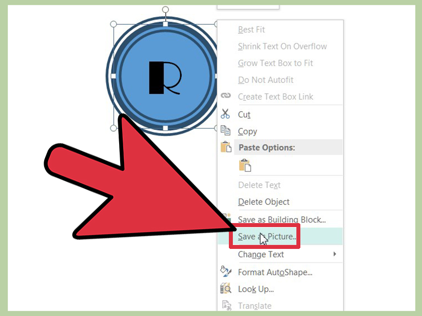
Next, export your logo in practical formats. Publisher allows you to save a publication as a PDF, and you can also save selected objects or pages as image files depending on your version and workflow. A PDF is useful for print and sharing with vendors. PNG is often best for websites and digital use, especially when you need a clean image. JPG can work for general use but may reduce quality because it compresses the image.
For best results, create several versions:
- A full-color logo for websites and marketing materials.
- A black version for simple print use.
- A white version for dark backgrounds.
- A square version for social media profiles.
- A horizontal version for website headers and email signatures.
If your logo will be printed professionally on signs, packaging, shirts, or large materials, ask the printer what file type and resolution they need. Publisher can create useful files, but professional print shops may prefer vector formats from dedicated design software. If your brand grows, you can later have a designer recreate the logo as a vector file while keeping your original concept.
Common Mistakes to Avoid When Making a Logo in Publisher
Using Too Many Fonts
One or two fonts are enough. Three fonts are risky. Four fonts are a cry for help. Too many typefaces make the logo look chaotic and reduce brand recognition.
Adding Too Much Detail
Tiny icons, thin lines, small taglines, and complicated illustrations often disappear when the logo is reduced. Keep the design bold enough to work at small sizes.
Relying on Effects Instead of Good Design
Drop shadows, bevels, outlines, glows, and gradients can be tempting, but they should not carry the design. A strong logo works even without effects.
Ignoring File Quality
A logo that looks sharp in Publisher can become blurry if exported too small or saved in a low-quality format. Always test the logo in the places where you plan to use it.
Copying Another Brand Too Closely
Inspiration is fine. Imitation is risky. Your logo should feel original and appropriate for your brand, not like a slightly disguised version of a famous company’s identity.
Practical Example: A Simple Coffee Shop Logo
Imagine you are creating a logo for a small coffee shop called “Maple Cup Café.” You want the design to feel warm, local, and friendly.
First, you open a blank square page in Publisher. Then you insert a circle shape and set the fill color to a warm brown. Next, you add a smaller cream-colored circle inside it to create a badge effect. You insert a simple coffee cup icon or create one using basic shapes. Below the cup, you add the words “Maple Cup” in a bold serif font and “Café” in a smaller sans-serif font.
You adjust the spacing, center everything, and test the logo at a small size. If the cup icon looks too detailed, you simplify it. If the font feels too formal, you try a friendlier typeface. Once the design feels balanced, you group all elements and save the file. Then you export versions for a menu, window sign, Instagram profile, and loyalty card.
This example shows the real strength of Publisher: it lets you quickly assemble a usable brand mark with familiar tools. You do not need to create the most revolutionary logo in coffee history. You just need a clear, attractive design that customers can recognize before caffeine enters their bloodstream.
When Microsoft Publisher Is a Good Logo Tooland When It Is Not
Publisher is a good choice when you need a simple logo quickly and you already use Microsoft Office. It is especially helpful for small projects, community organizations, classroom assignments, event branding, homemade product labels, and early-stage business ideas.
However, Publisher is not ideal for advanced logo design. If you need a fully scalable vector logo, complex custom lettering, professional brand guidelines, or files for national advertising and large-format printing, you may eventually need vector design software or a professional designer.
That does not mean your Publisher logo is useless. It can be an excellent starting point. Many strong brand identities begin with a simple concept. The important thing is to make smart design choices: keep it simple, align everything carefully, use readable fonts, choose colors with purpose, and export the best-quality files available.
Extra Experience: Real-World Lessons From Creating Logos in Microsoft Publisher
One of the most useful lessons from creating logos in Microsoft Publisher is that simple ideas usually win. Beginners often feel pressure to fill every empty space, add extra icons, and decorate the text until the logo looks “designed.” But in real projects, the best results often come from removing things. A clean name, one strong shape, and a thoughtful color palette can look more professional than a busy design packed with effects.
Another practical experience is to design the logo in the size where it will be used most often. For example, if the logo will mainly appear on flyers and business cards, test it at those sizes before calling it finished. A logo may look impressive when it fills the whole Publisher page, but once it is placed in the corner of a brochure, small details may vanish. This is why it helps to copy the finished logo several times onto the same page and resize each copy. Look at it large, medium, and tiny. If the smallest version still makes sense, the design is probably strong.
It is also smart to create variations from the beginning. A full logo with an icon, business name, and tagline may work well on a flyer, but the tagline may be too small for a social media profile photo. A simplified version with only the icon or initials can solve that problem. Publisher makes this easy because you can duplicate your grouped logo, remove a few elements, and save alternate versions. Think of these as members of the same logo family. They should look related, not like distant cousins who only meet at awkward holiday dinners.
Font choice is another area where experience matters. Decorative fonts can look exciting at first, but they often age badly or become difficult to read. When in doubt, choose a clean font and focus on spacing, size, and balance. Adjusting letter spacing slightly, making one word bold, or pairing a strong display font with a simple supporting font can make the logo feel custom without becoming messy.
Color testing is equally important. A logo may look great on a white background but disappear on a dark image or colored flyer. Always test your logo on light, dark, and neutral backgrounds. Create a black-only version as well. If the design works without color, the structure is solid. If it depends entirely on a fancy gradient to make sense, it may need more work.
Finally, save your work more often than you think you need to. Keep the original Publisher file, export high-quality versions, and store everything in a clearly named folder. Use names like “Logo_Full_Color,” “Logo_Black,” “Logo_White,” and “Logo_Square.” Future you will be grateful, especially when someone asks for the logo “in a different format” five minutes before a deadline. That request always arrives when coffee is low and patience is lower.
Conclusion
Learning how to create a logo in Microsoft Publisher is a practical skill for anyone who needs a clean brand design without jumping into advanced design software. Publisher gives you enough control to combine shapes, text, colors, icons, and layout tools into a professional-looking logo for small businesses, personal projects, events, and marketing materials.
The key is not to overcomplicate the process. Start with a clear brand idea, use a blank page, choose simple shapes, add readable text, limit your colors, align everything carefully, group the design, and export multiple versions. With a little patience and a willingness to simplify, you can create a logo that looks sharp, communicates clearly, and does not scream “clip art from another century.”
Note: Microsoft Publisher is useful for basic logo creation, but for long-term professional branding, keep backup files and consider recreating the final logo in a vector-based design program if you need unlimited scaling for large print or advanced commercial use.