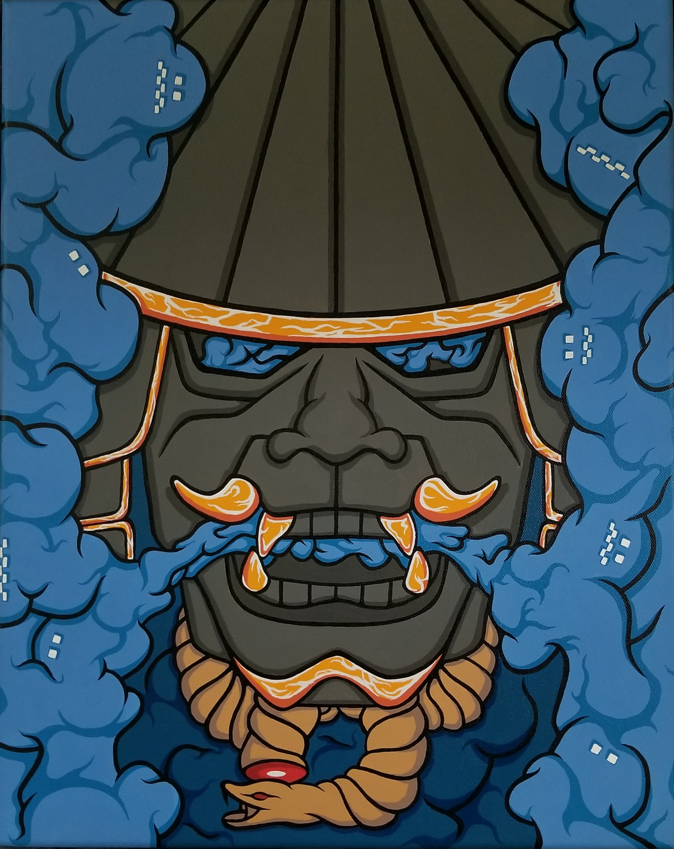
Some paintings whisper. Some paintings hum. And then there are the ones that walk into the room wearing muddy boots, slam the door, and ask why everyone is pretending memory is tidy. My recent body of work began with a simple question: what happens when nostalgia is treated not as a soft-focus filter, but as a forcebeautiful, unstable, funny, tender, and occasionally loud enough to rattle the windows?
The title, I Explored Nostalgia, Explosives, And The Psychology Of Mood In My Paintings, sounds almost like three different exhibitions collided in a hallway. Yet that collision is exactly the point. Nostalgia gives the paintings their emotional weather. Explosives, used here as a visual and conceptual language rather than a stunt, suggest rupture, ignition, surprise, and release. The psychology of mood ties everything together, because a painting does not simply sit on a wall; it changes the room, and the room changes whoever is standing inside it.
This article is a reflection on how memory, controlled chaos, color, texture, and emotional atmosphere shaped the work. It is also a practical look at how painters can build mood without turning the canvas into a lecture with a frame around it. After all, nobody wants to be scolded by a rectangle before coffee.
Why Nostalgia Became My First Palette
Nostalgia is often misunderstood as sentimental decoration: a vintage lunchbox, a faded photograph, a rotary phone that makes younger viewers ask whether it is some kind of ancient podcast device. But nostalgia is more complex than that. It is not just “the past was better.” It is a mixed emotional state, a blend of sweetness and ache, comfort and distance, belonging and loss.
In painting, nostalgia becomes especially powerful because visual art can hold contradictions without needing to solve them. A pale yellow can feel like an old kitchen at 4 p.m. A greenish shadow can turn a cheerful memory slightly suspicious. A smudged edge can suggest that the past is not gone, exactly, but also not available for pickup at the front desk.
When I began this series, I worked from ordinary memory fragments: backyard smoke after fireworks, the oily shine of playground equipment in summer, the strange blue of television light on a living room wall, the smell of dust in a garage, and the emotional suspense of family photographs where everyone looks happy but the wallpaper knows too much. These images were not copied literally. Instead, they became emotional prompts.
Nostalgia as Atmosphere, Not Illustration
The most tempting mistake in nostalgic painting is to become too literal. A bicycle, a childhood home, a school hallway, a birthday cakethese can all work, but only if they do more than point backward. I wanted the paintings to feel remembered rather than simply depicted. That meant softening certain forms, exaggerating others, scraping paint away, letting color stain the surface like a thought that refuses to leave.
In one painting, a block of washed-out coral sits beside a smoky gray field. There is no figure, no house, no calendar date, yet the color relationship feels like a summer evening after something has ended. That “something” is intentionally undefined. Nostalgia works best when the viewer can bring their own ghosts, snacks, and questionable childhood haircuts into the room.
Explosives as a Language of Rupture
The word “explosives” naturally grabs attention, mostly because it does not usually appear between “nostalgia” and “psychology” unless the dinner conversation has taken a dramatic turn. In this context, explosives refer to a controlled visual idea: suddenness, combustion, shock, dispersal, and transformation. The paintings explore explosive energy as metaphor and atmosphere, not as instruction or spectacle for its own sake.
Art history gives us serious examples of artists using volatile materials under professional, controlled, and institutionally supported conditions. What interests me is not the danger, but the philosophical charge: an explosion is a moment when control and accident meet. Painting has always lived in that same neighborhood. A brushstroke can be planned, but the paint still has opinions. A wash can be guided, but water behaves like it has somewhere else to be.
In my studio, explosive imagery translated into bursts, scorch-like marks, cratered textures, radiating lines, and areas where color appears to have been interrupted mid-sentence. Some marks look like fireworks seen through a dirty window. Others resemble emotional impact zones: the place where a memory hits the present and leaves a ring.
The Beauty of Controlled Chaos
Chaos in art is only interesting when it has a counterweight. A canvas made entirely of disorder can become visual static. So I paired explosive marks with calm fields of color, careful edges, and quiet zones where the eye could rest. This contrast mattered. A burst of red-orange feels more intense when it erupts from a muted blue-gray space. A smoky black passage becomes more emotional when it drifts across a tender pink that looks like it was borrowed from a childhood bedroom.
The explosive elements also challenged the nostalgia. Without them, the paintings risked becoming too soft, like memory wrapped in a blanket and told it was doing great. With rupture, the paintings became more honest. The past is not always gentle. Sometimes it arrives with confetti. Sometimes it arrives with a siren. Sometimes it arrives because one tiny objecta matchbook, a song, a chipped mugsets off an emotional chain reaction before lunch.
The Psychology of Mood in Painting
Mood is not the same as subject. A painting of a sunny porch can feel lonely. A painting of a storm can feel cleansing. Mood lives in color, scale, rhythm, contrast, texture, spacing, and the strange human tendency to project emotional meaning onto almost everything, including clouds, wallpaper, and suspiciously expressive chairs.
Color is one of the most direct tools for shaping mood. Warm colors such as red, orange, and yellow can feel active, intimate, heated, or urgent. Cool colors such as blue, blue-green, and violet can suggest distance, calm, melancholy, or spaciousness. But color is never universal in a simple way. A blue may soothe one viewer and remind another of a hospital hallway. A bright yellow may feel joyful, acidic, artificial, or like a lemon with unresolved issues.
That subjectivity is important. Rather than trying to force one emotional response, I used color to create conditions for feeling. I wanted viewers to sense a mood before they could name it. Naming often comes later, after the body has already reacted.
How Texture Carries Feeling
Texture became the emotional skin of the paintings. Smooth passages suggested distance, polish, or repression. Scraped areas felt archaeological, as though the painting had been excavated from itself. Thick ridges of paint gave the surface a stubborn physicality. They refused to be just an image; they wanted to be an object with a past.
One canvas began with a soft, rosy underpainting that looked almost too sweet. I buried it under gray, then dragged a blade through the surface to reveal flashes of pink beneath. The result felt more truthful: not innocence, but innocence partially recovered. Not childhood, but the adult act of trying to remember childhood through layers of noise, embarrassment, and tax documents.
Specific Examples From the Series
“After the Backyard Flash”
This painting began with the memory of watching fireworks from a lawn chair as a child. The actual event was ordinary: plastic cup, mosquito bites, adults talking too loudly, someone misplacing the lighter, someone else giving advice nobody requested. But the remembered mood was huge. The sky felt close. The dark felt alive. Every burst of color seemed temporary and therefore important.
On the canvas, I used a deep navy field interrupted by powdery blooms of orange, white, and violet. The marks do not illustrate fireworks exactly; they mimic the emotional afterimage of them. Around the edges, I added thin stains of green and brown to pull the painting back toward earth, grass, and the slightly tragic smell of summer bug spray.
“Room With Television Light”
This work is quieter. It uses rectangles of blue, lavender, and dull cream to suggest the mood of a living room lit by a television after everyone else has gone to bed. The painting is about the loneliness of comfort. Many people remember childhood television as cozy, but there is also something eerie about that blue light flickering across furniture in the dark.
The explosive element here is subtle: a small rupture of hot red near the lower edge. It looks almost accidental, like a warning light or a memory that refuses to behave. That tiny interruption changes the whole painting. Without it, the work might be calm. With it, the calm becomes suspicious.
“Family Photo With Missing Weather”
This piece grew from old family photographs where the people are visible but the atmosphere is missing. Photos often preserve faces while flattening mood. I wanted to paint what the camera left out: humidity, tension, affection, impatience, the smell of food from another room, and the heroic effort of children being told to smile when they would rather become feral.
The painting combines faded beige, bruised purple, and sudden yellow-white bursts. The surface is layered and rubbed down until figures almost appear, then disappear again. It asks whether memory is a document, a performance, or a weather system. My answer, after many hours in the studio, is yes.
Why Viewers Respond Differently
One of the most exciting parts of showing these paintings is hearing viewers describe completely different memories. A smoky orange passage reminded one person of a desert sunset. Another saw a kitchen fire from childhood. Someone else said it looked like “a birthday party right after the adults started arguing,” which is both oddly specific and, frankly, an excellent title.
This range of responses is not a problem. It is the work doing its job. Mood-based painting does not function like a road sign. It behaves more like music. It sets a key, a tempo, a temperature, and then lets the listener supply the private footage.
Nostalgia strengthens that openness because everyone has a past, but nobody carries it in the same container. Some people organize memory like a museum archive. Others store it like a junk drawer full of batteries, ticket stubs, and one mysterious key. Painting can honor both systems.
Balancing Beauty and Unease
I did not want the paintings to be merely pretty. Beauty matters, but beauty without friction can become decorative in the sleepy sense. The goal was to create paintings that attract the viewer first and trouble them second. A lovely color draws you closer; a strange mark asks what you are doing there.
This balance reflects how nostalgia actually feels. The past can be comforting, but it can also be edited, romanticized, or weaponized against the present. We say, “Things were simpler then,” when often we mean, “I was simpler then,” or “I did not yet know what the adults were worried about.” The paintings try to hold that double truth. They love memory, but they do not fully trust it.
The Role of Humor
Humor entered the work more than I expected. Nostalgia can become unbearably solemn if allowed to wear a velvet cape for too long. Small absurdities kept the paintings human: awkward color pairings, clumsy shapes, titles that undercut the drama, and compositions that feel as if they almost know what they are doing.
That humor is not a distraction from emotional seriousness. It is part of it. Many real memories are funny and sad at the same time. A family argument can be remembered alongside the terrible casserole served that night. A childhood fear can be attached to a cartoon bedsheet. The emotional life of a painting becomes richer when it admits that people are ridiculous even while suffering, longing, loving, and trying to parallel park their inner lives.
What the Process Taught Me
This series changed the way I think about painting. I became less interested in controlling every mark and more interested in creating conditions where accidents could become meaningful. I learned that nostalgia needs interruption. I learned that mood can be built through restraint as much as intensity. I learned that a small color decision can shift the emotional gravity of an entire canvas.
I also learned that painting about the past is never only about the past. Every nostalgic image is made from the present. The hand that paints is older than the memory it paints. The adult chooses the colors for the child’s room. The current mood edits the old scene. That tension became the real subject of the work.
Additional Experiences: Living With Nostalgia, Risk, and Mood in the Studio
At the end of the project, I realized the paintings had changed the atmosphere of my studio as much as I had changed them. The room began to feel like a memory lab, though admittedly one with more coffee cups than any reputable laboratory would approve. Canvases leaned against the wall in different stages of becoming: some glowing, some sulking, some looking like they had been through an emotional car wash and refused the wax upgrade.
Working with nostalgia every day made me more attentive to small triggers. A certain dull green reminded me of old school hallways. A milky peach brought back the color of bathroom tiles in houses built when everyone apparently agreed that plumbing should look like sherbet. A sharp white mark against black made me think of camera flashes, lightning, emergency rooms, stage lights, and birthday candles blown out too quickly. The studio became crowded with associations, but not in a bad way. It felt alive, as if each color had brought luggage.
The explosive theme also affected my pacing. I started to think of each painting as a sequence of pressure and release. Some days were for building tension: layering quiet colors, repeating shapes, tightening the composition. Other days were for rupture: adding a burst, scraping through a surface, turning a calm area into a charged one. The best moments came when I surprised myself without losing the painting completely. That line between discovery and disaster is thin, dramatic, and very familiar to anyone who has ever tried to assemble furniture using only confidence.
Mood became something I tested physically. I would stand across the room and ask: does this painting lower my voice? Does it speed me up? Does it make the space feel warmer, stranger, older, more awake? Sometimes the answer was immediate. Sometimes the canvas stared back with the blank patience of a cat judging a human. When that happened, I knew the painting needed either more risk or more silence.
One experience stayed with me. A visitor looked at a nearly finished work and said it reminded her of waiting in a car as a child while adults talked outside under porch lights. I had never painted that scene, but I knew exactly what she meant. That is when the project clicked. The paintings were not containers for my memories alone. They were mood machines, built from my materials but activated by someone else’s life.
By the final canvas, nostalgia no longer felt like a retreat. It felt like an ignition point. The past was not a cozy room to hide in; it was a charged material, capable of warmth, distortion, comedy, and surprise. The explosive marks gave that charge a visual body. The psychology of mood gave it structure. Painting gave it a place to land.
Conclusion
I Explored Nostalgia, Explosives, And The Psychology Of Mood In My Paintings is ultimately about emotional weather: how memory gathers, how color changes pressure, how rupture clears the air, and how a viewer can feel something before they understand it. Nostalgia gave the work tenderness. Explosive imagery gave it force. Mood gave it a pulse.
The paintings do not ask viewers to return to the past. They ask viewers to notice how the past returns to themin color, texture, flashes, jokes, aches, and strange little afterimages that appear when the room gets quiet. That is the real power of painting: it does not simply show what happened. It shows how remembering feels.
Note: This article is original, web-ready content written in standard American English. It discusses explosive imagery and art-historical context conceptually and safely, without providing practical instructions for dangerous materials.