Product teams rarely suffer from a shortage of data. They suffer from a shortage of answers.
Your analytics platform may contain thousands of events, dozens of user properties, several onboarding flows, and enough charts to make a spreadsheet feel emotionally secure. Yet when someone asks, “Why did trial conversion fall last month?” the room can still become suspiciously quiet.
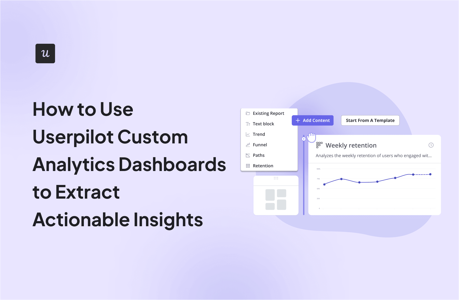
Userpilot custom analytics dashboards help solve this problem by bringing the reports related to a specific product question into one focused view. Instead of bouncing between separate trend, funnel, path, and retention reports, teams can monitor the metrics that explain a user journey together.
The secret is not adding more charts. It is selecting the right charts, applying meaningful segments, and connecting every insight to a decision. This guide explains how to build Userpilot custom analytics dashboards that reveal what users are doing, where they are struggling, and what your team should do next.
What Are Userpilot Custom Analytics Dashboards?
A Userpilot custom analytics dashboard is a personalized collection of product analytics reports organized around a goal, workflow, feature, or audience. It can combine existing reports, newly created reports, and text blocks that explain the data or provide instructions to dashboard viewers.
Custom dashboards are currently available on Userpilot Growth and Enterprise plans. Teams can build a dashboard from scratch or begin with templates focused on feature engagement, user activation, user retention, free-to-paid conversion, and expansion revenue. Dashboard content can then be resized and rearranged through drag-and-drop controls.
That flexibility makes custom dashboards useful for several teams:
- Product managers can monitor activation, feature adoption, and retention.
- Customer success teams can identify accounts with declining engagement.
- Growth teams can analyze trial conversion and upgrade behavior.
- UX teams can locate friction in onboarding and core workflows.
- Executives can review a concise summary of product health without touring every analytics report ever created.
Start With a Decision, Not a Dashboard
Before clicking Create dashboard, write down the decision the dashboard should support. A broad objective such as “understand engagement” is not specific enough. It invites seventeen unrelated widgets and, eventually, a dashboard that resembles a digital garage sale.
A stronger dashboard question sounds like one of these:
- Which onboarding step causes the largest activation drop-off?
- Does using the collaboration feature improve 30-day retention?
- Which customer segment converts from trial to paid most efficiently?
- What actions usually happen before an account upgrades?
- Did the new onboarding checklist reduce time to value?
Each question suggests a different combination of metrics. An activation dashboard may need a signup trend, onboarding funnel, time-to-completion metric, and retention comparison. An expansion dashboard may require upgrade trends, account-level segmentation, and path analysis around the upgrade event.
This decision-first approach keeps dashboards small enough to understand and specific enough to use.
Prepare Reliable Product Data
Define the Events That Represent Value
A dashboard cannot rescue an unclear tracking plan. Before creating reports, identify the events that represent meaningful product behavior.
For a project management platform, useful events might include:
account_createdfirst_project_createdteammate_invitedtask_completedintegration_connectedplan_upgraded
Userpilot supports labeled events, tracked events, custom events, feature tags, page views, content engagement, and other interaction data. Tracked events can also carry event properties, which are valuable when you need to analyze details such as template type, integration name, subscription plan, or workflow category.
Avoid vague events such as button_clicked unless the event includes enough properties to identify which button mattered. Otherwise, your report may accurately reveal that users clicked something somewhere. Congratulations; the mystery remains intact.
Confirm User and Company Properties
Properties provide the context that turns an overall metric into an actionable finding. Common user and company properties include:
- Subscription plan
- Company size
- User role
- Industry
- Acquisition source
- Device or platform
- Account age
- Trial status
- Customer lifecycle stage
Suppose overall activation is 48%. That number becomes much more useful when a breakdown shows activation at 68% for administrators but only 31% for invited contributors. The second result points toward a role-specific onboarding problem that the team can investigate and fix.
Create Behavioral Segments
Userpilot segments can group users or companies using properties, event behavior, pages viewed, content engagement, survey responses, and previously saved segments. Conditions can also specify how often an event occurred or whether an action did not occur.
Useful behavioral segments might include:
- Activated users who reached the value moment within seven days
- Trial users who created a project but invited no teammates
- Accounts that used a core feature at least three times this week
- New customers who completed onboarding but did not return
- Power users who adopted three or more advanced features
Behavioral segments are particularly actionable because they describe something users didor failed to dothat your product team can influence.
How to Create a Userpilot Custom Analytics Dashboard
Step 1: Choose a Template or Start From Scratch
Open the dashboard area and select Create a dashboard. Choose a template when your goal matches a standard use case, such as feature engagement, activation, retention, free-to-paid conversion, or expansion revenue.
Starting with a template saves setup time because the initial reports are already organized around that outcome. You can still replace reports, change filters, resize widgets, and modify the layout.
Choose a blank dashboard when the question crosses several workflows or requires a specialized audience view. For example, a customer health dashboard might combine product usage trends, onboarding completion, NPS responses, account-level engagement, and renewal-related behavior.
Step 2: Add the Right Report Types
Userpilot’s main product analytics reports answer different questions. Selecting the correct report is more important than selecting the prettiest chart.
Use Trends to Monitor Change
Trend reports show how events, page views, content engagement, users, companies, sessions, and calculated metrics change over time. They can be broken down by user properties, company properties, event properties, or segments.
Use a trend report to monitor:
- Daily, weekly, or monthly active users
- Feature adoption over time
- New account creation
- Upgrade volume
- Onboarding flow completion
- Usage frequency per user
Always include a comparison period when possible. A conversion rate of 17% means little without knowing whether it was 11% or 24% during the previous period.
Use Funnels to Find Friction
Funnels measure how users or companies progress through a defined series of actions. Userpilot funnels can use events, pages, mobile screens, and interactions with Userpilot content as steps. Teams can analyze ordered or non-linear journeys, set conversion windows, apply filters, and compare results across different groups.
An activation funnel might contain:
- Account created
- Workspace configured
- First project created
- Teammate invited
- First collaborative task completed
Do not stop after spotting the lowest-converting step. Break that step down by role, plan, device, company size, or acquisition source. The overall drop-off tells you where the problem exists; segmentation helps explain who experiences it.
Use Paths to Discover Real User Journeys
Funnels evaluate a journey you already expect. Path reports reveal the routes users actually take before or after a selected event. They can uncover unexpected navigation patterns, common entry points, detours, and behaviors associated with success or abandonment.
For example, if many users fail to connect an integration, create a path report beginning at the integration page. You may discover that users repeatedly visit documentation, open settings, return to the integration page, and then leave. That pattern suggests uncertainty or missing instructions rather than a lack of interest.
Use Retention to Measure Lasting Value
Retention reports examine whether users return and perform a selected action after a starting event. Userpilot can analyze first-time cohort behavior or recurring behavior, with filters for event, user, company, and segment data.
Instead of measuring only whether users return to the product, choose a return event connected to actual value. Logging in is technically activity, but a user who logs in, stares into the digital distance, and leaves is not necessarily retained in a meaningful sense.
Better return actions include completing a task, publishing a report, processing a transaction, collaborating with a teammate, or using a core feature.
Step 3: Arrange Reports as a Story
Place the most important outcome at the top of the dashboard. Supporting reports should appear below it in a logical sequence:
- Outcome: What changed?
- Journey: Where did the change occur?
- Segment: Who was affected?
- Behavior: What did those users do?
- Action: What should the team test next?
For a trial conversion dashboard, the top row might display new trials, paid conversions, and the conversion rate. The second row could show the signup-to-payment funnel. The third could compare conversion by company size or acquisition source. A final text block could record the current hypothesis and experiment owner.
This creates a decision narrative rather than a collection of unrelated charts. Dashboard design guidance from major analytics platforms consistently recommends prioritizing essential information, considering the audience, reducing clutter, and keeping the main story visible at a glance.
Step 4: Add Context With Text Blocks
Userpilot lets dashboard builders add text blocks alongside reports. Use them to document:
- The dashboard’s main question
- Metric definitions
- The selected date range
- Important releases or campaigns
- Known data limitations
- Current hypotheses
- The owner of the next action
A short note such as “The onboarding redesign launched on June 3” prevents teammates from interpreting a sudden conversion change without context. Analytics without context has a mischievous habit of turning coincidence into strategy.
Example: Building an Activation Dashboard
Imagine a B2B reporting platform whose value moment occurs when a new account imports data and publishes its first report.
The activation dashboard could include:
- A trend showing weekly signups
- A funnel from signup to data import to first published report
- Median time from signup to first report
- A breakdown of activation by company size
- A path report showing actions before successful data imports
- A retention report comparing activated and non-activated users
Suppose the funnel reveals that only 42% of new users complete the data import. A company-size breakdown shows that small businesses convert at 57%, while enterprise accounts convert at 24%. Path analysis then shows enterprise users frequently visit the permissions page before abandoning setup.
The dashboard has now produced an actionable hypothesis: enterprise users may lack the permissions or technical guidance needed to connect a data source.
The team could respond by creating a role-specific onboarding flow, adding an administrator checklist, and offering a technical setup guide. After launching the change, the same dashboard can measure whether enterprise import completion and activation improve.
That final measurement step matters. An insight is not truly actionable until the team implements a response and checks whether it worked.
Turn Dashboard Insights Into Product Actions
Use a Simple Insight-to-Action Framework
For every meaningful dashboard change, record five items:
- Observation: What changed?
- Segment: Who experienced the change?
- Hypothesis: What may have caused it?
- Action: What will the team change or test?
- Success metric: What result will confirm improvement?
For example:
Observation: Mobile activation fell from 51% to 38%.
Segment: New trial users on smaller screens.
Hypothesis: The workspace setup form is difficult to complete on mobile.
Action: Simplify the form and trigger a mobile-specific walkthrough.
Success metric: Restore mobile activation to at least 48% within four weeks.
Combine Behavioral Data With Feedback
A funnel can tell you that users abandoned a step. It cannot always tell you why. Pair behavioral reports with targeted surveys, NPS responses, interviews, support conversations, or session observations.
Triggering a short survey after a failed or abandoned action can uncover issues such as confusing terminology, missing permissions, unclear pricing, technical errors, or a feature that simply does not match the user’s needs.
Quantitative data identifies the pattern. Qualitative feedback supplies the explanation. Together, they are far more useful than either source wearing a tiny detective hat by itself.
Common Dashboard Mistakes to Avoid
Tracking Too Many Metrics
A dashboard should monitor a decision, not archive the entire product. Remove widgets that do not change what the viewer would do.
Using Vanity Metrics Without Outcomes
Page views, clicks, and logins may provide context, but they should not replace metrics tied to activation, adoption, conversion, retention, or revenue.
Ignoring Small but Valuable Segments
An overall average can hide important differences between administrators and members, free and paid users, small and enterprise accounts, or web and mobile customers.
Changing Event Definitions Silently
When an event name, property, or tracking rule changes, document it. Otherwise, a tracking update may look like sudden product growth or a dramatic collapse.
Reviewing Data Without Assigning Action
End dashboard reviews with an owner, an action, and a deadline. “Interesting” is not a product strategy.
Hands-On Experience: Lessons From Building Actionable Dashboards
The most valuable lesson from working with custom product analytics dashboards is that the first version is almost always too crowded. Teams begin enthusiastically, adding signup trends, active users, feature clicks, session counts, NPS scores, conversion funnels, retention tables, and perhaps a chart that someone created six months ago but nobody is brave enough to delete.
During the first review, everyone looks at a different widget. Marketing discusses acquisition. Product discusses feature adoption. Customer success notices several inactive accounts. The meeting ends with plenty of observations but no shared decision.
A better experience begins when each dashboard receives a narrowly defined job. In one implementation, an overloaded product-health dashboard was divided into three views: activation, core feature adoption, and account risk. The activation dashboard focused only on the first seven days of the customer journey. The feature dashboard measured repeated use of the product’s value-driving tools. The account-risk dashboard monitored falling usage among previously active companies.
The data did not change, but the conversations did. Each meeting became faster because the dashboard made the question obvious.
Another practical lesson is to test event definitions with real user profiles before trusting a chart. A report may appear reasonable while combining internal employees, test accounts, incomplete identities, or duplicate events. Checking a small sample of users often catches issues that a beautifully smooth line chart politely conceals.
Segmentation also tends to produce the first genuinely useful surprise. Overall numbers frequently confirm what the team already knows. Segment comparisons reveal what it does not know. A feature may look unsuccessful across the full customer base but highly valuable for one industry. An onboarding flow may perform well overall while failing for invited users. A trial campaign may generate many signups but retain far fewer customers than a smaller referral channel.
Text blocks have proven more useful than they initially appear. Adding a short description of the dashboard goal, metric definitions, release dates, and active experiments prevents repeated debates about what a number represents. This context becomes especially important when a dashboard is shared with executives or teammates who did not build the underlying reports.
Finally, effective dashboard management requires subtraction. Review each dashboard periodically and remove metrics that no longer support an active decision. Archive experiments that have ended, replace outdated reports, and confirm that key events still represent the current product experience.
The ideal Userpilot custom analytics dashboard is not the one with the most sophisticated collection of charts. It is the one that helps a team notice an important change, understand which users are affected, choose a reasonable response, and measure the result. When that cycle becomes routine, the dashboard stops being a reporting destination and becomes part of the product improvement process.