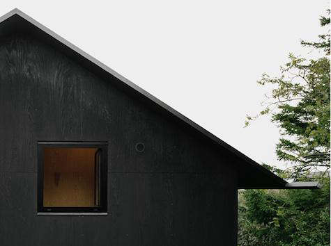
Some architects arrive with grand speeches, glossy manifestos, and renderings so dramatic they look like movie posters for “Concrete: The Sequel.” Johannes Norlander, by contrast, seems to prefer a quieter sort of drama. His buildings do not shout. They stand there, sharply composed, materially disciplined, and slightly mysterious, as if they know exactly what they are doing and have no interest in explaining themselves at a cocktail party.
An architect visit to Johannes Norlander in Sweden is really a visit into a particular Nordic state of mind: careful, restrained, practical, and surprisingly bold once you slow down enough to notice the details. His work moves between private houses, public buildings, housing, interiors, and furniture design, but the recurring theme is unmistakable. Norlander is interested in architecture that looks simple at first glance, then becomes richer the longer you live with it.
Based in Stockholm and founded in 2004, Johannes Norlander Arkitektur has developed a reputation for projects that balance artistic freedom with technical clarity, budget discipline, and regulatory common sense. That may not sound glamorous, but anyone who has ever renovated a bathroom knows this is basically architectural wizardry. Norlander’s best buildings prove that constraints do not kill creativity; they sharpen it.
Who Is Johannes Norlander?
Johannes Norlander is a Swedish architect and designer whose work is often associated with contemporary Nordic minimalism, but that label only tells part of the story. His architecture is minimal, yes, but not empty. It is reduced, not starved. It favors strong volumes, precise materials, and an almost graphic sense of composition, likely influenced by his studies in both architecture and graphic design.
Norlander studied architecture at Chalmers University of Technology in Gothenburg and the Royal Institute of Technology in Stockholm. He also studied graphic design at Konstfack, Sweden’s well-known university of arts, crafts, and design. That background helps explain why many of his buildings read so powerfully in silhouette. A Norlander house often has the confidence of a logo: clean, memorable, and hard to improve by adding anything else.
His practice has been described through ideas such as “naive post-minimalism,” a phrase that sounds like it escaped from an art-school seminar but is actually useful. The work often has a childlike directness in form: a house-shaped house, a black box, a wedge, a hexagon. Yet beneath that apparent simplicity is a sophisticated understanding of construction, site, light, and use.
The Swedish Setting: Why Place Matters
To understand Johannes Norlander’s architecture, it helps to understand Sweden itself. The country’s landscape is not merely a backdrop. It is a collaborator, sometimes a demanding one. Rocky islands, dense forests, low winter light, long summer days, coastal winds, and strict planning rules all shape the way buildings behave.
In much of Swedish residential architecture, the challenge is not to dominate the landscape but to negotiate with it. Norlander’s work is especially good at this negotiation. His buildings often seem compact and controlled, but they are not indifferent to nature. They frame views, respond to topography, and use materials that acknowledge weather as a design partner rather than an inconvenience.
This is not the soft, blond-wood version of Scandinavian design that sells throw pillows and kitchen timers. Norlander’s Sweden can be darker, tougher, and more elemental. His buildings often use black cladding, metal skins, raw concrete, and simple interiors. They are clean without being cute. They are minimal without asking you to whisper.
House Morran: A Cottage Reborn in Black
One of the most widely discussed Johannes Norlander projects is House Morran, located on an island near the sea route to the port of Gothenburg. The project began not as a blank slate but as a worn-down 1950s cottage with a later extension from the 1970s. Many architects might have treated the old structure like an embarrassing family photo and started over. Norlander took a more respectful approach.
The main volume and much of the existing structure were kept intact. Rather than exploiting the landscape with a bigger, louder replacement, the renovation refined what was already there. This decision is central to the project’s quiet intelligence. House Morran does not try to conquer the island; it sharpens the cottage’s relationship with it.
The exterior is clad in plywood treated with black pine tar, a traditional technique used to protect wooden boats. It is a practical choice, especially in a harsh coastal climate, but it is also visually powerful. The black surface gives the house an almost abstract presence against rock, sea, and sky. It looks modern, but not rootless. It feels as if it belongs to the coastline’s history of boats, weather, and dark timber.
Inside, the design becomes more open and luminous. That contrast between dark exterior and calm interior is a recurring pleasure in Nordic architecture. From the outside, House Morran looks guarded and stoic; inside, it becomes a place for summer light, family rituals, and the small domestic dramas of coffee, wet shoes, and someone asking where the matches went.
House Tumle: The Hexagon on the Hill
House Tumle, another important residential project by Johannes Norlander Arkitektur, sits in a residential area northwest of Gothenburg, positioned on a hill with views toward the North Sea. Completed around 2010, it is a compact two-story home for a small family, organized within a striking hexagonal form.
The shape is not a gimmick. The building volume follows the site’s topography and creates a natural flow around the house. The plan also helps organize the interior, guiding movement between rooms and focusing views toward specific outlooks. From a distance, House Tumle appears almost like a simple icon of a house. As one approaches, it becomes more physical, more textured, and more specific.
The six facades are clad in fine corrugated, powder-coated metal sheets, while the window frames are finished in coated aluminum. The result is both ordinary and unusual. Metal cladding is not exotic, but here it is handled with precision, giving the house a crisp, nearly industrial elegance. It has the calm confidence of a very well-designed toolbox, except you can sleep in it.
House Älta: Making Constraints Look Intentional
House Älta, located a few kilometers south of Stockholm, shows another side of Norlander’s talent: making difficult sites feel inevitable. The property sits on a hilly triangular plot with limited building rights and a surrounding context of mixed suburban structures from different decades. In less careful hands, this could have produced a compromise building that looked like a zoning diagram wearing windows.
Instead, the house uses its restrictions as generators of form. Its wedge-like plan and compact width help create a functional layout within a small footprint. The interior avoids unnecessary divisions, allowing movement and light to flow through the home. Glossy white surfaces and large windows expand the perception of space, making the building feel larger than its physical dimensions suggest.
House Älta is a useful reminder that good architecture is not only about grand sites and generous budgets. Sometimes the real art lies in solving awkward problems gracefully. Anyone can design a beautiful house on a perfect plot with unlimited money. The trick is doing it when the site is small, the rules are strict, and the neighbors’ houses are having an identity crisis.
Studio 1 in Gothenburg: Everyday Architecture, Elevated
Johannes Norlander’s work is not limited to private houses. Studio 1 in Gothenburg, a residential building for HSB, brought the practice major recognition when it received Sweden’s prestigious Kasper Salin Prize in 2016. This award is one of the country’s most important honors for architecture, and Studio 1’s win signaled that Norlander’s careful approach could scale beyond the single-family house.
What makes Studio 1 notable is not theatrical spectacle, but the strength of its everyday architecture. It is housing, after all: the architecture of mailboxes, stairwells, bikes, laundry, grocery bags, and neighbors who may or may not understand quiet hours. Norlander’s design treats these ordinary conditions seriously. The building shows how housing can be dignified, durable, and spatially rich without needing to perform acrobatics for attention.
The project is often praised for its material handling, collaborative process, and long-term quality. That matters because residential architecture is not judged only on opening day. It is judged after rain, after move-ins, after children learn to ride scooters in the courtyard, after someone drops a sofa against the wall while moving in. Studio 1 suggests architecture that can age with confidence.
Acne Studios Headquarters: Brutalism Gets a Fashionable Roommate
Norlander’s collaboration on Acne Studios’ headquarters at Floragatan 13 in Stockholm introduced his architectural thinking to a broader design audience. The building, originally the Czechoslovakian Embassy completed in the early 1970s, is a strong Brutalist structure with Cold War gravity and a whole lot of concrete attitude.
Rather than erasing that character, the renovation preserved and regenerated it. Acne Studios’ creative team, working with Johannes Norlander Arkitektur, transformed the building into a headquarters that feels part office, part fashion school, part design laboratory. The project respects the original architecture while introducing art, custom furniture, color, and new workplace energy.
This is where Norlander’s restraint becomes especially useful. A weaker renovation might have tried to soften the building until it became harmless. Instead, Floragatan 13 allows the old structure’s toughness to remain. The contrast between Brutalist mass and contemporary fashion culture gives the interiors their charge. Concrete and couture may sound like an odd couple, but apparently they get along if properly supervised.
The Norlander Design Language
1. Strong Form
Norlander’s buildings often begin with a clear geometric idea: a compact box, a hexagon, a wedge, a refined cottage volume. The form is legible, almost blunt, but the experience is not simplistic. This clarity gives the architecture a memorable presence and helps organize practical decisions.
2. Material Honesty
Wood, metal, concrete, glass, and coated surfaces are used with directness. Materials are rarely disguised as something else. In House Morran, black pine tar is both protection and expression. In House Tumle, corrugated metal creates a precise and abstract outer skin. Material choices do real work.
3. Respect for Site
Norlander’s projects do not float above their sites like imported objects. They respond to slope, view, climate, and regulation. The buildings may look highly controlled, but that control often comes from careful listening to place.
4. A Productive Kind of Minimalism
Minimalism can sometimes feel like a lifestyle punishment: one chair, one vase, and absolutely no evidence that anyone owns socks. Norlander’s minimalism is warmer than that. It removes clutter to strengthen space, light, and proportion. It is disciplined, but not joyless.
Why American Readers Should Care
For readers in the United States, Johannes Norlander’s work offers useful lessons at a moment when home design is pulled between excess and anxiety. Many houses are marketed through size, amenities, and visual noise. Bigger kitchens, bigger closets, bigger glass walls, bigger everything. Norlander’s architecture suggests another path: make the idea stronger, not necessarily the footprint larger.
His projects also speak to renovation culture. House Morran is especially relevant because it shows how an old structure can be renewed without being erased. In the U.S., where countless midcentury cabins, lake houses, ranch homes, and coastal cottages face pressure to become oversized replacements, Norlander’s approach feels refreshingly restrained. Improve the building. Strengthen what works. Do not bulldoze character just because a spreadsheet got excited.
There is also a sustainability lesson here. Reusing existing structures, designing compactly, choosing durable materials, and respecting site conditions are all practical environmental strategies. Norlander’s work does not always advertise itself in the language of green design, but many of its instincts align with long-term sustainability.
How to Borrow Johannes Norlander’s Ideas at Home
You do not need a rocky Swedish island or a Gothenburg hillside to learn from Norlander’s architecture. Homeowners, designers, and architecture lovers can borrow several principles from his work.
Start with the strongest idea
Before choosing finishes, identify the central architectural move. Is the house about a view, a courtyard, a dark exterior and bright interior, or a simple volume? A strong concept makes later decisions easier.
Let materials earn their place
Choose materials for performance as well as appearance. The best materials age well, solve problems, and contribute to atmosphere. Pretty but fragile finishes are like dramatic houseguests: amusing briefly, exhausting long-term.
Respect what already exists
In renovation, ask what is worth keeping. Structure, orientation, landscape relationships, and old quirks can become assets. Not every project needs a clean slate. Sometimes the most beautiful move is editing, not replacing.
Use contrast carefully
Dark outside and light inside. Heavy structure and delicate detail. Industrial cladding and warm domestic life. Norlander’s work often gains energy from controlled contrasts.
The Experience of Visiting Norlander’s Architecture in Sweden
Visiting architecture in Sweden is different from scrolling through photographs of it. Online, Norlander’s buildings can look severe, almost too composed. In person, they become more approachable because weather, sound, texture, and movement soften the abstraction.
Imagine approaching House Morran on a coastal island near Gothenburg. The black exterior first appears like a shadow placed carefully on the rock. It does not sparkle or beg for compliments. It waits. The smell of sea air and tarred wood makes the material choice feel obvious, almost ancient. Then you step closer and notice the precision of the openings, the way the house holds its old cottage volume, the way it refuses to over-explain itself.
At House Tumle, the experience is more geometric. The hexagonal plan changes as you move around it. What appears simple from one angle becomes more complex from another. The metal cladding catches light differently depending on weather and season. On a gray Swedish day, the house may look calm and muted. In bright light, it becomes sharper, more graphic.
Floragatan 13 offers a different kind of visit. There, the story is not solitude but adaptation. A former embassy becomes a creative headquarters. Heavy concrete becomes a setting for fashion, art, and collaboration. The building’s past is not hidden behind drywall and motivational office slogans. It remains present, giving the workplace a depth that new construction often struggles to fake.
Additional Reflections: What an Architect Visit Teaches You
An architect visit is never just about seeing buildings. It is about learning how to look. A project by Johannes Norlander asks visitors to slow down and notice decisions that might otherwise seem too quiet to matter. Why is the window placed there? Why does the building stop at that point? Why black? Why metal? Why keep the old structure instead of starting fresh? These questions are the real souvenirs.
The first experience related to a visit like this is the discovery that simplicity is rarely simple. A clean wall may conceal dozens of difficult choices. A compact plan may be the result of months of negotiation with site limits, budgets, regulations, and client needs. Good minimal architecture does not happen because the architect forgot to add things. It happens because the architect knew what to remove.
The second experience is the importance of atmosphere. Photographs show form, but buildings are lived through temperature, echo, shadow, smell, and time. In Sweden, the low angle of light can transform a room. A white interior may feel soft rather than sterile. A dark exterior may feel protective rather than gloomy. Norlander’s work depends on these atmospheric shifts. It is architecture for actual weather, not just perfect photography.
The third experience is humility toward landscape. Many visitors are used to architecture that tries to dominate its surroundings. Norlander’s houses often do the opposite. They become clearer by accepting limits. A rocky island is not treated as a decorative platform. A hillside is not flattened into submission. A small triangular site is not apologized for. The constraint becomes part of the design intelligence.
The fourth experience is recognizing the value of restraint in a noisy design culture. In many interiors and homes, every surface wants to be special. The countertop wants applause. The lighting wants a close-up. The staircase wants its own agent. Norlander’s architecture suggests that not every element needs to perform. Some things should simply be correct, durable, and calm. That calmness can feel luxurious because it gives the eye room to rest.
The fifth experience is practical inspiration. After visiting or studying Norlander’s work, you may look at your own home differently. Maybe the awkward corner is not a disaster but an opportunity for a built-in desk. Maybe the old siding should be replaced with something tougher and simpler. Maybe a renovation should preserve the original footprint instead of chasing square footage. Maybe the best design move is not buying another object, but removing three.
The sixth experience is understanding that architecture can be serious without being cold. Norlander’s buildings have discipline, but they are not lifeless. They support family life, creative work, views, movement, and daily routines. Their humor is dry, admittedly. These are not buildings that tell jokes loudly. But there is a quiet wit in making a hexagonal house feel natural, or turning a tired cottage into a dark coastal gem, or letting a Brutalist embassy become a fashion headquarters without losing its concrete backbone.
Finally, an architect visit to Johannes Norlander in Sweden reminds us that good design is not about making life look perfect. It is about making life more legible, more grounded, and more deeply connected to place. His architecture does not promise fantasy. It offers clarity. In a world full of visual shouting, that clarity feels almost radical.
Conclusion
Johannes Norlander’s architecture is a study in disciplined imagination. From the black pine-tar skin of House Morran to the geometric confidence of House Tumle, from the compact intelligence of House Älta to the award-winning urban presence of Studio 1 and the adaptive reuse of Acne Studios’ Floragatan 13, his work shows how architecture can be simple, strong, and deeply responsive.
For anyone interested in Swedish architecture, Nordic minimalism, contemporary residential design, or thoughtful renovation, Norlander’s practice offers a valuable lesson: restraint is not the absence of ambition. It is ambition with better manners. His buildings know when to speak, when to stay quiet, and when to let the landscape finish the sentence.
Note: This article synthesizes publicly available architecture information and design coverage about Johannes Norlander Arkitektur, including residential projects, awards, and notable collaborations, rewritten as original editorial content for web publication.