Some wallpapers whisper. Marimekko striped wallpaper walks into the room wearing excellent shoes, orders an espresso, and somehow makes your plain wall feel underdressed. That is the charm of a great stripe: it is simple enough to live with, bold enough to notice, and disciplined enough not to behave like a floral print that has had three cups of coffee.
Marimekko, the Finnish design house founded in 1951, is known for original prints, strong colors, and patterns that turn everyday living into something brighter. While many people immediately think of the famous Unikko poppy, Marimekko’s stripes deserve their own spotlight. In particular, the brand’s striped wallpapers and stripe-inspired patterns bring a crisp, Scandinavian-meets-modern energy to walls, windows, and floors. They can make a hallway feel taller, a breakfast nook feel fresher, and a small room feel like it finally found its posture.
The original design feature “Walls, Windows & Floors: Marimekko Striped Wallpaper” celebrated Marimekko’s Korsi Stripe wallpaper as a perennial classic. The Korsi design was noted for its clean white background and color choices including blue, red, black, yellow, or green stripes. It is easy to see why the look still works: it has the friendly confidence of a striped cotton shirt, but scaled up for architecture.
Why Marimekko Striped Wallpaper Still Feels Fresh
Trends in interiors come and go with the enthusiasm of a toddler changing favorite snacks. One year everything is gray. The next year gray is apparently a villain. Stripes, however, keep surviving the trend cycle because they are not really a trend. They are a design language.
Marimekko’s approach to stripes feels especially enduring because it combines clarity with joy. The company’s Tasaraita, or “even stripe,” was designed by Annika Rimala in 1968 and became associated with equality, openness, and a relaxed unisex spirit. That history matters because Marimekko stripes do not feel overly formal or stiff. They feel democratic, practical, and cheerfullike good design that refuses to be fussy.
In wallpaper form, this stripe language becomes architectural. Vertical stripes can draw the eye upward and make ceilings feel higher. Horizontal stripes can stretch the visual width of a room and create a calmer, more grounded rhythm. A crisp blue-and-white stripe may feel coastal without requiring seashells on every surface. Black-and-white stripes can look graphic and gallery-like. Yellow or green stripes can make a utility space feel less like a utility space and more like a small design decision with a pulse.
The Appeal of Korsi Stripe: Clean, Graphic, and Surprisingly Flexible
The Marimekko Korsi Stripe wallpaper is often remembered for its straightforward charm: colored stripes on a white background. In earlier product listings, the wallpaper appeared in colorways such as blue, red, black, yellow, and green, with a roll size around 27 inches wide by 396 inches long. A black-and-white Korsi listing described the wallcovering as a gravure print on PVC with a non-woven backing and a light texture emboss, covering approximately 74 square feet per roll.
Those specifications may sound technical, but they help explain why the design was practical as well as pretty. A non-woven backing can make installation feel more manageable than old-school papers that behave like wet lasagna. A no-design-match stripe is also friendlier for planning because it reduces the headache of lining up elaborate repeats. Of course, stripes still demand accuracy. Hang one panel even slightly crooked and your wall may start looking like it is quietly sliding into another zip code.
That is the wonderful and mildly bossy thing about striped wallpaper: it rewards precision. When installed well, it looks tailored. When installed carelessly, it becomes a ruler that tattles on you.
Best Rooms for Marimekko Striped Wallpaper
Entryways and Hallways
Entryways are perfect for Marimekko striped wallpaper because they are transitional spaces. You do not sit there for five hours analyzing your life choices; you pass through, hang a coat, drop your keys, and receive the first impression of the home. A vertical stripe in blue, black, or green can give a narrow hallway more height and polish. It says, “Welcome, we have personality,” without shouting, “We also collect seventeen kinds of novelty lamps.”
Powder Rooms
Powder rooms are tiny stages for bold choices. A stripe works beautifully here because the small footprint can handle a graphic wall treatment. Black-and-white Marimekko striped wallpaper can make a powder room feel chic and witty. Add a simple mirror, a wall sconce, and a stone or wood vanity, and the room suddenly feels intentional instead of forgotten.
Breakfast Nooks and Kitchens
In kitchens, stripes bring structure. A red-and-white or blue-and-white stripe can feel fresh beside white cabinets, butcher block, stainless steel, or open shelving. For renters or cautious decorators, a striped wallpaper on one breakfast nook wall can deliver the Marimekko mood without taking over the whole kitchen.
Children’s Rooms
Marimekko’s stripe heritage has a playful quality that works well in children’s rooms, especially when paired with simple furniture and colorful textiles. The key is balance. Let the wallpaper provide rhythm, then keep bedding, rugs, and storage pieces more restrained. Otherwise, the room may begin to resemble a parade route.
Home Offices
A stripe can be surprisingly useful in a home office. It gives the eye a sense of order, which is helpful when your inbox is staging a rebellion. A black, blue, or muted green stripe behind a desk can create a smart Zoom background that looks designed but not distracting.
How to Style Striped Wallpaper with Windows
Windows matter because stripes interact with light. A white-backed stripe looks crisp in daylight and softer in evening lamplight. If the room gets strong sun, a high-contrast black stripe may look dramatic at noon and moodier by dusk. A blue or green stripe can shift gently throughout the day, which is one reason these colorways feel so livable.
For curtains, avoid competing too aggressively with the wallpaper. Solid linen panels, sheer white curtains, bamboo shades, or simple Roman shades usually work better than another loud pattern. That does not mean pattern mixing is forbidden. Designers often combine wallpapers and fabrics successfully, but the secret is shared color, varied scale, and a little restraint. A narrow Marimekko stripe can sit nicely beside a larger organic print, while a wide stripe may prefer quieter neighbors.
If you want a bolder look, carry the stripe’s color into the window treatment. For example, blue-and-white striped wallpaper with navy linen curtains can feel polished and coastal. Green-and-white stripes with warm natural shades can lean garden-room fresh. Black-and-white stripes with cream curtains and brass hardware can create a crisp, modern look without feeling cold.
How Stripes Affect Floors and Furniture Choices
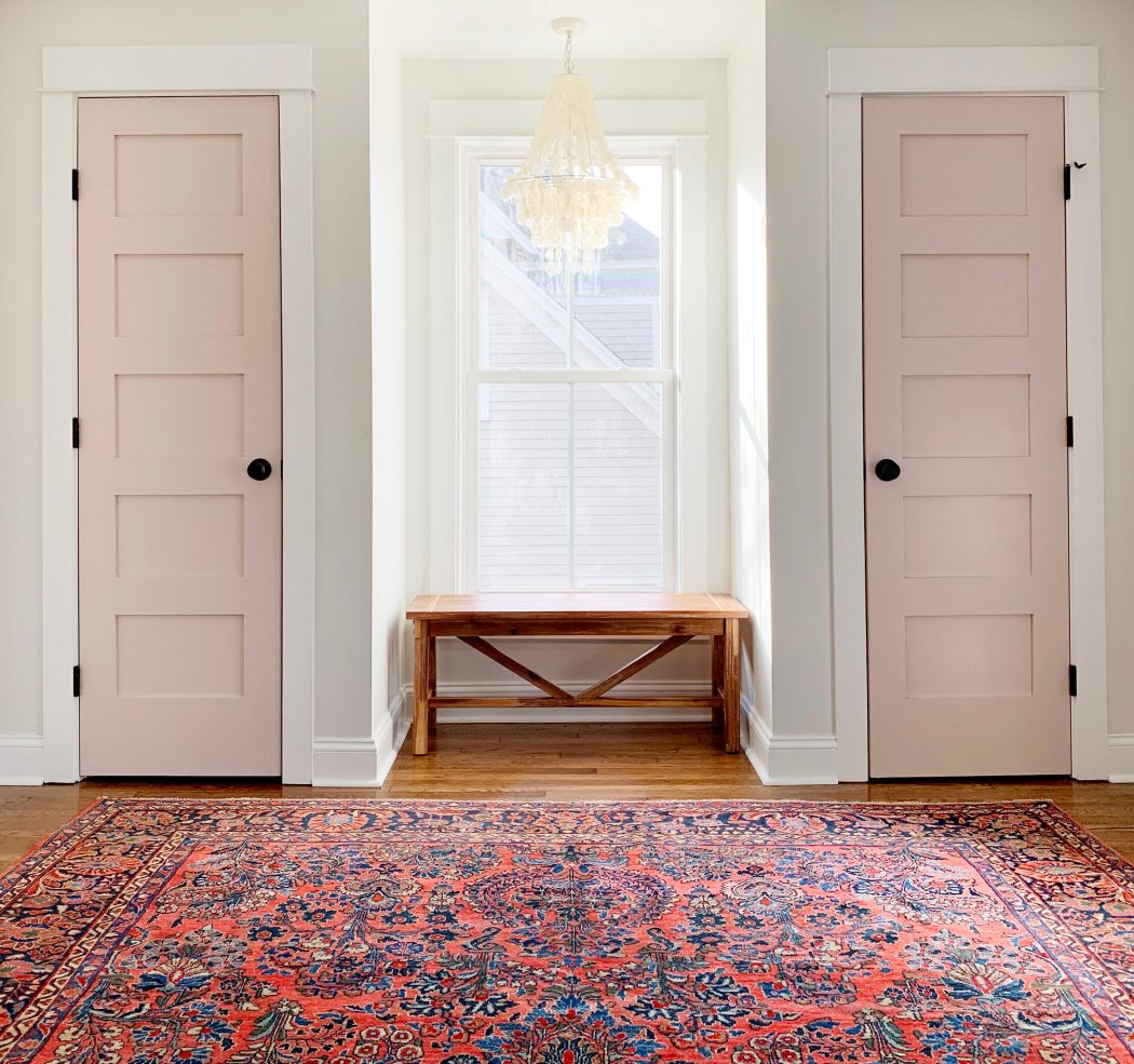
Floors are the anchor of a striped room. If the walls have a strong vertical rhythm, the floor should provide visual calm. Natural wood, sisal, jute, simple wool, terrazzo, or large-format tile all pair well with Marimekko striped wallpaper. The idea is to let the walls do the talking while the floor nods wisely in the background.
Striped wallpaper also changes how furniture reads. Clean-lined Scandinavian furniture looks like an obvious companion, but you do not need a full Nordic showroom to make it work. A vintage wood dresser, a white Parsons desk, a cane chair, or a modern sofa can all look excellent against stripes. The trick is to create contrast in texture. Smooth stripes love wood grain, woven shades, nubby upholstery, matte ceramics, and plants.
A striped room should not feel flat. Add round shapes to soften the geometry: a circular mirror, a globe lamp, a curved chair, a round side table, or a bowl filled with citrus. The wallpaper brings the lines; the accessories bring the breathing room.
Vertical vs. Horizontal: Which Stripe Direction Works Best?
Vertical stripes are the classic choice for wallpaper because they emphasize height. They make a ceiling feel taller and add a tailored quality to the room. In narrow spaces, vertical stripes can bring elegance and rhythm, especially when the stripe width is moderate and the colors are not too aggressive.
Horizontal stripes are trickier but rewarding. They can make a room feel wider and more relaxed, but they may also highlight uneven walls or awkward corners. If your room has older walls with waves, bumps, or mysterious architectural opinions, a very wide horizontal stripe may exaggerate those imperfections. In that case, a narrower vertical stripe is usually safer.
For ceilings, stripes can be magical when used carefully. A striped ceiling in a powder room, nursery, or closet can feel playful and custom. But ceiling installation requires patience, planning, and possibly a friendship test if you ask someone to help. Choose your helper wisely.
Color Guide: Choosing the Right Marimekko Stripe
Blue and White
Blue-and-white stripes are crisp, calm, and versatile. They work in coastal homes, city apartments, children’s rooms, laundry rooms, and kitchens. Pair them with white trim, pale wood, navy accents, and chrome or brushed nickel hardware.
Black and White
Black-and-white stripes are bold and architectural. They suit powder rooms, offices, entryways, and modern bedrooms. To prevent the look from becoming too severe, add warm wood, woven textures, aged brass, soft lighting, or one piece of colorful art.
Red and White
Red-and-white stripes are energetic and nostalgic. They can feel café-like, sporty, or retro depending on the furniture. Use this colorway in small doses if you want charm without visual caffeine jitters.
Yellow and White
Yellow-and-white stripes bring sunshine even when the weather is being dramatic. They work beautifully in breakfast areas, craft rooms, mudrooms, and cheerful bathrooms. Keep surrounding colors soft so the yellow remains fresh rather than overwhelming.
Green and White
Green-and-white stripes feel natural, lively, and slightly unexpected. They pair well with plants, terracotta, warm wood, and cream upholstery. This is a great choice for a reading nook or garden-facing room.
Installation Tips Before You Commit
Before ordering wallpaper, measure carefully and add extra for mistakes, trimming, and future repairs. Even when a stripe has no complicated pattern repeat, you still need enough paper to keep the line direction consistent. Always check the wall surface. Wallpaper likes clean, smooth, dry walls. It does not enjoy dust, grease, mystery texture, or paint that is already peeling like it has given up on life.
Use a level or laser line before hanging the first strip. Do not trust the corner of the room; corners are often liars. Start with a true vertical guide and work from there. Smooth bubbles gently, trim with a sharp blade, and step back often to check alignment. With stripes, small errors become visible quickly, so slow work is faster than rushed work you have to redo.
If you are not comfortable installing traditional wallpaper, hire a professional for high-visibility areas. A bold Marimekko stripe deserves a clean installation. Saving money is great; staring at crooked stripes for six years is less great.
Common Mistakes to Avoid with Striped Wallpaper
The first mistake is using too many stripes in one room. Striped wallpaper, striped curtains, striped rug, striped chair, striped lampshadeat some point the room starts looking like it is buffering. Choose one major striped surface and let the rest of the design support it.
The second mistake is ignoring scale. A very wide stripe can dominate a small room, while a very narrow stripe can create visual vibration if the contrast is too high. Order samples when possible and tape them to the wall. Look at them in morning light, afternoon light, and evening light. Wallpaper is basically a roommate; you should meet it more than once before committing.
The third mistake is forgetting art. Large stretches of stripe can benefit from framed artwork, mirrors, shelves, or furniture that breaks up the pattern. This prevents the room from feeling overly rigid and gives the eye places to rest.
Personal Experience: Living with Marimekko-Inspired Stripes
The first time I saw a Marimekko-style striped wall in a real home, not a perfectly lit design photo, I understood why stripes keep returning. The room was not large. It had an ordinary window, a slightly tired wood floor, and the kind of baseboards that had survived multiple paint colors and probably several family arguments. But the striped wallpaper changed everything. Suddenly, the room had rhythm. The ceiling looked taller. The window looked sharper. Even the old floor seemed more intentional, as if it had been waiting years for a graphic friend to arrive.
What surprised me most was how friendly the stripes felt. I expected the room to feel strict, maybe even a little formal. Instead, it felt fresh and awake. The wallpaper did not demand expensive furniture. A simple table, a woven chair, a white lamp, and a small stack of books were enough. The stripe did the heavy lifting, which is exactly what good wallpaper should do. It should make the room look designed even before you have finished arguing with yourself about throw pillows.
I have also learned that striped wallpaper is excellent at revealing what a room actually needs. After the paper goes up, clutter becomes more obvious. Random cords look more random. A crooked picture frame becomes a tiny scandal. This is not a bad thing. Stripes encourage editing. They ask for cleaner shapes, better spacing, and more thoughtful color choices. In that sense, Marimekko striped wallpaper behaves like a design coach: supportive, stylish, and just strict enough to make you stand up straight.
In window-heavy rooms, the experience is even more interesting. Morning light can soften the contrast, while evening shadows make the stripe feel more graphic. A blue stripe may look breezy during breakfast and quietly elegant at night. A black stripe may feel crisp in daylight and almost theatrical after sunset. This changing personality makes the wallpaper feel alive without being chaotic.
Floors matter more than people expect. A striped wall beside a warm wood floor feels relaxed and Scandinavian. The same wall beside black-and-white tile becomes sharper and more urban. Add a natural fiber rug, and the room calms down. Add a glossy lacquered table, and it becomes more fashion-forward. The wallpaper stays the same, but the floor and furniture decide whether the room is playful, polished, retro, coastal, or modern.
The biggest lesson is simple: do not be afraid of a stripe, but do respect it. Marimekko striped wallpaper is not background noise. It is a design decision with a backbone. Give it clean installation, breathing room, and a few warm textures, and it can transform plain walls, frame windows beautifully, and make floors feel like part of a larger composition. In other words, stripes are not just lines. In the right room, they are architecture with a sense of humor.
Conclusion
Marimekko striped wallpaper proves that simple design can have serious personality. Whether you are drawn to the clean Korsi Stripe look, the history of Tasaraita, or the broader Marimekko world of bold Finnish printmaking, stripes offer a rare combination of order and joy. They can stretch a hallway, sharpen a powder room, brighten a kitchen, or bring structure to a home office. The secret is balance: choose the right color, respect the scale, keep nearby materials warm, and install with care.
For homeowners who want a wall treatment that feels classic without being boring, Marimekko striped wallpaper is a smart choice. It is graphic but not gimmicky, cheerful but not childish, and flexible enough to work with modern, vintage, coastal, Scandinavian, or eclectic interiors. A good stripe does not just decorate a wall. It teaches the whole room how to stand taller.