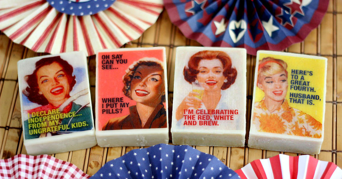
Personalized soap used to mean carving initials into a bar and hoping it did not look like a potato with a monogram. Thankfully, modern craft supplies have rescued us from that tiny tragedy. Today, you can personalize soap with funny retro graphics, vintage-style labels, playful slogans, bold typography, and nostalgic colors that make a humble bar of soap look like it escaped from a 1950s diner, a 1970s sitcom kitchen, or a groovy flea-market postcard.
Whether you are making party favors, handmade gifts, boutique products, wedding welcome-bag treats, or a “please wash your hands” reminder with personality, retro soap graphics are a charming way to turn a practical item into something people actually talk about. The best part? You do not need to be a professional designer or master soapmaker. With melt-and-pour soap, printable water-soluble paper, custom labels, soap stamps, and a little comic timing, you can create bars that are clean, funny, and delightfully extra.
This guide walks you through the full process: choosing a soap base, designing funny retro artwork, adding graphics safely, packaging your bars, and avoiding common mistakes. Think of it as a tiny design studio, a craft room, and a vintage joke book all sharing one sink.
Why Funny Retro Graphics Work So Well on Soap
Retro design has built-in personality. It borrows from old advertisements, diner signs, comic books, pin-up packaging, mid-century labels, psychedelic posters, and early supermarket branding. These styles feel familiar even when they are new. Add humor, and suddenly a bar of soap becomes more than a cleanserit becomes a mini billboard for your personality.
Funny retro graphics work especially well on soap because the product itself is ordinary. Soap is useful, simple, and universal. That contrast makes the humor stronger. A bar that says “Certified Dirt Eviction Notice” in a bold 1960s-style font is funnier than the same phrase on a mug. Soap has a job, and the joke supports the job.
Retro graphics also help handmade soap look giftable. A plain lavender bar is nice. A lavender bar wrapped in a vintage apothecary label reading “For Dramatic Sighing in the Bath” is memorable. It gives the recipient a reason to smile before they even use it.
Choose the Right Soap-Making Method
Melt-and-Pour Soap: The Beginner-Friendly Star
For most people, melt-and-pour soap is the easiest way to personalize soap with funny retro graphics. The base is already made, so you simply melt it, add approved fragrance or color if desired, pour it into molds, and let it harden. Clear melt-and-pour soap is especially useful because it allows printed graphics or embedded designs to show through the bar.
Popular base options include clear glycerin soap, white soap, goat milk-style bases, shea butter-style bases, and aloe-style bases. For visible graphics, clear soap is usually the winner. For labels and exterior packaging, any base works.
A smart beginner project is a clear rectangular bar with a small retro illustration embedded near the top. It might be a smiling cartoon bubble saying “Scrub-a-Dub, Hotshot!” or a vintage sunburst graphic with “Fresh Since Five Minutes Ago.” The soap stays simple, while the design does the heavy lifting.
Cold-Process Soap: Beautiful, But More Advanced
Cold-process soap gives makers more control over oils, textures, swirls, and shapes, but it involves a chemical reaction and materials that require experience, careful measuring, protective equipment, and a proper workspace. If you are new to soap crafting, especially if your main goal is adding funny graphics, melt-and-pour is the more practical route.
Cold-process soap can still be personalized with retro graphics through packaging, stamps, embeds, and bands. However, printed images placed directly into the soap may not behave the same way because of the soap’s curing process and changing pH. Save that experiment for later, after you have mastered the basics.
Three Main Ways to Personalize Soap With Retro Graphics
1. Embed Printed Graphics Inside Clear Soap
The most eye-catching method is embedding a small printed design into clear melt-and-pour soap. Makers often use water-soluble paper for this technique because it can hold an image while blending into the soap as the bar is used. The design should be printed with compatible ink and tested before making a large batch.
To create the look, pour a thin layer of clear soap into the mold and let it set slightly. Place the printed graphic face down or face up depending on the desired effect, then carefully pour another layer of soap over it. The trick is patience. Soap that is too hot can blur the ink, wrinkle the paper, or make your charming retro mascot look like it saw a ghost.
Small graphics work best. Try badge shapes, speech bubbles, diner-style price stickers, comic bursts, stars, checkerboard strips, or tiny mascot faces. Keep the image bold, high-contrast, and readable at soap-bar size.
2. Use Retro Labels, Bands, and Wraps
If you want maximum design freedom with fewer technical surprises, personalize the packaging instead of the soap itself. Soap labels are perfect for funny retro graphics because you can print bright colors, detailed typography, fake product claims for humor, and vintage-inspired borders without worrying about ink inside the bar.
Common packaging styles include cigar bands, belly bands, box labels, kraft paper wraps, glassine sleeves, shrink wrap with sticker labels, and small paper cartons. A soap band can look like an old-fashioned grocery label, a 1970s cleaning product, a classic motel sign, or a mid-century beauty ad.
Examples of funny retro label copy include:
- “Goodbye Grime, You Saucy Rascal”
- “For Hands That Have Seen Things”
- “Smells Like Victory and Mild Panic”
- “100% More Sophisticated Than Your Sink Deserves”
- “The Official Soap of Dramatic Bathroom Lighting”
3. Stamp or Deboss the Soap
Soap stamps create a tactile, handmade effect. You can stamp a simple retro icon into the surface of a bar: a starburst, smiley face, lightning bolt, old TV shape, soda-shop badge, or short phrase. This works especially well on opaque soap bars where embedded graphics would not show clearly.
Keep stamp designs simple. Fine details may disappear or look muddy, especially on softer bars. A bold “SQUEAKY CLEAN” stamp in chunky vintage lettering can look better than a complex illustration. Soap is not a billboard; it is a slippery little rectangle with boundaries.
How to Design Funny Retro Graphics for Soap
Start With a Retro Era
“Retro” is a big word. Narrowing it down makes the design stronger. Choose one visual lane before you start:
- 1950s diner: checkerboards, cherry red, cream, teal, chrome-style lettering, starbursts.
- 1960s pop art: halftone dots, comic bubbles, bright primaries, dramatic exclamations.
- 1970s groovy: wavy fonts, mustard yellow, burnt orange, avocado green, flower shapes.
- 1980s arcade: neon lines, pixel icons, grids, purple, cyan, electric pink.
- Vintage apothecary: serif type, ornate borders, cream labels, brown ink, faux medicinal seriousness.
The funniest designs usually combine a serious old-fashioned style with a silly modern phrase. Imagine an elegant apothecary label that says “Grandma’s Emergency Elbow Soap.” That tiny mismatch is comedy.
Use Bold, Readable Typography
Typography carries the mood. Retro soap labels often look best with one display font and one simple supporting font. For example, pair a bubbly 1970s headline font with a clean sans serif for the scent name and ingredients. Or use a bold slab serif for a vintage hardware-store look.
Avoid using five fonts on one tiny label. That is not retro; that is a ransom note with moisturizing properties. Two fonts are usually enough. Three can work if one is used only as a small accent.
Choose a Nostalgic Color Palette
Retro colors should feel intentional, not random. Try muted red, cream, teal, chocolate brown, dusty pink, mustard, olive green, burnt orange, navy, or faded sky blue. For a 1980s look, go brighter with neon pink, electric blue, black, and purple.
If the soap itself is colored, make sure the graphic or label does not clash. A bright orange soap with a mustard-and-brown label may look like it came from a stylish vintage pantry. A bright orange soap with seven neon colors may look like a traffic cone having a midlife crisis.
Add Texture Without Making It Messy
Retro graphics often use textures such as halftone dots, faded ink, distressed edges, paper grain, or imperfect registration. These details can make a digital design feel printed, aged, and charming. Use them lightly. Too much distressing can make text hard to read, especially when the label is small.
For soap labels, readability matters more than artistic chaos. Your funny line should be visible at a glance. If people have to squint, the joke has already left the bathroom.
Where to Find Retro Graphics Safely
You can create your own illustrations, buy commercial-use design assets, use public-domain images, or adapt open-access artwork where permitted. Public-domain museum collections, vintage advertising archives, and open-access image libraries can be excellent sources for old illustrations, ornaments, decorative borders, and quirky characters.
However, do not assume every “vintage” image online is free to use. Some scans, restorations, fonts, or design packs may have licensing restrictions. If you plan to sell personalized soap, use graphics that are clearly licensed for commercial use or create your own. Also be careful with famous characters, brand logos, old product mascots, movie imagery, and sports team graphics. Retro style is safe; copying protected intellectual property is where the soap bubbles get legally awkward.
Step-by-Step: Making Clear Soap With Embedded Retro Graphics
Supplies You May Need
- Clear melt-and-pour soap base
- Soap-safe colorant, optional
- Skin-safe fragrance oil, optional
- Silicone soap mold
- Water-soluble paper or tested soap-embed paper
- Printer and bold retro artwork
- Heat-safe measuring cup
- Small spatula or stir stick
- Rubbing alcohol in a spray bottle for bubbles, used carefully
- Paper towels and a clean work surface
Process Overview
- Create the artwork. Design a small graphic that fits inside your mold with room around the edges. Keep text bold and short.
- Print and cut. Print on suitable paper and cut each graphic neatly. Test one before making a full batch.
- Melt the base. Cut the soap base into cubes and melt gently according to the base instructions. Avoid overheating.
- Pour a thin clear layer. Add a small amount of clear soap to the mold and let it cool until it forms a light skin but is not fully hard.
- Place the graphic. Lay the design carefully on the set layer. Use clean, dry fingers or tweezers.
- Add the top layer. Pour more soap slowly. If the soap is too hot, let it cool a little first.
- Let it harden. Allow the bars to set fully before unmolding.
- Package promptly. Wrap melt-and-pour soap to help protect it from moisture and fingerprints.
Always run a test bar. Different printers, inks, papers, soap bases, temperatures, and fragrances can behave differently. Testing is the difference between “adorable handmade gift” and “why does this cowboy have three eyebrows?”
Funny Retro Soap Ideas You Can Try
For Housewarming Gifts
Create a mid-century label with a cheerful house illustration and the phrase “New Home, Same Old Germs.” Pair it with a lemon, clean cotton, or rosemary scent. Use cream paper, teal accents, and a red starburst for the phrase.
For Wedding Favors
Try a vintage motel key-tag style label that says “Thanks for Cleaning Up Nice.” Add the couple’s names and wedding date in small type. A soft ivory soap with gold, blush, or muted blue packaging keeps it classy while still being funny.
For Coworker Gifts
Make a soap labeled “Emergency Meeting Recovery Bar” or “For Hands That Survived the Spreadsheet.” Use a retro office memo style with typewriter fonts, stamp graphics, and faded paper texture.
For Holiday Soap
Design a 1960s holiday advertisement style with “Jingle Smells” or “Santa Saw ThatWash Up.” Peppermint, vanilla, pine, and cranberry-inspired scents can match the theme without making medical or exaggerated claims.
For Kids’ Party Favors
Use cheerful comic-book graphics with phrases like “Zap! Dirt Defeated!” or “Bubble Power Activated.” Keep the design bright, simple, and easy to read. Avoid small detachable decorations that could be unsafe for young children.
Packaging Tips for a Professional Finish
Packaging is where personalized soap becomes gift-ready. For melt-and-pour bars, wrapping helps protect the soap from moisture in the air. Clear wrap lets the embedded graphic show through, while a retro paper band adds branding and humor.
For handmade soap labels, include the product identity, net weight, business or maker information if selling, and ingredients when required for the type of product you are offering. Be especially careful with claims. Words like “moisturizing,” “deodorizing,” “antibacterial,” “acne-fighting,” or “eczema relief” can affect how a product is regulated. For casual gifts, you still want clear and honest labeling; for sales, take labeling seriously before listing anything online or at a market.
A good soap package has three layers of communication:
- The joke: the funny retro phrase that catches attention.
- The product details: scent, weight, ingredients, and maker information.
- The visual mood: colors, type, icons, and texture that make the bar feel special.
Common Mistakes to Avoid
Using Artwork That Is Too Detailed
Soap is small. Tiny facial expressions, thin script fonts, and crowded scenes can disappear. Use big shapes, bold outlines, and short phrases. If the design still works when viewed as a thumbnail, it will probably work on soap.
Pouring Soap Too Hot Over Paper
High heat can cause bleeding, curling, or distortion. Let melted soap cool slightly before pouring over printed graphics. Work slowly and test your materials.
Forgetting the Scent-Design Match
The design and scent should feel like cousins, not strangers. A 1950s cherry label pairs beautifully with cherry almond or vanilla. A vintage camping label works with pine, cedar, or campfire-inspired fragrance. A “Disco Shower Fever” bar probably wants something bright, citrusy, or tropical.
Overloading the Joke
One strong joke is better than six tiny jokes fighting for sink space. Let the main phrase shine. Use secondary text only when it supports the theme.
Experience Section: What I Learned From Personalizing Soap With Funny Retro Graphics
The first lesson is that soap design looks much larger on a laptop screen than it does on an actual bar. A graphic that feels simple at full size can turn into a postage stamp opera once printed. The best designs are almost aggressively clear: thick lines, high contrast, large letters, and a single focal point. My favorite test is the “arm’s length sink test.” Place the printed label or embed on the counter, step back, and see whether the joke still lands. If you cannot read it before pretending to wash your hands, simplify it.
The second lesson is that retro humor works best when it sounds slightly too serious. A label that says “Luxury Soap” is fine. A label that says “Official Department of Filth Removal, Established Whenever You Last Showered” has personality. Old advertisements often used confident, dramatic language, so borrowing that tone makes modern jokes funnier. The trick is to keep it playful, not mean. Soap should roast dirt, not the person using it.
The third lesson is to make a sample batch before committing to a full set. Even if the design is perfect, the materials may have opinions. Some inks blur. Some papers curl. Some fragrances tint clear soap slightly. Some labels look beautiful until they meet condensation. A single test bar can save an entire afternoon and possibly your faith in crafting.
Another practical discovery: packaging often matters more than the soap graphic itself. Embedded images are exciting, but a great label can transform even a simple white bar. If you are making favors for many guests, labels are faster, more consistent, and easier to correct. You can print extras, adjust colors, and change jokes without remelting anything. For small batches or special gifts, embedded graphics add a “how did you do that?” factor that people love.
Color discipline is also important. Retro design tempts you to use every charming shade in the vintage rainbow. Resist. Pick three main colors and one accent. Cream, teal, and red can carry a 1950s look. Mustard, brown, and orange can do the 1970s thing beautifully. Black, purple, and neon blue can scream 1980s arcade without requiring an actual fog machine.
Finally, funny personalized soap is a fantastic reminder that useful objects do not have to be boring. A bar of soap can be a party favor, a brand sample, a teacher gift, a guest bathroom surprise, or a tiny comedy routine next to the sink. When someone laughs before washing their hands, the project has already done its job. The clean hands are just a bonus.
Conclusion
Learning how to personalize soap with funny retro graphics is part craft project, part design challenge, and part comedy writing exercise. Start with a beginner-friendly soap base, choose a clear retro style, keep your artwork bold, and test everything before making a full batch. Use embedded graphics when you want a wow moment, labels when you want speed and polish, and stamps when you want a tactile handmade finish.
The best personalized soaps are not overloaded. They have one visual idea, one strong joke, and one clean presentation. Whether your bar looks like a 1950s diner sign, a 1970s beauty ad, or a comic-book cleaning weapon, the goal is the same: make something useful feel personal, funny, and worth keeping by the sink.
Note: If you plan to sell handmade soap, review current U.S. labeling and product-claim requirements before publishing labels or product descriptions. Keep humor separate from health or drug-like claims, and use materials intended for cosmetic or soap packaging applications.