Note: This article synthesizes current public housing data and market commentary from leading U.S. real estate, mortgage, government, and economic sources available through May 2026, including NAR, Realtor.com, Redfin, Zillow, Freddie Mac, FHFA, Census/HUD, MBA, NAHB, ATTOM, and FRED-style housing indicators.
The U.S. real estate market is not exactly sprinting, not exactly sleeping, and definitely not behaving like the simple “prices go up, rates go down, everyone buys a cute bungalow” story people wish it would be. Instead, the 2026 housing market looks like a complicated dashboard: home prices are still high, mortgage rates remain stubborn, inventory is improving but uneven, and buyers are doing more math than most of them signed up for.
That is why charts help. A good chart can do what a thousand dramatic housing headlines cannot: show the shape of the market without yelling. And right now, the charts suggest a market that is slowly rebalancing, but not yet becoming broadly affordable. Sellers are losing some of their pandemic-era superpowers, buyers have more listings to browse, and builders are cautiously watching demand like someone deciding whether to jump into a cold pool.
Below is a chart-driven look at the U.S. housing market, covering prices, sales, mortgage rates, inventory, new construction, affordability, regional patterns, and what all of it means for buyers, sellers, investors, and anyone casually checking Zillow “just for fun” at midnight.
U.S. Real Estate Market Snapshot: The Big Numbers
Before diving into the details, here is the wide-angle view. The market in spring 2026 is defined by three forces: elevated mortgage rates, slowly rising housing supply, and home prices that are no longer exploding but also not falling enough to rescue affordability.
| Market Indicator | Recent Reading | What It Means |
|---|---|---|
| Existing-home sales | About 4.02 million annualized in April 2026 | Sales remain historically sluggish as affordability limits demand. |
| Median existing-home price | About $417,800 in April 2026 | Prices are still high, even with slower growth. |
| Active listings | About 1 million in April 2026 | Inventory has improved, giving buyers more choices. |
| 30-year fixed mortgage rate | Roughly mid-6% range in late May 2026 | Borrowing costs remain the biggest affordability roadblock. |
| New-home median sales price | About $387,400 in March 2026 | Builders are using price cuts and incentives to move inventory. |
| Builder confidence | NAHB index near 37 in May 2026 | Builders are cautious but not completely frozen. |
Chart 1: Home Prices Are Cooling, Not Collapsing
The most important chart in the U.S. real estate market is still the home price chart. After the pandemic-era surge, many buyers expected a dramatic price correction. Instead, the market has delivered something less cinematic: slower growth, mild declines in some metros, and continued strength in others.
National home price indexes show that price growth has cooled substantially compared with the wild gains of 2020 through 2022. The Case-Shiller national index has been moving at a much slower pace, while FHFA data shows modest year-over-year gains for single-family homes. Zillow’s national home value measure also points to low single-digit growth, rather than a broad crash.
What the price chart says
| Price Measure | Recent Signal | Market Interpretation |
|---|---|---|
| Existing-home median price | Above $400,000 nationally | Affordability remains stretched for average households. |
| FHFA home price index | Modest annual growth | Prices are stable because supply is still limited in many areas. |
| Case-Shiller index | Growth has slowed sharply | The market is no longer in boom mode. |
| Zillow home value index | Low annual appreciation | Price momentum is cooling, but values remain elevated. |
The key point is simple: the chart is flatter, not falling off a cliff. That matters because many buyers are waiting for a 2008-style reset that has not arrived nationally. Unlike the mid-2000s housing bubble, today’s market is supported by tighter lending standards, high homeowner equity, and a shortage of homes in many desirable areas.
Chart 2: Mortgage Rates Are Still Steering the Market
If home prices are the headline, mortgage rates are the plot twist. A $420,000 home at a 3% mortgage rate and the same home at a 6.5% rate are not the same financial animal. One is a manageable monthly payment for many families; the other may require a second income, a bigger down payment, or a very serious conversation with the household budget spreadsheet.
By late May 2026, the average 30-year fixed mortgage rate was still hovering in the mid-6% range. That is below the late-2023 peak but far above the ultra-low rates many homeowners locked in during 2020 and 2021. This has created the famous “rate lock-in effect,” where current owners hesitate to sell because moving would mean giving up a cheaper mortgage.
Mortgage rate impact chart
| Mortgage Rate Environment | Buyer Impact | Seller Impact |
|---|---|---|
| Below 4% | Strong purchasing power | More owners willing to move |
| 5% to 6% | Affordability tightens but demand can function | More listings may appear if confidence improves |
| 6% to 7% | Monthly payments become a major barrier | Sellers must price more carefully |
| Above 7% | Demand slows sharply | Price cuts and longer listing times become more common |
The mortgage rate chart explains why the market can have rising inventory and still feel expensive. Buyers may see more homes for sale, but the monthly payment is often the real gatekeeper.
Chart 3: Inventory Is Improving, but Not Equally Everywhere
One of the more encouraging charts for buyers is inventory. Realtor.com data shows active listings rising, with the national count crossing roughly 1 million in April 2026. That is a meaningful improvement from the ultra-tight pandemic market, when buyers sometimes had to compete with ten offers, a cash buyer, and someone willing to name their firstborn after the seller’s dog.
Still, inventory has not fully returned to pre-pandemic norms in many regions. The market is more balanced than it was, but “more balanced” does not automatically mean “cheap.” In some metros, supply is rising quickly and sellers are cutting prices. In others, especially parts of the Northeast and Midwest, listings remain tight and homes can still move quickly.
Inventory chart: What buyers are seeing
| Inventory Trend | Where It Shows Up | Buyer Experience |
|---|---|---|
| Rising supply | Many Sun Belt and Mountain West metros | More negotiation room and more price reductions |
| Still-tight supply | Parts of the Northeast and Midwest | Good homes may still attract fast offers |
| New-home supply elevated | Builder-heavy markets | Incentives, rate buydowns, and discounts may be available |
| Affordable supply limited | Most major U.S. metros | Starter homes remain hard to find |
This chart is especially important for first-time buyers. Inventory can rise overall while affordable inventory remains scarce. A market with more $700,000 homes does not help a household shopping at $325,000. That is like saying the buffet is full, but every tray is lobster and your wallet came for soup.
Chart 4: Existing-Home Sales Remain Slow
Existing-home sales are one of the clearest signs of market temperature. In April 2026, annualized existing-home sales were near 4.02 million, far below the pace seen during hotter periods. The sales chart shows a market that is functioning, but not flourishing.
There are buyers out there. There are sellers out there. But many of them are standing on opposite sides of a river called affordability, waving politely and refusing to jump.
Why sales are sluggish
- High mortgage rates reduce buying power.
- High prices keep down-payment requirements elevated.
- Rate lock-in discourages homeowners from listing.
- Economic uncertainty makes households cautious.
- Regional mismatches mean homes are available in some places but not where buyers most want them.
The existing-sales chart also shows that demand has not disappeared. It has become more selective. Buyers are less willing to waive inspections, overbid wildly, or treat a listing with old carpet and “great potential” like a royal palace.
Chart 5: New Construction Is Carrying More Weight
New construction has become a major release valve in the housing market. Builders can do something individual homeowners often cannot: create supply. But builders are also dealing with expensive land, labor costs, financing costs, materials, permitting delays, and buyers who are sensitive to monthly payments.
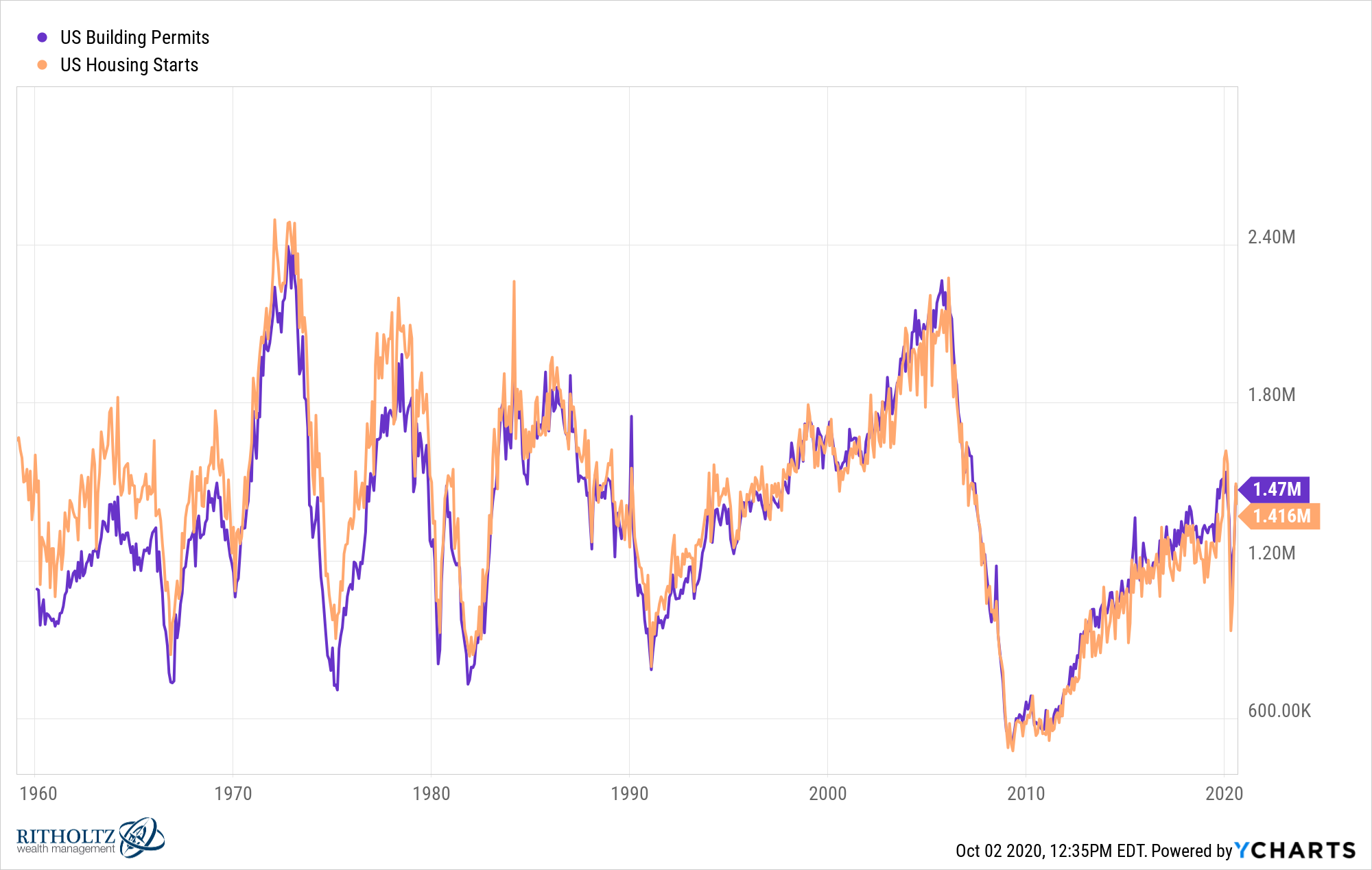
Recent Census and HUD data shows that the median price of new homes sold has moved below the median price of existing homes in some recent readings. That is unusual and important. Builders have been more willing to use incentives, price adjustments, and mortgage rate buydowns to keep sales moving.
New homes vs. existing homes
| Category | Recent Market Pattern | Why It Matters |
|---|---|---|
| New homes | More incentives and price flexibility | Buyers may find better deals from builders in some markets. |
| Existing homes | Limited supply in established neighborhoods | Prices stay firm where listings are scarce. |
| Single-family starts | Volatile and rate-sensitive | Builders pull back when demand weakens. |
| Multifamily construction | Still important for rental supply | Apartment supply can affect rent growth and investor returns. |
For buyers, the new-construction chart says one thing loudly: do not ignore builders. In many markets, a builder may offer closing-cost help, a temporary rate buydown, appliance packages, or other incentives that a traditional seller simply cannot match.
Chart 6: Affordability Is the Market’s Biggest Problem
If the U.S. housing market had a villain in 2026, it would not be sellers, buyers, real estate agents, or even the mysterious person who invented beige-on-beige kitchen flips. It would be affordability.
Home affordability has been squeezed from multiple directions. Prices rose dramatically during the pandemic boom. Mortgage rates then jumped. Insurance costs increased in many states. Property taxes climbed as assessments caught up with higher values. Maintenance costs also rose. The result is a monthly payment that often feels heavier than the listing price suggests.
Affordability pressure chart
| Cost Component | Recent Trend | Effect on Buyers |
|---|---|---|
| Home price | Still historically high | Requires larger down payments and bigger loans. |
| Mortgage rate | Mid-6% range | Raises monthly payments significantly. |
| Insurance | Rising in many climate-exposed states | Adds uncertainty to monthly housing costs. |
| Property taxes | Higher in many appreciating markets | Can surprise buyers after purchase. |
| Repairs and maintenance | Labor and material costs remain elevated | Ownership costs extend beyond the mortgage. |
This is why many households are still renting, even if they would prefer to buy. It is also why the phrase “house poor” is back in the conversation. Buying a home is not just about qualifying for a loan; it is about living comfortably after the closing papers are signed and the celebratory pizza has been eaten on the moving boxes.
Chart 7: Regional Markets Are Splitting Apart
There is no single U.S. housing market. There are hundreds of local markets wearing the same national name tag. The national chart gives the average, but the local chart tells the truth.
Some Sun Belt markets that boomed during the pandemic are now seeing more listings, longer days on market, and more price reductions. Markets such as parts of Florida, Texas, Arizona, and Colorado have become more negotiable than they were a few years ago. Meanwhile, some Midwest and Northeast metros remain relatively firm because supply is tighter and prices, while higher than before, may still look reasonable compared with coastal markets.
Regional market chart
| Region or Market Type | Current Pattern | Example Trend |
|---|---|---|
| Sun Belt boom markets | More inventory and price cuts | Buyers may have more leverage. |
| Midwest affordability markets | Steady demand | Lower price points attract cost-conscious buyers. |
| Northeast supply-constrained markets | Tight listings | Prices can stay firm despite high rates. |
| Luxury markets | More resilient in select metros | Cash buyers are less sensitive to mortgage rates. |
| New-construction suburbs | Builder incentives common | Rate buydowns can shift buyer decisions. |
For anyone buying or selling, this is the chart that matters most. National headlines may say the market is cooling, but your neighborhood might still be competitive. Or the headlines may say prices are stable, while your local market has five similar homes cutting prices at the same time.
Chart 8: Price Reductions Are Back, but Not Everywhere
Price reductions are one of the best charts for measuring seller confidence. Realtor.com data shows that a meaningful share of listings have seen price cuts, especially in markets where inventory has grown and buyer demand has softened.
That does not mean sellers are panicking. It means the market is forcing realism. In 2021, a seller could sometimes list a home with blurry photos, an ambitious price, and a bathroom last updated when flip phones were cool. In 2026, buyers are more selective. If the price is too high, the listing can sit.
What price cuts reveal
- Homes priced correctly can still sell quickly.
- Overpriced homes are more likely to sit and require reductions.
- Buyers have more room to negotiate in inventory-heavy markets.
- Move-in-ready homes still command premiums in many cities.
- Outdated homes need realistic pricing, not wishful thinking.
This chart is useful for sellers because it shows the cost of overpricing. The first two weeks of a listing still matter. If a home launches too high, the eventual price cut may not fully restore buyer excitement.
Chart 9: Foreclosures Are Rising From Low Levels
Foreclosure activity has been rising year over year, according to ATTOM-style market reports, but the chart needs context. Foreclosure filings are higher than they were during the unusually protected pandemic period, yet still well below the levels associated with the housing crisis of the late 2000s.
This is not a national foreclosure wave. It is more like a normalization with pressure points. Some homeowners are struggling with higher costs, job changes, insurance premiums, or adjustable debt, but widespread homeowner equity continues to act as a cushion.
Foreclosure chart: What to watch
| Indicator | Current Direction | Risk Level |
|---|---|---|
| Foreclosure filings | Up year over year | Worth watching |
| Foreclosure starts | Higher than last year | Localized stress may be growing |
| Completed foreclosures | Still low historically | Not yet a crisis signal |
| Homeowner equity | Generally strong | Helps prevent distressed sales |
For investors hoping for a flood of distressed properties, the chart does not yet support that story nationally. Opportunities may exist locally, but the broader market remains far from a foreclosure-driven collapse.
Chart 10: Buyer Psychology Has Changed
One of the least visible but most important charts is buyer psychology. During the pandemic boom, buyers were motivated by fear of missing out. In 2026, they are motivated by payment discipline. That is a major shift.
Buyers now ask harder questions: Can I afford the payment if insurance rises? Is the roof near the end of its life? Is the commute worth it? Will I regret buying if prices soften in this metro? Is this house actually charming, or did someone just put “charming” in the listing because the hallway is unusually narrow?
This more cautious mindset is healthy for the market. It slows reckless bidding and encourages better pricing. But it also means transactions take more work. Sellers need stronger presentation, agents need better local data, and buyers need realistic budgets.
What the Charts Mean for Buyers
For buyers, the charts offer a mixed but improving picture. More inventory means more choice. Price cuts in some markets mean more negotiating power. Builder incentives can create opportunities. But affordability remains difficult, and waiting for a dramatic national crash may not be a reliable plan.
Smart buyer moves in this market
- Shop by monthly payment, not just listing price.
- Compare existing homes with new construction incentives.
- Ask about seller credits, rate buydowns, and repair concessions.
- Watch local days-on-market trends before making an offer.
- Budget for taxes, insurance, repairs, and emergency savings.
The best opportunities may come from homes that are solid but poorly presented, listings that have been sitting, or builders with completed inventory. The worst mistake is stretching too far just because a lender says yes. A loan approval is not a lifestyle guarantee.
What the Charts Mean for Sellers
For sellers, the market is not bad, but it is less forgiving. Pricing strategy matters again. Condition matters again. Photography, staging, repairs, and flexibility matter again. The days of listing on Thursday and choosing from twelve offers by Sunday are still possible in some neighborhoods, but they are no longer the national default setting.
Smart seller moves in this market
- Price based on recent comparable sales, not 2021 memories.
- Watch competing listings and price reductions nearby.
- Fix obvious problems before listing.
- Consider concessions if buyers are payment-sensitive.
- Do not ignore feedback from showings.
A seller who prices correctly can still do well. A seller who prices emotionally may end up making several public price cuts, which is the real estate equivalent of repeatedly clearing your throat in a quiet room.
What the Charts Mean for Investors
For real estate investors, the 2026 market requires sharper pencils. Higher financing costs make cash flow harder. Insurance and taxes can change deal math quickly. Rent growth has cooled in some markets with new apartment supply, while other areas remain undersupplied.
The best investment opportunities are likely to be local and specific, not broad and obvious. Investors should study job growth, population trends, supply pipelines, rent-to-price ratios, property taxes, insurance risk, and local regulations. A market with falling prices is not automatically a bargain if rents are weak and ownership costs are rising.
Charts can help investors avoid emotional decisions. Cap rates, vacancy trends, permit activity, migration flows, and insurance costs tell a more useful story than a social media post claiming “this city is the next Austin.” The next Austin, as history keeps reminding everyone, usually becomes expensive right after someone names it.
of Practical Experience: Reading the U.S. Real Estate Market in Charts
Experience shows that the biggest mistake people make with real estate charts is treating one chart like the whole movie. A home price chart alone can make the market look strong. A mortgage rate chart alone can make it look frozen. An inventory chart alone can make buyers feel hopeful. But the real story appears only when the charts are layered together.
For example, imagine a buyer looking at a Sun Belt suburb where active listings are up 30% from last year. At first glance, that sounds like a buyer’s market. But then the buyer checks the price chart and sees that prices are only down 2%. Next comes the mortgage chart, which shows rates above 6%. Then the insurance chart enters the room wearing muddy boots: premiums have jumped because of storm risk. Suddenly, the “deal” is not as simple as it looked.
Now consider a seller in a tight Northeast suburb. National news says sales are slow and buyers are negotiating again. The seller worries they missed the boom. But local charts show limited inventory, strong school-district demand, and homes still selling near list price when properly prepared. In that case, national pessimism may be misleading. The seller does not need to panic; they need to price accurately and present the home well.
In practice, the most useful chart for buyers is often the monthly payment chart. A $25,000 price reduction sounds exciting, but if mortgage rates rise at the same time, the monthly payment may barely improve. Buyers should run scenarios: What happens if the rate is 6.25%, 6.75%, or 7%? What happens if insurance costs $200 more per month than expected? What happens if the home needs a roof in year two? This is not pessimism. It is adulting with a calculator.
For sellers, the most useful chart is days on market combined with price reductions. If similar homes are sitting for 45 to 60 days and cutting prices, launching high is risky. The first asking price is not just a number; it is a marketing signal. A sharp price attracts attention. An inflated price attracts silence, and silence is expensive.
For investors, the most useful chart may be supply pipeline. A city with strong rent growth today can soften quickly if thousands of new apartments are delivered next year. On the other hand, a market with steady jobs, limited construction, and moderate prices may outperform flashier cities over time.
The lesson is clear: charts do not predict the future perfectly, but they reduce the chance of being fooled by vibes. And in real estate, vibes can be costly. A beautiful kitchen can distract from a weak inspection. A low list price can hide high taxes. A “hot market” headline can ignore local oversupply. The smartest buyers, sellers, and investors use charts not to eliminate uncertainty, but to ask better questions before making expensive decisions.
Conclusion: The U.S. Housing Market Is Rebalancing, Not Resetting
The U.S. real estate market in charts tells a story of transition. Prices are no longer soaring, but they remain high. Inventory is improving, but affordable supply is still limited. Mortgage rates are lower than their worst levels but still high enough to strain monthly payments. Builders are offering incentives, sellers are adjusting expectations, and buyers are becoming more careful.
This is not the frenzy of 2021. It is not the crash of 2008. It is a slower, more selective, more local housing market where the details matter. For buyers, patience and payment discipline are essential. For sellers, realistic pricing is the new superpower. For investors, local data matters more than national hype.
The charts do not say the U.S. real estate market is broken. They say it is negotiating with reality. And reality, as usual, does not care what anyone paid in 2021.