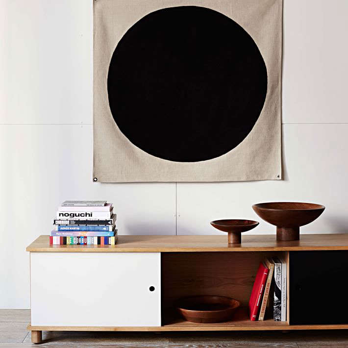
The Commune Eclipse Tapestry is the kind of wall piece that walks into a room, says very little, and somehow becomes the most interesting person at the party. Simple? Yes. Quiet? Mostly. Boring? Not even close. Designed as part of the Commune x West Elm collaboration, this modern textile wall hanging blends California cool, midcentury restraint, and a dash of cosmic mystery into one clean, graphic square.
At first glance, it may look like a minimalist composition: a bold circular form, black embroidery, natural fabric, and brass grommets. But the longer you look, the more personality it reveals. Is it an eclipse? A sun? A flag? A modern art joke that forgot to explain itself? That openness is exactly the charm. The Commune Eclipse Tapestry does not shout a single meaning from the wall; it lets the room, the light, and the viewer finish the story.
Note: Product availability and pricing may vary because the Commune x West Elm collection originally launched in 2016. If you are shopping today, this piece may appear through resale, vintage, or archived design marketplaces rather than standard retail inventory.
What Is the Commune Eclipse Tapestry?
The Commune Eclipse Tapestry is a textile wall art piece created in collaboration with Commune Design, the Los Angeles-based design studio known for architecture, interiors, product design, and an effortlessly layered West Coast aesthetic. The original retail listing described it as a modern take on 1960s wall art, built around scale, contrast, and a statement-making graphic composition.
The piece measures approximately 40 inches square with a slim profile of about 0.25 inches deep. It is made from a cotton and linen fabric blend, features an embroidered black design, and includes brass grommets for hanging. At the time of its original publication, it was listed at about $149, making it one of those rare design-collaboration pieces that felt accessible without looking mass-market.
Why This Tapestry Still Feels Fresh
It Uses Simplicity Like a Superpower
The Commune Eclipse Tapestry does not rely on ornate borders, heavy color, or decorative overload. Instead, it uses a restrained visual language: neutral textile, black embroidery, and a strong circular form. This is why it works in so many interiors. In a busy room, it adds focus. In a minimal room, it adds warmth. In a rental apartment with suspicious beige walls, it says, “Do not worry, I brought the personality.”
It Balances Softness and Structure
Framed prints and posters can feel crisp, polished, and sometimes a little predictable. A tapestry brings a different energy. The fabric surface softens sound, adds texture, and introduces subtle movement. The Eclipse Tapestry has enough structure to read as art, but enough softness to feel relaxed. That balance makes it especially useful in bedrooms, living rooms, studios, and reading corners where you want visual impact without museum-level seriousness.
The Brass Grommets Make Hanging Easy
One of the most practical details is the brass grommet construction. Instead of requiring complicated framing or specialty hardware, the piece can be hung directionally with a clean, intentional look. Brass also adds a warm metallic accent that pairs well with walnut, oak, leather, rattan, ceramic lamps, and vintage-inspired furniture.
The Design Language: California Cool Meets Midcentury Wall Art
Commune Design’s style often feels collected rather than decorated. The studio is known for blending influences from California craft, modernism, Japanese design, Mexican architecture, Scandinavian furniture, and 1960s and 1970s bohemian interiors. The Commune Eclipse Tapestry fits neatly into that universe.
The piece feels connected to vintage textile art but avoids looking like a costume from a retro movie set. Its circular motif suggests solar imagery, abstract symbolism, and the graphic confidence of midcentury design. The slightly offbeat composition keeps it human. It is polished, but not too polished. In other words, it has enough design-school intelligence to impress your architect friend and enough warmth to avoid scaring your houseplants.
How to Style the Commune Eclipse Tapestry
Hang It Above a Sofa
Because the tapestry is square and graphic, it works beautifully above a sofa. The 40-inch scale is large enough to anchor a seating area without overwhelming it. Pair it with a low-profile couch, linen pillows, a wood coffee table, and a ceramic table lamp for a relaxed California-modern mood. If your sofa is neutral, the black embroidery gives the wall just enough contrast.
Use It as a Bedroom Focal Point
Behind a bed, the Eclipse Tapestry can act like a softer alternative to framed art or a headboard. It brings texture without adding bulk, which is useful in smaller bedrooms. For the best effect, place it above a simple bed with white, oatmeal, charcoal, or clay-colored bedding. The result feels calm, grounded, and slightly celestial, like your bedroom hired a stylist but did not make a big deal about it.
Let It Shine in an Entryway
An entryway is a smart place for a graphic wall hanging. It creates an immediate design moment and sets the tone for the rest of the home. Add a narrow bench, woven basket, vintage mirror, or small brass hook nearby. The tapestry’s circular motif can make a small landing area feel intentional instead of accidental.
Pair It With Natural Materials
The cotton-linen fabric is a natural partner for wood, stone, clay, leather, wool, jute, and rattan. These materials support the tapestry’s handmade feel while keeping the overall look warm and livable. Avoid surrounding it with too many glossy surfaces. A little contrast is good; too much shine can make the textile feel like it wandered into the wrong apartment.
Best Rooms for the Commune Eclipse Tapestry
The best thing about the Commune Eclipse Tapestry is its flexibility. It can look sophisticated in a formal living room, cozy in a bedroom, creative in a studio, and surprisingly chic in a hallway. Because the design is black on a neutral textile ground, it does not fight with existing color palettes. It can live comfortably with warm neutrals, desert tones, deep greens, navy, terracotta, rust, ivory, and even muted pinks.
In a home office, it can soften the hard edges of desks, monitors, and shelving. In a dining room, it can add depth without feeling too precious. In a nursery or kid’s room, it offers a grown-up alternative to overly themed wall decor. And in a small apartment, it can create the feeling of collected design without requiring a large renovation budget or a dramatic conversation with your landlord.
What Makes It Different From a Poster or Print?
A poster gives you image and color. A tapestry gives you image, color, texture, shadow, and touch. That extra dimension changes how a room feels. The Commune Eclipse Tapestry has a tactile quality that framed paper cannot fully replicate. It absorbs rather than reflects light. It adds softness to flat drywall. It can make a new room feel more lived-in and an older room feel more thoughtfully updated.
Another advantage is movement. Even a very still textile has a gentle presence. It may shift slightly with air, drape softly at the edges, or cast a subtle shadow. That small amount of imperfection is part of the appeal. The Eclipse Tapestry is not trying to be a sterile gallery object. It is designed to live with furniture, books, lamps, shoes by the door, and possibly a dog who believes every rug-like object belongs to him.
Buying Tips: What to Check Before Purchasing
Because the original Commune x West Elm collection is no longer a typical new-release retail item, buyers may encounter the Commune Eclipse Tapestry through resale listings. Before buying, confirm the size, condition, fabric, embroidery, and grommets. Ask for clear photos of the front, back, corners, and hanging points. If a listing shows heavy fading, stains, pulled threads, or distorted fabric, factor that into the price.
Also check whether the piece includes original tags or packaging, though many used textiles will not. Lack of packaging does not automatically mean the item is not authentic, but detailed photos and accurate measurements matter. If the seller describes it as “inspired by” rather than “Commune Eclipse Tapestry,” proceed carefully. Inspired pieces may be perfectly attractive, but they are not the same as the original collaboration.
Care and Maintenance
Caring for a cotton-linen wall hanging is mostly about prevention. Keep it away from damp walls, heavy kitchen grease, direct bathroom humidity, and strong sunlight that could fade the fibers over time. Dust gently using a soft brush or a vacuum with low suction and a protective screen or fabric barrier. Do not scrub the embroidery as if you are removing barbecue sauce from a picnic blanket. Textile art prefers manners.
If deeper cleaning is needed, check any original care label first. For valuable, vintage, or hard-to-replace textiles, professional cleaning is safer than experimental laundering. Cotton and linen can be durable, but embroidery, grommets, and construction details make the piece more complex than a standard throw blanket.
Who Will Love the Commune Eclipse Tapestry?
This tapestry is ideal for people who like modern wall art but want something warmer than a framed print. It suits fans of midcentury design, California interiors, natural materials, subtle statement pieces, and decorative objects that feel open to interpretation. It is also a strong choice for renters, because it can make a room feel finished without permanent changes.
It may not be the best fit for someone who wants bright color, detailed illustration, or traditional scenic tapestry work. The Eclipse Tapestry is graphic, abstract, and intentionally restrained. Its beauty comes from proportion, material, and mood rather than decorative complexity.
Living With the Commune Eclipse Tapestry: Experience Notes
Imagine bringing the Commune Eclipse Tapestry into a room that feels almost finished but not quite alive. The sofa is in place, the rug is behaving itself, the coffee table has a book on it that everyone pretends to have read, and the walls are still doing their best impression of plain oatmeal. The moment this tapestry goes up, the room changes. Not dramatically, like a renovation show reveal with suspiciously perfect lighting, but quietly. The wall gains a center. The furniture suddenly looks more intentional. The room exhales.
The first experience is usually about scale. At 40 inches square, the piece has presence without being oversized. Above a small sofa, it feels generous. Above a console, it feels architectural. In a bedroom, it can become the visual anchor that keeps the bed from looking like it is floating in landlord-white space. The square shape is easy to work with because it does not create awkward empty corners or demand a matching set of companion pieces.
The second experience is about texture. From across the room, the black eclipse motif reads as a strong graphic mark. Up close, the cotton-linen surface and embroidery soften the geometry. That combination makes the tapestry surprisingly versatile. It can sit near a sleek metal floor lamp and not feel too rustic. It can hang above a vintage wood bench and not feel too modern. It plays well with both sides of the design family, which is more than can be said for some relatives at Thanksgiving.
The third experience is the pleasure of interpretation. Guests may see a sun, moon, eclipse, portal, symbol, or abstract flag. Some will ask about it. Others will simply stare at it for a second longer than expected. That is a useful quality in home decor: it creates conversation without demanding a speech. The best objects in a room do not explain everything. They leave a little mystery, like a stylish neighbor who owns excellent ceramics and never reveals where they shop.
Over time, the Commune Eclipse Tapestry becomes less like a decorative purchase and more like a design punctuation mark. Move it to a hallway, and it gives the space rhythm. Place it in a home office, and it softens screens and shelves. Hang it near plants, and the circular motif feels almost sunlike. Pair it with warm wood, and the black embroidery becomes sharper. Pair it with white bedding, and the whole room feels calmer. It is the rare wall hanging that can be quiet and memorable at the same time.
Conclusion
The Commune Eclipse Tapestry remains appealing because it understands restraint. It does not try to be everything. It is not a painting, not a poster, not a rug pretending to be wall art, and not a trend begging for attention. It is a thoughtful cotton-linen wall hanging with a strong black embroidered motif, warm brass hanging details, and a design language rooted in modern textile art, midcentury influence, and California ease.
For anyone looking to add texture, contrast, and quiet drama to a room, this tapestry is a smart reference point. Whether found as an original resale piece or used as inspiration for styling textile wall art, it proves that a single well-chosen object can make a space feel more complete. Sometimes the best design move is not adding more stuff. Sometimes it is adding one piece with enough presence to make the rest of the room sit up straighter.