Creating a graph in Google Sheets is one of those skills that sounds suspiciously “office-y” until you actually need it. Then, suddenly, a neat chart can save your meeting, rescue your report, and make a pile of numbers look like it has finally discovered personal hygiene. Whether you are tracking monthly sales, comparing class survey results, monitoring website traffic, or proving that your coffee budget has become a minor household emergency, Google Sheets can turn your data into a clear visual story.
The best part? You do not need to be a spreadsheet wizard with a cape made of formulas. Google Sheets includes a built-in Chart Editor that helps you select data, insert a chart, choose a graph type, customize labels, and share the final result. With a few thoughtful choices, you can create a graph that is not only accurate but also easy for other people to understand.
In this guide, you will learn how to create a graph in Google Sheets in 8 practical steps. We will also cover chart types, formatting tips, examples, common mistakes, and real-world experience from using Google Sheets graphs for reports, school projects, business dashboards, and everyday planning.
What Is a Graph in Google Sheets?
A graph in Google Sheets is a visual representation of spreadsheet data. Instead of forcing readers to scan rows and columns like they are solving a tiny accounting mystery, a graph displays patterns, comparisons, relationships, or trends in a format people can understand quickly.
Google Sheets supports many chart and graph types, including line charts, bar charts, column charts, pie charts, scatter charts, area charts, combo charts, histograms, and more. Each type has a purpose. A line graph is great for showing change over time. A bar graph works well for comparing categories. A pie chart can show parts of a whole, although it should be used carefully because pie charts can become confusing when there are too many slices. Nobody wants their data to look like a pizza that lost a fight.
Why Use Google Sheets to Create Graphs?
Google Sheets is popular because it is free for many users, cloud-based, collaborative, and easy to access from a browser. You can create a graph, edit the source data, and watch the chart update automatically. This makes it useful for team reports, student assignments, content calendars, budget tracking, business analytics, and quick presentations.
Another advantage is simplicity. You do not have to install heavy software or learn advanced design tools. If your data is organized properly, Google Sheets can usually suggest a chart automatically. Then you can customize the chart title, legend, colors, axis labels, data range, and chart style from the Chart Editor.
How to Create a Graph in Google Sheets: 8 Steps
Step 1: Open Google Sheets and Prepare Your Data
Start by opening your spreadsheet in Google Sheets. If you are creating a new file, enter your data into columns and rows. A simple structure works best. Put labels in the first row or first column, then place the numbers beside or below those labels.
For example, imagine you want to create a graph showing monthly website visitors:
| Month | Visitors |
|---|---|
| January | 4,200 |
| February | 4,850 |
| March | 5,300 |
| April | 6,100 |
This format is clean, readable, and graph-friendly. The first column provides the category or time period, while the second column provides the values. If your spreadsheet looks like a tornado visited a calculator factory, tidy it up before inserting a graph. Remove blank rows, fix inconsistent labels, and make sure numbers are stored as numbers, not text.
Step 2: Select the Data You Want to Graph
Highlight the cells you want to include in your graph. Include your headers if they describe the data clearly. Headers help Google Sheets understand what each row or column means, and they can automatically become chart labels or legend entries.
Using the example above, you would select the month names and visitor numbers. If your data is in cells A1:B5, highlight that full range. You can click and drag with your mouse, or click the first cell, hold Shift, and click the final cell in the range.
Be selective. Do not highlight unrelated notes, totals, empty cells, or random side comments like “ask Kevin about this.” Google Sheets is smart, but it is not emotionally prepared to interpret Kevin’s chaos.
Step 3: Click Insert and Choose Chart
After selecting your data, go to the top menu and click Insert, then choose Chart. Google Sheets will automatically insert a chart into your spreadsheet and open the Chart Editor panel on the right side of the screen.
At this point, Google Sheets usually makes an educated guess about the best chart type. Sometimes it gets it right. Sometimes it chooses something that technically works but feels like wearing shoes on the wrong feet. That is why the next step matters.
Step 4: Choose the Right Chart Type
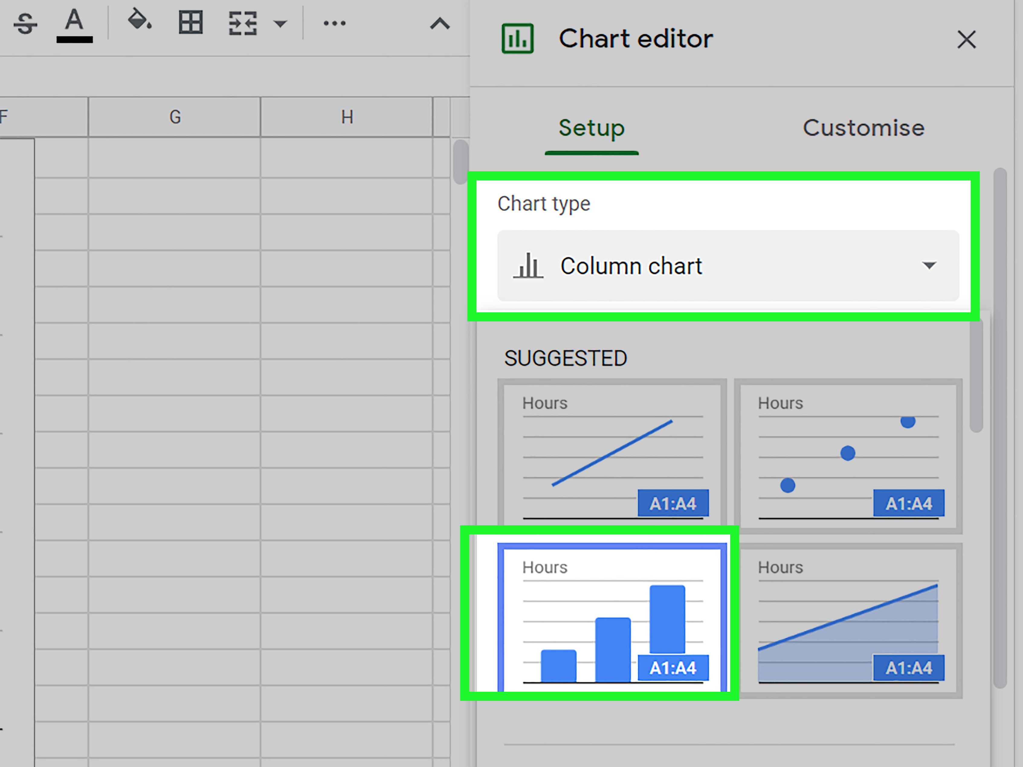
In the Chart Editor, open the Setup tab and find the Chart type dropdown menu. This is where you can choose the graph style that best matches your data and your goal.
Here are common chart types and when to use them:
- Line chart: Best for showing trends over time, such as monthly traffic, revenue growth, or temperature changes.
- Column chart: Best for comparing values across categories, such as sales by product or attendance by event.
- Bar chart: Similar to a column chart, but horizontal. Great when category names are long.
- Pie chart: Best for showing parts of a whole, such as budget percentages, but only when you have a small number of categories.
- Scatter chart: Best for showing relationships between two numeric variables, such as advertising spend and conversions.
- Combo chart: Useful when you want to compare different types of data in one chart, such as revenue and profit margin.
The golden rule is simple: choose the chart type that makes your point easiest to understand. A graph should explain your data, not make readers squint like they are decoding an ancient spreadsheet prophecy.
Step 5: Check the Data Range and Series
Still in the Setup tab, check the Data range. Make sure Google Sheets selected the correct cells. If the graph looks strange, the data range is often the first place to investigate.
You can also review the X-axis and Series settings. The X-axis usually contains categories or dates. The series contains the numeric values being plotted. If your chart has rows and columns reversed, use the Switch rows / columns option. This can quickly fix charts where the labels and values appear in the wrong places.
For example, if you are comparing monthly visitors, the months should appear along the X-axis and the visitor numbers should appear as the plotted values. If Google Sheets flips them around, your chart may look confusing. Fortunately, this is usually a two-click fix, not a dramatic spreadsheet tragedy.
Step 6: Add a Clear Chart Title and Axis Labels
Now click the Customize tab in the Chart Editor. Open Chart & axis titles. Add a clear title that tells readers what the graph shows. A weak title might be “Visitors.” A stronger title would be “Monthly Website Visitors, January–April.”
Axis labels matter too. If your vertical axis shows dollars, say so. If it shows page views, units sold, survey responses, or test scores, label it clearly. Good labels reduce confusion and help your chart stand on its own, even when someone views it without your explanation.
For example:
- Chart title: Monthly Website Visitors, January–April
- Horizontal axis: Month
- Vertical axis: Visitors
Think of your chart title as the headline and your axis labels as the helpful tour guides. Without them, readers may wander through your graph asking, “Wait, what are we looking at?” which is not the vibe we are going for.
Step 7: Customize the Design for Readability
A graph does not need to look like it was designed by a luxury branding agency, but it should be readable. In the Customize tab, you can adjust chart style, background, font, colors, legend position, gridlines, and data labels.
Keep formatting simple. Use enough contrast so text and chart elements are easy to see. Avoid using too many colors unless each color has a purpose. A chart with twelve bright colors may look exciting, but so does a spilled box of markers. Exciting is not always useful.
If your graph compares multiple series, make sure the legend is visible and easy to understand. If your chart would benefit from showing exact values, open Series and enable Data labels. Data labels can be helpful for bar charts, column charts, pie charts, and other chart types, but do not overuse them. Too many labels can clutter the chart.
You can also adjust gridlines and ticks if the graph looks too busy. The goal is to remove visual noise while keeping enough information for readers to interpret the data accurately.
Step 8: Move, Resize, Download, or Share Your Graph
Once your graph looks good, you can move it around the sheet by clicking and dragging it. Resize it by dragging the corners. If you want the chart on a separate sheet, click the three-dot menu on the chart and choose the option to move it to its own sheet.
You can also copy the graph into Google Docs or Google Slides. This is useful for reports, presentations, proposals, and class assignments. If you need an image file, use the chart menu to download it in available formats. If your spreadsheet is shared with a team, the graph can update when the data changes, which is one of the nicest things about using Google Sheets instead of a static screenshot.
Example: Creating a Sales Graph in Google Sheets
Let’s say you run a small online store and want to compare product sales for four items:
| Product | Units Sold |
|---|---|
| T-Shirts | 320 |
| Hoodies | 210 |
| Caps | 145 |
| Tote Bags | 180 |
For this data, a column chart or bar chart would work well because you are comparing categories. Select the table, click Insert, choose Chart, and then select Column chart from the Chart type menu. Add the title “Units Sold by Product,” label the vertical axis “Units Sold,” and keep the product names on the horizontal axis.
Now the story is obvious: T-shirts sold the most, caps sold the least, and hoodies are doing respectably enough to avoid an awkward performance review.
Common Mistakes When Creating Graphs in Google Sheets
Using the Wrong Chart Type
The wrong chart type can make good data look confusing. Do not use a pie chart for trends over time. Do not use a line chart when your categories have no natural order. Do not use a 3D-style chart when a simple flat chart would be clearer. Your goal is communication, not spreadsheet theater.
Selecting Messy Data
Messy data creates messy graphs. Before you insert a chart, check for blank rows, inconsistent date formats, extra totals, duplicate headers, and numbers stored as text. A few seconds of cleanup can prevent several minutes of chart-related sighing.
Forgetting Labels and Units
A chart without labels is like a map without street names. It may look official, but it is not very helpful. Always clarify what your chart measures and what each axis represents.
Overloading the Chart
Not every number belongs in one graph. If you have too many categories, too many colors, or too many data series, consider creating multiple smaller charts. Readers should not need a magnifying glass, a decoder ring, and emotional support to understand your data.
Tips for Making Better Google Sheets Graphs
Start with a question. What are you trying to show? Are sales increasing? Which product performs best? Did attendance improve? Are two variables related? When you know the question, choosing the right chart becomes much easier.
Use descriptive titles. Instead of “Revenue,” write “Quarterly Revenue Growth in 2026.” Instead of “Survey Results,” write “Customer Satisfaction Survey Results.” A specific title gives readers context immediately.
Keep your design clean. Use colors intentionally, not decoratively. Make sure text is readable. Avoid unnecessary borders, heavy gridlines, and cluttered legends. In data visualization, simple usually wins because simple lets the insight do the talking.
Consider adding a trendline when you are working with time-based or relationship-based data. A trendline can help show the overall direction of the data, especially in line, scatter, column, or bar charts where the option is available. Use it when it adds meaning, not just because it looks impressively mathematical.
When Should You Use a Graph Instead of a Table?
Use a graph when you want readers to see patterns quickly. Graphs are excellent for trends, comparisons, distributions, and relationships. Use a table when exact numbers matter more than visual patterns. For example, a table is better for listing invoice details, while a graph is better for showing monthly revenue growth.
In many reports, the best approach is to use both. A graph gives readers the big picture, and a table provides the exact details. Together, they create a balanced presentation that works for both quick readers and detail lovers.
How to Edit a Graph After Creating It
To edit an existing graph in Google Sheets, double-click the chart. The Chart Editor will reopen on the right side. From there, you can change the chart type, adjust the data range, edit titles, update labels, move the legend, add data labels, change colors, or modify the axes.
This flexibility is useful because your first chart is not always your best chart. Sometimes you need to test a bar chart, switch to a line chart, add labels, remove clutter, and then proudly pretend you knew the final design all along. That is normal. Good charts are often edited into shape.
Experience Notes: What I Learned Creating Graphs in Google Sheets
After using Google Sheets graphs for many different projects, one lesson stands out: the quality of the chart depends heavily on the quality of the data. When the source data is organized, consistent, and clearly labeled, creating a graph feels smooth. When the data is messy, the chart becomes a tiny visual complaint. I have seen charts go wrong simply because one date was typed as text, one number had an extra space, or a total row was accidentally included in the selected range. Google Sheets can do a lot, but it cannot read minds. At least not yet, which is probably good for all of us.
Another practical lesson is that simple charts usually perform better in real communication. It is tempting to customize every color, add every label, and choose the fanciest chart type available. But the best graph is often the one that answers the reader’s question in three seconds. A clean column chart can beat a complicated combo chart if the goal is basic comparison. A simple line chart can explain a trend better than a crowded dashboard with five competing visuals.
For business reports, I have found that titles make a bigger difference than most people expect. A title like “Q1 Sales” is acceptable, but “Q1 Sales Increased 18% After February Promotion” is much stronger if that is the key takeaway. The second title tells a story. It does not just label the chart; it guides the reader toward the insight. This is especially helpful when charts are copied into Google Slides or shared with people who were not involved in building the spreadsheet.
For school or beginner projects, the most useful habit is checking the chart after every major change. Change the data range, look at the chart. Switch the chart type, look again. Add labels, check readability. This small habit prevents confusion later. It also helps you learn what Google Sheets is doing behind the scenes. The more you experiment, the faster you understand which chart types work for different data sets.
One underrated feature is the ability to copy charts into Google Docs and Slides while keeping them linked to the original spreadsheet. This is incredibly helpful for reports that change over time. Instead of rebuilding visuals every week, you can update the data in Sheets and refresh the chart in your document or presentation. That can save a surprising amount of time, especially for recurring reports, marketing dashboards, classroom progress charts, or budget reviews.
My final experience-based advice is this: do not create a graph just because you can. Create it because it helps someone understand something faster. A graph should have a job. Maybe its job is to show growth, reveal a problem, compare options, or support a decision. If the graph does not make the data clearer, the table may be enough. But when the data has a story hidden inside it, Google Sheets gives you a fast, practical way to bring that story into the daylight.
Conclusion
Learning how to create a graph in Google Sheets is a practical skill for work, school, business, and personal organization. The process is simple: prepare your data, select the correct range, insert a chart, choose the right chart type, check the setup, customize labels, improve readability, and share or export the finished graph.
The real secret is not just clicking Insert > Chart. The real secret is understanding what your data needs to say. Once you know the message, Google Sheets becomes more than a spreadsheet tool. It becomes a quick visual storytelling machine, minus the dramatic background music.