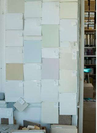
Some paint colors sit on a wall. Donald Kaufman colors seem to wake up, stretch, sip coffee, and change personalities as the sun moves across the room. That is the magic behind the Donald Kaufman Color Collection for Pratt & Lambert: a refined palette built around the relationship between color, architecture, pigment, and light.
This is not the usual “pick a beige and hope for the best” paint story. Donald Kaufman is known for treating wall color like fine art, using complex pigment combinations to create depth, luminosity, and subtle movement. When his signature colors became available through Pratt & Lambert, homeowners gained easier access to a designer-level paint experience once associated mainly with architects, museums, galleries, and highly customized interiors.
For anyone planning a living room refresh, a historic home restoration, a gallery-like hallway, or a kitchen that does not scream “builder-grade white,” this collection deserves a serious look. It is elegant without being fussy, sophisticated without being cold, and practical enough for real homes where people spill coffee, move chairs, and occasionally let a toddler redecorate with crayons.
What Is the Donald Kaufman Color Collection for Pratt & Lambert?
The Donald Kaufman Color Collection for Pratt & Lambert was a curated group of luminous architectural paint colors created with Kaufman’s full-spectrum approach. Remodelista’s early coverage described the collection as offering more than 100 colors, including new shades and multiple acrylic finishes, bringing Kaufman’s highly respected color work to homeowners through Pratt & Lambert.
The big idea behind the collection is simple but powerful: paint should not be flat, dull, or disconnected from the room around it. Kaufman’s colors are designed to interact with daylight, artificial light, flooring, furniture, artwork, and trim. A soft neutral may look warm in the morning, quieter at noon, and moodier by evening. That is not a flaw. That is the point.
Why Donald Kaufman Paint Colors Feel Different
Full-Spectrum Pigments Create Depth
Many conventional paint colors are mixed from a limited number of colorants. Kaufman’s work is known for using more complex pigment formulas, often described as full-spectrum or fine-art-inspired pigment layering. The result is color that feels less like a printed swatch and more like a living surface.
Think of the difference between instant coffee and a carefully brewed espresso. Both are technically coffee. One gets the job done; the other has layers. Donald Kaufman paint colors aim for the layered version. They can make a wall feel soft, atmospheric, and dimensional rather than simply “painted.”
Light Becomes Part of the Design
Kaufman’s color philosophy treats rooms as containers of colored light. That may sound poetic, but it is also practical. A north-facing room, a skylit kitchen, a windowless hallway, and a candlelit dining room will all change how color appears. This is why a paint color that looks perfect in a store can become strangely green, gray, yellow, or ghostly once it gets home.
The Donald Kaufman approach asks you to choose paint in context. Instead of trusting a tiny chip under fluorescent retail lighting, you test color where it will actually live. The wall, the light, the sofa, the oak floor, the marble counter, and even the art on the wall all join the conversation.
Pratt & Lambert: Why the Partnership Mattered
Pratt & Lambert has long been associated with premium architectural paints. Founded in the nineteenth century and later part of the Sherwin-Williams family of brands, Pratt & Lambert built a reputation among designers, contractors, and homeowners who wanted refined finishes and reliable performance.
The partnership mattered because Kaufman’s color work had an elite reputation, while Pratt & Lambert gave homeowners and professionals a familiar paint brand through which to access it. For design-minded homeowners, that meant less mystery and more possibility. Instead of hearing that a color consultant had created a custom museum-grade shade somewhere in Manhattan, you could actually explore a Donald Kaufman palette for your own walls.
Today, Pratt & Lambert’s product presence has shifted, and its products are now associated with the Valspar lineup. However, the design conversation around the Donald Kaufman collection remains useful because the palette’s core lessons still apply: color should be tested carefully, chosen with light in mind, and treated as part of the architecture rather than an afterthought.
Best Rooms for Donald Kaufman Colors
Living Rooms
A living room is often the best place to appreciate a nuanced paint color. Natural light changes throughout the day, lamps come on at night, and the walls interact with upholstery, books, rugs, and art. A Donald Kaufman neutral can keep the room calm without turning it bland. A soft green, smoky blue, or warm off-white can create a relaxed, collected feeling that says, “I read design magazines,” not “I panicked at the paint counter.”
Dining Rooms
Dining rooms love drama, but not every home needs theatrical burgundy walls and a chandelier that looks like it has a trust fund. Kaufman-inspired colors work beautifully in dining spaces because they can feel rich without being loud. A deep brown, red-brown, charcoal, olive, or blue-black can make evening light feel intimate and flattering.
Kitchens
Kitchens are tricky because color must work with cabinets, countertops, hardware, appliances, and food. Nobody wants a wall color that makes a salad look suspicious. Subtle Donald Kaufman-style whites, creams, greiges, pale yellows, and warm grays can soften hard surfaces and keep the room from feeling sterile.
Bedrooms
For bedrooms, the strongest move is often restraint. Kaufman himself has advised using fewer colors to calm a space. A bedroom does not need to announce itself like a parade float. Soft off-white, muted blue, mineral gray, dusty lavender, or warm taupe can create a room that feels restful without becoming boring.
Hallways and Transitional Spaces
Hallways are often ignored, which is rude considering they do so much walking. A luminous neutral can make a hallway feel intentional, especially when paired with crisp trim and good lighting. Because hallways often have limited natural light, test colors carefully and consider slightly warmer tones to avoid a cold tunnel effect.
How to Choose a Donald Kaufman Paint Color
Start With the Room, Not the Swatch
The biggest mistake is choosing paint as if the room does not exist. Before selecting a color, look at the room’s fixed elements. What color is the floor? Are the windows large or small? Is the trim bright white, cream, wood, or painted? Are the furnishings cool, warm, colorful, or neutral?
A color that sings beside walnut floors may sulk beside orange oak. A creamy white that glows in a sunny room may look dingy in a cool northern exposure. Paint has feelings. Or at least it behaves like it does.
Use Large Sample Boards
Large sample boards are essential. Paint each sample on sturdy board, apply the correct number of coats, and move the board around the room. Look at it in morning light, afternoon light, and evening artificial light. Hold it near trim, fabric, tile, stone, and flooring.
Do not judge by one quick glance. Paint color is like a houseguest: you need to see how it behaves over time before inviting it to stay permanently.
Compare Less, Observe More
Donald Kaufman has emphasized considering a white or color on its own merits instead of obsessively comparing names and chips. That is smart advice. When you place ten nearly identical whites in a row, your brain starts inventing drama. Suddenly one looks “too yellow,” another “too gray,” and another “possibly haunted.”
Pick a few serious candidates, view them in the actual room, and pay attention to the feeling they create. Does the space feel calmer? Larger? Warmer? More elegant? That matters more than whether the color name sounds expensive.
Choosing the Right Finish
Color is only half the story. Finish controls how light reflects, how durable the surface feels, and how easily the wall can be cleaned. A flat or matte finish hides imperfections and gives walls a soft, elegant appearance. Eggshell adds a slight sheen and is often a practical choice for living rooms and bedrooms. Satin and semi-gloss finishes offer more durability and moisture resistance, making them useful for kitchens, bathrooms, trim, doors, and cabinets.
With sophisticated colors, sheen matters even more. A deep tone in a glossy finish may feel glamorous, but it can also highlight every bump and roller mark. A pale full-spectrum color in matte may feel velvety and atmospheric, but it may not be ideal behind a stove or in a mudroom where backpacks attack the wall daily.
Preparation: The Unsexy Secret to Beautiful Paint
Beautiful paint still needs a well-prepared surface. Clean the walls, repair holes, sand rough areas, remove dust, tape carefully, and prime when needed. Primer is especially important when changing from a dark color to a light one, painting new drywall, covering stains, or working with patched surfaces.
This is where patience pays off. Expensive paint over a poorly prepared wall is like wearing a tuxedo with muddy sneakers. Technically dressed up, emotionally confusing.
Indoor Air and Ventilation
When painting indoors, ventilation matters. Open windows when possible, use fans safely, follow product instructions, and avoid storing unnecessary paint supplies inside living areas. Low-VOC and zero-VOC options may help reduce odor and indoor air concerns, but good airflow is still smart. Fresh color is lovely; a headache is not part of the design plan.
Design Examples: How the Palette Works in Real Homes
The Gallery-Style Apartment
Imagine a city apartment with oak floors, white trim, a linen sofa, black-framed art, and afternoon light. A Donald Kaufman-style warm white or pale gray can create a gallery-like backdrop without feeling sterile. The walls stay quiet, but not empty. Art stands out, shadows soften, and the room feels finished.
The Historic Dining Room
In a home with crown molding, dark wood furniture, and brass fixtures, a deep red-brown or muted charcoal can make the dining room feel grounded and elegant. Add low light and the color becomes richer. It is the opposite of a flat accent wall; it creates atmosphere.
The Calm Bedroom
A bedroom with natural linen bedding, woven shades, and warm wood can benefit from a muted off-white, mineral blue, or soft taupe. These colors support rest without looking generic. The goal is not to shout “design statement.” The goal is to exhale.
Pros and Cons of the Donald Kaufman Color Approach
Pros
The main advantage is depth. These colors can make rooms feel more nuanced, more expensive, and more connected to light. They are especially strong for interiors where subtlety matters: art-filled homes, architect-designed spaces, historic properties, refined apartments, and rooms where the wall color needs to support rather than dominate.
Cons
The challenge is decision-making. Subtle colors require careful sampling. They may also cost more than standard paint options, depending on product availability and formulation. And because the colors respond strongly to light, rushing the selection process can lead to disappointment.
Experience Notes: Living With a Donald Kaufman-Inspired Palette
The first experience many people have with a sophisticated full-spectrum paint is confusion. On the sample card, the color looks simple. On the wall, it suddenly has a social life. In the morning it feels creamy and fresh. At noon it becomes quieter. At night, under warm lamps, it may reveal a soft gold, gray, green, or pink undertone that was invisible earlier. At first, this can feel alarming. Then you realize this is exactly why the color feels so good.
In a real home, the Donald Kaufman approach rewards patience. The best method is to live with samples for several days. Tape large painted boards near windows, behind furniture, next to trim, and in the shadowy corners that usually get ignored. Check them while drinking coffee. Check them while making dinner. Check them when the lamps are on and the room is messy, because that is the honest version of the room. A color that only works when the house is spotless and professionally photographed may not be your color.
One of the most useful lessons is that the “safe” choice is not always the best choice. Many homeowners automatically choose a standard white or beige because they fear making a mistake. But a more complex off-white, gray, taupe, or pale yellow can actually be safer because it works with the room’s natural light instead of fighting it. A flat white can turn cold in a shaded room. A warmer, layered white can make the same room feel gentle and lived-in.
Another experience is learning how much trim affects wall color. A beautiful wall shade can look wrong beside trim that is too stark, too creamy, or too glossy. When using a refined palette, test trim and wall colors together. Sometimes the best solution is not high contrast but a quiet relationship: walls in one soft tone, trim in a related lighter tone, and doors in a slightly deeper finish. This creates architecture without shouting.
Furniture also changes everything. A Kaufman-inspired gray beside a blue sofa may look cool and tailored. Beside a camel leather chair, it may reveal warmth. Beside a red rug, it may suddenly appear greenish. This is not the paint misbehaving; it is color theory politely reminding you that everything in a room is connected.
The biggest practical tip is to buy enough paint for the project and keep records. Note the color, finish, product base, room, date, and number of coats. If multiple cans are used, have the painter box them together for consistency. Future you will be grateful, especially when a chair scrapes the wall two years later and you need a touch-up instead of an emotional support group.
Living with this kind of palette can also change how you see design. You may stop chasing trendy colors and start noticing atmosphere. You may care less about whether a color is “in” and more about whether it makes your kitchen feel generous in the morning or your bedroom feel calm at night. That is the real value of the Donald Kaufman Color Collection for Pratt & Lambert: it teaches that paint is not decoration pasted onto architecture. It is part of the architecture’s voice.
Conclusion
The Donald Kaufman Color Collection for Pratt & Lambert remains a fascinating example of what happens when fine-art color thinking meets architectural paint. Its appeal is not about loud trends or instant drama. It is about depth, light, restraint, and the subtle pleasure of walls that change beautifully throughout the day.
For homeowners, designers, and renovators, the lesson is clear: choose paint slowly, test it honestly, and respect the room’s light. A great color does more than cover a wall. It shapes the way a room feels, the way furniture settles into place, and the way everyday life looks inside your home.