White tile is the little black dress of kitchens and bathrooms: dependable, adaptable, and occasionally accused of being boring. Grout is what proves the accusation wrong. Those narrow lines can make a wall look seamless, outline a herringbone pattern, warm up a cool room, or transform basic subway tile into a graphic feature.
The best grout color for white tile depends on the tile’s undertone, finish, shape, joint width, lighting, room style, and cleaning demands. A glossy blue-white subway tile behaves differently from creamy handmade ceramic, even when both boxes simply say “white.” Below are six designer-recommended directions, plus practical ways to test the choice before the grout becomes a long-term roommate.
Why Grout Color Matters So Much
Grout acts like a frame. A close match lets tile read as one continuous surface, emphasizing sheen and texture. A contrasting grout outlines every piece, making brick bonds, stacked layouts, hexagons, and herringbone patterns more noticeable.
Contrast also reveals workmanship. Dark grout can celebrate precise joints, but it can advertise uneven spacing just as enthusiastically. A softer neutral is more forgiving with handmade edges, imperfect walls, and natural variation.
Start With the Tile’s Undertone
Compare the tile with bright white printer paper in the room’s actual light. Cool white tile often suits crisp white, silver gray, charcoal, blue, or cool greige. Warm white tile generally works with ivory, mushroom, beige, or warm gray. Marble-look tile can pair beautifully with grout that echoes its veining.
Use physical samples. Screens and paper charts can only approximate the installed result, which may shift with lighting, water ratio, grout formula, curing conditions, tile porosity, and cleanup technique.
1. White Grout: Seamless and Classic
White grout with white tile creates the quietest, most continuous look. The grout lines recede, allowing the tile’s finish and texture to take center stage. It is a strong choice for minimalist kitchens, traditional shower walls, small bathrooms, and large-format tile where visual calm matters.
Match the temperature rather than grabbing the brightest white available. Brilliant grout can make creamy tile look yellowed, while antique white may look dirty beside a cool, crisp tile. Maintenance is the trade-off: white grout shows cooking splashes, floor soil, cosmetics, and gradual discoloration more readily than midtone neutrals. It is usually easier to live with on a backsplash or wall than on a busy floor.
2. Warm White or Ivory Grout: Soft and Inviting
Warm white, ivory, bone, alabaster, and linen grout soften the grid without making it disappear. These shades complement creamy ceramic, oak cabinets, brass fixtures, limestone, terracotta, and warm neutral paint. They are especially useful when pure white looks too clinical.
Ivory can also prevent a backsplash from competing with veined countertops or patterned floors. However, warm grout beside a blue-white tile may appear yellow or pre-stained, especially under cool LED lighting. Test the pairing during the day and at night. Warm white disguises mild discoloration better than bright white, but it still requires a grout product and cleaning routine appropriate for the room.
3. Light Gray Grout: The Versatile Favorite
Light gray is often the most flexible answer to “What color grout goes with white tile?” It outlines the tile without turning the surface into graph paper. The result works across contemporary, farmhouse, transitional, industrial, and Scandinavian-inspired interiors.
Silver gray complements cool white, chrome, stainless steel, concrete, and blue-based paint. A warmer pale gray works with brushed nickel, wood, and softer whites. On marble-look porcelain, gray grout can echo the veining and make the pattern feel more intentional.
Designers return to light gray because it hides ordinary dust and minor staining better than white while avoiding charcoal’s visual intensity. Sample several versions; “light gray” can range from almost white to distinctly smoky.
4. Greige, Taupe, or Mushroom Grout: Earthy Sophistication
Greige combines gray restraint with beige warmth, while taupe and mushroom move further into earthy territory. Against white tile, these hues create gentle structure and connect naturally with wood cabinetry, woven materials, stone, bronze hardware, and plaster-like walls.
A balanced greige is useful in rooms containing both warm and cool finishes. It can bridge a white backsplash, stainless appliances, oak flooring, and beige quartz without forcing everything to match exactly.
Watch the undertone. Taupe may lean pink, green, violet, or brown, and that hidden note should relate to another finish in the room. Compare the grout beside tile, countertops, cabinets, flooring, and paintnot tile alone.
5. Charcoal or Black Grout: Bold and Graphic
Charcoal and black grout turn white tile into a visible pattern. Subway tile becomes architectural, hex tile becomes playful, and herringbone becomes the main event. The combination suits modern bathrooms, industrial kitchens, black-and-white powder rooms, and spaces with dark window frames or matte-black fixtures.
Charcoal is often easier to live with than true black because it provides strong definition without looking quite as severe. Dark grout does, however, reveal inconsistent joints and crooked cuts. Pigment may also mark porous or textured tile, so a test board and any recommended pre-sealing are important.
Dark grout hides many stains, but not everything. Hard-water deposits, soap film, lint, and efflorescence can appear pale against it. Camouflage, yes; invisibility cloak, sadly no.
6. Blue, Green, or Another Muted Color: Personality With Control
Colored grout can make inexpensive white tile look custom. Dusty blue, navy, sage, teal, blush, or muted terracotta adds personality while white tile keeps the room bright. The most polished designs repeat the grout color elsewherea navy vanity, sage cabinets, a Roman shade, artwork, or clay accessories.
Choose a softened, slightly grayed color rather than the loudest option on the chart, and limit competing accents. Simple tile shapes make the best canvas because the grout supplies the surprise.
Consider longevity. Hardware can be replaced in an afternoon; grout is less eager to leave. Pick a color you would enjoy after the trend cycle moves on to whatever is nextpossibly motivational grout with its own podcast.
Match the Grout to the Tile Shape and Room
Subway, Hexagon, and Penny Tile
White or ivory makes subway tile feel traditional and blended; light gray offers moderate definition; charcoal emphasizes running bond, vertical stack, and herringbone layouts. Small hexagon and penny tile contain many joints, so grout occupies more of the visible field. A matching color softens the pattern, while contrast outlines every shape and increases the importance of neat spacing.
Handmade and Marble-Look Tile
Handmade or zellige-style tile usually pairs well with soft white, pale greige, or light gray, which supports its rippled surface and color variation. Strong contrast can exaggerate irregular edges. For marble or marble-look tile, match the background for a slab-like effect or echo a vein color for subtle structure.
Kitchens, Showers, and Floors
Backsplashes often benefit from ivory, warm gray, light gray, or greige because these colors are softer than charcoal and more forgiving than pure white. Shower walls can remain bright with white or pale gray, while bathroom floors, entries, and mudrooms generally age more gracefully with medium gray, mushroom, or charcoal. Dark shower grout may reveal pale mineral deposits, so local water conditions deserve a vote.
How to Test Grout Color Before Committing
- Gather three physical samples: one close match, one subtle contrast, and one bolder option.
- Make a sample board: install enough spare tile to show the real layout and joint width.
- Use the exact grout product: identical color names from different manufacturers are not identical colors.
- Let it cure: wet grout looks darker, and early color may not represent the final shade.
- Move the board around: compare it with cabinets, counters, floors, paint, daylight, and artificial lighting.
- Test ordinary messes: after full cure, try cleaning coffee, tomato sauce, cosmetics, or muddy water according to product instructions.
A mockup costs a little time and material. It costs considerably less than disliking an entire shower every morning for the next decade.
Choose the Right Grout Formula, Not Just the Right Shade
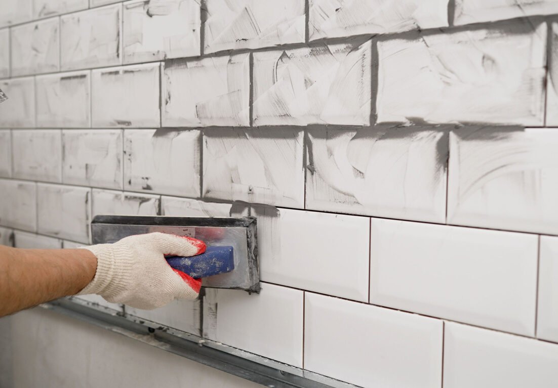
Cement-based grout is common, but some products require sealing and ongoing maintenance. High-performance cement, ready-to-use, and epoxy grouts may offer better stain resistance or color consistency, although cost, application, cure time, and tile compatibility vary.
Joint width and tile surface influence product selection. Some grouts suit narrow joints, others wider joints, and abrasive aggregate may scratch delicate finishes. Use a product approved for the tile, room, and joint size. For consistent cement-grout color, measure water carefully, mix batches the same way, avoid excessive washing, and use material from the same lot when possible.
Quick Grout Color Guide
- White: seamless, bright, classic, and best where staining is manageable.
- Warm white or ivory: soft, traditional, and ideal with cream, brass, and wood.
- Light gray: versatile, subtly defined, and forgiving in everyday use.
- Greige, taupe, or mushroom: warm, organic, and useful for mixed-neutral palettes.
- Charcoal or black: graphic, modern, and highly dependent on precise installation.
- Muted color: creative, personal, and strongest when repeated elsewhere in the room.
Real-World Experience: Lessons That Make Grout Decisions Easier
In real renovation projects, the biggest grout regrets rarely come from choosing an objectively unattractive color. They come from choosing a color in isolation. A sample may look perfectly neutral in a store and unexpectedly pink, green, or yellow once it sits between the tile and countertop. The practical lesson is simple: every finish gets a vote. Tile, paint, cabinets, stone, metal, flooring, and lighting should all be present during the final comparison.
Another common experience is underestimating scale. On a two-inch swatch, charcoal grout looks like a tasteful dark accent. Across 80 square feet of white subway tile, it becomes a major design element. Strong contrast multiplies with every joint. A sample board should therefore contain enough tile to show the actual layoutnot merely two pieces separated by one heroic line of grout.
Homeowners also discover that maintenance works in both directions. White grout exposes dark dirt and stains. Black grout exposes white mineral deposits, soap film, lint, and construction dust. Medium gray and greige are popular partly because they hide a wider range of ordinary life. They are the sweatpants of grout colors: respectable enough for company and forgiving on busy days.
Lighting creates another surprise. Warm bulbs can make cool gray grout appear blue or lavender, while cool LEDs can make ivory look yellow. Natural light changes throughout the day, and windowless bathrooms depend entirely on artificial light. Testing the sample vertically matters too; a backsplash receives light differently from a floor.
Installation quality becomes far more visible with dark grout. White-on-white can disguise tiny changes in joint width, but charcoal outlines them. Before choosing maximum contrast, inspect a dry-laid section and discuss alignment expectations with the installer. Handmade tile is intentionally irregular, so the goal is not machine perfection. The question is whether the variation looks artisanal or distracting once it is outlined.
People often learn too late that grout color names are not universal standards. “Warm gray” from one brand may resemble another brand’s taupe, and “snow white” may be warmer than expected. The grout formula can also affect appearance. Test the exact product rather than relying on a paper chip with a friendly name.
Finally, successful projects balance style with location. White grout can remain lovely on a lightly used guest-bath wall, while the same shade may frustrate a family of five on a shower floor. Colored grout can delight in a powder room but overwhelm an open kitchen. The best choice is not simply the trendiest hue; it is the one that still looks intentional after cooking, cleaning, hard water, muddy shoes, changing daylight, and several years of actual life.
Conclusion
The best grout color for white tile is the shade that supports both the design and the room’s daily use. White and ivory create quiet continuity. Light gray offers subtle structure. Greige and mushroom introduce warmth. Charcoal celebrates pattern, while muted color adds personality.
Identify the tile’s undertone, decide whether grout lines should disappear or perform, and consider maintenance before committing. Most importantly, create a cured mockup with the exact materials. Grout occupies a small portion of the surface, yet it has a suspicious amount of authority. Give it the audition it deserves.
Research note: This article synthesizes guidance from U.S. tile manufacturers, grout makers, home-improvement retailers, and design publications.