Note: Clean HTML body only, ready to copy. Unnecessary citation artifacts removed for publishing.
Farrow & Ball does not fling new paint colors into the world like confetti. It tiptoes. It considers. It probably squints at a wall in changing daylight for several days first. That is exactly why the brand’s newest release feels like a small event in the decorating universe. The company’s 2025 collection introduces nine brand-new shades, alongside three archival colors brought back into the fold, and the result is less “look at me!” and more “why does this room suddenly feel ten times better?”
The real magic of these new Farrow & Ball colors is that they are inspired by ordinary things: a shell, a garden tool, starch, candle snuffers, marmalade, cleaning cloths, and other humble references that somehow end up looking wildly elegant on walls, cabinets, trim, and doors. In other words, this palette proves that everyday life has better taste than it gets credit for. If you have been craving paint colors with warmth, personality, and a little less sterile showroom energy, this lineup is worth a serious look.
Below, we break down the nine new Farrow & Ball colors, why they feel so timely, where they work best, and how to use them without turning your home into a color experiment gone rogue. Goodbye, flat gray fatigue. Your reign was long. Your exit can be graceful.
Why This Farrow & Ball Release Matters
What makes this reveal especially interesting is not just the colors themselves, but the mood behind them. Farrow & Ball’s newest palette leans into earthy paint colors, nostalgic tones, softened blues, muddied greens, and warm clay-based hues that feel collected rather than trendy. These shades are expressive, but they are not loud. They have personality, but they do not stomp into a room wearing tap shoes.
That balance is exactly why the launch has turned heads across the design world. Instead of chasing flashy “color of the moment” energy, Farrow & Ball built a palette around familiarity and comfort. The names alone tell the story: Scallop, Dibber, Sizing, Naperon, Marmelo, Kakelugn, Douter, and Duster. They sound like characters in a very stylish British mystery novel, but they behave like surprisingly flexible decorating tools.
The biggest takeaway is this: the new Farrow & Ball colors are not trying to shock you. They are trying to stay with you. And in real homes, that usually matters more.
The Nine New Farrow & Ball Colors, One by One
1. Scallop: The Soft Salmon That Feels Grown-Up
Scallop is a lighter interpretation of Dead Salmon, with a softer, curved, shell-inspired personality. If the phrase “salmon paint” makes you nervous, fair. It should. But this is not a cartoon fish color. It is a muted, elegant pinkish neutral with warmth and grace. In the right light, it can read as a dusty blush, a mellow peach, or a quietly romantic plaster tone.
Scallop works beautifully in bedrooms, powder rooms, and dining spaces where you want softness without sweetness. Pair it with creamy whites, natural oak, aged brass, linen upholstery, and a little restraint. This is not a color that needs explaining. It just makes everything around it look a bit more thoughtful.
2. Dibber: The Muddy Green That Grounds a Room
Dibber is named after the beloved gardening tool used to make holes for seeds and bulbs, and the color feels just as connected to soil and planting season as its name suggests. This is a down-to-earth green with a muddied, khaki-leaning quality that makes it feel more sophisticated than a typical botanical shade.
It is an excellent choice for cabinetry, mudrooms, libraries, and even exterior details. If you want a green paint color that feels organic rather than trendy, Dibber nails it. It has enough weight to stand on its own, but enough softness to pair with pinks, creams, terracottas, and darker woods.
3. Reduced Green: The Color That Keeps You Guessing
Reduced Green is one of the most intriguing shades in the collection because it plays a quiet little game with the eye. Farrow & Ball describes it as an intense muddied green with the green pigment reduced so much that some people see brown while others still see green. In short, this is the paint equivalent of a mood ring for grown-ups.
Reduced Green is ideal for color drenching, built-ins, kitchen islands, and smaller spaces where ambiguity becomes a design strength. It feels rich, grounded, and slightly mysterious. If you are tired of straightforward neutrals but not ready for drama that enters the room before you do, this is an excellent middle path.
4. Sizing: A Crisp Blue-Based Neutral
Sizing takes its name from laundry starch, and somehow that domestic reference makes perfect sense once you see the color. It is a crisp, pale, blue-based neutral that feels freshly pressed and wonderfully clean. Think less “baby blue nursery” and more “tailored shirt in a beautifully lit laundry room.”
Sizing is one of the easiest shades in the collection to use. It shines in bathrooms, laundry rooms, kitchens, and bedrooms where you want lightness with a little more personality than basic white or gray. It also pairs especially well with polished nickel, marble, pale stone, and clean-lined cabinetry.
5. Naperon: The Familiar Clay That Warms Everything Up
Naperon is a familiar terracotta-inspired clay with a softly nostalgic feel. It is warm without becoming orange, earthy without feeling heavy, and retro without looking like a themed restaurant. This is exactly the kind of color that can make a kitchen, breakfast nook, or entryway feel instantly more human.
If you love the current shift toward warmer interiors, Naperon deserves attention. It pairs naturally with plaster, travertine, unlacquered brass, white oak, and woven textures. It also plays surprisingly well with deep reds and muted greens, which gives it real flexibility in layered interiors.
6. Marmelo: Comfort in Color Form
Marmelo, inspired by the quince that gave us marmalade, is a grounded orange hue with a comforting, cozy quality. This is not a blazing citrus orange. It is richer, deeper, and more baked than bright. Picture the color of jam simmering on the stove or late-afternoon light hitting terracotta pottery.
Marmelo is fabulous for lower kitchen cabinets, studies, dining rooms, and spaces that need warmth without defaulting to beige. It brings friendliness to a room, but it still feels collected and elegant. This is the kind of shade that looks even better when surrounded by imperfect natural materials and a little patina.
7. Kakelugn: A Cleaner, Lighter Blue
Kakelugn is a clean light blue inspired by Swedish folkloric fires, and it answers a very specific decorating wish: a pale blue that feels cleaner and fresher than many traditional powder blues. If you have ever wanted a light blue paint color that stays crisp instead of turning sugary, this is your moment.
Kakelugn works in bathrooms, bedrooms, ceilings, and cabinetry where you want clarity and softness in equal measure. It has a refreshing, airy personality that still feels grounded enough for older homes and classic architecture. Pair it with warm whites, natural fibers, and darker accents to keep it from feeling too delicate.
8. Douter: The Smoky Gray-Green With Serious Style
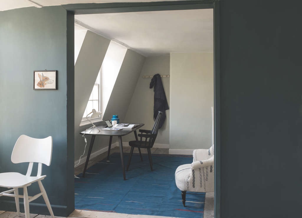
Douter is inspired by soot and tarnished brass candle snuffers, and that slightly moody origin story shows up on the wall in the best possible way. It is a smoky gray-green, described as a green interpretation of Inchyra Blue, which immediately tells you it belongs in the club for quietly dramatic colors.
Douter is perfect for offices, dining rooms, front doors, cabinetry, and cozy living spaces where you want atmosphere. It is moody, yes, but not gloomy. It has the depth to create contrast and the softness to remain livable. Add aged brass, tobacco leather, antique wood, or stone floors and the room practically writes poetry about itself.
9. Duster: The Deep Ochre That Feels Surprisingly Timeless
Duster may be inspired by the familiar cleaning cloth, but there is nothing humble about the impact it makes. This deep ochre is an aged yellow with richness, character, and far more versatility than many people expect from yellow paint. It feels nostalgic, warm, and cheerful without crossing into lemon-drop territory.
Use Duster in kitchens, pantries, breakfast rooms, hallways, or anywhere that could use a little energy. It also works beautifully as an accent on cabinetry or millwork. If butter yellow has been catching your eye lately but you want something deeper and more grounded, Duster is a smarter, moodier cousin.
What the Palette Says About Color Trends Right Now
The nine new Farrow & Ball colors line up neatly with where interior design has been heading: away from icy grays and toward warmer, more nuanced tones. There is a clear appetite for earthy greens, sunbaked clays, softened ochres, and blues that feel washed by light instead of sharpened by it. In that sense, Farrow & Ball is not merely launching paint; it is putting a polished stamp on a broader shift in taste.
The palette also taps into something emotional. These shades feel rooted in memory and daily ritual. They nod to kitchens, gardens, laundry rooms, firesides, and well-used tools. That makes them especially appealing in homes that want to feel lived in, personal, and calm. This is not maximalism for maximalism’s sake. It is warmth with good manners.
How to Use the New Farrow & Ball Colors in Real Homes
If you are trying to figure out where these colors belong, start with mood before room. Scallop and Kakelugn lean soft and airy. Dibber and Reduced Green feel grounding and architectural. Naperon and Marmelo warm a space from the inside out. Douter deepens a room with elegance, while Duster adds a confident hit of aged sunshine.
A few practical ideas:
- For kitchens: Try Marmelo, Dibber, or Reduced Green on lower cabinets or an island.
- For bathrooms and laundry rooms: Sizing and Kakelugn offer freshness without sterility.
- For bedrooms: Scallop creates softness; Douter adds cocoon-like depth.
- For entryways and hallways: Duster or Naperon can bring instant warmth and personality.
- For color drenching: Reduced Green and Douter are especially strong candidates.
The key is not to overthink perfection. These colors are at their best when they interact with real materials, natural light, and slightly imperfect homes. In other words, they were made for living, not just for being admired in a four-inch sample square while you spiral emotionally in the paint aisle.
The Experience of Living With These Colors
The most interesting thing about the new Farrow & Ball palette is not what happens when you first paint the wall. It is what happens a week later. Then a month later. Then on a gray Tuesday morning when the coffee is barely working and the room still somehow looks fantastic.
That is the difference between a trendy paint color and a lasting one. Trendy colors make a splash the first day. Lasting colors become part of the rhythm of your life. Scallop, for example, does not scream for attention. It glows. In morning light it feels gentle and flattering, almost like the room has learned how to exhale. In the evening, with lamps on and shadows softening the edges, it becomes warmer and more intimate. It does not perform. It settles in.
Dibber and Reduced Green create a different kind of experience. They make a home feel rooted. These are colors that seem to belong near boots by the door, stacks of books, ceramic bowls, and wooden chairs that have been actually used. They carry a little weight, and that weight is comforting. You notice how beautifully they frame brass hardware, black iron, worn leather, and white trim. The room starts to feel more finished, but also more relaxed. It is the decorating equivalent of someone confident enough not to talk over everyone at dinner.
Sizing and Kakelugn are fascinating because they change your relationship with cleanliness and light. Not in a weird, obsessive way. More in a “this bathroom suddenly feels like a place where I have my life together” way. They reflect light with a freshness that makes ordinary moments look better: folded towels, a painted vanity, a shelf with soaps, a little vase by a window. These shades can make practical rooms feel considered instead of forgotten.
Then there are the warmer tones. Naperon and Marmelo have the kind of presence that can shift the emotional temperature of a room. A kitchen painted in one of these shades feels more welcoming before anyone even starts cooking. The colors seem to flatter wood, stone, baskets, fruit bowls, old cutting boards, and that one mug everyone in the house fights over. They make spaces feel inhabited in the best sense of the word. Not cluttered. Not staged. Just loved.
Douter and Duster deliver their own kind of drama, but it is mature drama. Douter can make a study, hallway, or dining room feel moody and magnetic without becoming cave-like. Duster, meanwhile, brings energy without the jittery brightness that some yellows can create. It has the warmth of sunlight that has been filtered through age, fabric, and memory. Both colors remind you that bold choices do not have to be brash.
Living with these nine new Farrow & Ball colors would likely feel less like making a grand design statement and more like slowly realizing your home has become more beautiful in the background of everyday life. The walls look good in photos, yes. But more importantly, they look good while you are packing lunches, paying bills, hosting friends, watering plants, or wandering into the kitchen for a midnight snack you absolutely described as “just one bite.”
And that may be the biggest compliment possible. These colors do not beg to be noticed every second. They simply make daily life look richer, calmer, warmer, and a little more intentional. That is not flashy. It is better.
Final Thoughts
The big reveal of Farrow & Ball’s nine new colors is not really about novelty for novelty’s sake. It is about nuance. This is a palette built on memory, utility, and the beauty of everyday objects, translated into shades that feel current without feeling temporary. From the softened salmon of Scallop to the earthy ochre of Duster, every color brings personality without chaos.
If you are choosing paint in 2026 and want something that feels warm, layered, and genuinely livable, these Farrow & Ball new colors deserve a place on your shortlist. Test them in real light, pair them with natural textures, and do not be afraid of the muddier, more ambiguous shades. They are often the ones that make a home feel the most human.