Cafe Gratitude’s former Downtown Los Angeles location did something surprisingly difficult: it made macramé look sophisticated again. Inside a thoroughly modern Arts District development, designer Wendy Haworth combined knotted fiber, pale oak, brass, handmade ceramics, greenery, and sun-faded California colors. The result was neither a 1970s time capsule nor a showroom trying too hard to become Instagram famous. It was a warm, community-minded restaurant that happened to serve its plant-based meals with a generous side of design inspiration.
Editor’s note: This is a historical design retrospective. Cafe Gratitude’s Arts District location closed after eight years, serving its final customers on February 26, 2023.
A Bohemian Counterpoint to Downtown LA’s New Architecture
Cafe Gratitude arrived in the Arts District during a period of dramatic change. Former warehouses, loading docks, factories, and rail-adjacent properties were being transformed into apartments, galleries, boutiques, offices, and restaurants. One Santa Fe, the enormous mixed-use development designed by Michael Maltzan Architecture, became one of the neighborhood’s most visible symbols of that transition.
The restaurant occupied a roughly 4,200-square-foot space within the development. That presented an immediate challenge: how do you make a brand-new commercial shell feel soulful? New construction is practical, efficient, and clean, but it can also possess the emotional warmth of an airport charging station.
Interior designer Wendy Haworth answered that challenge by adding materials with texture, history, and evidence of human hands. Working with architect Victor Corona of VMC Architecture, who concentrated on the layout and kitchen, Haworth developed an interior that reflected Cafe Gratitude’s emphasis on community, nature, wellness, and plant-based dining.
Instead of disguising the restaurant as an old farmhouse or covering every surface with predictable reclaimed wood, the design balanced contemporary architecture with handcrafted details. It felt unmistakably Californian: bright but not sterile, bohemian but not chaotic, and polished without becoming precious.
How Wendy Haworth Made a New Space Feel Established
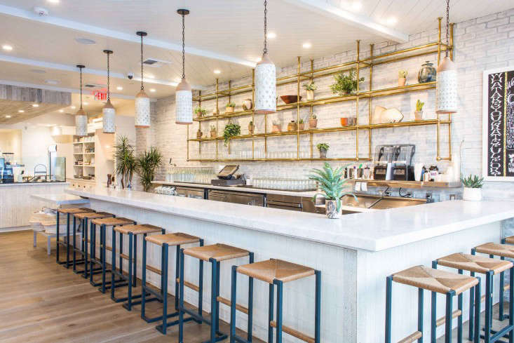
One of the most effective decisions was the creation of a brick-veneer wall behind the bar. Haworth has often expressed a preference for authentic materials, but here the brick served a specific visual purpose. It gave the newly completed shell a sense of solidity and permanence, as though the restaurant had uncovered part of an older Arts District building instead of moving into fresh construction.
Custom brass shelving brought a clean, geometric structure to that textured backdrop. Brass also appeared in pendant lights and sconces, creating a subtle glow rather than the high-gloss sparkle associated with formal dining rooms. The metal developed a conversation with the restaurant’s natural finishes: warm against white brick, crisp beside handmade pottery, and slightly glamorous next to all that rope.
The floors were made from cerused engineered oak, a treatment that emphasizes the wood grain with contrasting pigment. Above, ceiling beams were modeled after those in Haworth’s own 1920s West Hollywood apartment. This combination visually compressed the age gap between the brand-new building and the comfortable room diners encountered.
The restaurant offered several seating experiences, including bar stools, café tables, banquettes, and an outdoor terrace. That variety mattered. A guest stopping for juice needed a different kind of space from a couple ordering dinner, while a group debating whether cashew cheese truly counts as cheese needed enough room to reach a peaceful resolution.
Lighting as Functional Sculpture
Lighting helped keep the pale interior from feeling flat. Brass fixtures from Los Angeles studio Atelier de Troupe added refined lines, while ceramic artist Heather Levine created custom stoneware pendants for the bar. These handmade lights introduced irregularity and texturethe small imperfections that convince the eye a room was assembled thoughtfully rather than downloaded from a furniture catalog.
Haworth has described her design process as being similar to composing a photograph. She identifies empty areas, visual weight, and missing elements, then fills the frame without overcrowding it. At Cafe Gratitude Downtown LA, the lighting performed that compositional work. Fixtures directed attention, broke up open ceiling space, and made the restaurant more intimate after sunset.
The Macramé Revival Takes Center Stage
The restaurant’s most memorable decorative elements were its macramé wall hangings. Created by Free Creatures, an independent fiber artist discovered by Haworth online, the pieces were suspended from driftwood. Their loose fibers and hand-tied patterns softened the restaurant’s straight architectural lines.
Macramé is made by knotting cord rather than weaving or knitting it. Common techniques include square knots, half hitches, lark’s head knots, and spiraling variations. The craft has roots stretching across centuries and cultures, appearing in decorative textile fringes, sailors’ ropework, Victorian household furnishings, and, most famously, the plant-hanger-heavy interiors of the 1970s.
That last association once made macramé difficult to use without irony. For years, a knotted wall hanging suggested shag carpeting, oversized collars, and a record player that had not moved since the Carter administration. Yet the contemporary craft revival changed the context. Modern artists began using simplified patterns, natural cotton, raw wood, asymmetrical forms, and neutral colors.
At Cafe Gratitude, macramé worked because it was treated as art rather than novelty. The pieces were not surrounded by every other object ever sold at a flea market. Instead, they appeared against clean walls and near refined materials such as marble, brass, oak, and powder-coated steel. The contrast allowed the fibers to look intentional.
The driftwood supports reinforced the restaurant’s nature-oriented philosophy without becoming overly literal. There were no fake barn doors, decorative pitchforks, or signs instructing guests to “Live, Laugh, Lentil.” The design communicated its values through material choices instead of slogans alone.
Plants, Screens, Ceramics, and Mustard-Yellow Chairs
Macramé was only one part of a broader handcrafted environment. Lightweight laser-cut wooden screens from the California Workshop divided areas without blocking light or making the dining room feel confined. Their patterns created transparency, shadow, and a sense of movement as guests crossed the space.
Hollyflora supplied plants and hanging planters, giving the room actual greenery rather than simply suggesting nature through beige upholstery. Plants softened corners, introduced height, and connected the indoor dining room with the terrace. They also complemented Cafe Gratitude’s plant-based identity in the most direct way possible: the décor was literally photosynthesizing.
White Thonet-style armchairs gathered around marble-topped café tables, while mustard-yellow fiberglass shell chairs from Modernica appeared beneath a sloped plaster wall. The yellow accents prevented the neutral palette from becoming monotonous. Stacks of yellow and white dishes provided another simple graphic moment behind the scenes.
Haworth also designed powder-coated steel stools with paper-cord seats and footrests. Like the macramé, the woven paper cord added tactile warmth. Yet the steel frames kept the furniture visually disciplined. This repeated balancesoft against hard, handmade against engineered, rustic against modernbecame the central language of the interior.
Even the water bottles participated. Glass bottles were etched with words associated with gratitude and optimism, extending the restaurant’s affirmation-based identity to the table setting. Depending on your tolerance for motivational language, this was either charming or the first time your water had asked you to become your best self.
When the Menu and Interior Tell the Same Story
Cafe Gratitude has long built its identity around organic, plant-forward food, wellness, connection, and positive language. Menu items traditionally use first-person affirmations, turning the simple act of ordering into a small performance. Guests may find themselves declaring that they are grateful, glorious, liberated, or extraordinary before receiving a bowl, salad, sandwich, smoothie, or dessert.
The concept can sound theatrical when described outside the restaurant. Inside the Arts District space, however, the environment supported it. Natural fibers, handcrafted pottery, plants, warm lighting, and communal seating made the affirmations feel connected to a larger hospitality philosophy rather than printed onto the menu by an unusually enthusiastic life coach.
The food program emphasized organic, seasonal ingredients and produce from farmers markets and the founders’ agricultural operations. That sourcing story aligned with the interior’s respect for makers and materials. The kitchen celebrated ingredients as ingredients, while the dining room allowed wood to resemble wood, clay to resemble clay, and rope to remain proudly rope.
This unity is one reason the location became so influential. The design was not simply decorative packaging placed around a vegan menu. Food, language, service, furnishings, plants, and lighting contributed to the same narrative: eating could be nourishing, social, optimistic, and aesthetically pleasurable.
Why the Cafe Gratitude Look Spread Across Los Angeles
By the late 2010s, variations of the Cafe Gratitude aesthetic had appeared throughout Los Angeles. Coffee shops, juice bars, boutiques, wellness studios, and restaurants adopted whitewashed walls, pale timber, brass details, ceramics, woven textures, hanging plants, and large fiber artworks.
The look was easy to admire but surprisingly easy to imitate badly. Its success did not come from placing a succulent beside a macramé hanger and declaring the project complete. Haworth’s interior relied on proportion, restraint, local craftsmanship, and contrast.
The Arts District location showed that an inviting California bohemian interior needs structure. Its palette was controlled. Repeated materials tied different zones together. Strong architectural lines kept handmade objects from becoming visual clutter. Bright yellow accents appeared sparingly, and plants were used to shape the room rather than fill every available ledge.
Local Makers Gave the Space Its Personality
Another lesson was the value of collaboration. Instead of sourcing every object from one commercial supplier, Haworth worked with ceramicists, metalworkers, fiber artists, woodworkers, lighting studios, and floral designers. Their work gave the restaurant details that could not be reproduced by ordering a complete “modern boho restaurant package” from a single website.
That approach also supported Cafe Gratitude’s community-minded message. Local and independent makers were not hidden behind the design; their work formed the design. The interior therefore felt assembled over time, even though the original space had started as an empty new shell.
Is Macramé Better the Second Time Around?
In this case, yes. The modern revival removed some of macramé’s fussiness while preserving its tactile appeal. At Cafe Gratitude Downtown LA, it added movement, softness, shadow, and a visible connection to handcraft.
The project also demonstrated how to use macramé without turning a room into a costume. One or two large pieces can carry more visual authority than a dozen small decorations. Neutral cotton works particularly well against brick, plaster, wood, or dark paint. Driftwood provides an organic support, while a clean metal rod can give the same craft a more contemporary appearance.
Design Lessons to Borrow at Home
Homeowners can adapt the restaurant’s strategy by choosing a single macramé statement piece and giving it enough open wall space. Pair it with materials that provide contrast, such as marble, blackened metal, glass, or smooth plaster. Add plants, but vary their heights and shapes instead of creating a dense indoor jungle that requires its own irrigation department.
Warm lighting is equally important. A woven wall hanging under harsh overhead bulbs can resemble a classroom craft project. Place it near a soft pendant, wall sconce, or indirect light source so the knots produce shadows and dimensional texture.
Finally, avoid treating “bohemian” as permission to display every basket, tassel, vintage stool, patterned rug, and ceramic animal you have ever loved. Cafe Gratitude’s interior succeeded because the handmade pieces had room to breathe.
A Lasting Design Legacy After the Arts District Closure
Cafe Gratitude’s Downtown LA restaurant eventually closed in February 2023 after approximately eight years in the Arts District. The neighborhood’s dining scene continued changing around it, as restaurant scenes always do. Concepts open, communities form, rents shift, tastes evolve, and eventually someone carries the chairs away.
Yet the interior’s influence outlasted the location. Wendy Haworth’s combination of natural materials, local craft, restrained color, and modern architecture helped define a recognizable form of California restaurant design. The space showed that plant-based dining did not need to look clinical, aggressively rustic, or permanently trapped inside a health-food store.
Most importantly, it gave macramé a convincing second act. The humble knot became part of a polished urban restaurantnot as a joke, but as an essential layer of texture and identity. That is quite an achievement for a material many people previously associated with their aunt’s avocado-green living room.
Experiencing Cafe Gratitude in Downtown LA
Imagine approaching One Santa Fe during the Arts District location’s years of operation. Outside, Downtown Los Angeles supplies its usual mixture of converted warehouses, passing trains, murals, concrete, construction noise, creative studios, expensive apartments, and people who appear to be professionally carrying iced coffee.
Entering Cafe Gratitude created a noticeable shift. The scale remained urban, but the textures became softer. Pale oak flooring reflected daylight while white surfaces kept the room open. Rather than being confronted by a dramatic host stand or a dark bar, guests entered a calm visual field shaped by wood, ceramics, greenery, and brass.
The first impression would likely have been brightness. During the day, natural light moved across the whitewashed brick and illuminated the grain of the floor. Laser-cut wooden screens created partial views into other seating areas, allowing the restaurant to feel active without exposing every table at once.
Then the handmade objects began to register. A stoneware pendant might hang slightly differently from the fixture beside it. Brass shelving added precision behind the bar. Paper cord wrapped the seats of custom stools. On the wall, macramé fibers created small shadows that changed with the light. These details rewarded attention without demanding it.
Choosing a seat changed the experience. Bar stools placed diners close to the movement of drinks and dishes. Banquettes provided a more settled position for longer conversations. Marble-topped café tables created an airy, almost European rhythm, while the terrace connected guests with the industrial surroundings of the Arts District.
Ordering introduced Cafe Gratitude’s famous language. A diner accustomed to requesting a burger by number might suddenly need to announce a positive personal quality. The first attempt could feel slightly awkward. Is it possible to say “I am extraordinary” while avoiding eye contact? Absolutely. Los Angeles has trained for stranger situations.
Once the food arrived, the presentation continued the interior’s visual story. Colorful vegetables, grains, herbs, sauces, and edible garnishes stood out against ceramic plates and pale tabletops. The meals often looked abundant rather than restrictive, challenging the old assumption that plant-based dining involved a lonely lettuce leaf and an apology.
Sound also shaped the room. Because seating styles and screens divided the space, the restaurant could host several moods simultaneously. One table might contain friends sharing smoothies after yoga. Another might hold a business lunch between people pretending not to check their phones. At the bar, a solo diner could eat comfortably without feeling abandoned in the middle of a banquet hall.
The macramé was unlikely to dominate an actual meal. That was part of its success. It operated in peripheral vision, softening the room and supporting the atmosphere. Guests did not need to analyze every square knot to benefit from the visual warmth it created.
As afternoon turned into evening, the handmade pendants and brass fixtures became more prominent. The restaurant’s pale surfaces stopped feeling beachy and began to feel intimate. Ceramics gained deeper shadows, wood tones became richer, and the fibers of the wall hangings appeared more sculptural.
Leaving the restaurant returned visitors to the harder textures of Downtown LA. Concrete, steel, traffic, and large-scale development replaced cord, oak, plants, and clay. That contrast clarified what Haworth’s design accomplished. It had not attempted to erase the city outside. Instead, it created a temporary refuge within ita place where a contemporary development could feel personal and where an old decorative craft could feel entirely relevant.
The physical restaurant is gone, but the experience remains instructive. Successful hospitality design is not simply about photographing well. It changes how long people stay, where they sit, what they notice, and how they remember a meal. Cafe Gratitude’s Arts District interior tied those experiences together one carefully considered knot at a time.